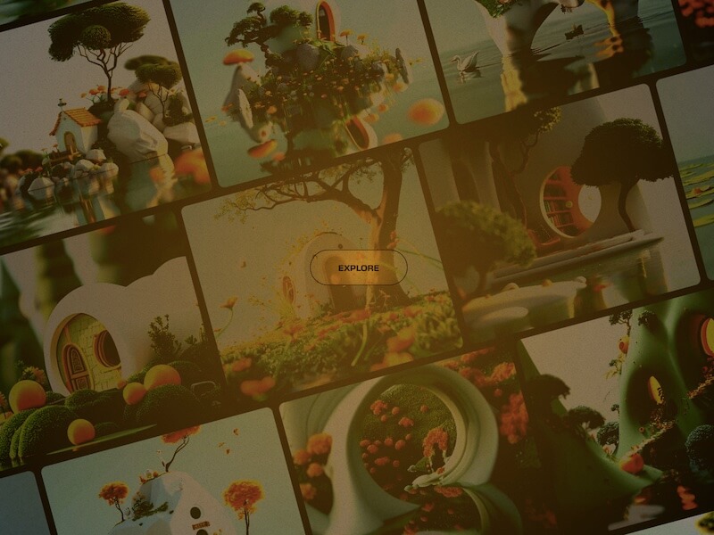
A little hover motion effect on a grid and an intro animation.
I have a real appreciation for websites that incorporate playful interactive visuals; they add a distinctive character to a brand and create an engaging experience for visitors. Recently, I came across sink.design, where they aptly refer to these visuals as “Play.”
Just click on it and you’ll see a new experiment every time. One of these experiments is the following:
Rows of text move in sync with your mouse movements, which is quite impressive, especially since the entire setup is rotated. I couldn’t help but imagine how it would look with an image grid instead of text, so I gave it a try and added some filter animations. Additionally, I thought about how this effect could serve as an introductory animation on a webpage, revealing content upon clicking an enter button. For that I drew some inspiration from a Dribbble shot by Nick Hart.
This is how the hover motion looks like:
When clicking the button to enter, the center image goes fullscreen and the content moves in.
Hope you enjoy this little mashup and find it inspirational!
