Explore the vibrant branding and visual identity of Woohoop, designed by Marco Oggian, highlighting innovative patterns and colors.
Marco Oggian’s latest rebranding project for Woohoop showcases a dynamic approach to branding and visual identity. Woohoop, a leader in the customized packaging sector, sought a fresh identity that would resonate with their diverse, global clientele, which includes industry giants like Coca Cola, Siemens, Instagram, and Disney.
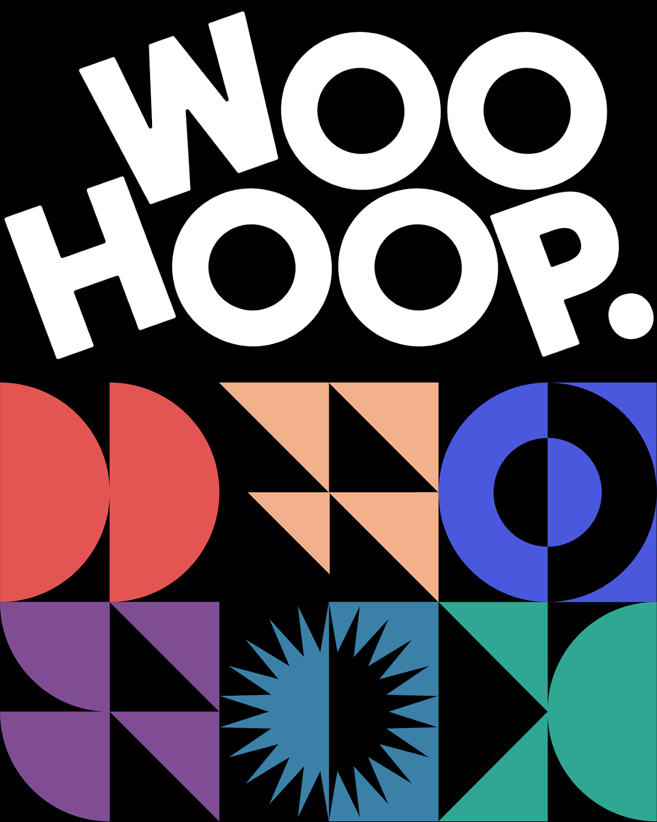
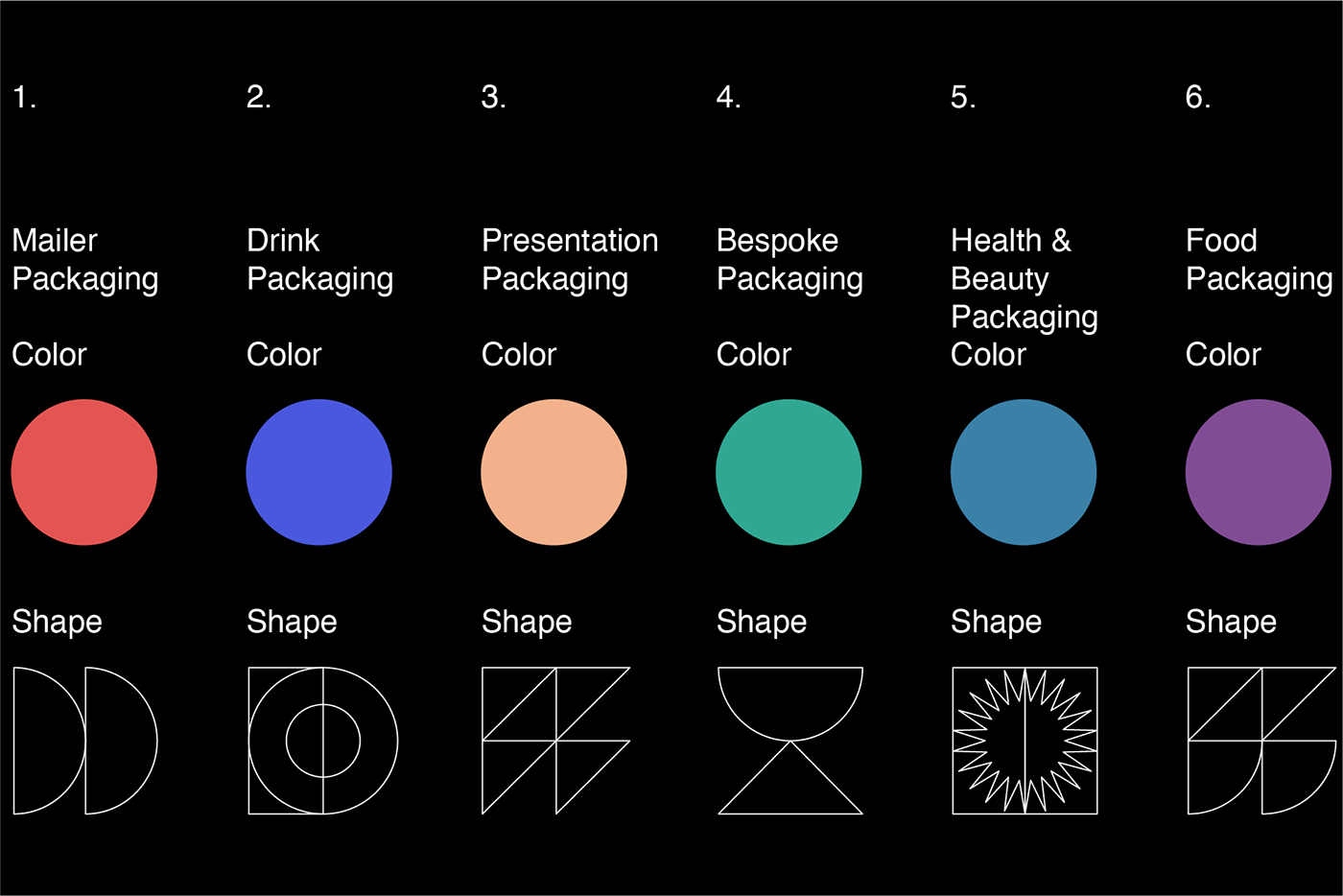
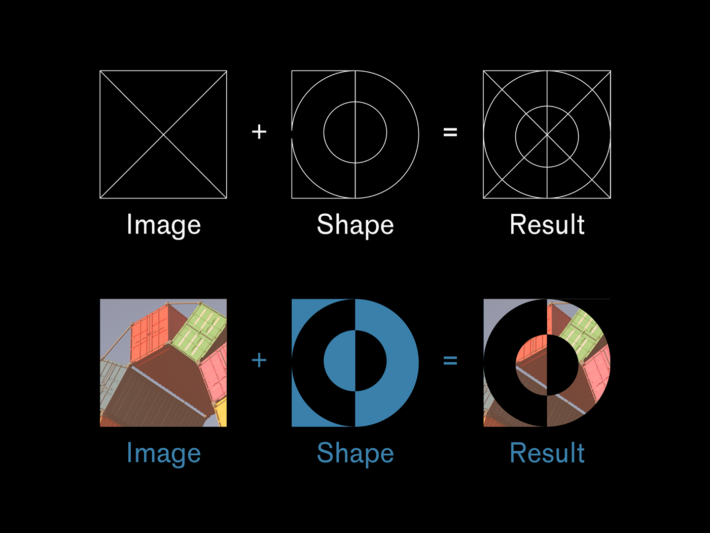
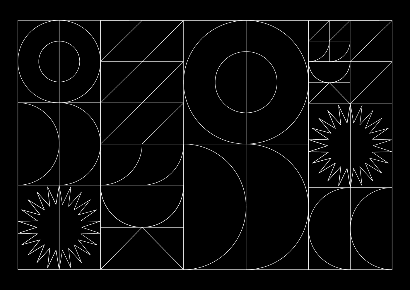
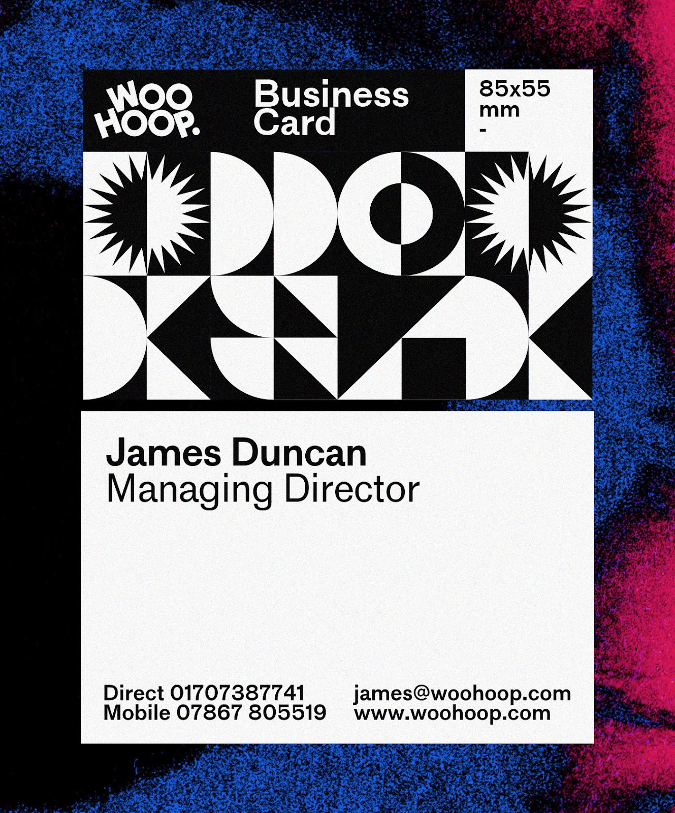
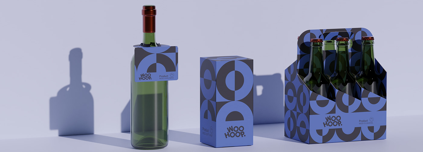
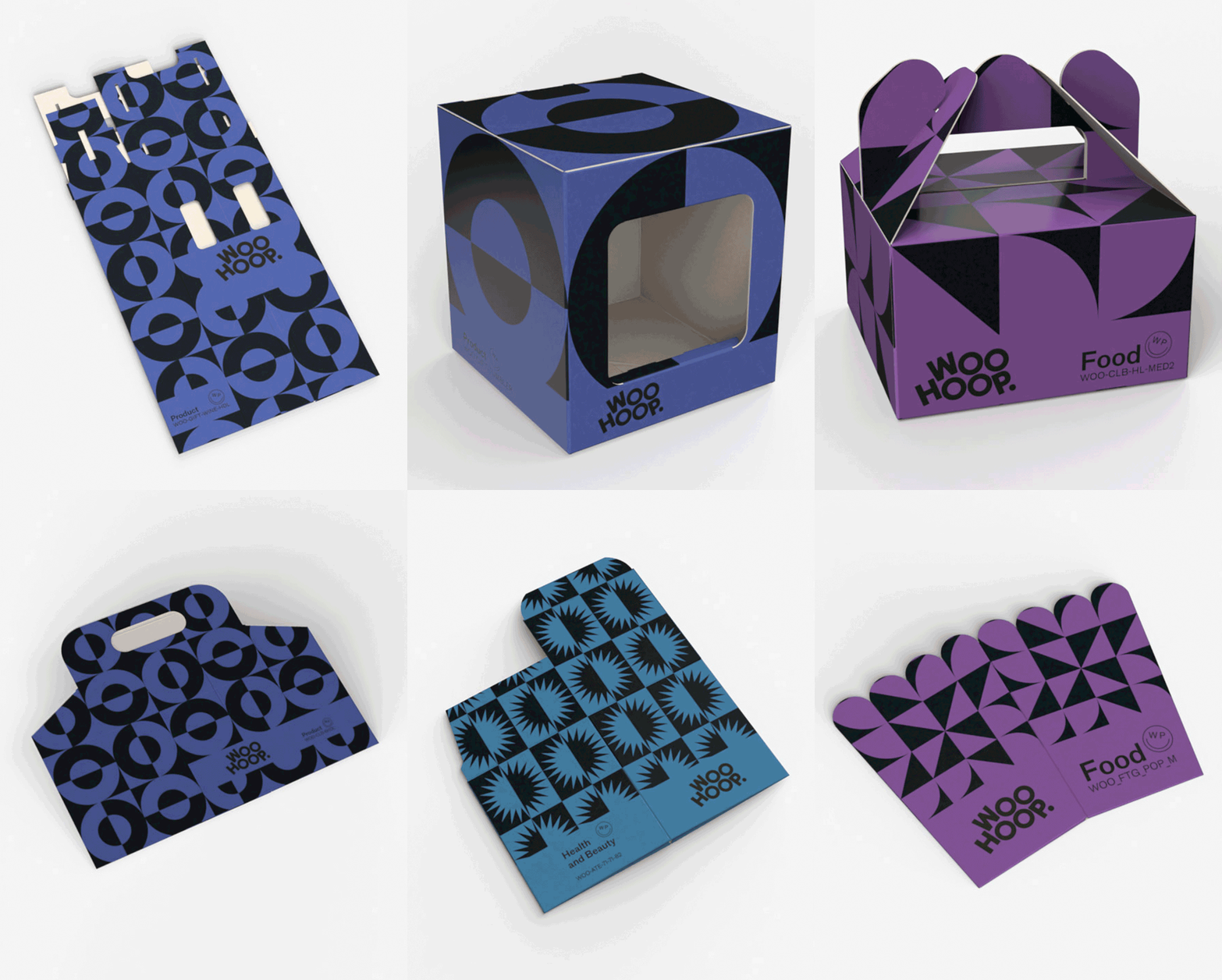
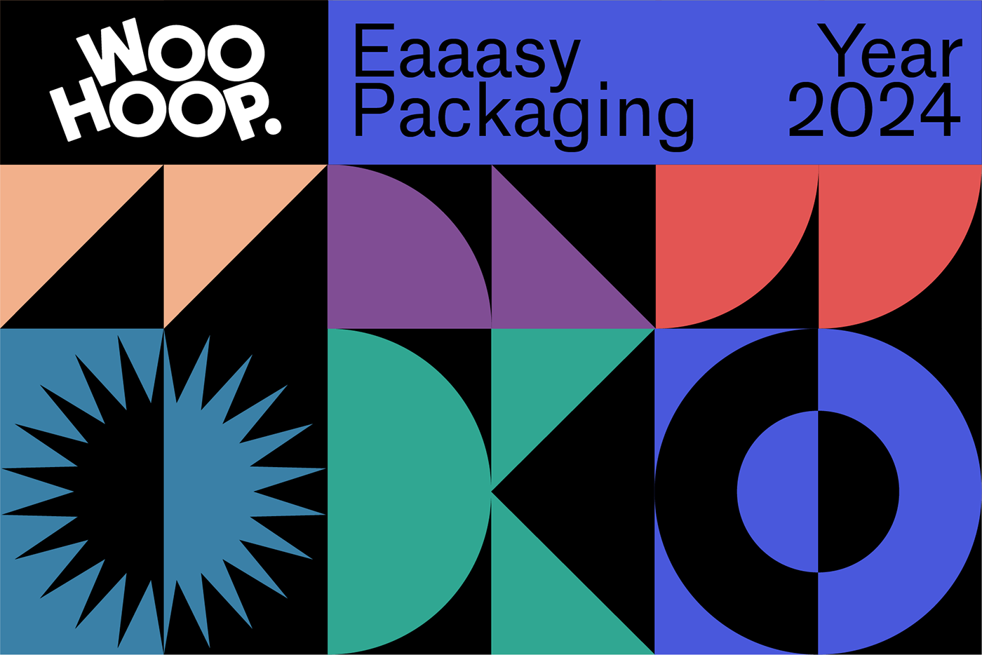
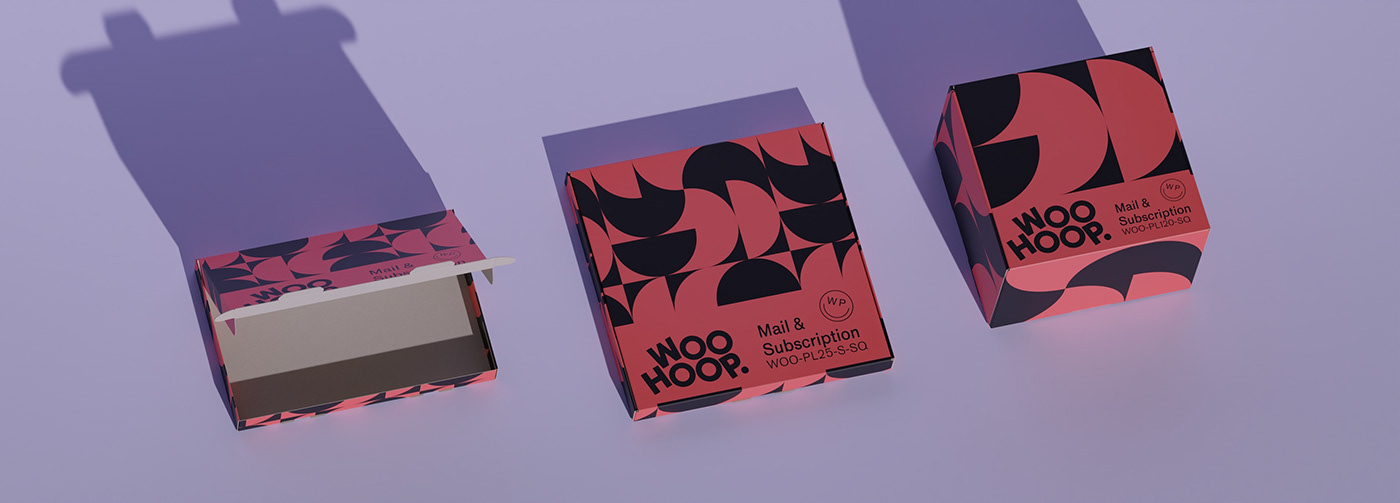
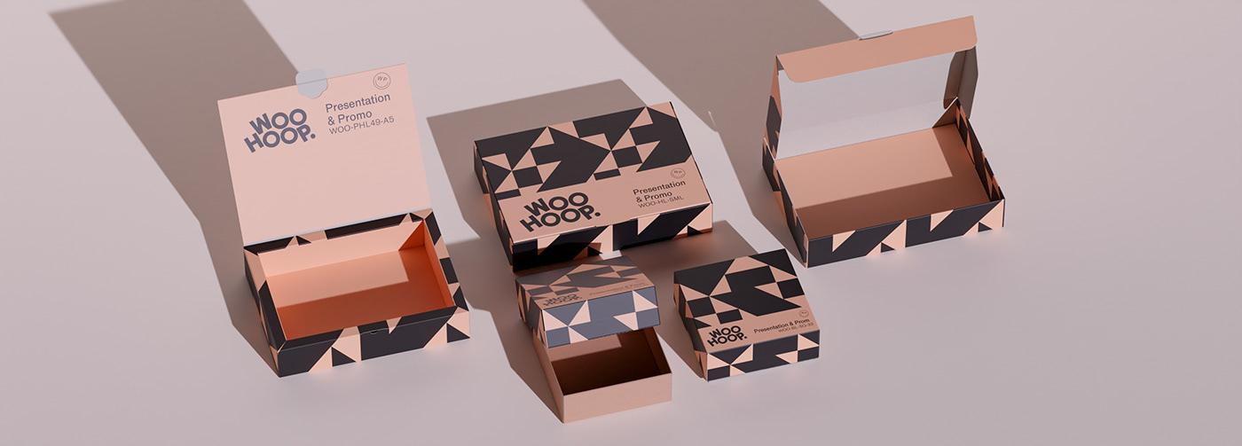
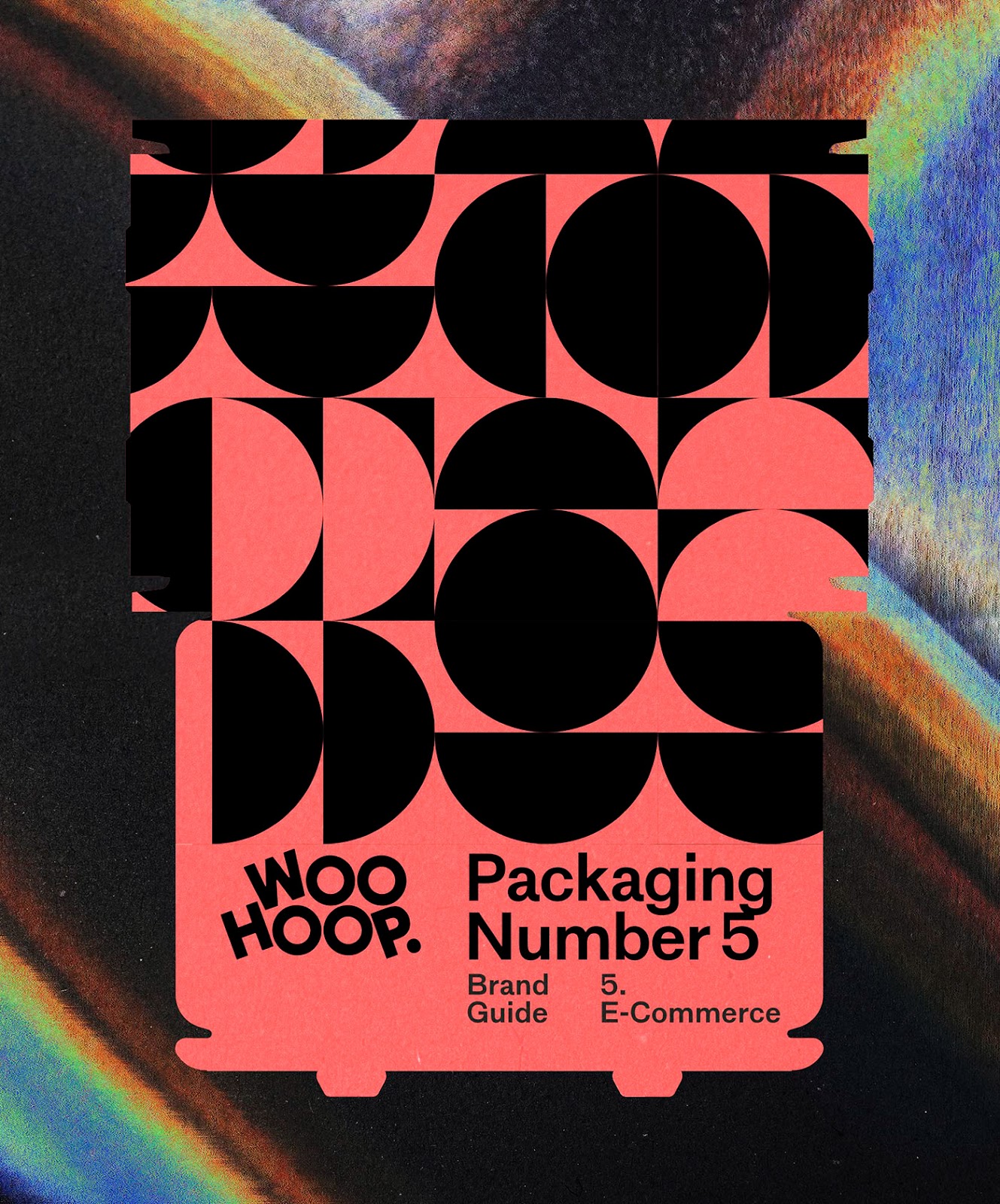
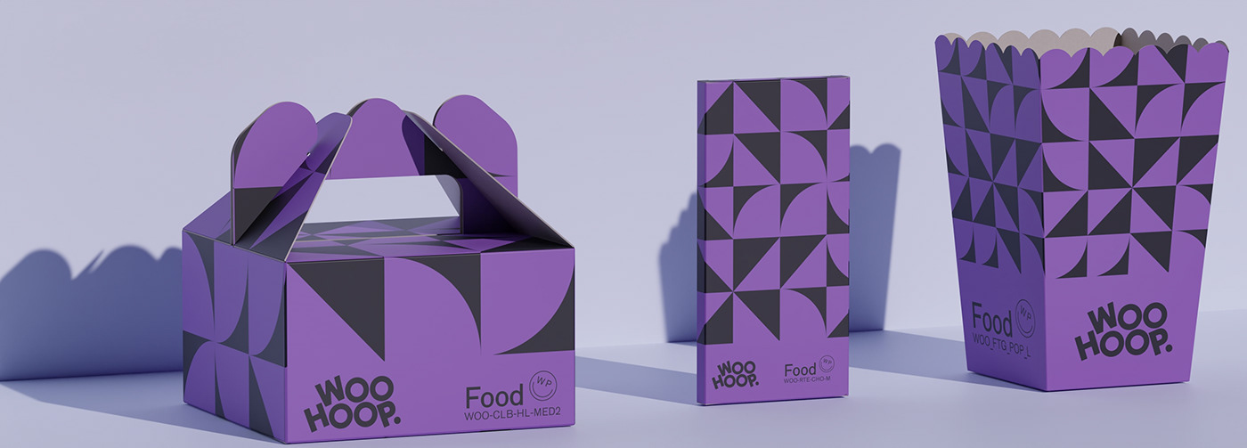
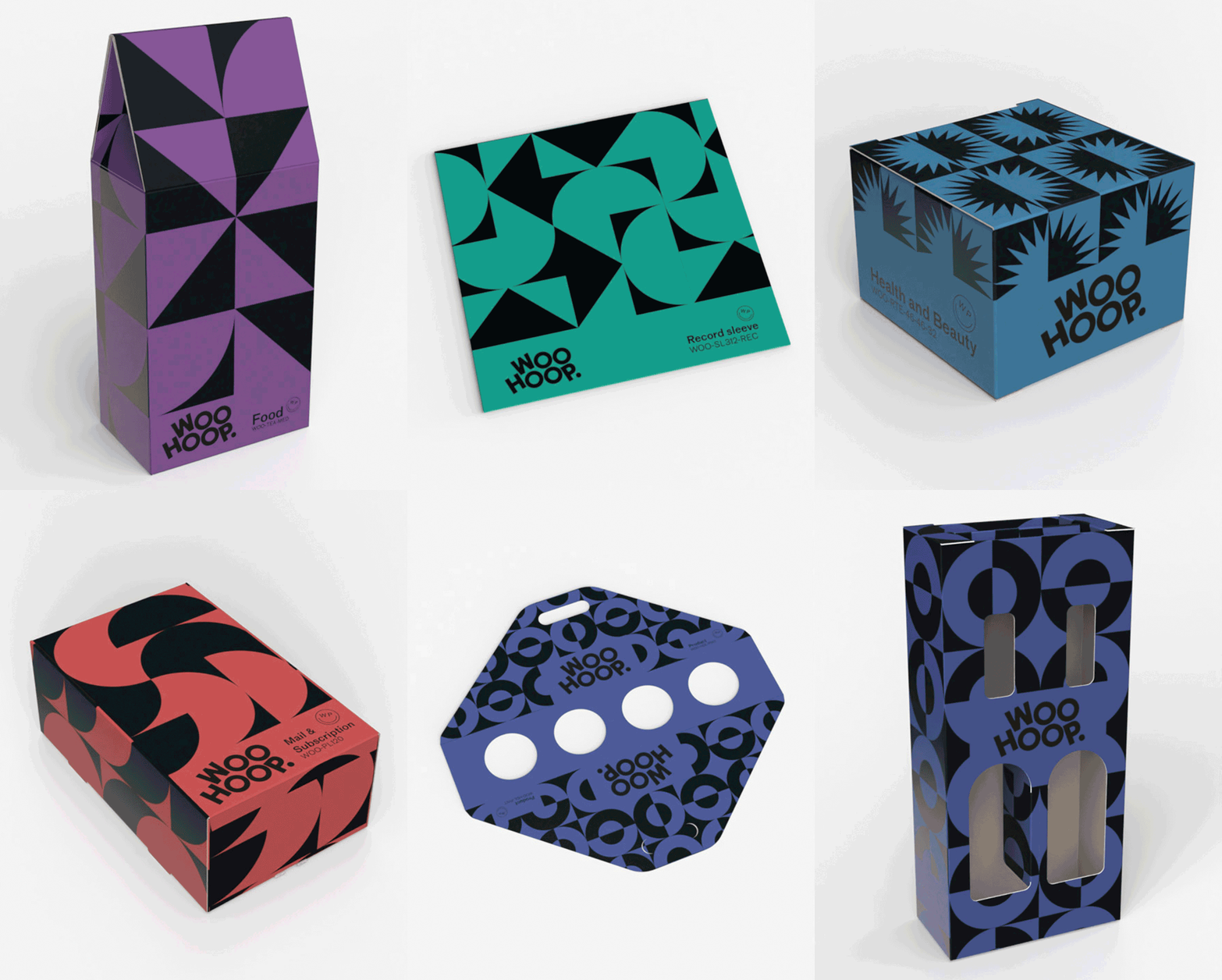
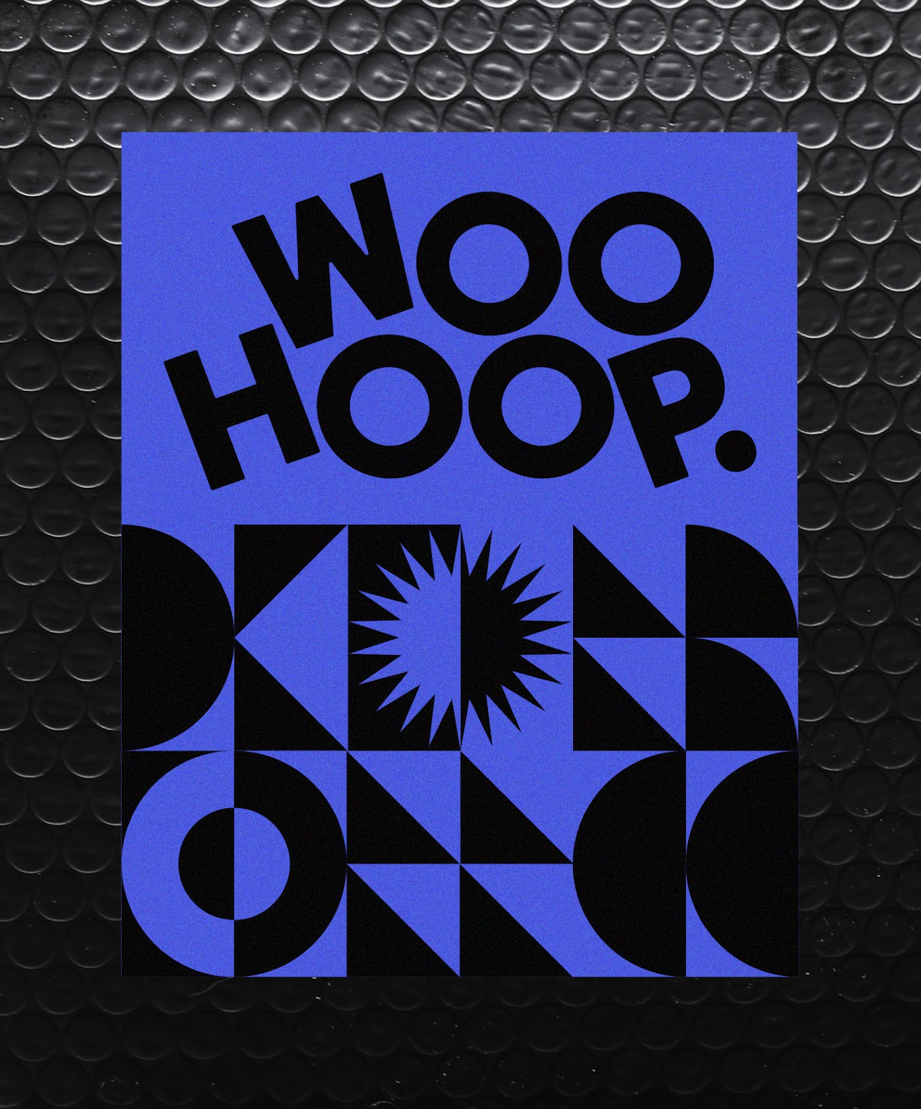
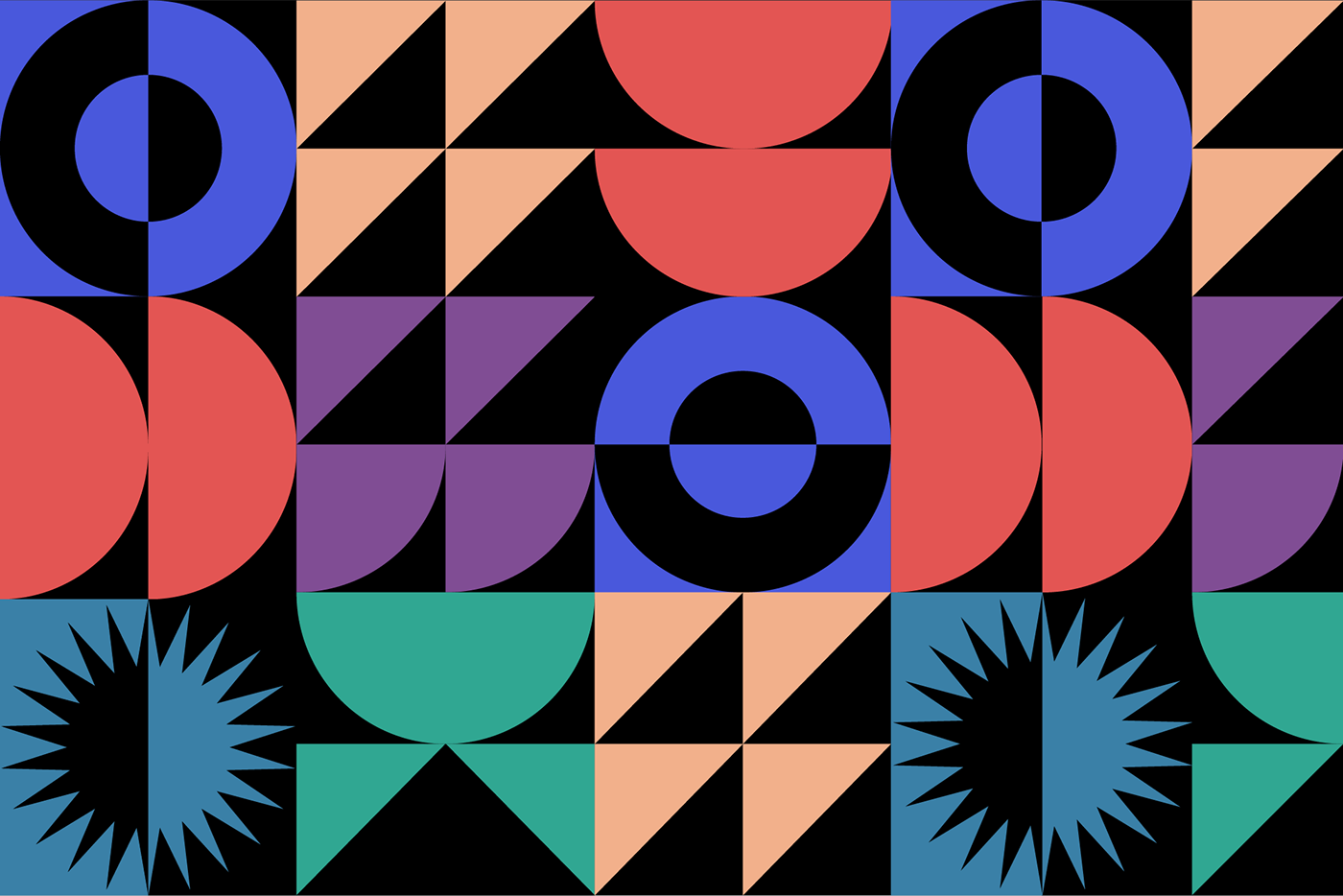
The challenge was to organize Woohoop’s extensive product catalog into distinct subcategories. Oggian’s solution was both innovative and visually striking. Each product category was assigned a unique color and geometric shape. These elements, when repeated, create patterns that offer an almost infinite number of combinations. This method not only enhances visual differentiation but also maintains a cohesive brand identity.
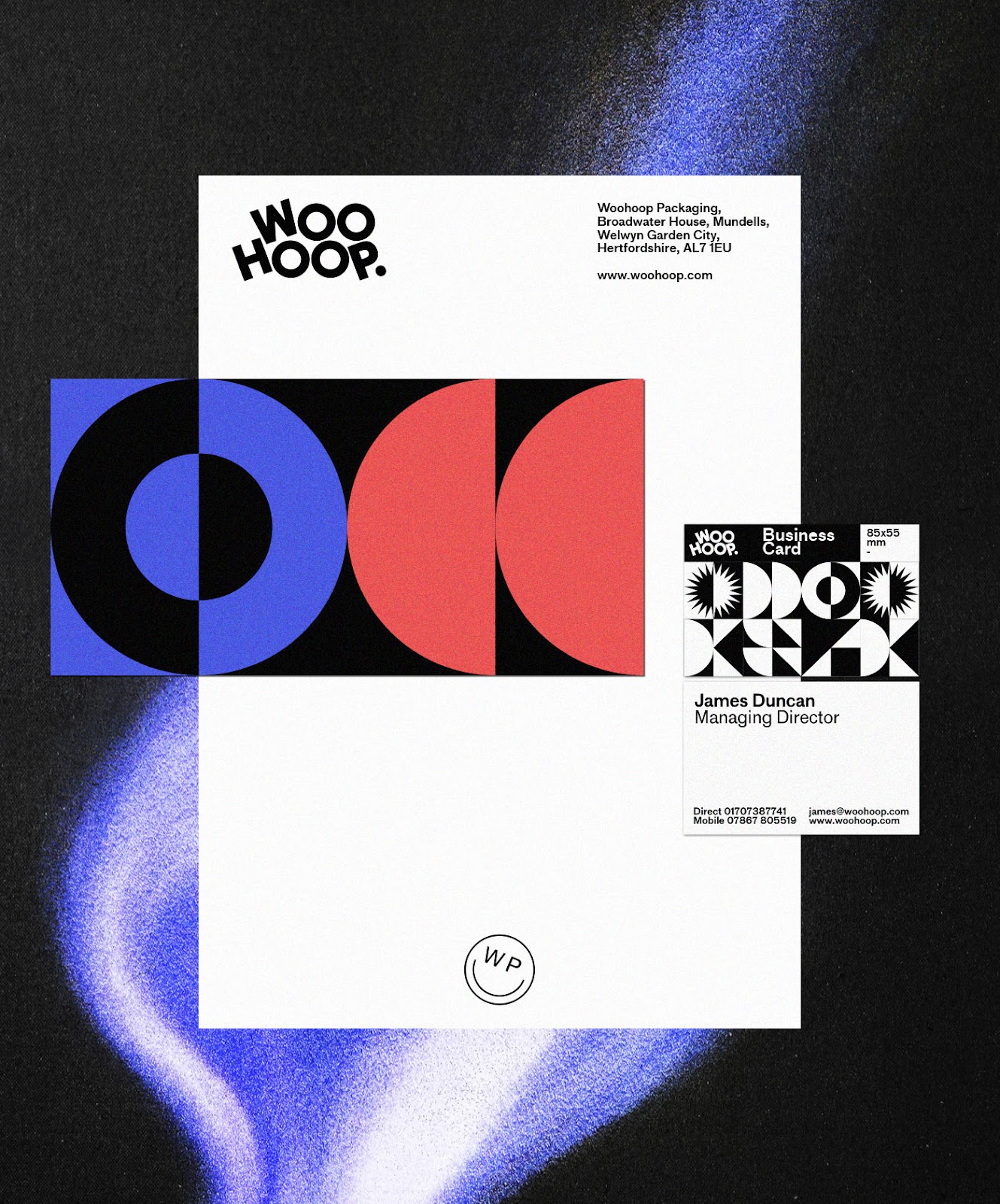
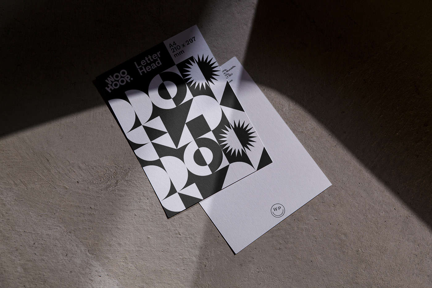
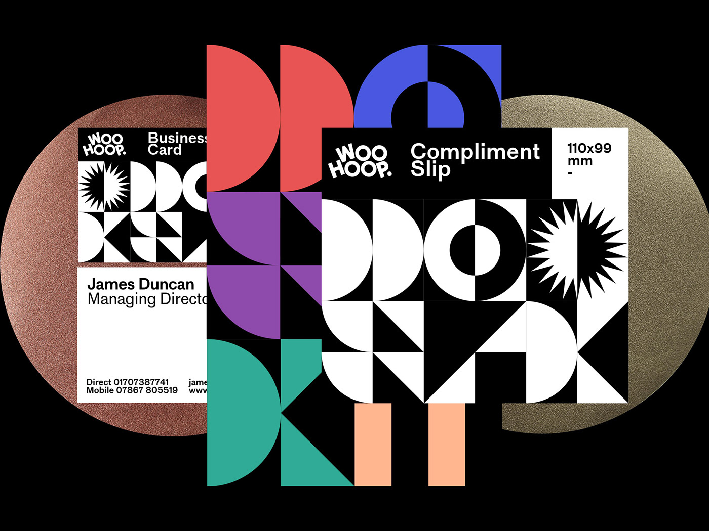
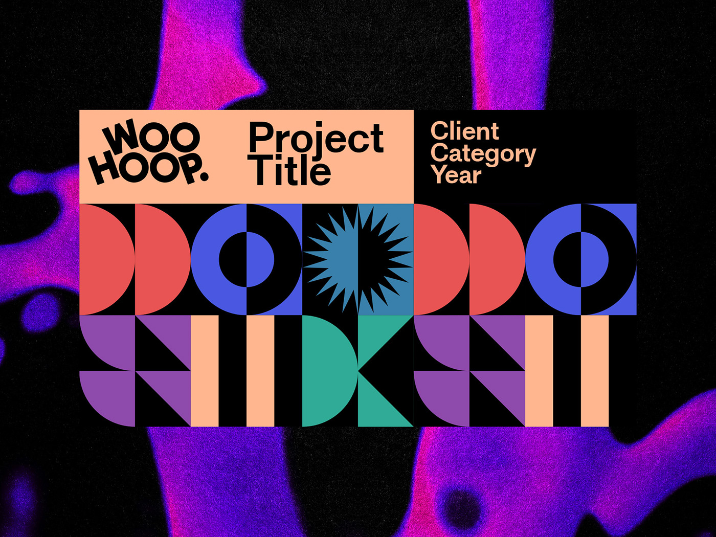
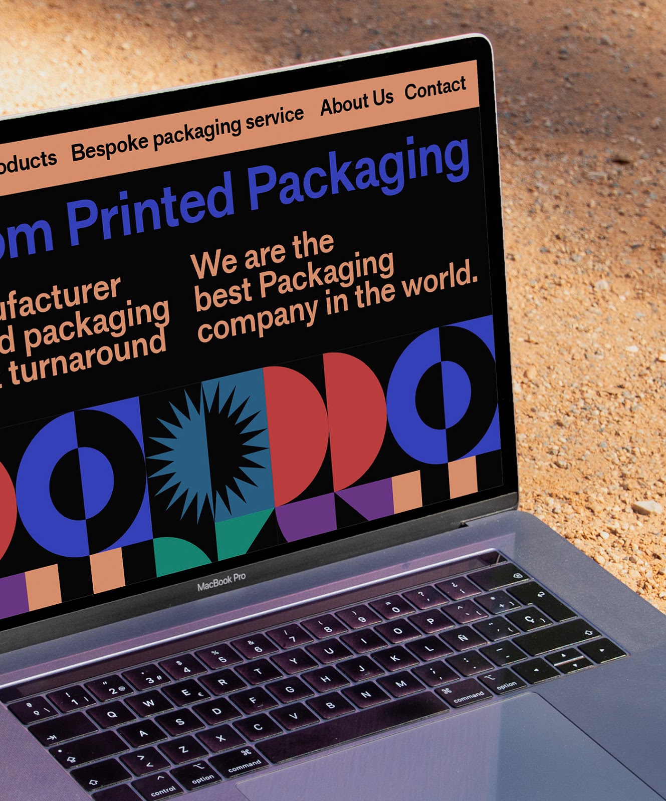
Oggian’s design extends beyond the packaging. For the web page and presentations, the shapes and colors are blended to represent Woohoop’s essence. The result is a vibrant, unified look that captures the company’s creativity and adaptability. This approach ensures that Woohoop’s digital and physical presence remains consistent and engaging.
The choice of colors and shapes is deliberate, with each combination designed to evoke specific emotions and associations. This thoughtful approach ensures that each product category stands out while still feeling part of the overall brand. The geometric shapes add a modern, playful touch, appealing to a wide audience and reflecting Woohoop’s innovative spirit.
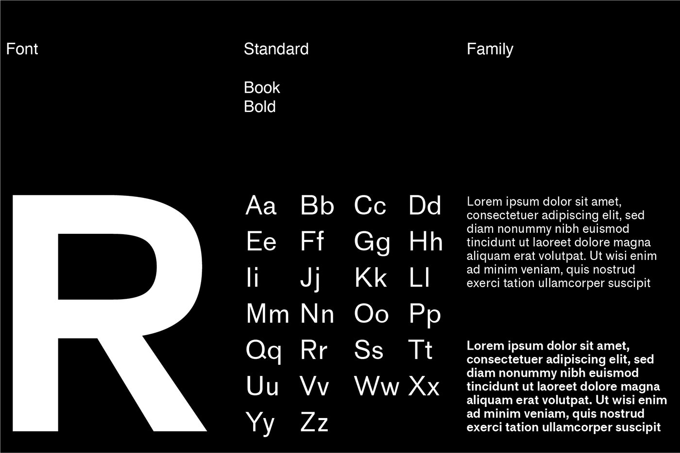
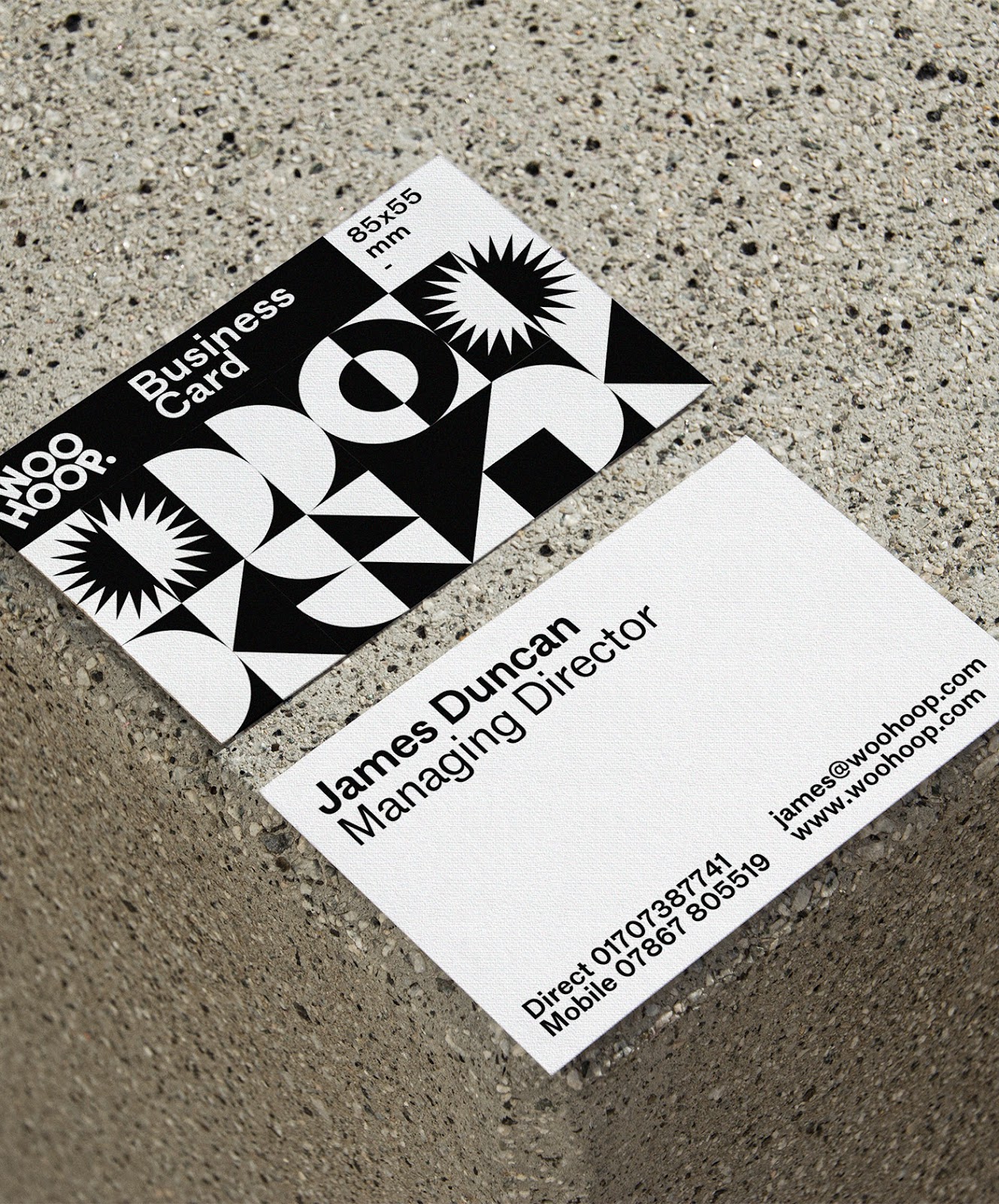
Typography and layout also play crucial roles in the new branding. The use of clean, modern fonts enhances readability and adds to the contemporary feel of the design. The layouts are structured to guide the viewer’s eye, making navigation intuitive and ensuring that the brand’s message is clear and impactful.
Oggian’s work on Woohoop is a prime example of how thoughtful design can elevate a brand. By combining vibrant visuals with strategic design thinking, Woohoop’s new identity not only stands out in the market but also effectively communicates the company’s values and vision.

For more information make sure to check out Marco Oggian on Behance and website a mrcggn.com