
Typography has become a hot topic, often used referring illustrative typography or custom lettering. At its core, however, typography is simply the skill of setting type. Several centuries ago, this meant composing every paragraph by hand, character by character, before locking it into a form and printing it on a letterpress machine. For much of the 1900s, this meant typing it out on a Linotype or a similar composing machine.
Since the advent of the digital age, nearly all composing has been done digitally. This certainly makes things simpler, but we’ve also lost many typographic sensibilities. Here are a number of items for your consideration that will help you set type better, applicable in both print and web scenarios.
The Principle Of Typography
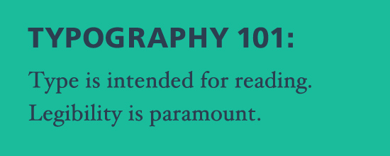
Type is intended for reading. Readability is your primary concern when setting type, and that’s what most of these principles affect. Whether it is the use of dashes, which ligatures are appropriate, or which type of quotes to use, it all comes back to the question of how the text is read.
Maintaining “type color” is important. Type color excludes the spectrum, only dealing with black and white. It is a figure–ground relationship, with “blackness” being the printed portion of the page (or its digital equivalent, in web design).
To learn more on type color and particularly the negative space and its role in typography, I’d recommend Cyrus Highsmith’s recent book, “Inside Paragraphs”, a foundational book on how text is read, dealing with typography and the thought that goes into individual characters, words, lines and entire paragraphs. For now, let’s get to some specific applications!
Dashes
Dashes remain among the more confusing and sometimes controversial components in typography. It doesn’t help that the dashes we should be using most often are not represented by a key on a standard keyboard! There are three types of dashes that we use often: the en dash, the em dash, and the figure dash. The mathematical symbol for minus and the hyphen are separate characters.

The em dash is equal in width to—you guessed it—one em in any given typeface. An em is equal in width to the point size of a typeface, traditionally named because the capital ‘M’ was often one em wide in older typefaces. For a number of reasons that isn’t always true anymore, but the name remains.
The en dash was traditionally half the width of an em, but that is more of a guideline than a rule, and en dashes vary in length quite a bit. The figure dash, which is not as commonly used, is the width of a numerical character, which in most normal fonts as well as monospaced fonts, are all the same width.
En Dash Or Em Dash? The Controversy
One of the most common uses of dashes is to denote a break in thought, similar to parentheses. There is however, heated discussion over which method to use. Some style books, such as The Chicago Manual of Style and The Oxford Style Guide recommend using an em dash—like this—with no spaces around it. Robert Bringhurst’s Elements of Typographic Style, on the other hand, recommends a padded en dash – an en dash with a space on either side – like this.
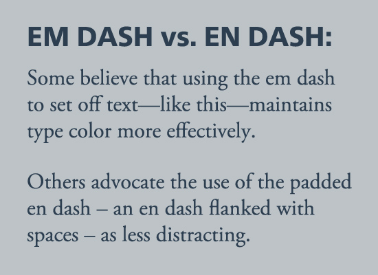
Many people have different opinions on what reads better and maintains a more even type color. Often a typographer will choose depending on the typeface being used, as some typefaces have an over-long em dash. Weigh the arguments, test both alternatives, and use what seems appropriate in the typeface you’re using! Some considerations depend on the language you’re typesetting as well. German uses the padded en dash almost exclusively, while Russian favors the em dash.
The Em Dash Elsewhere
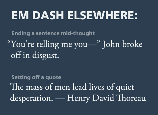
The em dash is also used to end a sentence mid-thought without usual punctuation, in dialogue, a similar effect as an ellipsis, although again it implies a stronger break in thought. When citing the author of a quote, use the em dash between the quote and the name of the author. It is also occasionally used in lieu of quotation marks to mark the beginning of quoted text, but this is an archaic method.
The En Dash Elsewhere
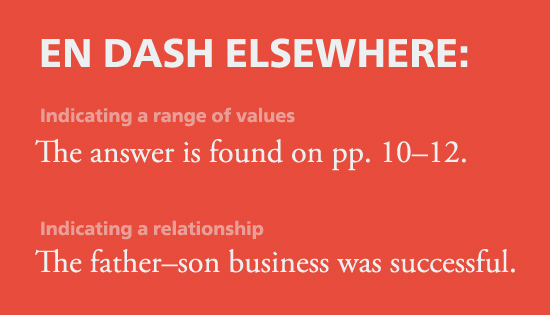
The en dash has a broader usage. When there is a range of values, or something similar, it is correct to use an en dash (rather than a hyphen) to connect the two, such as describing a range of dates or a series of pages (January–March, pp. 10–12). It’s also used in such instances as a relationship (father–son), in demonstrating a contrast (58%–42% vote, a 4-2 score).
The Figure Dash
The figure dash, a third type of true dash that is equal to the width of a given typeface’s digits, is not commonly used, and indeed not always available in a font. Its correct use is in a series of numbers, such as in a phone number, in which it would be used (rather than a hyphen) to separate the digits.
The Hyphen And Minus Sign
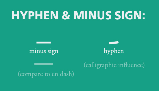
Hyphens and minus signs are not true dashes. While dashes are completely horizontal, the hyphen often has a slight angle to mimic the stroke of a pen by a right-handed writer. It has a number of common uses. A hyphen connects compound words (e.g. egg-beater), and can also connect words in order to clarify meanings (e.g. “the man-eating sandwiches” versus “the man eating sandwiches”). Words are also hyphenated when they are split at the end of a line (see below).
A minus sign is exclusively used in mathematics. It’s longer than a hyphen, being closer in length to the en dash. As there are no standard shortcuts for typing a minus symbol and it must be inserted from the character set manually, most people simply substitute a hyphen or en dash.
Standard Shortcuts For Dashes

Quotes
Quotes are perhaps a little more intuitive than the dashes. It’s easy to note when a person isn’t using “smart quotes”. The quotes should always point inwards. However, as you may have noticed, the correct quote glyphs are not represented on a keyboard. Instead, there are only straight quotes. If you’re typing in Microsoft Word or a similar word-processing program, it will correct the quotes for you automatically. However, if you’re typing a blog post or a piece intended to be printed, make sure you include the smart quotes. Single quotes are generally used for a quote within a quote, like this: “He told me not to ‘walk too near the edge’ or I’d fall off.”
The apostrophe is another often-misused glyph. It is essentially a closing single quote, but is used to indicate possession (John’s book), or to indicate a contraction (that’s, it’s). The apostrophe always points to the left. Where we see it often misused is when the software you’re typing tries to make it a “smart quote”, thus pointing the wrong direction, in abbreviations such as ’90s.
Other Common Quote Types
No matter which language you speak, it’s worth your while to be familiar with quotes used in multiple languages. Here are a few of the most common. Guillemets are used extensively, indicating quotes in dozens of languages, including German, Russian and French. Another common way to introduce a quote is the use of a padded en dash at the beginning of the line, or occasionally an em dash.
Sometimes people will mix and match, resulting in interesting discussions for editors and typographers!
Typing The Right Quotes
Since these characters aren’t represented by a key on the standard English keyboard, here’s a table of the common shortcuts for using these marks.

Ligatures
Let’s face it – we all love ligatures. Perhaps we love them a little too much. They’re fun, unusual, and add a little interest to the type we use. With the advent of web fonts and broadening support across browsers, we’ve had even more opportunities to show off our typographic skills. However, there are a few rules about ligatures that we should consider in order to uphold the cardinal rule of typography – readability.
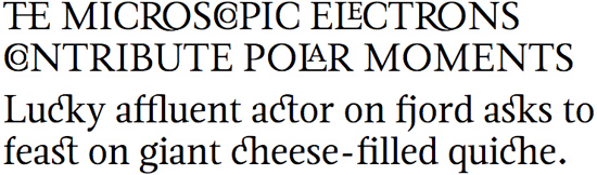
Ligatures are primarily intended to improve legibility, combining awkward character combinations into a single glyph, such as fi, ffl, or Th. These actually improve the flow of the text, aiding the eye in scanning the line by removing awkward visual tension or gaps.

Others, however, are called “discretionary ligatures”, due to the fact that they don’t have a place in body text. These include the ct and st ligatures. They look cool (as all ligatures do!), but they disrupt the reading and are more of a distraction than an aid to legibility. These are better off used only in headlines, where they can be eye-catching and draw attention to the headline, serving a completely different purpose than that of a standard ligature smoothing out an awkward spot in a paragraph.
Some typefaces have deliberately over-the-top ligatures for display type, such as this sample of Magneta. I have to admit, these are quite cool, but also should be used very sparingly. They’re an aesthetic decision over legibility, and therefore should only be used when legibility is not a concern (i.e., if the type size is massive).
Some characters that look like ligatures are actually a unique character, such as æ or œ. They often originated as a ligature, but shouldn’t be treated as one today. The Latin “W” began this way, as a combination of two Vs, but now it is a unique character, and if there were a word with two Vs or Us we wouldn’t replace them with a W.
Closing Remarks
So there you have it! Those are the basic rules and guidelines relating to dashes, quotes and ligatures. Things can get much more complex than that, but if you stick with the material in this article you’ll be in good standing.
Some of you are probably thinking, “why should we worry about all of this? Is it necessary to worry about em dashes, en dashes, hyphens and minus signs, when they all look so similar?” The answer is, unequivocally, yes! For one thing, harking back to the principle rule of typography, using these features thoughtfully and correctly makes a huge impact on readability. Also, setting type correctly, with attention to detail, lends an entirely new level of professionalism to your typography, whether on the web or for print.
So, next time you are digitally setting type for a brochure, a book, or a blog post, take the extra time to make sure you’re using these typographic features correctly! Your readers will thank you for it, whether they know it or not!