The Bezold effect is rooted in the interactions between photoreceptors in the eye and psychological processing. We’ve discussed the science and some of the other effects that contribute to it in previous color theory articles. Today, we’ll be diving deeper into the Bezold effect specifically.
Discover how you can use this effect to enhance visual impact, create striking contrasts, and refresh designs with just one color adjustment. This dynamic interplay can revolutionize your design strategy.
1. The science behind the Bezold effect
1.1 Photoreceptors and color perception
We discussed the physiology of the three types of color receptors and the psychology of color processing in an earlier article. In short, cones are the photoreceptors responsible for detecting color, with three types sensitive to different wavelengths: short (blue), medium (green), and long (red). The brain works with the information it receives from the cones and identifies color based on relative activity across all three types of cones.
1.2 Psychological processing
The brain’s role in color perception extends beyond simple detection. It processes colors contextually, meaning our perception of a color is affected by the colors around it. This contextual processing can alter the hue, brightness, and saturation of a color, leading to what we experience as simultaneous contrast.
Fatigue in the photoreceptors can lead to an effect called after-image that overlaps with other adjacent colors and changes their appearance, especially with extended viewing. As after-image accumulates, it can cause yet another effect called vibrating boundaries, which is particularly strong when adjacent colors have a similar brightness or value.
1.3 The Bezold effect
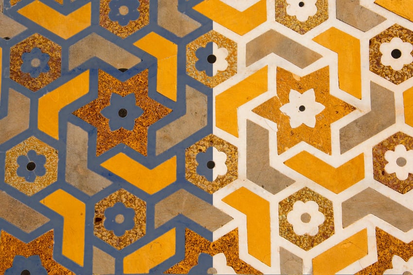

The effects of after-image, successive contrast, and simultaneous contrast tend to show up with specific color combinations, but the effects are all interconnected. The Bezold effect occurs in patterns or images where multiple blocks of color interact with each other. It can be thought of as a combination of all of the previous effects we’ve explored because the changes in appearance depend on multiple factors.
2. Applying the Bezold effect in design
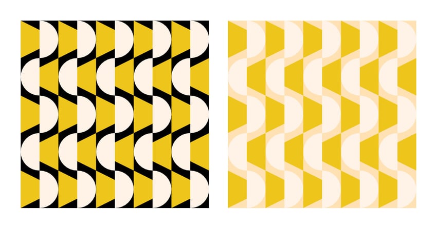
Using the Bezold effect can be somewhat unpredictable since it incorporates multiple effects. If the original color scheme uses complementary colors, it will likely be influenced by after-image and vibrating boundaries. Changing one of the complementary colors will, of course, reduce those effects. On the other hand, if the original color scheme is analogous, changing one color will make it stand out more.
Here are a few ways in which you can implement the Bezold effect.
2.1 Enhancing visual impact
You can use the Bezold effect to make certain elements stand out or blend in. By placing a color with high contrast next to key elements, you can enhance their visibility and impact. This technique can be especially useful in creating focal points and guiding the viewer’s attention to important aspects of a design.
2.2 Creating depth and dimension
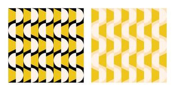
Using contrasting colors can create a sense of depth and dimensionality. This effect can be applied in various design contexts, from print to digital media. For instance, placing a dark color next to a lighter one can make objects appear to recede or come forward, adding a three-dimensional feel to the design.
2.3 Maximizing surface area
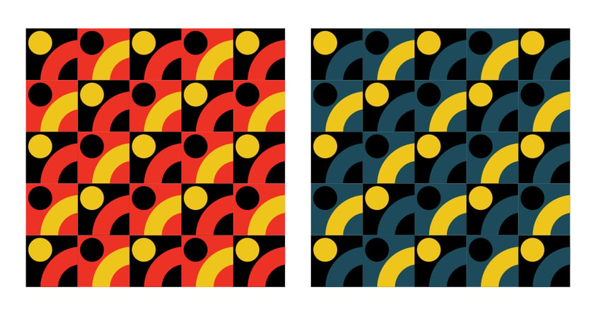
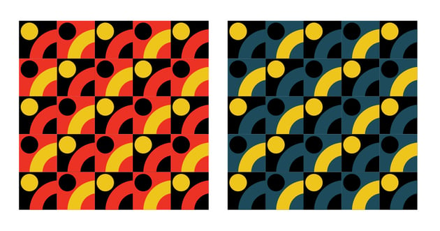
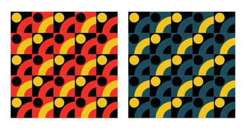
Perhaps the most important decision is choosing a color that interacts with as many other colors as possible. By maximising the area where the altered color interacts with other colors, we maximise its impact on the overall design.
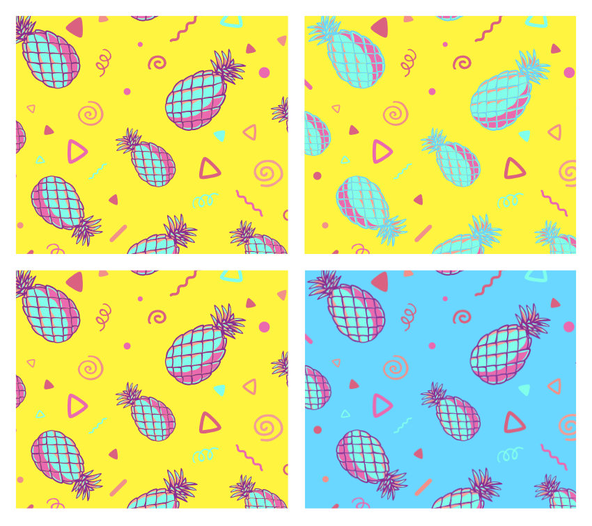
2.4 Reusing patterns with different color schemes
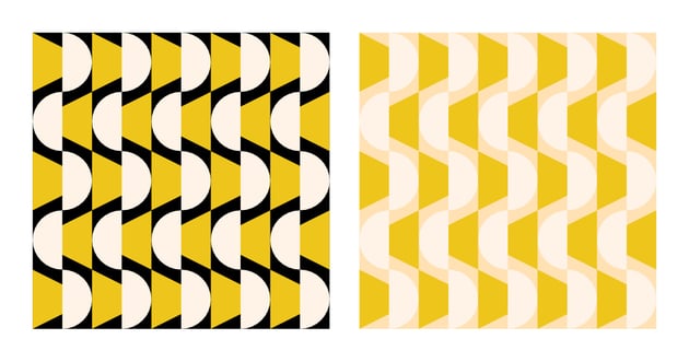
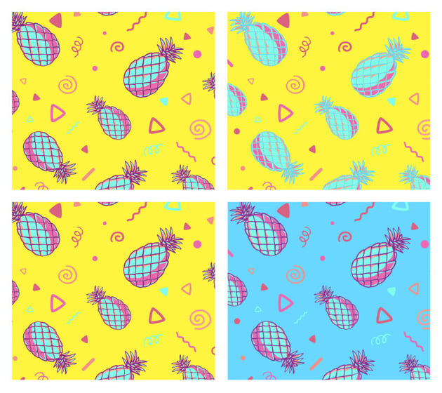
Clever use of the Bezold effect can extend the practical application of pattern assets. Simply changing one color in the design will change the overall look of the pattern, potentially making it look like an entirely new asset.
Now you know what the Bezold effect is!
The Bezold effect illustrates the profound complexity and interconnected nature of color effects. This phenomenon highlights the intricate relationship between our visual system and psychological processing and the ways in which seemingly small changes can have a disproportionate effect on designs. As we’ve seen, the Bezold effect incorporates various color effects such as after-image, successive contrast, and simultaneous contrast, all contributing to the overall perception of color in a dynamic and sometimes unpredictable manner.
For designers, the Bezold effect offers both opportunities and challenges. It can create depth and provide opportunities to refresh existing assets. At the same time, though, it can lead to undesirable shifts in branding libraries where color schemes are tightly integrated. Understanding and applying this effect can help you save time and avoid undesirable effects.
Thanks for reading! Check out some of the latest design trends of 2024!