In this age of content saturation on the web, one opportunity for online publishers to stand out is through their respective communities. The communities which surround and make use of websites are massively important, and how they interact with those websites, and each other, is equally important.
We’re used to seeing comment threads on websites; some show carefully curated and valuable discussion, others are unnavigable reams of spam and trolling. Some are cleverly presented, others less so. In this week’s roundup we’ll take a look at some inspirational examples.
Fighting the Trolls
Negativity and abuse can ruin a comments section, to the point that many high profile outlets (such as The Verge) have removed their comments altogether.
“What we’ve found lately is that the tone of our comments (and some of our commenters) is getting a little too aggressive and negative” – The Verge
In this case comments were eventually reinstated, and many others continue to fight the good fight.
The Financial Times take their comments sections seriously; recognising that without sensible discourse the value of their online newspaper would be vastly reduced. The first comment you see upon scrolling down to the bottom of an article is a highlighted editor’s pick:

Comments can then be viewed and sorted by the newest, oldest, or most recommended–something quite common to all the major news publisher websites.
The level of FT comment activity acts as a genuine benchmark too:
Comments are very valuable for FT as sign of subscriber committment – @rkapkap #ONALondon
— Lina Rozovskaya (@wy_yw) April 1, 2016
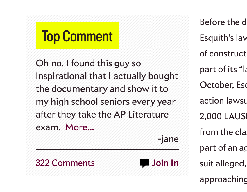
Slate go one step further and bring their top comments right up into the article content as a blockquote. This does two things:
- It validates genuine conversation, encouraging people to properly engage.
- It reminds people that there’s a comments section before they reach the bottom of the page:
Designer News use some blunt, but lighthearted copy to encourage good behaviour (whether it works or not is another matter):

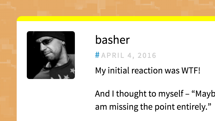
Positive encouragement is also the name of the game on CSS Tricks, where a decent comment will earn featured status, giving it a shiny yellow highlight:
Visibility
Comment sections can take up a huge amount of page real estate, so it’s often wise to hide those threads until they’re specifically requested. Sam Solomon hides his comments, but it’s clear they’re there if we need them:
24 Ways also hide their comments by default, though a quick click on an obvious like will toggle their visibility. What’s more significant is the language used to encourage proper use, taking us back to beating trolls:
“Comments are ordered by helpfulness, as indicated by you. Help us pick out the gems and discourage asshattery by voting on notable comments.” – 24 Ways
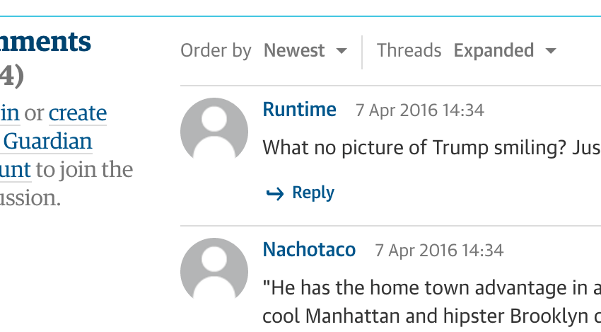
The Guardian don’t hide their readers’ comments, but do serve them up in a collapsed state by default. As well as a sorting option, you also have the option to expand the threads:
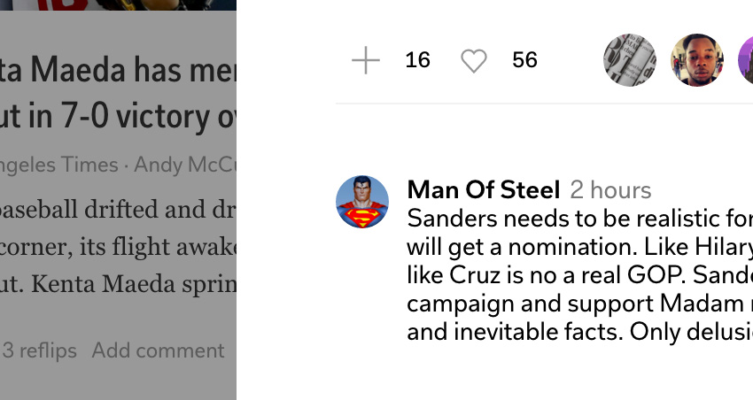
The Flipboard web interface allows users to comment on posts by sliding in a very complete dialogue from the side. Within this box you can like, share, upvote, report, suggest, comment, connect, collect, all that jazz.
Annotation
Chris Coyier recently noticed that the W3C are toying with annotation:
Looks like the W3C is interested in standardizing annotations on web content.https://t.co/VqcHzKFZLD pic.twitter.com/lqqzE5TQQo
— CSS-Tricks (@Real_CSS_Tricks) April 4, 2016
Annotation is a way of scribbling in the margins of the web; votes, feedback, and discussion, precisely targeted and contextual. In the proposal mentioned above, there’d be a standard for highlighting content and applying comments. Even commenting on existing comments–wow!
You may have already used annotation on some websites; let’s take a look at some.
Medium raised the bar with their online publishing platform. Among many innovative features are the annotations, allowing users to highlight, then subsequently comment upon, share, or recommend that section.
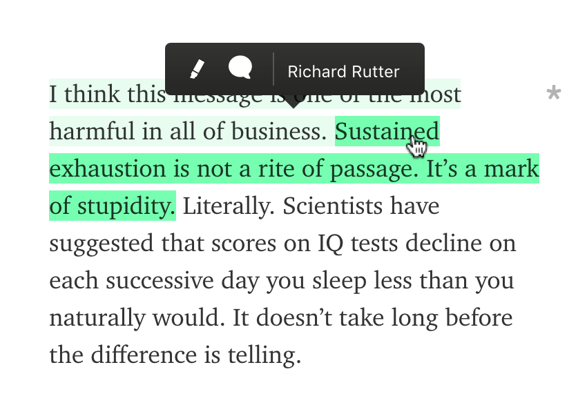
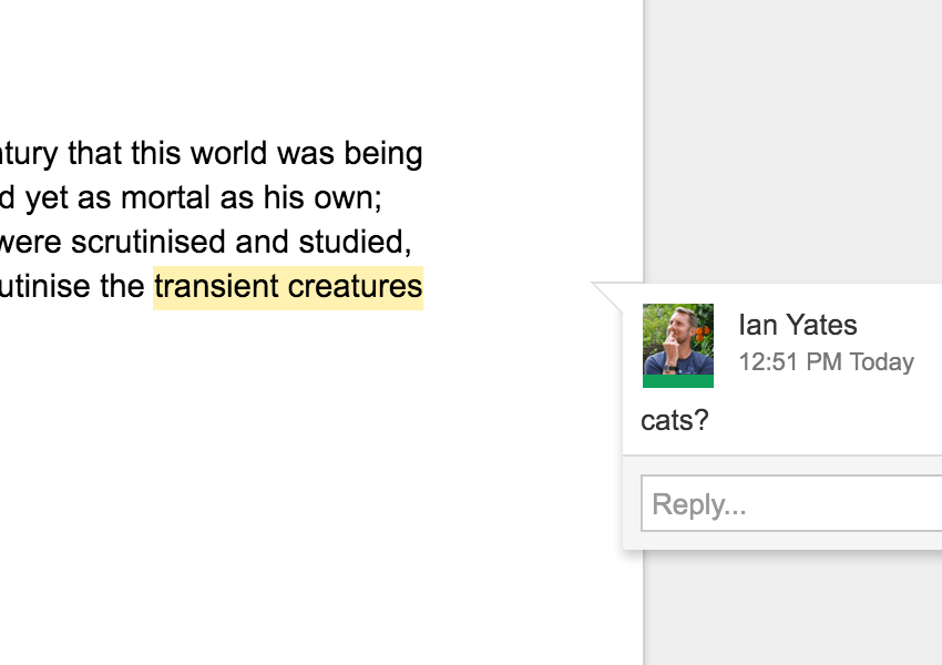
This form of annotation isn’t entirely new, but it’s more familiar to us within web apps like Google Docs:
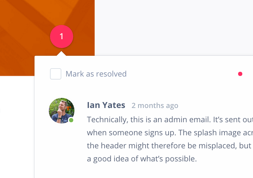
Similar team workflows are possible with Invision. Invision allows you to upload design files and place hotspots on a layer over the top. Each hotspot can host comments, discussion, voting, and sharing, until the initial commenter feels the point has been resolved.
Resources
Moving on, here are a couple of resources for adding your own comments and annotations to websites (how creatively you then implement them is down to you..)
- Disqus: “a global comment system that improves discussion on websites and connects conversations across the web” and what we use here on Envato Tuts+. There’s a WordPress plugin too, if you’re interested.
- Facebook comments: which open up your discussions to the vast plains of Facebook.
- Yoast Comment Hacks: odds are, if you’ve used WordPress before, you’ve also used one of Joost de Valk’s plugins. This one turbo charges the way you manage WordPress comments.
- Duoshuo: a Chinese equivalent to Disqus’ platform.
- Jetpack Comments: Jetpack equips your WordPress install with a ton of different optional features, one of which is this comments module. It replaces the native WordPress comments, adding extra bells and whistles such as social integration.
Envato Market
Envato Market has a ton of comment plugins, from standalone PHP scripts, to WordPress add-ons. Here are some of the top sellers!
Wrapping Up
Comments sections can be a double-edged sword for content publishers; they give communities a voice, but that voice can often ruin things for everyone. A bit of creative thinking can lead to more effective discussion. How do you approach things? Where else on the web have you seen good use of comments? Let us know in th– well, you know..