In this tutorial, you’ll learn how to make an element enter fullscreen mode in any browser using the JavaScript FullScreen API.
“The Fullscreen API adds methods to present a specific element and its descendants in fullscreen mode, and to exit fullscreen mode once it is no longer needed” – MDN
Fullscreen mode removes all other elements on screen (such as a browser navigation bar or a desktop dock) and fills available screen real estate with the selected element. A common example is when sharing a presentation or watching a video in fullscreen.
One advantage of fullscreen mode is that it allows the user to focus solely on the element being viewed without being distracted by other elements onscreen. The FullScreen API also makes use of the system default behaviour so we can take advantage of some inbuilt features without having to write more code, such as pressing the Esc key to close fullscreen.
1. Markup with HTML
For our markup, we’ll be using a video element and a button element for our fullscreen toggle.
Since we’re using a custom fullscreen button for our video element, we’ll need to turn off the default controls on the video element (not to worry, we can always get the controls back once the fullscreen mode is activated). We can do this by not including the controls attribute in our video tag.
This is what our markup looks like:
1 |
<main>
|
2 |
<video id="video" autoplay loop muted> |
3 |
<source id='mp4' src="video-src.mp4" type='video/mp4' /> |
4 |
</video>
|
5 |
|
6 |
<button
|
7 |
class="full-screen" |
8 |
title="Enter fullscreen mode" |
9 |
aria-label="Enter fullscreen mode" |
10 |
>
|
11 |
</button>
|
12 |
</main>
|
2. Styling with CSS
We’ll style the full-screen button to be placed in the middle of the video container.
1 |
main { |
2 |
position: relative; |
3 |
height: auto; |
4 |
}
|
5 |
|
6 |
video { |
7 |
min-height: 100vh; |
8 |
max-width: 100%; |
9 |
width: 100%; |
10 |
height: auto; |
11 |
padding: 0; |
12 |
}
|
13 |
|
14 |
.full-screen { |
15 |
transition: 150ms; |
16 |
position: absolute; |
17 |
top: 0; |
18 |
bottom: 0; |
19 |
right: 0; |
20 |
left: 0; |
21 |
margin: auto; |
22 |
height: fit-content; |
23 |
width: fit-content; |
24 |
background-color: rgba(255, 255, 255, 0.5); |
25 |
border-color: transparent; |
26 |
border-radius: 50%; |
27 |
padding: 16px; |
28 |
display: flex; |
29 |
justify-content: center; |
30 |
align-items: center; |
31 |
outline: none; |
32 |
cursor: pointer; |
33 |
}
|
34 |
|
35 |
.full-screen:hover { |
36 |
background-color: rgba(255, 255, 255, 1); |
37 |
}
|
We can also use the CSS media query hover to determine how the button should behave on hover devices (e.g. laptops) vs. touch devices (e.g. mobile phones). In this demo, we’ll set the button so it’s always visible on touch devices, and only visible when hovered over on hover devices.
1 |
@media (hover: hover) { |
2 |
.full-screen { |
3 |
opacity: 0; |
4 |
}
|
5 |
|
6 |
main:hover .full-screen { |
7 |
opacity: 1; |
8 |
}
|
9 |
}
|
3. FullScreen Functionality
Now we have our layout and styling done, we can get started on the functionality using JavaScript.
We’ll store the elements to be targeted as global variables.
1 |
const video = document.getElementById("video"); |
2 |
const fullscreenButton = document.querySelector(".full-screen"); |
Using an event listener, we’ll look out for when the fullscreen button has been clicked and make a call to the FullScreen API. This can be done using the .requestFullScreen() method directly on the element to be made fullscreen.
1 |
fullscreenButton.addEventListener("click", function () {
|
2 |
video.requestFullscreen(); |
3 |
}); |
FullScreen Support on iOS
For iOS devices, we require a different method so we’ll need to update our function to take that into account.
1 |
fullscreenButton.addEventListener("click", function () { |
2 |
if (video.webkitSupportsFullscreen) { |
3 |
video.webkitEnterFullscreen(); |
4 |
return; |
5 |
}
|
6 |
|
7 |
video.requestFullscreen(); |
8 |
});
|
The requestFullScreen method only applies to the element it’s called on and its descendants. In this demo, the fullscreen button is not a descendant of the video element so once the fullscreen mode is applied to the video, the fullscreen button will no longer be visible.
Since we’ll no longer have access to the toggle button when the video is in fullscreen mode, we’ll need another method of ensuring the user can exit the full screen view. Luckily, the HTML5 video default controls include a fullscreen toggle so we can use this to our benefit by showing the video controls once fullscreen mode is active. We’ll see how to do that in the next section.
FullScreen Event Listener
There’s a specific event listener for detecting when the browser enters or leaves fullscreen mode. We can detect the fullscreen mode toggle with the fullscreenchange event listener and also detect if the browser is currently in fullscreen mode with the fullscreenElement property. The property returns the exact element currently in fullscreen view or returns null if no element is found.
Using these two properties, we can make changes to our elements based on if they’re in fullscreen mode or not.
In this demo, we’ll be adding the default controls to the video once it’s in fullscreen mode and removing them when it’s no longer in fullscreen mode using the setAttribute and removeAttribute methods.
1 |
document.addEventListener("fullscreenchange", function () { |
2 |
if (document.fullscreenElement) { |
3 |
video.setAttribute("controls", true); |
4 |
return; |
5 |
}
|
6 |
|
7 |
video.removeAttribute("controls"); |
8 |
});
|
Styling FullScreen Elements
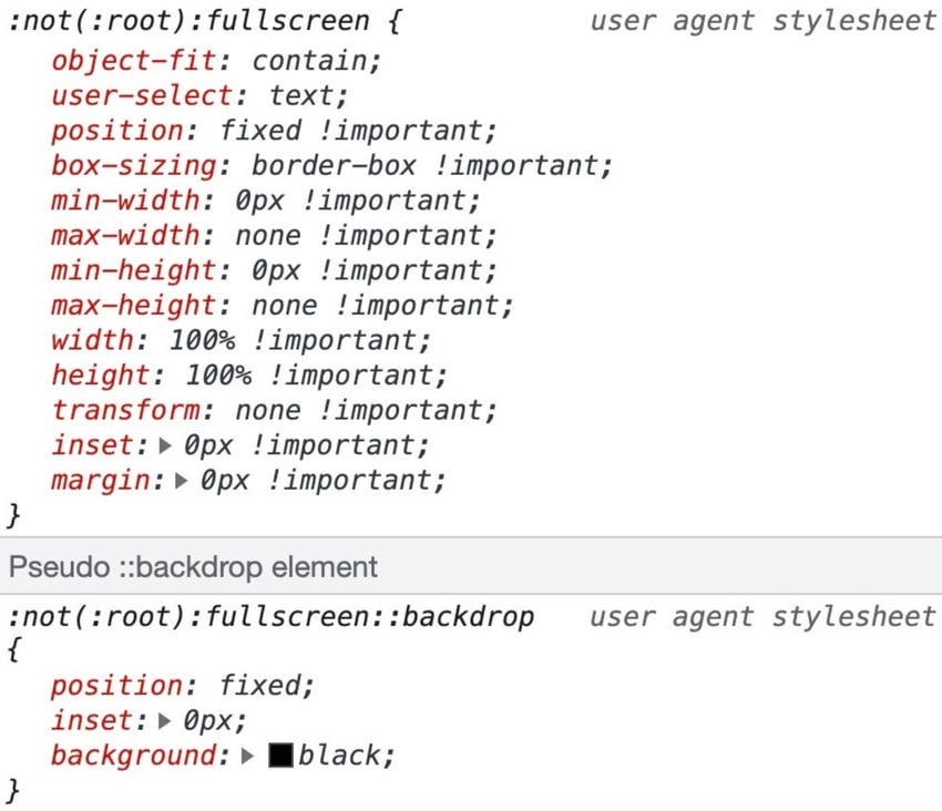
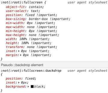
There are also CSS selectors for styling elements when in fullscreen mode. The :fullscreen selector can be used to style elements when fullscreen mode is active and the ::backdrop pseudo-selector can be used to style the background of the fullscreen mode.
These selectors are used by the browser to apply default styling to the fullscreen mode.

5. Using FullScreenAPI on Non-Video Elements
At the start of this tutorial, I mentioned that the FullScreen API is only fully supported on video elements for iOS devices. Now we’ll take a look at a non-cross-browser compliant method of using the FullScreen API on other elements.
In this demo, we’ll be calling the FullScreen API on a carousel we previously created in another tutorial.
Here’s the new demo (larger version on CodePen). Remember, this implementation won’t work on an iPhone.
We’ll be using the layout from the carousel tutorial and adding a fullscreen button. We’ll also be using SVG icons to toggle the button display depending on if fullscreen mode is active or not.
This is what our markup looks like:
1 |
<section class="slider-wrapper" id="wrapper"> |
2 |
|
3 |
<button class="full-screen" title="Enter full screen mode"> |
4 |
<svg class="full-screen--open"></svg> |
5 |
|
6 |
<svg class="full-screen--close"></svg> |
7 |
</button>
|
8 |
|
9 |
<ul class="slides-container" id="slides-container"> |
10 |
</ul>
|
11 |
</section>
|
One difference with this implementation is that the fullscreen button is a descendant of the element we’ll be making fullscreen so we’ll still have access to it in fullscreen mode. Because of that, we can use the same button to exit fullscreen mode as well.
Get Elements
First we’ll get the elements we’re targeting with JavaScript:
1 |
const wrapper = document.getElementById("wrapper");
|
2 |
const fullscreenButton = document.querySelector(".full-screen");
|
Since we’re using a toggle button, we don’t need to detect the fullscreen change event as we can check both instances within our click event listener.
1 |
fullscreenButton.addEventListener("click", function () { |
2 |
if (document.fullscreenElement) { |
3 |
document.exitFullscreen() |
4 |
} else { |
5 |
if (wrapper.webkitSupportsFullscreen) { |
6 |
wrapper.webkitEnterFullscreen() |
7 |
} else { |
8 |
wrapper.requestFullscreen() |
9 |
}
|
10 |
}
|
11 |
});
|
Toggle Icon Display
The requestFullScreen() and exitFullScreen() methods return promises so it’s possible to chain another function to be carried out once the methods have run using the .then() method.
We can use this method to toggle the icon display in the fullscreen button by adding and removing a class is-active.
This is what our updated function looks like:
1 |
fullscreenButton.addEventListener("click", () => { |
2 |
if (document.fullscreenElement) { |
3 |
document
|
4 |
.exitFullscreen() |
5 |
.then(() => fullscreenButton.classList.remove("is-active")); |
6 |
} else { |
7 |
if (wrapper.webkitSupportsFullscreen) { |
8 |
wrapper
|
9 |
.webkitEnterFullscreen() |
10 |
.then(() => fullscreenButton.classList.add("is-active")); |
11 |
} else { |
12 |
wrapper
|
13 |
.requestFullscreen() |
14 |
.then(() => fullscreenButton.classList.add("is-active")); |
15 |
}
|
16 |
}
|
17 |
});
|
Then we can update our CSS to display the icon we want, based on the class name:
1 |
.full-screen:not(.is-active) .full-screen--close { |
2 |
display: none; |
3 |
}
|
4 |
|
5 |
.full-screen.is-active .full-screen--open { |
6 |
display: none; |
7 |
}
|
It’s also possible to achieve the same effect using the :fullscreen selector without having to toggle the classnames with JavaScript.
Using the :fullscreen selector, our CSS looks like this:
1 |
.full-screen--close { |
2 |
display: none |
3 |
}
|
4 |
|
5 |
:fullscreen .full-screen--open { |
6 |
display: none; |
7 |
}
|
8 |
|
9 |
:fullscreen .full-screen--close { |
10 |
display: block; |
11 |
}
|
Conclusion
And that’s all, folks! In this tutorial you’ve learned how to implement the JavaScript Fullscreen API, including a couple of use cases and caveats.