Forms are critical to any modern front-end application, and they’re a feature that we use every day, even if don’t realize it. Forms are required for securely logging in a user to the app, searching for all the available hotels in a particular city, booking a cab, building a to-do list, and doing tons of other things that we are used to. Some forms have just a couple of input fields, whereas other forms could have an array of fields that stretch to a couple of pages or tabs.
In this tutorial, we will be talking about different strategies available for developing forms in Angular. Irrespective of the strategy that you choose, here are the things that a form library should cover:
- Support two-way binding so that the input control values are in sync with the component state.
- Keep track of the form state and use visual cues to let the user know whether the current state is valid or not. For instance, if the username has invalid characters, a red border should appear around the input field for the username.
- Have a mechanism to display validation errors properly.
- Enable or disable certain parts of the form unless some validation criteria are met.
Introduction to Forms in Angular
Angular, being a full-fledged front-end framework, has its own set of libraries for building complex forms. The latest version of Angular has two powerful form-building strategies. They are:
- template-driven forms
- model-driven or reactive forms
Both technologies belong to the @angular/forms library and are based on the same form control classes. However, they differ remarkably in their philosophy, programming style, and technique. Choosing one over the other depends on your personal taste and also on the complexity of the form that you are trying to create. In my opinion, you should try both approaches first and then choose one that fits your style and the project at hand.
The first part of the tutorial will cover template-driven forms with a practical example: building a signup form with validation for all form fields. In the second part of this tutorial, we will retrace the steps to create the same form using a model-driven approach instead.
Template-Driven Forms
The template-driven approach is a strategy that was borrowed from the AngularJS era. In my opinion, it is the most straightforward method for building forms. How does it work? We will be using some Angular directives.
Directives allow you to attach behavior to elements in the DOM.— Angular Documentation
Angular provides form-specific directives that you can use to bind the form input data and the model. The form-specific directives add extra functionality and behavior to a plain HTML form. The end result is that the template takes care of binding values with the model and form validation.
In this tutorial, we will be using template-driven forms to create the signup page of an application. The form will cover the most common form elements and different validation checks on these form elements. Here are the steps that you will follow in this tutorial.
- Add
FormsModuletoapp.module.ts. - Create a class for the
Usermodel. - Create initial components and layout for the signup form.
- Use Angular form directives like
ngModel,ngModelGroup, andngForm. - Add validation using built-in validators.
- Display validation errors meaningfully.
- Handle form submission using
ngSubmit.
Let’s get started.
Prerequisites
The code for this project is available on my GitHub repo. Download the zip or clone the repo to see it in action. If you prefer to start from scratch instead, make sure that you have Angular CLI installed. Use the ng command to generate a new project.
1 |
$ ng new SignupFormProject
|
Next, generate a new component for the SignupForm.
1 |
ng generate component SignupForm |
Replace the contents of app.component.html with this:
1 |
<app-signup-form> </app-signup-form> |
Here is the directory structure for the src/ directory. I’ve removed some non-essential files to keep things simple.
1 |
. |
2 |
├── app |
3 |
│ ├── app.component.css |
4 |
│ ├── app.component.html |
5 |
│ ├── app.component.ts |
6 |
│ ├── app.module.ts |
7 |
│ ├── signup-form |
8 |
│ │ ├── signup-form.component.css |
9 |
│ │ ├── signup-form.component.html |
10 |
│ │ └── signup-form.component.ts |
11 |
│ └── User.ts |
12 |
├── index.html |
13 |
├── main.ts |
14 |
├── polyfills.ts |
15 |
├── styles.css |
16 |
├── tsconfig.app.json |
17 |
└── typings.d.ts |
As you can see, a directory for the SignupForm component has been created automatically. That’s where most of our code will go. I’ve also created a new User.ts for storing our User model.
The HTML Template
Before we dive into the actual component template, we need to have an abstract idea of what we are building. So here is the form structure that I have in my mind. The signup form will have several input fields, a select element, and a checkbox element.
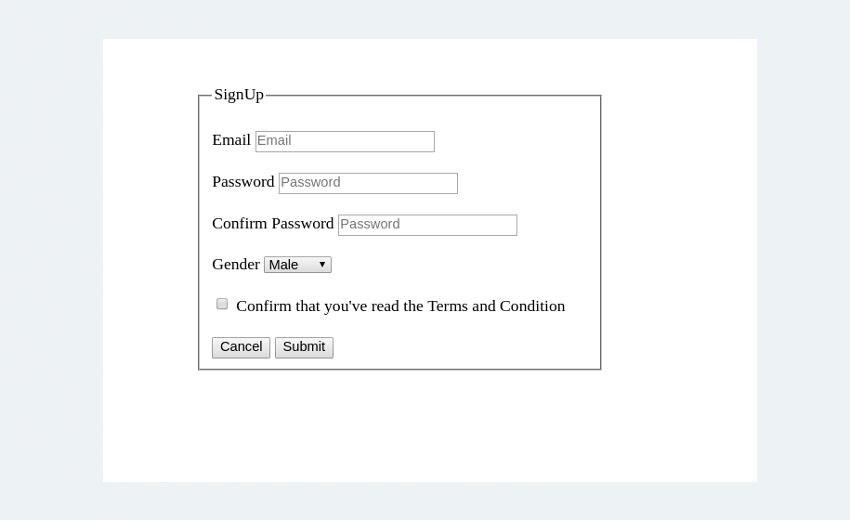
Here is the HTML template that we will be using for our registration page.
HTML Template
1 |
<div class="row custom-row"> |
2 |
<div class= "col-sm-5 custom-container jumbotron"> |
3 |
|
4 |
<form class="form-horizontal"> |
5 |
<fieldset>
|
6 |
<legend>SignUp</legend> |
7 |
|
8 |
<!--- Email Block --->
|
9 |
<div class="form-group"> |
10 |
<label for="inputEmail">Email</label> |
11 |
<input type="text" |
12 |
id="inputEmail" |
13 |
placeholder="Email"> |
14 |
</div>
|
15 |
<!--- Password Block --->
|
16 |
<div class="form-group"> |
17 |
<label for="inputPassword">Password</label> |
18 |
<input type="password" |
19 |
id="inputPassword" |
20 |
placeholder="Password"> |
21 |
</div>
|
22 |
|
23 |
<div class="form-group"> |
24 |
<label for="confirmPassword" >Confirm Password</label> |
25 |
<input type="password" |
26 |
id="confirmPassword" |
27 |
placeholder="Password"> |
28 |
</div>
|
29 |
|
30 |
<!--- Select gender Block --->
|
31 |
<div class="form-group"> |
32 |
<label for="select">Gender</label> |
33 |
<select id="select"> |
34 |
<option>Male</option> |
35 |
<option>Female</option> |
36 |
<option>Other</option> |
37 |
</select>
|
38 |
</div>
|
39 |
|
40 |
<!--- Terms and conditions Block --->
|
41 |
<div class="form-group checkbox"> |
42 |
<label>
|
43 |
<input type="checkbox"> Confirm that you've read the Terms and |
44 |
Conditions |
45 |
</label>
|
46 |
</div>
|
47 |
|
48 |
<!--- Buttons Block --->
|
49 |
<div class="form-group"> |
50 |
<button type="reset" class="btn btn-default">Cancel</button> |
51 |
<button type="submit" class="btn btn-primary">Submit</button> |
52 |
</div>
|
53 |
</fieldset>
|
54 |
</form>
|
55 |
</div>
|
56 |
</div>
|
The CSS classes used in the HTML template are part of the Bootstrap library used for making things pretty. Since this is a not a design tutorial, I won’t be talking much about the CSS aspects of the form unless necessary.
Basic Form Setup
To use the template-driven form directives, we need to import the FormsModule from @angular/forms and add it to the import array in app.module.ts.
app/app.module.ts
1 |
import { FormsModule } from '@angular/forms'; |
2 |
@NgModule({ |
3 |
.
|
4 |
.
|
5 |
imports: [ |
6 |
BrowserModule, |
7 |
FormsModule
|
8 |
],
|
9 |
.
|
10 |
.
|
11 |
})
|
12 |
export class AppModule { } |
Next, create a class that will hold all properties of the User entity. We can either use an interface and implement it in the component or use a TypeScript class for the model.
app/User.ts
1 |
export class User { |
2 |
constructor( |
3 |
public id: number, |
4 |
public email: string, |
5 |
public pwd: string, |
6 |
public confirmPwd: string, |
7 |
public gender: string, |
8 |
public terms: boolean |
9 |
) { } |
10 |
|
11 |
}
|
Now, create an instance of the class in the SignupForm component.
app/signup-form/signup-form.component.ts
1 |
import { Component } from '@angular/core'; |
2 |
import { User } from '../user'; |
3 |
|
4 |
@Component({ |
5 |
selector: 'app-signup-form', |
6 |
templateUrl: './signup-form.component.html', |
7 |
styleUrls: ['./signup-form.component.scss'] |
8 |
})
|
9 |
export class SignupFormComponent { |
10 |
gender = ['Male','Female','Other'] |
11 |
|
12 |
user = new User(1,'[email protected]','secret', 'secret', this.gender[1], true); |
13 |
|
14 |
}
|
For the signup-form.component.html file, I am going to use the same HTML template discussed above, but with minor changes. The signup form has a select field with a list of options. Although that works, we will do it the Angular way by looping through the list using the ngFor directive.
app/signup-form/signup-form.component.html
1 |
<div class="row custom-row"> |
2 |
<div class= "col-sm-5 custom-container jumbotron"> |
3 |
|
4 |
<form class="form-horizontal"> |
5 |
<fieldset>
|
6 |
<legend>SignUp</legend> |
7 |
. |
8 |
. |
9 |
<!--- Gender Block -->
|
10 |
<div class="form-group"> |
11 |
<label for="select">Gender</label> |
12 |
<select id="select"> |
13 |
|
14 |
<option *ngFor = "let g of gender" |
15 |
[value] = "g"> {{g}} |
16 |
</option>
|
17 |
</select>
|
18 |
</div>
|
19 |
. |
20 |
. |
21 |
</fieldset>
|
22 |
</form>
|
23 |
</div>
|
24 |
</div>
|
Next, we want to bind the form data to the user class object so that when you enter the signup data into the form, a new User object is created that temporarily stores that data. This way, you can keep the view in sync with the model, and this is called binding.
There are a couple of ways to make this happen. Let me first introduce you to ngModel and ngForm.
ngForm and ngModel
ngForm and ngModel are Angular directives that are essential to creating template-driven forms. Let’s start with ngForm first. Here is an excerpt about ngForm from the Angular docs.
ngFormcreates a top-levelFormGroupinstance and binds it to a<form>element to track aggregated form value and validation status. As soon as you importFormsModule, this directive becomes active by default on all<form>tags. You don’t need to add a special selector.
First, update the form with the ngForm directive:
app/signup-form/signup-form.component.html
1 |
<form
|
2 |
class="form-horizontal" |
3 |
#signupForm = "ngForm"> |
4 |
. |
5 |
. |
6 |
</form>
|
#signupForm is a template reference variable that refers to the ngForm directive which governs the entire form. The example below demonstrates the use of a ngForm reference object for validation.
app/signup-form/signup-form.component.html
1 |
<button
|
2 |
type="submit" |
3 |
class="btn btn-success" |
4 |
[disabled]="!signupForm.form.valid"> |
5 |
Submit |
6 |
</button>
|
Here, signupForm.form.valid will return false unless all the form elements pass their respective validation checks. The submit button will be disabled until the form is valid.
As for binding the template and the model, there are plenty of ways to do this, and ngModel has three different syntaxes to tackle this situation. They are:
[(ngModel)][ngModel]ngModel
Let’s start with the first one.
Two-Way Binding Using [(ngModel)]
[(ngModel)] performs two-way binding for reading and writing input control values. If a [(ngModel)] directive is used, the input field takes an initial value from the bound component class and updates it back whenever any change to the input control value is detected (on keystroke and button press). The image below describes the two-way binding process better.
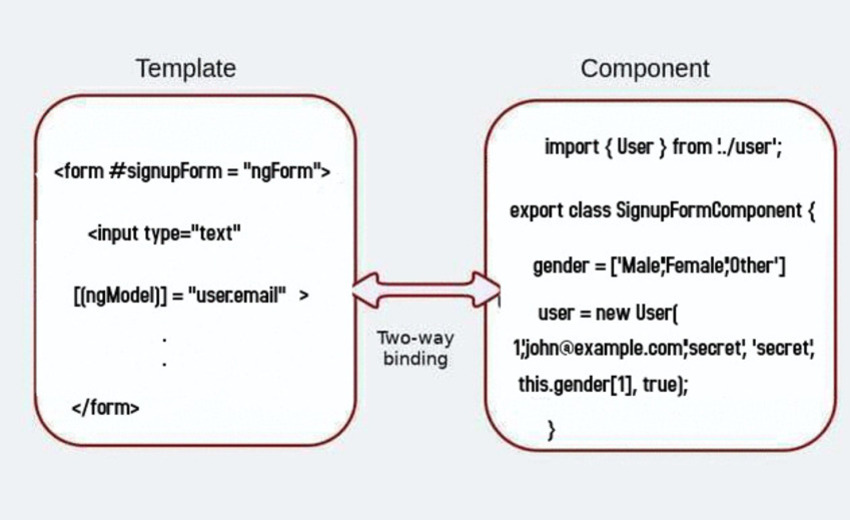
Here is the code for the email input field:
1 |
<div class="form-group"> |
2 |
<label for="inputEmail">Email</label> |
3 |
<input type="text" |
4 |
[(ngModel)] = "user.email" |
5 |
id="inputEmail" |
6 |
name="email" |
7 |
placeholder="Email"> |
8 |
</div>
|
[(ngModel)] = "user.email" binds the user’s email property to the input value. I’ve also added a name attribute and set name="email". This is important, and you will get an error if you’ve not declared a name attribute while using ngModel.
Similarly, add a [(ngModel)] and a unique name attribute to each form element. Your form should look something like this now:
app/signup-form/signup-form.component.html
1 |
. |
2 |
. |
3 |
. |
4 |
<div ngModelGroup="password"> |
5 |
<div class="form-group" > |
6 |
<label for="inputPassword">Password</label> |
7 |
<input type="password" |
8 |
[(ngModel)] = "user.pwd" name="pwd" |
9 |
placeholder="Password"> |
10 |
</div>
|
11 |
<div class="form-group"> |
12 |
<label for="confirmPassword" >Confirm Password</label> |
13 |
<input type="password" |
14 |
[(ngModel)] = "user.confirmPwd" name="confirmPwd" |
15 |
placeholder="Confirm Password"> |
16 |
</div>
|
17 |
</div>
|
18 |
<div class="form-group"> |
19 |
<label for="select">Gender</label> |
20 |
<select id="select" |
21 |
[(ngModel)] = "user.gender" name = "gender"> |
22 |
|
23 |
<option *ngFor = "let g of gender" |
24 |
[value] = "g"> {{g}} |
25 |
</option>
|
26 |
</select>
|
27 |
</div>
|
28 |
|
29 |
. |
30 |
. |
31 |
. |
The ngModelGroup is used to group together similar form fields so that we can run validations only on those form fields. Since both password fields are related, we will put them under a single ngModelGroup. If everything is working as expected, the component-bound user property should be in charge of storing all the form control values. To see this in action, add the following after the form tag:
Pipe the user property through the JsonPipe to render the model as JSON in the browser. This is helpful for debugging and logging. You should see a JSON output like this.

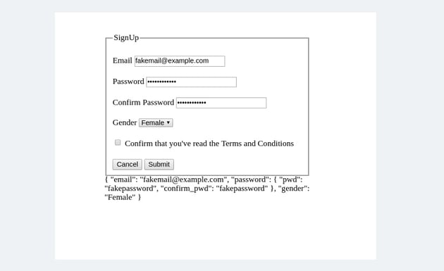
The values are flowing in from the view to the model. What about the other way around? Try initializing the user object with some values.
app/signup-form/signup-form.component.ts
1 |
newUser() { |
2 |
this.user = new User(2, '[email protected]', '','','Male',false); |
3 |
}
|
And they automatically appear in the view:
1 |
{ "email": "[email protected]",
|
2 |
"pwd": "", "confirm_pwd": "", |
3 |
"gender": "Male" |
4 |
} |
The two-way binding [(ngModel)] syntax helps you build forms effortlessly. However, it has certain drawbacks; hence, there is an alternate approach that uses ngModel or [ngModel].
Adding ngModel to the Mix
When ngModel is used, we are in fact responsible for updating the component property with the input control values and vice versa. The input data doesn’t automatically flow into the component’s user property.
So replace all instances of [(ngModel)] = " " with ngModel. We will keep the name attribute because all three versions of ngModel need the name attribute to work.
app/signup-form/signup-form.component.html
1 |
<div class="form-group"> |
2 |
<label for="inputEmail">Email</label> |
3 |
<input type="text" |
4 |
ngModel
|
5 |
id="inputEmail" |
6 |
name="email" |
7 |
placeholder="Email"> |
8 |
</div>
|
With ngModel, the value of the name attribute will become a key of the ngForm reference object signupForm that we created earlier. So, for example, signupForm.value.email will store the control value for the email id.
Replace {{user | json}} with {{signupForm.value | json }} because that’s where all the state is stored right now.
One-Way Binding Using [ngModel]
What if you need to set the initial state from the bound class component? That’s what the [ngModel] does for you.
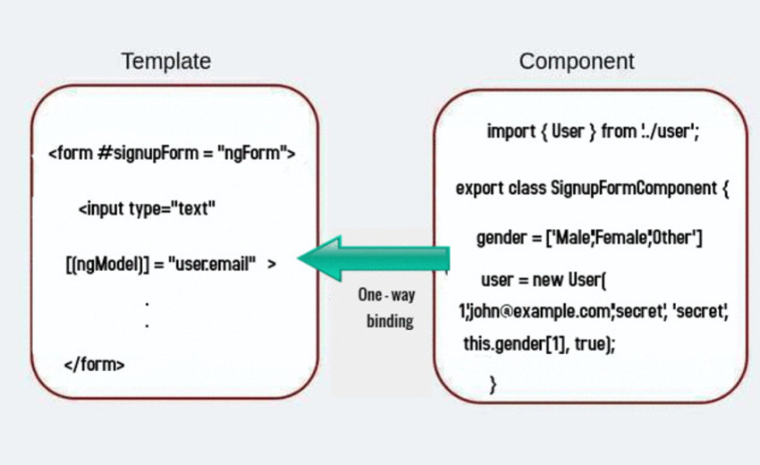
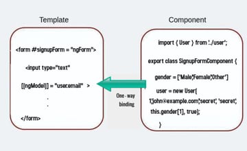
Here, the data flows from the model to the view. Make the following changes to the syntax to use one-way binding:
app/signup-form/signup-form.component.html
1 |
<div class="form-group"> |
2 |
<label for="inputEmail">Email</label> |
3 |
<input type="text" |
4 |
[ngModel] = "user.email" |
5 |
id="inputEmail" |
6 |
name="email" |
7 |
placeholder="Email"> |
8 |
</div>
|
So which approach should you choose? If you’re using [(ngModel)] and ngForm together, you will eventually have two states to maintain—user and signupForm.value—and that could be potentially confusing.
1 |
{ "email": "[email protected]",
|
2 |
"pwd": "thisispassword", "confirm_pwd": "thisispassword", |
3 |
"gender": "Male" |
4 |
} //user.value |
5 |
{ "email": "[email protected]",
|
6 |
"pwd": "thisispassword", "confirm_pwd": "thisispassword", |
7 |
"gender": "Male" |
8 |
} //signupForm.value |
Hence, I will recommend using the one-way binding method instead. But that’s something for you to decide.
Validation and Displaying Error Messages
Here are our requirements for the validation.
- All form controls are required.
- Disable the submit button until all input fields are filled.
- The email field should strictly contain an email id.
- The password field should have a minimum length of 8.
- Both the password and confirmation should match.
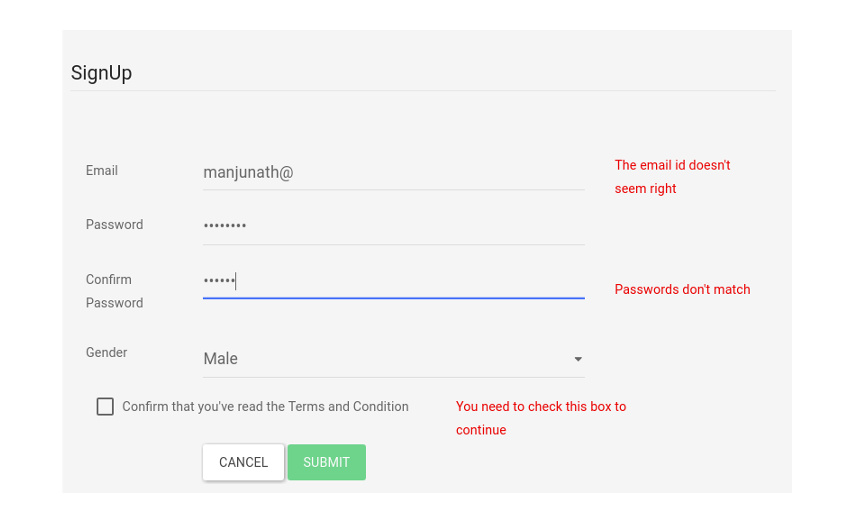

The first one is easy. You have to add a required validation attribute to each form element like this:
app/signup-form/signup-form.component.html
1 |
<input type="text" |
2 |
[ngModel] = "user.email" name="email" |
3 |
#email = "ngModel" |
4 |
placeholder="Email" |
5 |
required> |
Apart from the required attribute, I’ve also exported a new #email template reference variable. This is so that you can access the input box’s Angular control from within the template itself. We will use it to display errors and warnings. Now use the button’s disabled property to disable the button:
app/signup-form/signup-form.component.html
1 |
<button
|
2 |
type="submit" |
3 |
class="btn btn-success" |
4 |
[disabled]="!signupForm.form.valid"> |
5 |
Submit |
6 |
</button>
|
To add a constraint on email, use the pattern attribute that works with input fields. Patterns are used to specify regular expressions like the one below:
1 |
pattern="[a-z0-9._%+-]+@[a-z0-9.-]+.[a-z]{2,3}$"
|
For the password field, all you have to do is add a minlength=" " attribute:
app/signup-form/signup-form.component.html
1 |
<input type="password" |
2 |
ngModel
|
3 |
id="inputPassword" |
4 |
name="pwd" |
5 |
#pwd = "ngModel" |
6 |
placeholder="Password" |
7 |
minlength="8" |
8 |
required> |
To display the errors, I am going to use the conditional directive ngIf on a div element. Let’s start with the input control field for email:
app/signup-form/signup-form.component.html
1 |
<div class="form-group"> |
2 |
<label for="inputEmail">Email</label> |
3 |
<input type="text" |
4 |
[ngModel] = "user.email" name="email" |
5 |
#email = "ngModel" id="inputEmail" |
6 |
placeholder="Email" |
7 |
pattern="[a-z0-9._%+-]+@[a-z0-9.-]+.[a-z]{2,3}$" |
8 |
required> |
9 |
</div>
|
10 |
<!-- This is the error section -->
|
11 |
<div *ngIf="email.invalid && (email.dirty || email.touched)" |
12 |
class="alert alert-danger"> |
13 |
<div *ngIf = "email.errors?.required"> |
14 |
Email field can't be blank |
15 |
</div>
|
16 |
<div *ngIf = "email.errors?.pattern && email.touched"> |
17 |
The email id doesn't seem right |
18 |
</div>
|
19 |
</div>
|
There is a lot going on here. Let’s start with the first line of the error section.
1 |
<div *ngIf="email.invalid && (email.dirty || email.touched)" |
2 |
class="alert alert-danger" |
Remember the #email variable that we exported earlier? It carries some amount of information about the input control state of the email field. This includes email.valid, email.invalid, email.dirty, email.pristine, email.touched, email.untouched, and email.errors. The image below describes each of those properties in detail.
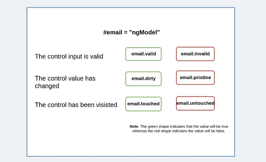
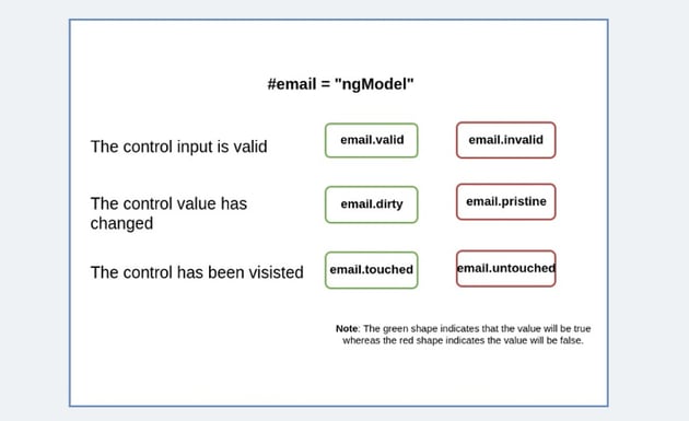
So the div element with the *ngIf will be rendered only if the email is invalid. However, the user will be greeted with errors about the input fields being blank even before they have a chance to edit the form.
To avoid this scenario, we’ve added the second condition. The error will be displayed only after the control has been visited or the control’s value has been changed.
The nested div elements are used to cover all the cases of validation errors. We use email.errors to check all possible validation errors and then display them back to the user in the form of custom messages. Now, follow the same procedure for the other form elements. Here is how I’ve coded the validation for the passwords.
app/signup-form/signup-form.component.html
1 |
<div ngModelGroup="password" #userPassword="ngModelGroup" required > |
2 |
<div class="form-group"> |
3 |
<label for="inputPassword">Password</label> |
4 |
<input type="password" |
5 |
ngModel name="pwd" |
6 |
id="inputPassword" placeholder="Password" |
7 |
minlength ="8" required> |
8 |
</div>
|
9 |
<div class="form-group"> |
10 |
<label for="confirmPassword" >Confirm Password</label> |
11 |
<input type="password" |
12 |
ngModel name="confirmPwd" |
13 |
id="confirmPassword" placeholder="Confirm Password"> |
14 |
</div>
|
15 |
|
16 |
|
17 |
<div *ngIf="(userPassword.invalid|| userPassword.value?.pwd != userPassword.value?.confirmPwd) && (userPassword.touched)" |
18 |
class="alert alert-danger"> |
19 |
|
20 |
<div *ngIf = "userPassword.invalid; else nomatch"> |
21 |
Password needs to be more than 8 characters |
22 |
</div>
|
23 |
<ng-template #nomatch > |
24 |
Passwords don't match |
25 |
</ng-template>
|
26 |
</div>
|
27 |
</div>
|
This is starting to look a bit messy. Angular has a limited set of validator attributes: required, minlength, maxlength, and pattern. To cover any other scenario like that of password comparison, you will have to rely on nested ngIf conditionals as I did above. Or ideally, create a custom validator function, which I will cover in the third part of this series.
In the code above, I’ve used the ngIf else syntax which was introduced in the latest version of Angular. Here is how it works:
1 |
<div *ngIf="isValid;else notvalid"> |
2 |
Valid content... |
3 |
</div>
|
4 |
<ng-template #notValid>Not valid content...</ng-template> |
Submit the Form Using ngSubmit
We have nearly finished the form. Now we need to be able to submit the form, and the control of the form data should be handed over to a component method, say onSubmit.
app/signup-form/signup-form.component.html
1 |
<form class="form-horizontal" novalidate |
2 |
onFormSubmit(signupForm) |
3 |
(ngSubmit)= "onSubmit(signupForm)" |
4 |
#signupForm="ngForm"> |
Now, for the component:
app/signup-form/signup-form.component.ts
1 |
onSubmit({value, valid}: NgForm) { |
2 |
console.log( this.user.email); |
3 |
console.log("valid: " + valid); |
4 |
}
|
Final Demo
I’ve put the final version of the application in a GitHub repo. You can download or clone it to try it out for yourself. I’ve added a few bootstrap classes to make the form pretty.
Summary
We’re all done here. In this tutorial, we covered everything that you need to know about creating a form in Angular using the template-driven approach. Template-driven forms are popular for their simplicity and ease of use.
However, if you need to build a form with lots of form elements, this approach will become messy. So, in the next tutorial, we will cover the model-driven way of building the same form.
This post has been updated with contributions from Esther Vaati. Esther is a software developer and writer for Envato Tuts+.