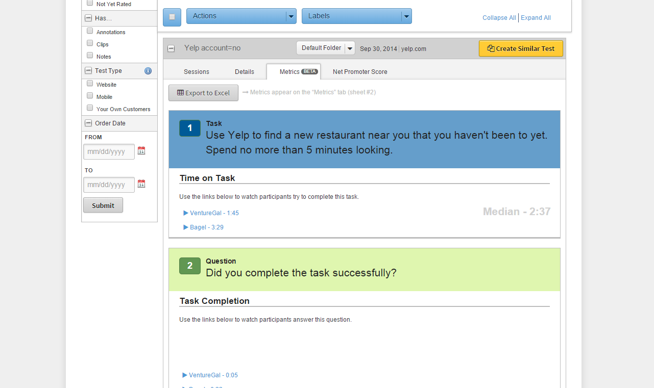
To see how users behave in a natural environment, it helps to use remote usability software to record the screens and the voices of test participants. This lets you hear them thinking out loud and see every click.
While focus groups and field studies help you understand user opinions and natural product use, remote recorded tests let you see reactions and hear the thoughts of users as they focus on specific tasks. To demonstrate how to run quick usability tests as part of a design process, we ran a few unmoderated tests and redesigned the Yelp website accordingly.
Regardless of the method you choose, just remember that user research is not about writing reports — it’s about asking and answering the right questions and gathering data so that you can make evidence-based decisions in your designs.
Choosing User Demographics
As described in The Guide to Usability Testing, in order to set up your user tests, one of your first steps is determining who the target audience should be for the purpose of the study.

Image Source: The Role of UX Research.
From the perspective of a company with a very large user base (138 million unique monthly visitors, according to Yelp’s Q2 2014 numbers), it is very important for the redesigned website to still be usable by the average current user. Yelp certainly would not want to alienate its existing readers in favor of an improved onboarding experience for first-time users.
So, for this study, we were primarily interested in observing current, semi-frequent Yelp users, rather than brand new users. We also chose not to focus on power users (those who use Yelp every day), because their experience would not be representative of the middle-of-the-road, occasional user.

We chose not to focus on age, gender, income level, or experience using the web since Yelp users come from all backgrounds. Since this study was purely for
qualitative analysis, we did not need statistical significance to validate our findings. We followed industry best practices and ran our study with a total of 5 users (according to Nielsen Norman Group, a sample of 5 users will uncover 85% of a site’s problems).
One of the tasks in our test required users to log in to an account. Since our test participants were not new users, however, we were not interested in testing account creation. We were slightly concerned that users who had an account would be more likely to be power users, so we decided to test with two segments: one with Yelp accounts (3 users), and one without (2 users). For the segment with Yelp accounts, we only selected participants who had been Yelp users for less than 6 months to further eliminate the likelihood that they would be power users.
Lastly, for simplicity’s sake in our design sprint, we only tested Yelp’s website on desktop, not on mobile. If this had been more than an exercise in design, we would have tested the experience on smartphone and tablet as well to make sure we addressed any problems that users encountered on mobile devices.
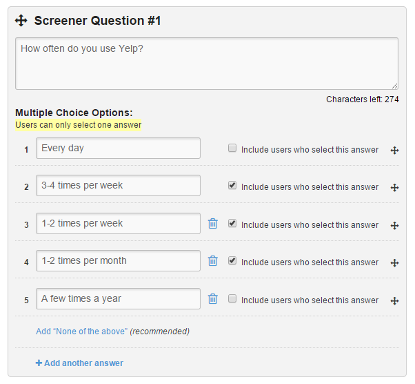
As shown in the free e-book User Testing & Design, Here are the exact demographic requirements and screener questions that we used:
Test Details: Group 1 (Yelp account holders)
- User requirements: 3 users
- Any age, any income level
- Any gender
- Any web experience
- Device: desktop computer
- Located in U.S.
- How often do you use Yelp?
- Every day
- 3-4x a week
- 1-2x a week
- 1-2x a month
- a few times a year
- How long have you been using Yelp?
- Less than 6 months
- 6 months – 1 year
- More than a year
- Do you have a Yelp account?
- Yes
- No
Test Details: Group 2 (Not account holders)
- User requirements: 2 users
- Any age, any income level
- Any gender
- Any web experience
- Device: desktop computer
- Located in U.S.
- How often do you use Yelp?
- Every day
- 3-4x a week
- 1-2x a week
- 1-2x a month
- a few times a year
- How long have you been using Yelp?
- Less than 6 months
- 6 months – 1 year
- More than a year
- Do you have a Yelp account?
- Yes
- No
Determining Test Objectives and Assigning Tasks
Any good research plan should begin with the question, “What are we hoping to learn?“
In our case, our objectives were to learn how semi-frequent Yelp users go about completing several very common tasks (to see what features were most important), and at least one not-so-common task (to see if they knew how to use a more advanced feature).
We assigned all users the following common tasks:
- Focused task — Find a business based on very specific parameters.
- Open-ended task — Find a business without being given very many guidelines.
- Highly specific task — Look up a specific location to learn a specific piece of information.
We wanted to learn when both user groups chose to search versus browse, how they interacted with filters, and how they made a decision about which business to go to.
As for the less common tasks, we provided a different task for each user group. Since we had heard several anecdotal complaints from registered Yelp users about Bookmark and Lists features, we asked registered users (Group 1) to complete the less-common task of saving businesses for later reference.
For users without accounts (Group 2), we chose a less-common task that did not require an account: finding an event. We wanted to see if these users would search or browse the site, and how they would make a decision about which event to attend.

Below, you’ll find detailed explanations of the common and less-common tasks that we assigned to each group of users. After each task, we asked test participants if they were able to complete the task successfully and the level of ease or difficulty of completion.
Tasks: Group 1 (Yelp Account Holders):
- Imagine you need to reserve a private dining space for a group of 15 people. You are looking for an Italian restaurant with a classy ambiance. Your budget is about $ 20 per person. Try to find a restaurant near you that matches all of these needs.
- Imagine your best friend is having a birthday soon, and you’ll be planning a party. Find 10 bars or lounges near where you live that you would be curious to look into later for the party. Save them so that you can easily find them again on Yelp.
- Imagine you are driving through Boise, Idaho, and your car starts to make a strange noise right as you’re about to stop for the night. Your passenger recommends 27th St Automotive. Use Yelp to find out if they are open at 8:00 pm on Tuesday.
- >Go to the place where you saved the 10 bars for your best friend’s party. Keeping his or her tastes in mind, choose one that would be a good match.
Tasks: Group 2 (Not Account Holders):
- Use Yelp to find a new restaurant near you that you haven’t been to yet. Spend no more than 5 minutes looking.
- Imagine you need to reserve a private dining space for a group of 15 people. You are looking for an Italian restaurant with a classy ambiance. Your budget is about $ 20 per person. Try to find a restaurant near you that matches all of these needs.
- Imagine you are looking for something fun and unique to do in your neighborhood this weekend. Try to find a concert, play, or other event using Yelp.
- Imagine you are driving through Boise, Idaho, and your car starts to make a strange noise right as you’re about to stop for the night. Your passenger recommends 27th St Automotive. Find out if they are open at 8:00 pm on Tuesday.
Once we had selected our test participants and written our test questions, we launched the user tests. Our video results came back within about an hour, and we got ready to watch and analyze them within the UserTesting dashboard.
Analyzing Usability Testing Results
To gather qualitative data, we ran a remote usability test with 5 users via UserTesting. To gather quantitative data, we tested ~30 users with a closed card sort (which shows how you can restructure your IA to match people’s thinking processes) and a first-click test (which shows what site element makes the strongest first impression). You can learn more about the quantitative user tasks, but we’ll just summarize the top insights from both tests:
- The Search bar was the starting point for almost all tasks. It was also the preferred backup option when users weren’t sure how to interact with the site UI (e.g. searching for “Bars” instead of clicking the category). Our redesign definitely needed to prioritize the Search bar.
- The Events tab wasn’t noticeable. When asked to find an interesting activity, one user went to the Search bar while the other navigated through the Best of Yelp section. If we wanted users to actually interact with the Events feature on Yelp, we would need to make it easier to find.
- The price categories weren’t clear. When given a budget to find a restaurant, some useres weren’t sure what the dollar signs meant. In our new design, we added price ranges to the symbols.
- The filters aren’t prioritized correctly. People didn’t use 7 of Yelp’s 47 filters, and the most popular filters that arose in testing (such as “Accepts Credit Cards” and “Open Now”) take several clicks to access. Our redesign reorganizes filters into clusters of 4 for easier access.
- Photos are a key part of the experience. When asked to find restaurants with a certain ambiance, users relied on photos the most. Our redesign makes Yelp more visual.
- Bookmarking needs to be simpler. Currently, you can’t just save a restaurant or business straight from the search results — you need to visit each individual page to bookmark them. Our redesign lets you save a business with one click on the search results page.
To see how we incorporated all 7 usability testing insights, you can play with the low fidelity Yelp prototype, and check out the final high-fidelity prototype.
In case you’d like to use these tools to support your design decisions, all 3 companies are running a bundle deal until 12.22.14. Save up to $ 1132 on user-centered design tools.
To learn more about how to incorporate cost-efficient usability testing into your designs, check out the free e-book User Testing & Design. We’ve included 109 pages of screenshots and tips, using the Yelp redesign exercise as an example.
