


This tutorial will show how simple it is to achieve simple animation mouse hover using CSS3. We use transitions and animations css properties to achieve some of the interactive animation.
1. Simple image popup effect using pure CSS3
*{margin:0;padding:0;}
body{margin-top:80px;font-size:12px;font-family:arial,sans-serif;color:#9C9C91;background:#fff;}
a {color:#333;text-decoration: none;}
a:hover   {color:#f00;}
.wrap {width:720px;background:#f2f2f2;margin:0 auto;}
ul.works {list-style:none;margin:0;padding:0;}
ul.works li   {float:left;display: inline;margin:0 20px 20px 0;width:158px;height:150px;}
ul.works li a {text-decoration: none;display:block;width:158px;height:150px;background:#fff;}
ul.works li a img {width:150px;height:140px;border:0;}
ul.works li a .imgthumb {position:relative;background:#EFEFEF;}
ul.works li a .imgthumb span.thumb_shadow_right {position:relative;top:-3px;left:-3px;display:block;border:1px solid #BCBEC0;background:#FFF;padding:3px;text-align:center;}
ul.works li a .intro   {display:none;margin-top:5px;height:80px;color:#9C9C91;line-height:1.5;}
ul.works li a .intro p {border-bottom:1px solid #DEDEDD;overflow:hidden;}
ul.works li a:hover {position:absolute;z-index:5;margin:-60px -6px -220px -30px;width:210px;height:273px;background:#CFE798;cursor:pointer;}
ul.works li a:hover .shadow {position:relative;display:block;padding:4px;}
ul.works li a:hover .box    {border:1px solid #9FCF30;background:#fff;padding:15px 10px 15px 15px;}
ul.works li a:hover .intro  {display:block;}
<div>
	<ul>
		<li><a href="#"><div><div><div><span><img src="image2.jpg" /></span></div><div><p>Some text</p><p>Some more text</p><p>Added more text</p><p>Demo Text: 2008.03</p></div></div></div></a></li>
		<li><a href="#"><div><div><div><span><img src="image3.jpg" /></span></div><div><p>Some text</p><p>Some more text</p><p>Added more text</p><p>Demo Text: 2008.03</p></div></div></div></a></li>
		<li><a href="#"><div><div><div><span><img src="image4.jpg" /></span></div><div><p>Some text</p><p>Some more text</p><p>Added more text</p><p>Demo Text: 2008.03</p></div></div></div></a></li>
		<li><a href="#"><div><div><div><span><img src="image5.jpg" /></span></div><div><p>Some text</p><p>Some more text</p><p>Added more text</p><p>Demo Text: 2008.03</p></div></div></div></a></li>
	</ul>
 </div>
2. Icon hover effect
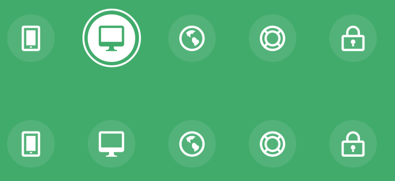
First lets prepare our div section which has all the links.
<div>
       <a href="#"> Mobile </a>
       <a href="#"> Desktop </a>
       <a href="#"> Partners </a>
       <a href="#"> Support </a>
       <a href="#"> Security </a>
</div>
Now the animation part
. Hi-icon-Effect-6. Hi-icon {
    Box-Shadow: 0 0 0 4px RGBA (255,255,255,1);
    Transition: background 0.2s, 0.2s Color;
}
. No-Touch. Hi-icon-Effect-6. Hi-icon: hover {
    background: RGBA (255,255,255,1);
    Color: # 64bb5d;
}
. No-Touch. Hi-icon-Effect-6. Hi-icon: hover: before {
    Animation: spinAround 2S Linear infinite;
}
@ Keyframes spinAround {
    from {
        transform: Rotate (0deg)
    }
    to {
        transform: Rotate (360deg);
    }
}
make sure you download all the fonts before implementing this code.