Plenty of time in the past, I’ve shown you how to create different types of charts using CSS and JavaScript. Today, I’ll guide you on how to build line charts in pure CSS.
What is a Line Chart?
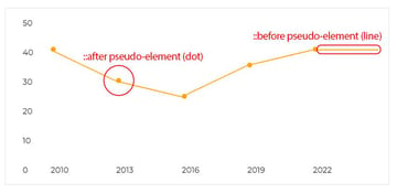
A line chart looks like a cardiogram; it consists of data points that are connected through a line.

This kind of chart can provide useful information for trends over the year, price changes, compare behaviors, etc.
1. Begin With the Data
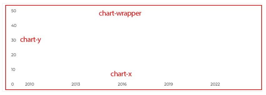
For this demo, we’ll assume that we want to visualize in a line chart the following data that describe the employee count over the years:
| Year | Number of Employees | |
| 2010 | 40 | |
| 2013 | 30 | |
| 2016 | 25 | |
| 2019 | 35 | |
| 2022 | 40 |
2. Specify the Page Markup
We’ll specify a wrapper element that contains two lists:
- The first list sets the y-axis range. If you look at the table data above, you’ll see that the second column includes values up to 40. Keeping this in mind, we’ll define six values from 0 to 50 with a step size of 10. The values of the y-axis will therefore be 0, 10, 20, 30, 40, and 50.
- The second list sets the x-axis data. These are extracted from the first column of our table, from lowest to highest. Consider also the
start,end, anddelayCSS variables that we pass to the list items. We’ll use them to create the data points that will construct the line.
Here’s the required markup:
1 |
<div class="chart-wrapper"> |
2 |
<ul class="chart-y"> |
3 |
<li>50</li> |
4 |
<li>40</li> |
5 |
<li>30</li> |
6 |
<li>20</li> |
7 |
<li>10</li> |
8 |
<li>0</li> |
9 |
</ul>
|
10 |
<ul class="chart-x"> |
11 |
<li style="--start:80%; --end:60%"> |
12 |
<span>2010</span> |
13 |
</li>
|
14 |
<li style="--start:60%; --end:50%; --delay: 1"> |
15 |
<span>2013</span> |
16 |
</li>
|
17 |
<li style="--start:50%; --end:70%; --delay: 2"> |
18 |
<span>2016</span> |
19 |
</li>
|
20 |
<li style="--start:70%; --end:80%; --delay: 3"> |
21 |
<span>2019</span> |
22 |
</li>
|
23 |
<li style="--start:80%; --end:80%; --delay: 4"> |
24 |
<span>2022</span> |
25 |
</li>
|
26 |
</ul>
|
27 |
</div>
|
Let’s now explain the values of these variables:
- The
startvalues will describe the number of employees per year. The highest value in the y-axis is 50, which means 100% in percent mode. So, for representing 40 employees, we’ll use this calculation: (40 / 50) * 100 =>80%. Similarly, for 30 employees, we’ll use this: (30 / 50) * 100 =>60%, etc. - To connect the data points, the
endvalue of all list items apart from the last one should match thestartvalue of their next sibling list item. That said, theendvalue of the first list item will match thestartvalue of the second list item, theendvalue of the second list item will match thestartvalue of the third list item, etc. - The
delayvalues will set the chart animation sequence. The higher the value, the more time the related animation needs to run.
3. Style the Chart
For simplicity, we’ll skip the reset/basic styles. You can check them by clicking the CSS tab of the demo project.
The chart wrapper will be a flex container with a 20px gap between the axes. The y-axis width will be auto while the x-axis will expand to cover the remaining space.

The x-axis and its items will also be flex containers. The items will equally be distributed across the main axis, and their content will sit at the bottom.
Here are the relevant styles:
1 |
.chart-wrapper { |
2 |
display: flex; |
3 |
gap: 20px; |
4 |
}
|
5 |
|
6 |
.chart-wrapper .chart-x { |
7 |
display: flex; |
8 |
flex-grow: 1; |
9 |
}
|
10 |
|
11 |
.chart-wrapper .chart-x li { |
12 |
display: flex; |
13 |
align-items: flex-end; |
14 |
flex: 1; |
15 |
}
|
Next, we’ll define the ::before and ::after pseudo-elements of the list items.
The ::before pseudo-elements will construct the lines, while the ::after pseudo-elements, which will be optional, will create the data points.


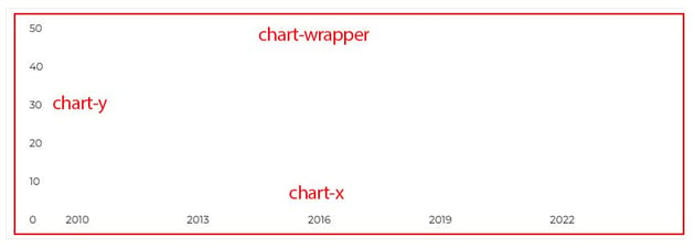
Line Animation
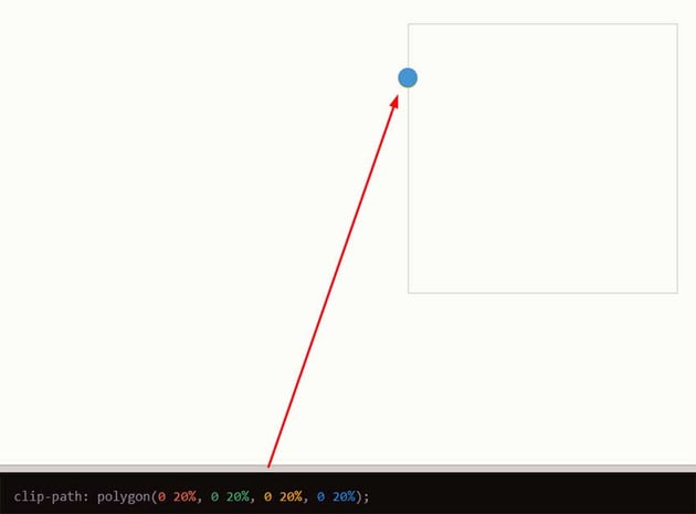
To create the line animation, like we’ve done in many tutorials in the past, we’ll take advantage of the clip-path property and specifically its polygon() CSS function.
Just as a reminder, an element with clip-path: polygon(0 0, 100% 0, 100% 100%, 0 100%) makes it appear entirely.
In our case, let’s concentrate on the line animation for the first list item that has a start value of 80% and an end value of 40%.
1 |
<!--FIRST LIST ITEM-->
|
2 |
<li style="--start:80%; --end:60%"> |
3 |
<span>2010</span> |
4 |
</li>
|
Initially, we’ll set its clip-path property to polygon(0 20%, 0 20%, 0 20%, 0 20%) which will make all points sit at the same position.

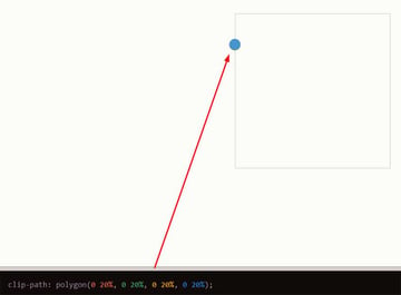
When the page loads, we’ll update the clip-path value to polygon(0 20%, 100% 40%, 100% calc(40% + 2px), 0 calc(20% + 2px)). That way, the position of the last three points changes, and a line is created whose thickness we can control.
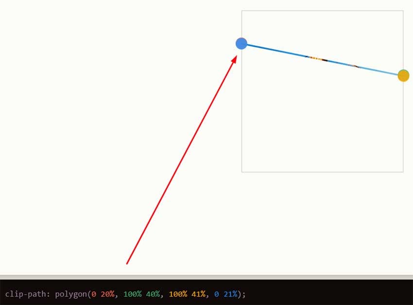
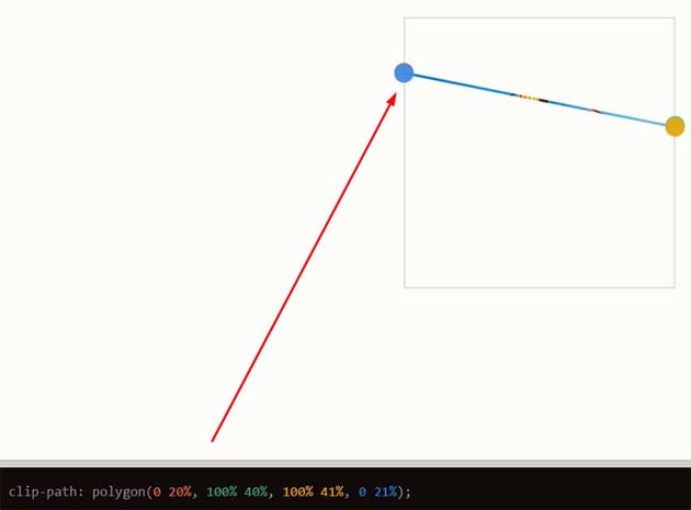
Please note that in the Clippy tool, we cannot add CSS. That’s why I tried 41% and 21% instead of calc(40% + 2px) and calc(20% + 2px) that appear in the styles.
With all this in mind, we can now construct dynamic styles regardless of the chart’s data points.
Here are the related styles:
1 |
/*CUSTOM VARIABLES HERE*/
|
2 |
|
3 |
.chart-wrapper .chart-x li { |
4 |
position: relative; |
5 |
}
|
6 |
|
7 |
.chart-wrapper .chart-x li::before, |
8 |
.chart-wrapper .chart-x li::after { |
9 |
content: ""; |
10 |
position: absolute; |
11 |
left: 0; |
12 |
background: var(--chart-color); |
13 |
}
|
14 |
|
15 |
.chart-wrapper .chart-x li::before { |
16 |
top: 0; |
17 |
width: 100%; |
18 |
height: 100%; |
19 |
clip-path: polygon( |
20 |
0 calc(100% - var(--start)), |
21 |
0 calc(100% - var(--start)), |
22 |
0 calc(100% - var(--start)), |
23 |
0 calc(100% - var(--start)) |
24 |
);
|
25 |
transition: clip-path 0.5s calc(var(--delay, 0) * 0.5s); |
26 |
}
|
27 |
|
28 |
.chart-wrapper .chart-x li::after { |
29 |
top: calc(100% - var(--start)); |
30 |
width: 10px; |
31 |
height: 10px; |
32 |
border-radius: 50%; |
33 |
transform: translateY(-50%); |
34 |
}
|
35 |
|
36 |
.loaded .chart-wrapper .chart-x li::before { |
37 |
clip-path: polygon( |
38 |
0 calc(100% - var(--start)), |
39 |
100% calc(100% - var(--end)), |
40 |
100% calc(calc(100% - var(--end)) + var(--chart-thickness)), |
41 |
0 calc(calc(100% - var(--start)) + var(--chart-thickness)) |
42 |
);
|
43 |
}
|
Lastly, it’s worth noting that to ensure that the chart animation will run on page load, we’ll use JavaScript to add the loaded class to the body element.
1 |
window.addEventListener("load", function() { |
2 |
document.body.classList.add("loaded"); |
3 |
})
|
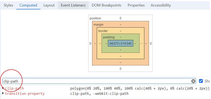
Don’t forget to use your browser tools to test the resulting clip-path value for each item.

Multi-Line Charts
With our single-line chart in place, we can go even further and create CSS-only multi-line graphs with just a little more extra markup.
Consider the following demo which follows the same principles we discussed in the single-line graph:
Conclusion
We just completed another CSS chart tutorial, folks! I hope you enjoyed the demos we developed and learned one or two new things.
Of course, you can always create something more advanced using a JavaScript charting library. But, on the other hand, it’s always fun to go the hard way by experimenting with modern CSS techniques.
As always, thanks for reading!