Animating different widgets in your Android app had always been a painful experience for developers. However, all that changed with the introduction of the MotionLayout subclass in Android.
You can use MotionLayout in your app to handle widget animations from one state to another. MotionLayout was added as a subclass of the ConstraintLayout class in version 2.0. Support for MotionLayout goes as far back as API level 14 with the help of a backwards-compatible support library.
Some useful and interesting features of the class include animation of different layout properties, as well as support for seekable transitions. The support for keyframes in MotionLayout is simply the cherry on top. This allows you to create your own fully customized transitions.
In this tutorial, you will learn how to create animations within your Android app using MotionLayout.
Add Dependencies
The first step before you can start using MotionLayout in your Android app involves adding ConstraintLayout as a dependency to your project. This is included by default in all Android projects now. However, you should still make sure that any project that uses MotionLayout uses a version above 2.0.0 for the ConstraintLayout as its dependency.
You can check your own project dependencies by opening the build.gradle file and looking for this line under dependencies.
1 |
implementation 'androidx.constraintlayout:constraintlayout:2.1.4' |
The version number at the end will change from time to time. So, don’t worry about a mismatch. The important thing to remember is that it should be at least 2.0.0.
Define the App Layout
If you are creating a new app while following this tutorial, you will see that the activity_main.xml file is using ConstraintLayout for widget placement. We will have to replace all instances of ConstraintLayout in our layout file with MotionLayout.
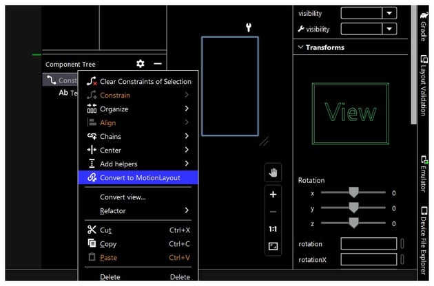
The easiest way to do that is to switch your layout from Code view to either Split or Design View. You will find a Component Tree panel on the left side. Open the panel, and you will see the ConstraintLayout in use. Right-click on it and select Convert to MotionLayout as shown in the image below.
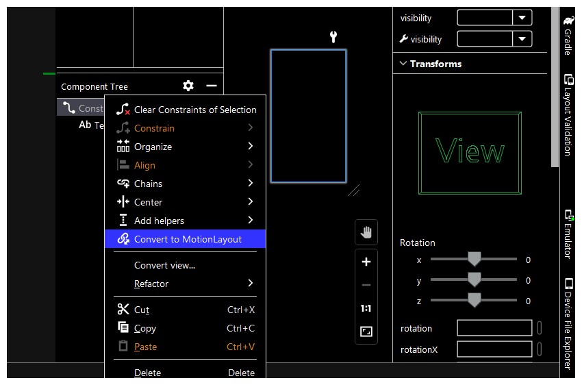

This will result in a new pop-up window letting you know that the conversion to MotionLayout will result in the creation of a separate MotionScene file. Click the Convert button.
Your activity_main.xml file should now have the following XML code:
1 |
<?xml version="1.0" encoding="utf-8"?>
|
2 |
<androidx.constraintlayout.motion.widget.MotionLayout xmlns:android="https://schemas.android.com/apk/res/android" |
3 |
xmlns:app="http://schemas.android.com/apk/res-auto" |
4 |
xmlns:tools="http://schemas.android.com/tools" |
5 |
android:layout_width="match_parent" |
6 |
android:layout_height="match_parent" |
7 |
app:layoutDescription="@xml/activity_main_scene" |
8 |
tools:context=".MainActivity"> |
9 |
|
10 |
<TextView
|
11 |
android:id="@+id/textView" |
12 |
android:layout_width="wrap_content" |
13 |
android:layout_height="wrap_content" |
14 |
android:text="Hello World!" |
15 |
app:layout_constraintBottom_toBottomOf="parent" |
16 |
app:layout_constraintEnd_toEndOf="parent" |
17 |
app:layout_constraintStart_toStartOf="parent" |
18 |
app:layout_constraintTop_toTopOf="parent" /> |
19 |
|
20 |
</androidx.constraintlayout.motion.widget.MotionLayout>
|
Let’s add a Button widget to our layout. We will design our app in such a way that a click on the button will make our TextView widget jump up a bit and increase in size. Add the following XML below the TextView widget to add a button that says Jump and stays 20sp below our TextView widget.
1 |
<Button
|
2 |
android:id="@+id/button" |
3 |
android:layout_width="wrap_content" |
4 |
android:layout_height="wrap_content" |
5 |
android:text="Jump" |
6 |
android:textSize="18sp" |
7 |
android:layout_marginTop="20sp" |
8 |
app:layout_constraintEnd_toEndOf="parent" |
9 |
app:layout_constraintStart_toStartOf="parent" |
10 |
app:layout_constraintTop_toBottomOf="@id/textView" /> |
Editing the MotionScene File
Do you remember that Android Studio showed us a pop-up window which mentioned that the conversion of our ConstraintLayout to MotionLayout will result in the creation of a MotionScene file? The name of that MotionScene file is activity_main_scene.xml. You can find it under res > xml > activity_main_scene.xml in your project.
A reference to the motion scene file is also present in our activity_main.xml file under the app:layoutDescription attribute. The activity_main_scene.xml file contains the following code:
1 |
<?xml version="1.0" encoding="utf-8"?>
|
2 |
<MotionScene
|
3 |
xmlns:android="http://schemas.android.com/apk/res/android" |
4 |
xmlns:motion="http://schemas.android.com/apk/res-auto"> |
5 |
|
6 |
<Transition
|
7 |
motion:constraintSetEnd="@+id/end" |
8 |
motion:constraintSetStart="@id/start" |
9 |
motion:duration="1000"> |
10 |
<KeyFrameSet>
|
11 |
</KeyFrameSet>
|
12 |
</Transition>
|
13 |
|
14 |
<ConstraintSet android:id="@+id/start"> |
15 |
</ConstraintSet>
|
16 |
|
17 |
<ConstraintSet android:id="@+id/end"> |
18 |
</ConstraintSet>
|
19 |
</MotionScene>
|
As you can see, the scene file contains a root MotionScene tag with other tags inside it that control the actual motion or animation of a widget.
The Transition tag inside MotionScene defines how the animation will proceed based on its start and end ConstraintSets. Each ConstrainSet can contain a Constraint tag which you can use to provide constraint and view specific attribute values.
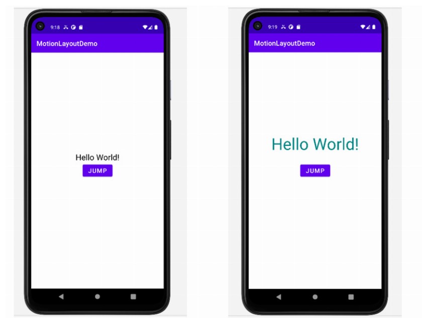
There are three things that we want to change about our TextView with each button click. The color of the text should change from black to teal_700. These values are defined in the colors.xml file. The spacing between the TextView widget and the Button should increase to 40sp. The TextView widget should scale up to twice the original size.
Here is the XML that we can use inside our MotionScene file to make our textView jumpy.
1 |
<?xml version="1.0" encoding="utf-8"?>
|
2 |
<MotionScene
|
3 |
xmlns:android="http://schemas.android.com/apk/res/android" |
4 |
xmlns:motion="http://schemas.android.com/apk/res-auto"> |
5 |
|
6 |
<Transition
|
7 |
motion:constraintSetEnd="@+id/end" |
8 |
motion:constraintSetStart="@id/start" |
9 |
motion:duration="200" |
10 |
motion:motionInterpolator="easeIn"> |
11 |
<OnClick
|
12 |
motion:targetId="@id/button" |
13 |
motion:clickAction="transitionToEnd" /> |
14 |
</Transition>
|
15 |
|
16 |
<ConstraintSet
|
17 |
android:id="@+id/start"> |
18 |
<Constraint
|
19 |
android:id="@id/textView"> |
20 |
<CustomAttribute
|
21 |
motion:attributeName="textColor" |
22 |
motion:customColorValue="@color/black" /> |
23 |
</Constraint>
|
24 |
</ConstraintSet>
|
25 |
|
26 |
<ConstraintSet
|
27 |
android:id="@+id/end"> |
28 |
<Constraint
|
29 |
android:id="@id/textView" |
30 |
android:scaleX="2" |
31 |
android:scaleY="2"> |
32 |
<Layout
|
33 |
android:layout_marginBottom="40sp" |
34 |
android:layout_width="wrap_content" |
35 |
android:layout_height="wrap_content" |
36 |
motion:layout_constraintBottom_toTopOf="@id/button" /> |
37 |
<CustomAttribute
|
38 |
motion:attributeName="textColor" |
39 |
motion:customColorValue="@color/teal_700" /> |
40 |
</Constraint>
|
41 |
</ConstraintSet>
|
42 |
</MotionScene>
|
The attributes inside Transition specify the duration of the animation in milliseconds, as well as the interpolation method used to calculate intermediate values. We also use the optional OnClick tag to specify when the transition should trigger. The targetId attribute determines which view will trigger the animation. In our case, we use our button as the trigger element. The clickAction attribute specifies what should happen once the user clicks our button. In this case, we have set its value to transitiontoEnd. Other possible values are toggle, transitionToStart, jumpToEnd, and jumpToStart.
After that, we define our ConstraintSet tags which determine what our widget will look like at the start and end of the animation. You can also consider using the Motion Editor if you don’t want to write all the XML yourself. This will also give you a good idea of the way your layout looks at the start and end of the animation.

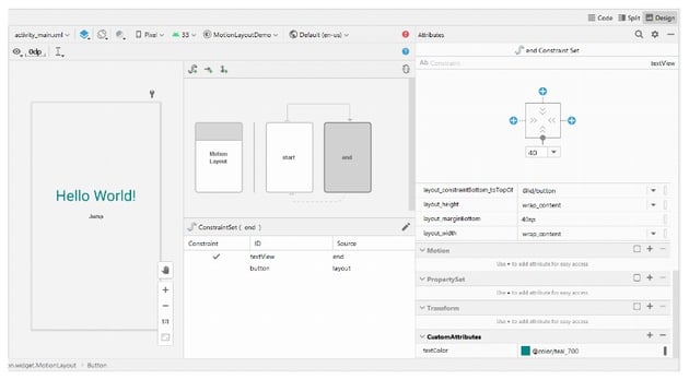
Try running your app on either the emulator or a physical device now. You should see the TextView jump up, change color, and increase in size.


Controlling the Animation Programmatically
While it was possible for us to animate our text simply by writing some XML, you will probably want more control over the animation. Executing the animation programmatically gives you the option to do other tasks based on the overall progress of the animation.
Add the following line to your Button widget XML to call a method named start(), which is defined in our MainActivity.kt file:
1 |
android:onClick="start" |
Define a method called start() within the MainActivity class, just below onCreate(). It should have the following code:
1 |
fun start(v: View) { |
2 |
val motionContainer = findViewById<MotionLayout>(R.id.motion_container) |
3 |
motionContainer.transitionToEnd(); |
4 |
}
|
We begin by getting a reference to our MotionLayout. In the next line, we use the transitionToEnd() method to transition to the animation from the values in the starting ConstraintSet to the ending ConstraintSet.
You can attach a transition listener to your MotionLayout widget to monitor the progress of the animation and handle what happens at different events. The TransitionListener interface has four abstract methods. Android Studio will generate stubs for all those methods for you automatically. Your code below the call to transitionToEnd() should look like this now:
1 |
val jumpButton = findViewById<Button>(R.id.button) |
2 |
val greeting = findViewById<TextView>(R.id.textView) |
3 |
|
4 |
motionContainer.setTransitionListener( |
5 |
object: MotionLayout.TransitionListener { |
6 |
|
7 |
override fun onTransitionStarted( |
8 |
motionLayout: MotionLayout?, |
9 |
startId: Int, |
10 |
endId: Int |
11 |
) { |
12 |
jumpButton.setBackgroundColor(Color.BLACK); |
13 |
}
|
14 |
|
15 |
override fun onTransitionChange( |
16 |
motionLayout: MotionLayout?, |
17 |
startId: Int, |
18 |
endId: Int, |
19 |
progress: Float |
20 |
) { |
21 |
|
22 |
}
|
23 |
|
24 |
override fun onTransitionCompleted( |
25 |
motionLayout: MotionLayout?, |
26 |
currentId: Int) { |
27 |
if(currentId == R.id.end) { |
28 |
greeting.text = "Good Evening!"; |
29 |
}
|
30 |
}
|
31 |
|
32 |
override fun onTransitionTrigger( |
33 |
motionLayout: MotionLayout?, |
34 |
triggerId: Int, |
35 |
positive: Boolean, |
36 |
progress: Float |
37 |
) { |
38 |
|
39 |
}
|
40 |
}
|
41 |
)
|
We begin by getting a reference to the TextView widget and the Button widget.
Inside the TransitionListener, the onTransitionStarted() method fires when the transition is about to start. It accepts the defined MotionLayout as the first parameter. The second and third parameters are the IDs of the start and end constraint sets.
We call the setBackgroundColor() method on the jumpButton to change its color to black once the transition starts.
The onTransitionCompleted() method fires when the transition is complete. It accepts two parameters. The first one is the reference to our MotionLayout. The second one is the ID of the ConstraintSet currently applicable to the layout.
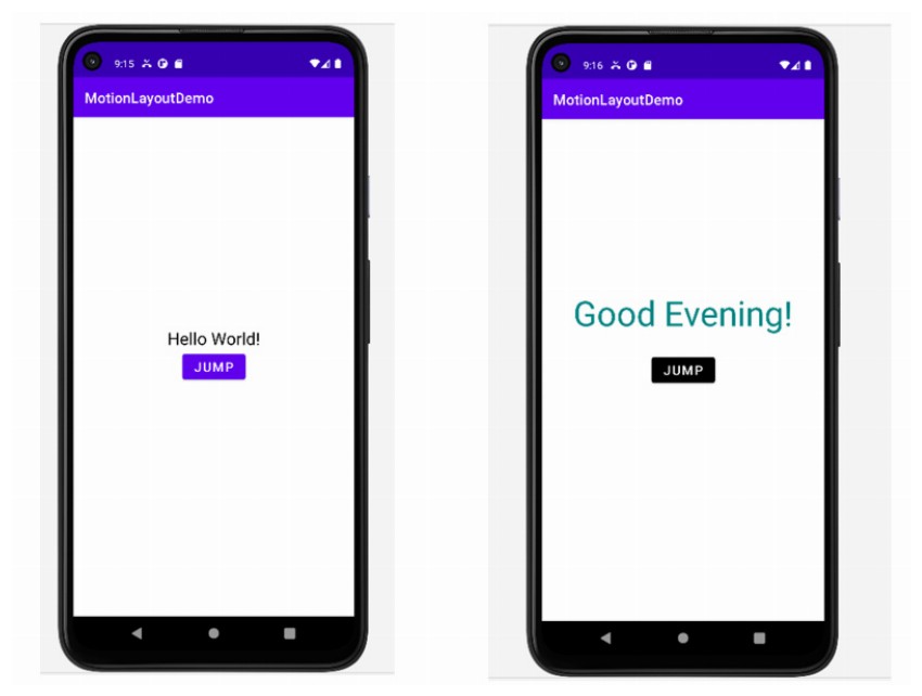
We check if the currentId matches the ID of our end ConstraintSet. The greeting text changes to Good Evening! if there is a match. You could also do other things here, such as taking the transition back to the initial state by making a call to transitionToStart().
Clicking the Jump button this time will update the text and change the button color.
Final Thoughts
In this tutorial, you learned how to animate different widgets in your activity using MotionLayout. It is possible for you to animate layouts by just using XML. However, you can get granular control over the animation if you use code to do the animation. It also allows you to do other things during different stages of the animation.
Android Studio also comes with a Motion Editor that helps you quickly define complex transitions. You will also be able to see the initial and final stages of the animation when using the Motion Editor.