
Postach.io is a blogging system with a difference. It has one feature in particular which makes it especially interesting: instead of an admin panel you simply create your posts inside Evernote.
You can use any Evernote app, which means Postach.io blogging is multi-platform, automatically backed up, and (if you’re already an Evernote user) very familiar.
In this tutorial we’ll be learning how to setup your own Postach.io/Evernote powered blog and how to create a custom theme for it.
1. Setting up Your Blog
To begin with, if you don’t already have an Evernote account, you’ll need to set one up. Once you’re set up with an Evernote account, head over to Postachi.io and click the “LOG IN” using Evernote button.

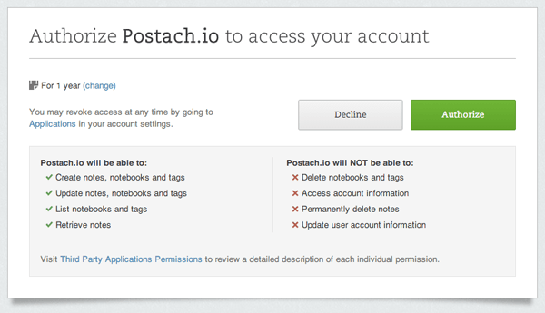
You’ll be taken to a page where you can authorize Postach.io to gain access to your Evernote account. Click the green “Authorize” button to proceed.
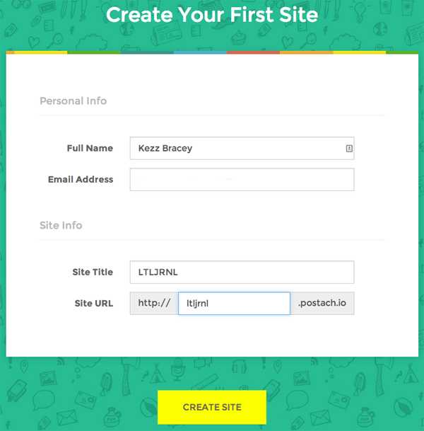
In the next screen enter your name, email address, site the title and the subdomain you’d like for your site, then click the yellow “Create Site” button.
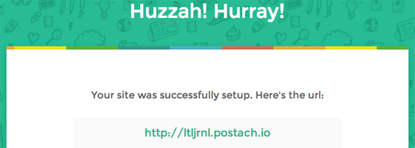
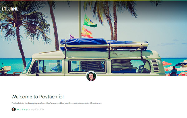
After a few seconds your blog setup will be complete and you’ll see a success screen with a link you can follow to go to your new site:
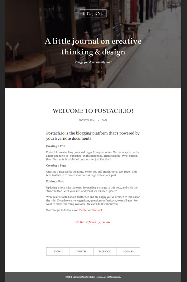
By default your new blog will look like this:
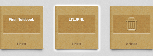
If you take a look at your Evernote notebooks area, you’ll see a new entry with a name matching your site. You’ll create all of your blog’s content within this notebook.
Creating Posts
You can post to your blog via whichever Evernote app you’re most comfortable with meaning you can edit on your desktop, mobile device or via the browser based app. Postach.io recommend using the browser app for access to more tools. However, in my experience between the browser and the Mac desktop version I couldn’t find any major differences, so at the moment I feel it comes down to personal preference.
Adding blog posts via Postach.io is ridiculously simple. Just create a new note in the notebook allocated to your blog, write up your post, then tag it “published”.
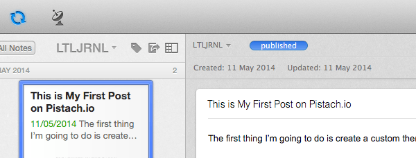
Hit the Evernote “Sync” button and the post will be sent to your blog.
Inversely, if you want to remove a post just delete its “published” tag and sync again.
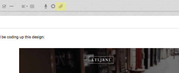
Adding Images
Adding images is also super easy. Drag an image from your computer into the note and it will automatically be uploaded to the cloud and included in your post. Alternatively, you can click the little paperclip icon to browse directly to a file for insertion.
Formatting Posts
There are two ways to format the content of your Postach.io posts. You can either use Evernote’s default formatting tools:

…or you can activate Markdown via your Postach.io dashboard “Details” tab:
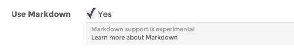
Note: If you’re new to Markdown take a look at Markdown: The Ins and Outs
With either one you can place inline HTML to give greater control over your posts, however there are some distinct differences between the two approaches that may determine which you prefer.
Markdown Advantages:
Much Better Markup
With Markdown active your posts will have proper placement of H tags, p tags and so on. On the other hand, with default formatting you might find every line wrapped in div tags, all line breaks created by <br /> tags (which can cause spacing havoc), and the insertion of outdated tags like <b> instead of <strong>.
Easy Insertion of H Tags
With Markdown active you can easily insert H level headings by placing # marks. Default formatting however only has the ability to insert increased font sizes and not actual headings. With default formatting you can enter H tag code as HTML, but your headings are likely to be wrapped in div tags.
Default Formatting Advantages:
Post Formatting WYSIWYG
With default formatting you’ll see your application of bolding, aligning and so on as you’re editing your note. However with Markdown there’s as yet no native or cross platform preview for Evernote so you can’t see how your posts will appear until they’re published.
Easy Text and Image Alignment
With default formatting you can select an image or text element and left, right or center align it. Markdown doesn’t have any native alignment ability so it requires the addition of inline HTML.
It’s One or the Other
You should be aware that with Markdown activated the default Evernote formatting won’t work and vice versa, so for the moment you have to choose according to which set of advantages you need most.
My personal recommendation is to go with Markdown because otherwise you might find the div and br tag code generated by the default formatting tools prevents proper separation between your paragraphs.
Tip: If you do find you have line breaks in your post where you actually want paragraph breaks, select all the text then click the ordered/unordered list button twice. The addition and removal of a list against your content will correct the paragraph formatting.
Embedding Media
Postach.io provides several embed codes to allow you to place things like YouTube videos, Gist code snippets, Tweets, Soundcloud tracks and so on. At first glance it might seem like a lot of different embed codes to deal with, but the format is exactly the same for each one making it easy to remember:
[<service name> url="<item url>"]
Adding a YouTube video is therefore:
[youtube url="http://www.youtube.com/watch?v=07ds8iv1XPM"]
…adding a Gist is:
[gist url="https://gist.github.com/postachio/9059890"]
…and so on. See the full list of embed codes in the Postac.io docs.
2. Creating a Custom Theme
There are several ready-made themes you can apply to your theme by looking under the Theme Browser tab in your Postach.io dashboard. However, creating themes is relatively straight forward, so we’ll go through the process of making a simple theme for your Postach.io blog here.
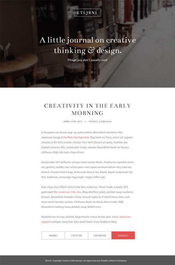
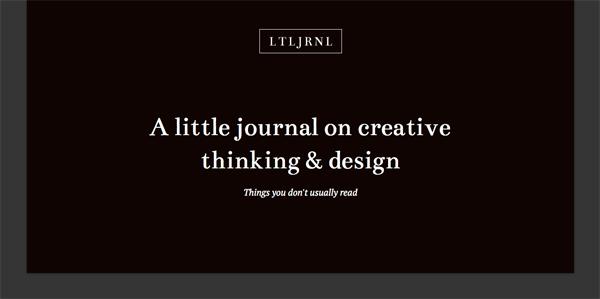
We’ll be coding up this lovely design from Tomas Laurinavicius:
How Postach.io Themes Work
The thing I love most about Postach.io themes is that they are entirely contained within a single template file. Conditional checks are run to determine what type of content should be shown to the visitor, and the appropriate code is written within the confines of these checks. You’ll see this in action shortly.
This makes for a very concise, neat and tidy theming system. The whole template file you’ll be creating is just 170 lines long.
The templating language used by Postach.io themes is Jinja2, which allows for the placement of template tags as well as some basic logic.
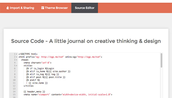
Custom themes are added to Postach.io by directly copying and pasting your custom code. There’s no actual theme installation zip as you might find with other platforms. Instead, you go to the “Source Editor” tab in your dashboard and paste your code straight in:
As we go along you’ll need to paste in your theme’s HTML so I recommend creating an offline file named “theme.html”, working in that file, then copying and pasting from it when you’ve completed each stage.
Before You Begin
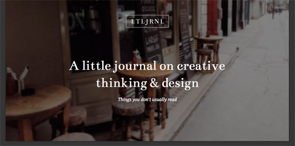
For the purposes of this tutorial, go to your Postach.io dashboard and under the Details tab set your Site Title to “A little journal on creative thinking & design” and your Site Description to “Things you don’t usually read”.
We do this as these fields will be used to populate the site’s header area with the same text display as we have in our blog design PSD.
Theme CSS, Images and Dropbox Hosting
The downside of Postach.io’s direct theme code editing approach is there’s no way to upload a separate CSS file along with your theme. This means you have two options:
- Write all your CSS directly in the head section
- Host your stylesheet elsewhere and link it in.
Because I always prefer to use a CSS preprocessor and hence need to have a standalone file to compile into I recommend choosing the second option. As such, we’ll need somewhere to host our stylesheet. In this case we’ll be using Dropbox. We’ll also use Dropbox to host the theme’s logo image.
Using Dropbox to host static assets is very easy. Just create the folder for your project inside your local Dropbox folder, then as you save your changes they’ll be automatically uploaded to your account.
To get a URL for any css or image asset right-click them in your Dropbox folder and choose “Share Dropbox Link”:
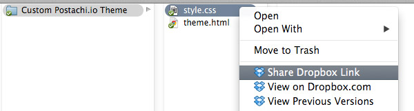
This will add the publicly visible link for your file to your cache.
Important: To convert the url into a format which is usable in your site’s code, paste the link and then change the www to dl.
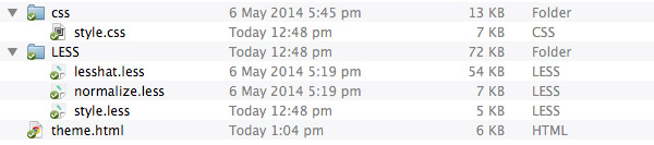
Setup Your Project Folder
To get the ball rolling, create a project folder inside your DropBox folder then inside it create a file named theme.html (as per the information above).
We’re going to write our styles in LESS so next, create two subfolders within your project folder, one named css and the other named LESS. Inside the LESS folder create a file named style.less. All the styles for your site will be written into this file, and subsequently compiled into css > style.css.
We’ll be using the free app Prepros to compile. I covered the next steps you’ll need to take in a recent tutorial, so please head over and follow the instructions in the sections titled Setup Autocompiling with Prepros and Incorporate LESSHat and Normalize.less.
After you complete those two sections you should have a file & folder structure for your project that looks like this:
Basic HTML Wrapper and Header
We’ll begin by inserting a basic HTML5 setup as well as our head section. Add the following to your theme.html file, and remember to copy and paste it into your Postach.io dashboard “Source Editor” when you’re done:
<!DOCTYPE html> <html prefix="og: http://ogp.me/ns#" xmlns:og="http://ogp.me/ns#"> <head> <meta charset="utf-8"> <title> {% if is_login %}Login {% elif is_home %}{{ site.author }} {% elif is_tag %}{{ tag }} {% elif post %}{{ post.title }} {% endif %} | {{ site.name }} </title> {{ header_meta }} <meta name="viewport" content="width=device-width, initial-scale=1.0"> <link href='http://fonts.googleapis.com/css?family=Bentham|PT+Serif:400,700,400italic,700italic' rel='stylesheet' type='text/css'> <link href="{{ static('themes/_assets/fontawesome/css/font-awesome.min.css') }}" rel="stylesheet" /> <link href="https://dl.dropbox.com/s/5qkjwzv57kzsdgu/style.css" rel="stylesheet" /> {% if site.analytics %} <script> var _gaq = _gaq || []; _gaq.push(['_setAccount', '{{ site.analytics }}']); _gaq.push(['_trackPageview']); (function() { var ga = document.createElement('script'); ga.type = 'text/javascript'; ga.async = true; ga.src = ('https:' == document.location.protocol ? 'https://ssl' : 'http://www') + '.google-analytics.com/ga.js'; var s = document.getElementsByTagName('script')[0]; s.parentNode.insertBefore(ga, s); })(); </script> {% endif %} </head> <body> </body> </html>
Here’s a quick rundown on what you’re seeing above:
- Output of the
titledepending on where a user is on the site. - The
{{header_meta}}template tag to output Postach.io’s default meta tags. - Meta tags to ensure correct behaviour on mobile devices.
- Loading the Google Fonts used in the design; Bentham and PT Serif.
- Loading a FontAwesome stylesheet (for font icons) from Postach.io’s available static resources.
- Loading our custom stylesheet from Dropbox.
Important: You’ll need to get your own stylesheet’s URL via the method described above. - Google Analytics integration, with data taken from the Postach.io dashboard.
Now we’ll add some basic code to the body section. Add the following in between your opening and closing body tags:
{% if is_login %} {{ login_form }} {% else %} <!-- Start blog display --> <div class="wrapper"> <!-- Header --> <div class="header_wrap"> <header role='banner' class="site_header"{% if site.cover_photo %} style="background-image: url('{{ site.cover_photo }}'); background-repeat: no-repeat; background-position: center center;"{% endif %}> <a href="/"><img src="https://dl.dropbox.com/s/1ckudtjd4sk6lws/logo.png" alt="{{ site.name }}"></a> <h1><a href="/">{{ site.name }}</a></h1> {% if site.bio %}<p><a href="/">{{ site.bio }}</a></p>{% endif %} </header> </div> </div> <!-- End blog display --> {% endif %} {{ footer_meta }}
Let’s break this down. First, we use Jinja2 syntax to run a conditional check on whether the visitor is on the Postach.io login screen or not. If they are, they’re shown the login form and, if not, we commence the blog display.
The area that will contain our blog display code is encapsulated with the comments <!-- Start blog display --> and <!-- End blog display -->. We start with a div bearing the class wrapper that we’ll use to control the width of our layout, and we then place our site’s header code.
On the header element’s opening tag we check to see if the user has added a site cover photo with the code {% if site.cover_photo %}...{% endif %}. If a cover image is present we use inline styles to place it as a background image, using the template tag {{ site.cover_photo }} to output its URL.
Within the header element we place the logo. This is done by first exporting the logo image from the blog design PSD as a transparent PNG. We then place the image in the project folder inside our local Dropbox folder, and use its public URL in the code.
<a href="/"><img src="https://dl.dropbox.com/s/1ckudtjd4sk6lws/logo.png" alt="{{ site.name }}"></a>
Again, you should add the URL you get from your own Dropbox folder using the method described earlier.
Note on the Postach.io dashboard “Logo” field: There is a space in the dashboard to upload a custom logo image, however it has the restriction of needing to be at least 256px by 256px. This appears to be because it also doubles as your blog’s avatar image, given that to place this image you use the template tag {{ site.avatar }}. Additionally, this field cannot handle transparent images as a white background is added during the upload process. For these reasons, we are hosting the logo image on Dropbox and loading it in from there.
After this, we place the site name with the template tag {{ site.name}} and if available the site bio/description via the tag {{ site.bio }}.
Finally, after the conditional check is closed with {% endif %} we allow Postach.io to load its required footer scripts with the template tag {{ footer_meta }}.
Add Base and Header Styling
As you’ve setup Prepros to autocompile your LESS file and you have Dropbox automatically uploading for you, you should be able to see your style changes applied to your live site a second or two after you save them.
We’re going to start by creating some base styling for some default elements as well as your wrapper. Add this code to your style.less file under the two import lines you added earlier, so you end up with:
// Imports @import "lesshat.less"; @import "normalize.less"; // Variables @base_font_size: 18; @base_font_size_ems: unit(@base_font_size / 16, em); //standard default browser size is 16px, so this brings base font size to 18px while keeping things flexible for users @px: unit(1 / @base_font_size, rem); @type_font_heading: 'Bentham'; @type_font_regular: 'PT Serif'; @layout_site_width: 1200; @layout_header_height: 600; @color_site_bg: #282828; @color_wrapper_bg: #fff; @color_link_default: #e3514e; @color_link_hover: saturate(@color_link_default, 70%); @color_header_bg: #0d0603; @color_header_text: #fff; // Styles * { .box-sizing(border-box); } html { font-size: @base_font_size_ems; //standard default browser size is 16px, so this brings base font size to 18px while keeping things flexible for users font-family: @type_font_regular; background-color: @color_site_bg; } img { max-width: 100%; height: auto; } a, a:link, a:visited { text-decoration: none; color: @color_link_default; } a:hover, a:active { text-decoration: none; color: @color_link_hover; } .wrapper { width: 100%; margin: 0 auto; max-width: @layout_site_width * @px; background-color: @color_wrapper_bg; .box-shadow(~"0 0 5px rgba(0,0,0,.5)"); } .header_wrap { display: table; width: 100%; background-color: @color_header_bg; height: @layout_header_height * @px; text-align: center; } .site_header { display: table-cell; vertical-align: middle; color: @color_header_text; img { margin-bottom: 120 * @px; } h1 { margin: 0 auto; max-width: 700 * @px; font-family: @type_font_heading; font-size: 60 * @px; font-weight: 400; a { color: inherit; } } p { margin-bottom: 100 * @px; font-size: 20 * @px; font-style: italic; a { color: inherit; } } }
Let’s take a look at what we’ve done here.
In our PSD we have a base font size of 18px, however in our actual code we don’t want to set that 18px size explicitly so we don’t override the ability of users or browsers to determine the best overall font-size. You can read more about the reasoning behind this in my article on “Readability First“.
Instead, we set the value of 18 against the variable @base_font_size and we then run it through this calculation:
@base_font_size_ems: unit(@base_font_size / 16, em);
The most common default browser font size is 16px so this calculation sets the variable @base_font_size to an em based value that will equate to 18px on most devices, in this case 1.125em. However this value will remain flexible should devices or users need to work with a base font size other than 16px.
We apply this base font size to the html element with the line: font-size: @base_font_size_ems;
The next variable you’ll see is created with this code:
@px: unit(1 / @base_font_size, rem);
This calculation figures out the rem value that corresponds with the size of a single pixel, depending on the value of the base font size.
We can use this variable anywhere we would normally use a px unit by simply multiplying it by the number of pixel size we are targeting, e.g. 50 * @px instead of 50px. We can then think in pixels, something that makes working from a PSD much easier, but we will get rem based output in our CSS ensuring that all elements of the design remain fully scalable and flexible.
The remaining variables are used to store our regular and heading font family names and the colors from the PSD that we’ll be using in our site background, wrappers, header and header text.
The remaining code applies the newly created variables within style declarations in order to determine background colors, text colors, widths and so on. Notice we use a technique of setting the width attribute on the site wrapper to 100% so the site will shrink to fit smaller screens, and a max-width attribute to set the width the site will appear at on larger screens.
We also setup responsive scaling images via the img style, remove underlines from links, apply the text styling used in the PSD design to the header text, and use display: table; and display: table-cell; vertical-align: middle; on the .header_wrap and .site_header styles respectively to vertically align the header content.
We haven’t yet uploaded our site cover image, so after applying all the above to your blog it should look like this:
Add Your Site Cover Image
You should now export the site cover image from your blog design PSD. You should get an image 1200px wide by 600px high. My own export came out at around 55Kb.
To upload it to your blog go to your Postach.io dashboard and to the “Settings” tab. There you’ll see a label reading “Cover Photo” and a button to browse your computer for a file. Go ahead and browse for your cover photo file then upload it:
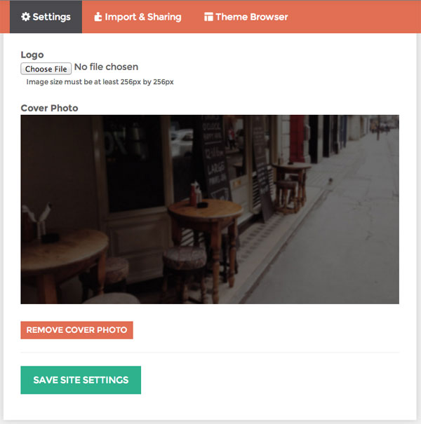
Click the Save Site Settings button, go back to your blog and you should now see:
Footer and Social Links
Next we’re going to add the other aspect of the site that will be visible on all pages, the social links and the footer.
Add the following code to your theme.html below the .header_wrap div and above the .wrapper closing div, then update your Postach.io source editor:
<!-- Footer --> {% if site.twitter or site.facebook or site.googleplus %} <div class="social_links"> <div class="social_col">SOCIAL:</div> {% if site.twitter %}<div class="social_col"><a href="{{ site.twitter }}" target="_blank">TWITTER</a></div>{% endif %} {% if site.facebook %}<div class="social_col"><a href="{{ site.facebook }}" target="_blank">FACEBOOK</a></div>{% endif %} {% if site.googleplus %}<div class="social_col"><a href="{{ site.googleplus }}" target="_blank">GOOGLE+</a></div>{% endif %} </div> {% endif %} <footer class="site_footer"> 2014 © Copyright Creative Little Journal. All rights reserved. </footer>
Add these three variables to your style.less file:
@color_social_border: #838383; @color_footer_bg: #555; @color_footer_text: #fff;
And also add these new styles:
.social_links { width: 100%; max-width: 640 * @px; margin: 60 * @px auto 110 * @px; } .social_links:before, .social_links:after { content: " "; display: table; } .social_links:after { clear: both; } .social_col { float: left; line-height: 54 * @px; font-size: 16 * @px; text-align: center; color: @color_footer_bg; a { width:100%; height: 100%; display: block; color: inherit; } border-width: @px 0 @px @px; border-color: @color_social_border; border-style: solid; &:last-of-type { border-right-width: @px; } &:hover { border-color: @color_link_hover @color_social_border; a { background-color: @color_link_hover; color: #fff; } &:last-of-type { border-right-color: @color_link_hover; } &:first-of-type { border-color: @color_social_border; } } } /* two items */ .social_col:first-child:nth-last-child(2), .social_col:first-child:nth-last-child(2) ~ .social_col { width: 50%; } /* three items */ .social_col:first-child:nth-last-child(3), .social_col:first-child:nth-last-child(3) ~ .social_col { width: 33.3333%; } /* four items */ .social_col:first-child:nth-last-child(4), .social_col:first-child:nth-last-child(4) ~ .social_col { width: 25%; } .site_footer { background-color: @color_footer_bg; color: @color_footer_text; text-align: center; line-height: 70 * @px; font-size: 14 * @px; }
There’s both some relatively basic and some pretty cool stuff going on with this code.
On the basic side, we’ve added the width and margins to the social links bar, we’ve set the links within it to float to the left, and we’ve added some clearfix code. We’ve also set border colors and widths for the social link items, as well as background and text colors for both the default and hover states.
We’ve also added styling for the .site_footer class, giving it a grey background with text and dimensions to match our PSD design.
The cool part is we’re using a pure CSS solution to have the widths of the social link items change depending on how many there are.
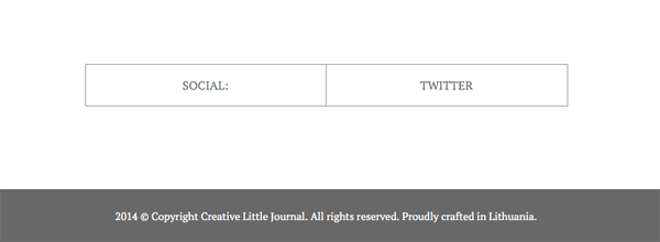
So if you’ve only entered your Twitter link details in your Postach.io account and it’s the only item showing you’ll see this:
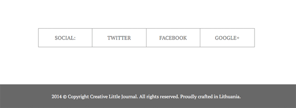
But if you’ve also entered your Facebook and Google+ information you’ll see this:
Credit to Lea Verou for this technique.
Add the Posts Area
Now we’re ready to enter the most important part of the blog, the posts area.
Add this code to your theme.html and then your Postach.io source editor, in between your header and social links code:
<!-- Posts Area --> <main class="posts_area"> {% if is_home or is_tag %} <!-- Post list --> {% if is_tag %} <h4 class="tag_header"><span class="separator">•</span> Showing all posts tagged as {{ tag }} <span class="separator">•</span></h4> {% endif %} {% if posts %} {% for post in posts %} <article class="post" role="article" itemscope itemtype="http://schema.org/Article"> <h1 class="title"><a href="{{ post.permalink }}#post_start">{{ post.title }}</a></h1> <div class="post_meta"> <time class="post_date" datetime="{{ post.created_at|format_date }}" itemprop="datePublished">{{ post.created_at|format_date }}</time> </div> <div class="postcontent_list" itemprop="articleBody" data-type-cleanup="true"> {{ post.content }} {% if post.type == 'link' %} <p class="link_display"><a href="{{ post.url }}"><i class="icon-link"></i> {{ post.url }}</a></p> {% endif %} <div class="after_post"><a href="{{ post.permalink }}#post_start">Read More »</a></div> </div> </article> {% endfor %} {% if not is_tag %} <div class="pagination"> {% if pagination.prev %}<a href="{{ pagination.prev }}" class="pagination_prev"><i class="icon-hand-left"></i> Prev</a>{% endif %} {% if pagination.next %}<a href="{{ pagination.next }}" class="pagination_next">Next <i class="icon-hand-right"></i></a>{% endif %} </div> {% endif %} {% endif %} {% else %} <!-- Single post --> <article class="post" id="post_start" role="article" itemscope itemtype="http://schema.org/Article"> <h1 class="title">{{ post.title }}</h1> <div class="post_meta"> <time class="post_date" datetime="{{ post.created_at|format_date }}" itemprop="datePublished">{{ post.created_at|format_date }}</time> {% if post.tags %} <span class="separator">•</span> <div class="post_tags"> <a href="/tag/{{ tag }}">{{ post.tags|format_tags(delimiter=', ', humanize=True, link=True) }}</a> </div> {% endif %} </div> <div class="postcontent_single" itemprop="articleBody" data-type-cleanup="true"> {{ post.content }} {% if post.type == 'link' %} <p class="link_display"><a href="{{ post.url }}"><i class="icon-link"></i> {{ post.url }}</a></p> {% endif %} </div> <div class="after_post">{{ theme.social.bar }}</div> </article> {% endif %} </main>
The first thing that happens here within our main element is a conditional check to see if we are on a list of posts, i.e. the home page or a tag page, or if we are on a single post. This is done with the code:
{% if is_home or is_tag %} <!-- Post list --> {% else %} <!-- Single post --> {% endif %}
We can then add the code for each of these display types in between these conditional check tags.
The Post List Code
In the code for the “Post list” another conditional check is run to see if we are on a tag page, and if so, a header for that tag page is shown.
After that we check for the presence of posts with {% if posts %}...{% endif %} and start looping through them with {% for post in posts %}...{% endfor %}. For each post we create an article element and display the post title, the post created date, the post content and a “Read More” link.
We also check to see if the post is of the type Evernote appends a source link to, i.e. any note that originated from the web clipper, with the check {% if post.type == 'link' %}...{% endif %} and display the attached link if it is.
The last part of the “Post list” display is the placement of pagination, a “Prev” and “Next” link. Be aware that pagination only works on the home page and not on tag pages. If you try to use pagination on a tag page you’ll get an error.
The Single Post Code
The “Single Post” code is much the same as that for the “Post List”, with a couple of differences.
First, because there is only one post to display we don’t need to check for the presence of a post or to initiate a loop, we just go straight into our article code.
Second, we include code to display the post’s tags next to the post’s date. Tags can only be displayed on a single post and not on a post list.
Third, we don’t include a “Read More” link for obvious reasons, and instead we place the {{ theme.social.bar }} template tag which will display a social sharing tool, as well as Postach.io specific “Like” and “Follow” links.
Posts Area Styling
Add the following three variables to your style.less file:
@color_title_text: #434343; @color_title_hover: lighten(@color_title_text, 10%); @color_post_text: #6f6f6f;
Then add these new styles:
.posts_area { display: block; min-height: 300 * @px; max-width: 640 * @px; margin: 0 auto; color: @color_post_text; } .tag_header { text-align: center; font-weight: normal; text-transform: uppercase; margin-top: 80 * @px; } .post_meta { text-align: center; font-size: 14 * @px; text-transform: uppercase; margin-bottom: 60 * @px; } .post_date, .post_tags { display: inline-block; color: @color_title_text; a { color: inherit; &:hover { color: @color_link_hover; } } } .separator { margin-left: 20 * @px; margin-right: 20 * @px; } .post { padding-top: 100 * @px; &:last-of-type { padding-bottom: 100 * @px; } h1, h2, h3, h4, h5, h6 { font-weight: 400; color: @color_title_text; } img { display: block; margin-left: auto; margin-right: auto; } } .title { font-family: @type_font_heading; font-size: 42 * @px; font-weight: 400; text-transform: uppercase; text-align: center; color: @color_title_text; a { color: inherit; &:hover, &:active { color: @color_title_hover } } } .link_display { font-size: 1.2em; text-align: center; } .after_post { text-align: center; margin-top: 3em; font-weight: bold; } a.pagination_prev, a.pagination_next { width: 50%; display: inline-block; color: @color_title_text; &:hover, &:active { color: @color_link_default; } } .pagination_prev { text-align: left; float: left; } .pagination_next { text-align: right; float: right; }
With all the above template and style code in place you’re just about done!
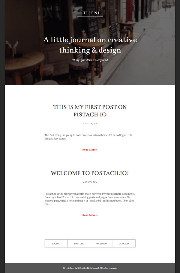
Your blog should now look like this on the home page:
Tag pages will look the same, but with an additional tag heading above the post list.
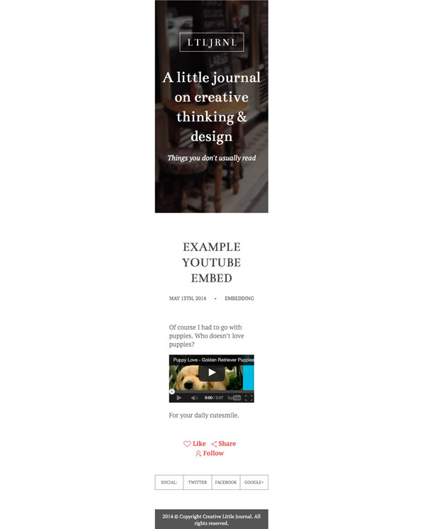
Single posts should look like this:

3. Responsive Tweaks
One of the final things we want to do is ensure iFrame embedded content such as YouTube videos behave responsively, i.e. they scale to fit the available width and preserve their aspect ratio.
This is achieved by adding the following script to your template, right before the <!-- End blog display --> comment:
<script src="//ajax.googleapis.com/ajax/libs/jquery/1.11.0/jquery.min.js"></script> <script> jQuery(document).ready(function($ ){ function responsiveIframe() { $ ('iframe').each(function(){ var iw = $ (this).width(); var ih = $ (this).height(); var ip = $ (this).parent().width(); var ipw = ip/iw; var ipwh = Math.round(ih*ipw); $ (this).css({ 'width': ip, 'height' : ipwh, }); }); } responsiveIframe(); //Call function again if window resized $ (window).resize(function(){ responsiveIframe(); }); }); </script>
We then also need to add some media queries to ensure the layout adjusts itself gracefully along with reduction in viewport size. Add the following to the very end of your style.less file:
@media (max-width: 44rem) { .site_header { img { margin-bottom: 40 * @px; } } .posts_area { padding-left: 40 * @px; padding-right: 40 * @px; } } @media (max-width: 30rem) { .site_header { padding-left: 20 * @px; padding-right: 20 * @px; h1 { font-size: 45 * @px; } p { margin-bottom: 50 * @px; } } .post { padding-top: 50 * @px; &:last-of-type { padding-bottom: 50 * @px; } } .title { font-size: 36 * @px; } .social_links { margin: 0 auto 55 * @px; } .social_col { line-height: 40 * @px; font-size: 12 * @px; } .site_footer { padding: 10 * @px; line-height: normal; } } @media (max-width: 10em) { html { min-width: 10em; } }
With your iframe script and your media queries added, you should now get something like this on a thin viewport:
4. Extras
There are some additional aspects to working with Postach.io themes that we didn’t implement above, but that you might be interested to know about for your own application.
Post Types
Evernote posts can be one of four types; post, page, link or food. To keep things simple we just created one type of display for all, however you may recall we ran a {% if post.type == 'link' %} check to see if there would be a link to append to the post.
Using the same checking methods you can also create an entirely different presentation for each different post type. Here’s some information on each of these post types and how they might form part of your blog.
Post
{% if post.type == 'post' %}
The regular, default post type.
Page
{% if post.type == 'page' %}
Any note tagged with “page”, useful for creating static pages such as “About Me” for example. The item will be pulled out of the list of posts and if you choose you can have its title added to a menu. The method to achieve this will be described shortly.
Link
{% if post.type == 'link' %}
Any item that comes via clipping from someone else’s site with the web clipper then reposting to your blog.
Food
{% if post.type == 'food' %}
I couldn’t quite figure out how to make a post come up as a “Food” post type. I attempted different methods both via Evernote for Mac and Evernote Food for Android.
I couldn’t seem to get anything added to the “Meal” section of Evernote Food to carry across as a post, given I couldn’t associate it with my blog’s notebook. I tried adding to the “My Cookbook” section both via the Web Clipper and via Evernote Food itself, and both attempts were categorized as “Link” post types. I also attempted tagging posts as “food” or “recipe” and had no luck there either.
I’m sure something awesome is baking for the “Food” post type (see what I did there) but for the time being we might just have to wait for more information before we see what it is.
Menus
If you’re using pages on your blog you can also have a menu generated. The following code will take the title of each of your published pages and add it to a nav element with an unordered list of menu links:
{% if pages %} <nav><ul> <li><a href="{{ site.base_url }}">Home</a></li> {% for page in pages %} <li><a href="{{ page.permalink }}" class="{{ set_active(page.permalink) }}">{{ page.title }}</a></li> {% endfor %} </ul></nav> {% endif %}
Disqus Comments
You can also equip your site for conversation by adding the following code below your existing single post code:
{% if site.disqus %} <div class="post_comments"> <div id="disqus_thread"></div> <script> var disqus_shortname = '{{ site.disqus }}'; var disqus_url = '{{site.base_url}}{{ post.permalink }}'; (function() { var dsq = document.createElement('script'); dsq.type = 'text/javascript'; dsq.async = true; dsq.src = 'http://' + disqus_shortname + '.disqus.com/embed.js'; (document.getElementsByTagName('head')[0] || document.getElementsByTagName('body')[0]).appendChild(dsq); })(); </script> </div> {% endif %}
The above will work with the information added to your Postach.io site via the Details tab in your dashboard.
Wrapping Up
You now have your own Postach.io/Evernote powered blog and the ability to create custom themes for it. You can also download the completed theme files via the Download Attachment button near the top of the right sidebar of this site.
Postach.io is already a super interesting platform which is even more compelling when you consider it’s fairly new. I’m very curious to see what else might be in the works for the system. Perhaps in the future we’ll see Evernote plugins to enhance the blogging process, such as Markdown previews and the like.
If you’re an Evernote user, and even if you’re not, I highly recommend giving Postachi.io a whirl to experience an all new kind of blogging.