First, we’ll create the basic structure with minimal markup and the power of CSS pseudo-elements. Then, we’ll use some JavaScript to add some transitional effects as we scroll down the page.
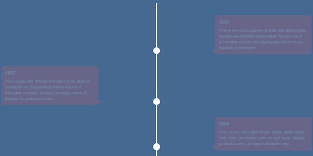
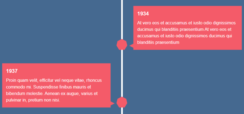
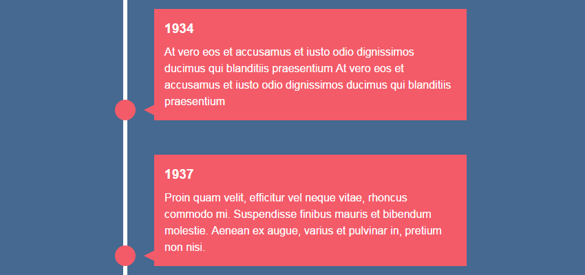
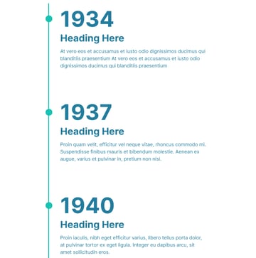
Let’s get an idea of what we’ll be building (check out the larger version on CodePen).
This tutorial has been updated with another timeline version—check out the demo below and the added extra section!
1. HTML Markup
The markup we’ll use is pretty straightforward; a plain unordered list with a div element inside each of our list items. As we’re dealing with events along a timeline, we’ll give each list item a time element to display the year.
Additionally, we’ll wrap the whole thing within a section element with the class of timeline:
1 |
<section class="timeline"> |
2 |
<ul>
|
3 |
<li>
|
4 |
<div>
|
5 |
<time>1934</time> |
6 |
Some content here |
7 |
</div>
|
8 |
</li>
|
9 |
|
10 |
<!-- more list items here -->
|
11 |
</ul>
|
12 |
</section>
|
This gives us the following unstyled output:
2. Adding Initial CSS Styles
After some basic colors etc. (check out the upper section of the CSS in the pen below), we’ll define some structural CSS rules for the list items. We’ll also style the ::after pseudo-element of these items:
1 |
.timeline ul li { |
2 |
list-style-type: none; |
3 |
position: relative; |
4 |
width: 6px; |
5 |
margin: 0 auto; |
6 |
padding-top: 50px; |
7 |
background: #fff; |
8 |
}
|
9 |
|
10 |
.timeline ul li::after { |
11 |
content: ''; |
12 |
position: absolute; |
13 |
left: 50%; |
14 |
bottom: 0; |
15 |
transform: translateX(-50%); |
16 |
width: 30px; |
17 |
height: 30px; |
18 |
border-radius: 50%; |
19 |
background: inherit; |
20 |
z-index: 1; |
21 |
}
|
I’ve removed the content within the list items to make this step clearer, giving us the following:
3. Timeline Element Styles
Now let’s style the div elements (we’ll call them “timeline elements” from now on) which are part of the list items. Again, we style the ::before pseudo-element of these elements.
Also, as we’ll see in a moment, not all divs share the same styles. Thanks to the :nth-child(odd) and :nth-child(even) CSS pseudo-classes, we’re able to differentiate their styles.
Have a look at the corresponding CSS rules below:
1 |
.timeline ul li div { |
2 |
position: relative; |
3 |
bottom: 0; |
4 |
width: 400px; |
5 |
padding: 15px; |
6 |
background: #F45B69; |
7 |
}
|
8 |
|
9 |
.timeline ul li div::before { |
10 |
content: ''; |
11 |
position: absolute; |
12 |
bottom: 7px; |
13 |
width: 0; |
14 |
height: 0; |
15 |
border-style: solid; |
16 |
}
|
Then some styles for our odd elements:
1 |
.timeline ul li:nth-child(odd) div { |
2 |
left: 45px; |
3 |
}
|
4 |
|
5 |
.timeline ul li:nth-child(odd) div::before { |
6 |
left: -15px; |
7 |
border-width: 8px 16px 8px 0; |
8 |
border-color: transparent #F45B69 transparent transparent; |
9 |
}
|
Then finally the styles for our even elements:
1 |
.timeline ul li:nth-child(even) div { |
2 |
left: -439px; |
3 |
}
|
4 |
|
5 |
.timeline ul li:nth-child(even) div::before { |
6 |
right: -15px; |
7 |
border-width: 8px 0 8px 16px; |
8 |
border-color: transparent transparent transparent #F45B69; |
9 |
}
|
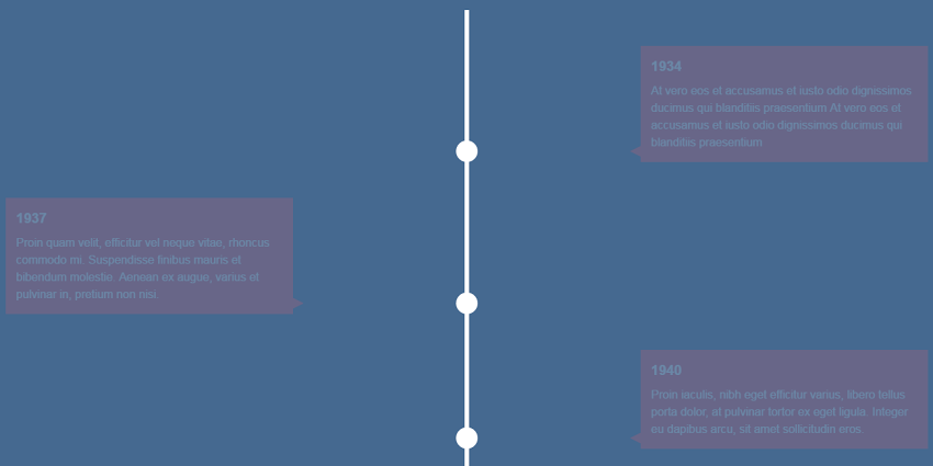
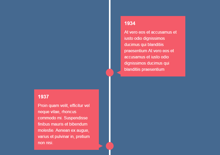
With these rules in place (and our HTML once again complete with content) our timeline looks as follows:
The main difference between the “odd” and “even” divs is their position. The first ones have left: 45px while the second ones left: -439px. To understand the positioning of our even divs, let’s do some simple maths:
Width of each div + Desired spacing – Width of each list item = 400px + 45px – 6px = 439px
The second, less important difference is the generated arrow of their pseudo-element. That means the pseudo-element of each of the “odd” divs has a left arrow, whereas the pseudo-element of each of the “even” divs displays as a right arrow.
4. Adding Interactivity
Now that the basic structure of the timeline is ready, let’s figure out the new requirements:
- By default, the timeline elements (
divs) should be hidden. - They should appear when their parent (list item) enters the viewport.
The first task is relatively straightforward. The second one, though, is a bit more complicated. We need to detect if the target elements (list items) are fully visible in the current viewport, then if that happens we reveal their child. To implement this functionality, we won’t use any external JavaScript library (e.g. WOW.js or ScrollReveal.js) or write our own complex code. Happily enough, there’s a popular thread on Stack Overflow about this issue. So first let’s take advantage of the proposed answer to test whether an element is visible in the current viewport or not.
Here’s the simplified function that we’ll be using:
1 |
function isElementInViewport(el) { |
2 |
var rect = el.getBoundingClientRect(); |
3 |
return ( |
4 |
rect.top >= 0 && |
5 |
rect.left >= 0 && |
6 |
rect.bottom <= (window.innerHeight || document.documentElement.clientHeight) && |
7 |
rect.right <= (window.innerWidth || document.documentElement.clientWidth) |
8 |
);
|
9 |
}
|
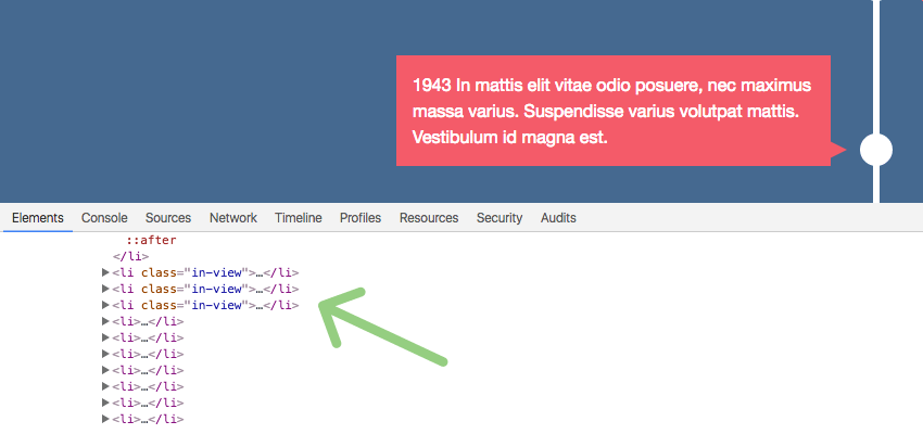
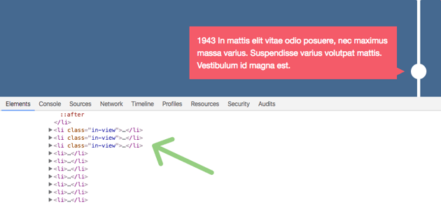
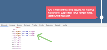
Add Class When in View
Next, we add the in-view class to the list items which are visible in the current viewport.
Note: we must test if they’re visible in the following cases:
- When the page loads
- As we scroll down
If needed, we can make some additional tests (such as when the size of the browser window changes).
In our example, here’s the code we use:
1 |
var items = document.querySelectorAll(".timeline li"); |
2 |
|
3 |
// code for the isElementInViewport function
|
4 |
|
5 |
function callbackFunc() { |
6 |
for (var i = 0; i < items.length; i++) { |
7 |
if (isElementInViewport(items[i])) { |
8 |
items[i].classList.add("in-view"); |
9 |
}
|
10 |
}
|
11 |
}
|
12 |
|
13 |
window.addEventListener("load", callbackFunc); |
14 |
window.addEventListener("scroll", callbackFunc); |
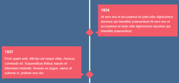
Now that we’ve added our JavaScript, if we reload the page, we should see a result similar to this:
Hiding and Revealing
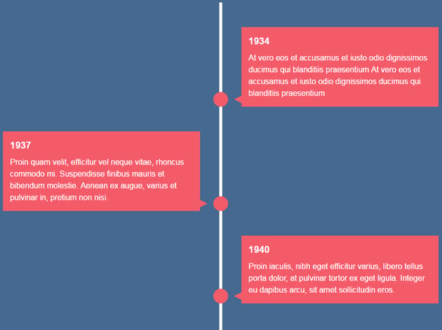
Let’s now revisit our initial requirement. Remember, by default, all divs should be hidden. To achieve this, we use the visibility and opacity CSS properties. Furthermore, we use the translate3d() function to move them 200px away from their original position. As long as their parent is in view, we’ll reveal them and remove the predefined offset. In this way, we create nice slide-in effects.
Lastly, another small thing we’ll do when a li is within the viewport is to change the background color of its ::after pseudo-element.
The following styles take care of all that:
1 |
.timeline ul li::after { |
2 |
background: #fff; |
3 |
transition: background .5s ease-in-out; |
4 |
}
|
5 |
|
6 |
.timeline ul li.in-view::after { |
7 |
background: #F45B69; |
8 |
}
|
9 |
|
10 |
.timeline ul li div { |
11 |
visibility: hidden; |
12 |
opacity: 0; |
13 |
transition: all .5s ease-in-out; |
14 |
}
|
15 |
|
16 |
.timeline ul li:nth-child(odd) div { |
17 |
transform: translate3d(200px,0,0); |
18 |
}
|
19 |
|
20 |
.timeline ul li:nth-child(even) div { |
21 |
transform: translate3d(-200px,0,0); |
22 |
}
|
23 |
|
24 |
.timeline ul li.in-view div { |
25 |
transform: none; |
26 |
visibility: visible; |
27 |
opacity: 1; |
28 |
}
|
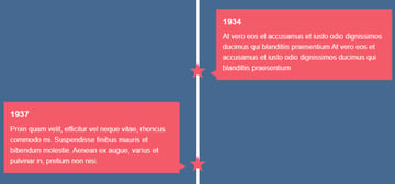
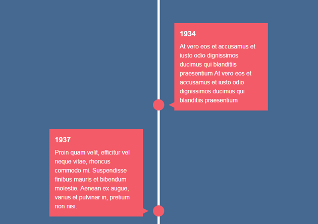
The following visualization shows the initial state of our timeline. Here you’re able to see the timeline elements because I’ve given them a touch of opacity just to illustrate where they’re initially located:
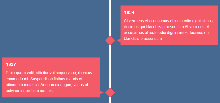
And here’s the final state of the timeline:


5. Customizing the Circles
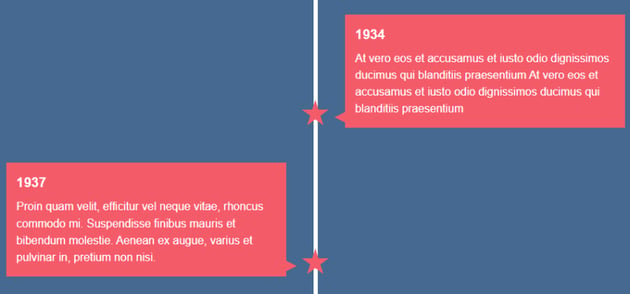
By default, the ::after pseudo-element of each timeline element will look like a circle. However, let’s give some choices for customizing its initial appearance.
Most importantly, we’ll use the clip-path property to create some complex shapes. But happily enough, we won’t need to create them from scratch. We’ll take advantage of Clippy, a clip-path generator.
- In case you want a star instead of a circle, add the
timeline-clippyandtimeline-starclasses to the timeline like this:
1 |
<section class="timeline timeline-clippy timeline-star"> |
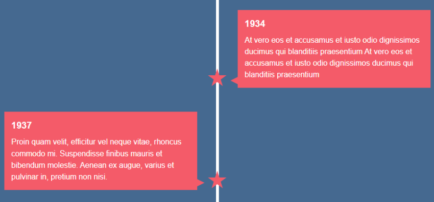
- In case you want a rhombus instead of a circle, add the
timeline-clippyandtimeline-rhombusclasses to the timeline like this:
1 |
<section class="timeline timeline-clippy timeline-rhombus"> |

- In case you want a heptagon instead of a circle, add the
timeline-clippyandtimeline-heptagonclasses to the timeline like this:
1 |
<section class="timeline timeline-clippy timeline-heptagon"> |

Clippy lets you create even more shapes, so be sure to check its site if you want something different.
If you still want to keep the circles, there’s also the possibility to give them some infinite scale animation by using the timeline-infinite class like this:
1 |
<section class="timeline timeline-infinite"> |

Of course, you can also combine this animation with the aforementioned custom shapes like this:
1 |
<section class="timeline timeline-clippy timeline-star timeline-infinite"> |

Here are all the associated styles:
1 |
.timeline-clippy ul li::after { |
2 |
width: 40px; |
3 |
height: 40px; |
4 |
border-radius: 0; |
5 |
}
|
6 |
|
7 |
.timeline-rhombus ul li::after { |
8 |
clip-path: polygon(50% 0%, 100% 50%, 50% 100%, 0% 50%); |
9 |
}
|
10 |
|
11 |
.timeline-rhombus ul li div::before { |
12 |
bottom: 12px; |
13 |
}
|
14 |
|
15 |
.timeline-star ul li::after { |
16 |
clip-path: polygon( |
17 |
50% 0%, |
18 |
61% 35%, |
19 |
98% 35%, |
20 |
68% 57%, |
21 |
79% 91%, |
22 |
50% 70%, |
23 |
21% 91%, |
24 |
32% 57%, |
25 |
2% 35%, |
26 |
39% 35% |
27 |
);
|
28 |
}
|
29 |
|
30 |
.timeline-heptagon ul li::after { |
31 |
clip-path: polygon( |
32 |
50% 0%, |
33 |
90% 20%, |
34 |
100% 60%, |
35 |
75% 100%, |
36 |
25% 100%, |
37 |
0% 60%, |
38 |
10% 20% |
39 |
);
|
40 |
}
|
41 |
|
42 |
.timeline-infinite ul li::after { |
43 |
animation: scaleAnimation 2s infinite; |
44 |
}
|
45 |
|
46 |
@keyframes scaleAnimation { |
47 |
0% { |
48 |
transform: translateX(-50%) scale(1) |
49 |
}
|
50 |
50% { |
51 |
transform: translateX(-50%) scale(1.25); |
52 |
}
|
53 |
100% { |
54 |
transform: translateX(-50%) scale(1); |
55 |
}
|
56 |
}
|
6. Going Responsive
We’re almost ready! The last thing we have to do is to make our timeline responsive.
First, on what we’ll refer to as “medium screens” (>600px and ≤900px), we only make one small modification. Specifically, we decrease the width of the divs.
Here are the rules that we have to change:
1 |
@media screen and (max-width: 900px) { |
2 |
.timeline ul li div { |
3 |
width: 250px; |
4 |
}
|
5 |
.timeline ul li:nth-child(even) div { |
6 |
left: -289px; /*250+45-6*/ |
7 |
}
|
8 |
}
|
In such a case, the timeline looks like this:

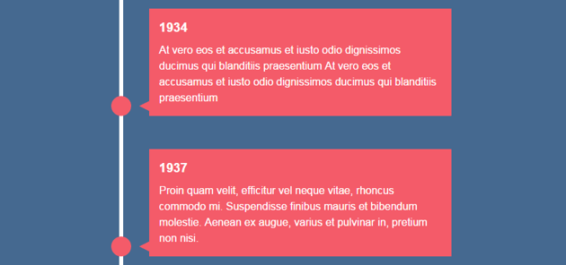
On small screens, however (≤600px), all timeline elements look the same; there are no differences between the “odd” and “even” divs. Again, we have to overwrite some CSS rules:
1 |
@media screen and (max-width: 600px) { |
2 |
.timeline ul li { |
3 |
margin-left: 20px; |
4 |
}
|
5 |
|
6 |
.timeline ul li div { |
7 |
width: calc(100vw - 91px); |
8 |
}
|
9 |
|
10 |
.timeline ul li:nth-child(even) div { |
11 |
left: 45px; |
12 |
}
|
13 |
|
14 |
.timeline ul li:nth-child(even) div::before { |
15 |
left: -15px; |
16 |
border-width: 8px 16px 8px 0; |
17 |
border-color: transparent #F45B69 transparent transparent; |
18 |
}
|
19 |
}
|
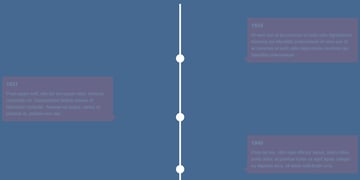
On smaller screens the timeline looks as follows:

Note: on small screens, we use the vw unit to specify the width for the timeline elements. There aren’t any special reasons behind this approach. We could equally have used percentages or pixels.
Browser Support
The demo works well in most recent browsers and devices. On iOS devices, however, the timeline elements are always visible, instead of appearing as their parent enters the viewport.
From my testing, I’ve seen that on those devices the window.innerHeight and document.documentElement.clientHeight properties don’t return the actual viewport height. Specifically, they return a much larger number. As a result of that inconsistency, all list items receive the in-view class when the page loads.
Although it’s not a big deal (you may want the animations only on large screens), if you know more about this issue or you’ve seen it before, don’t forget to leave details via social media.
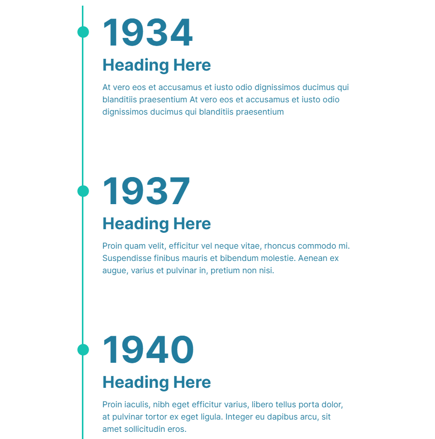
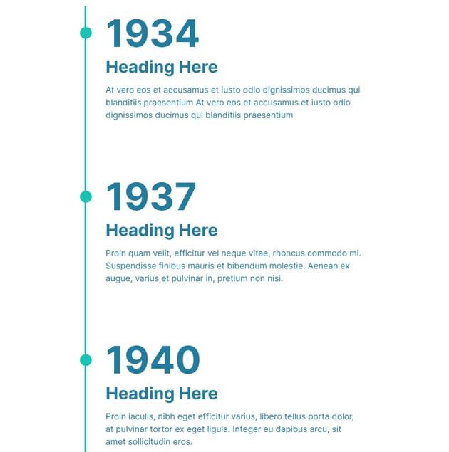
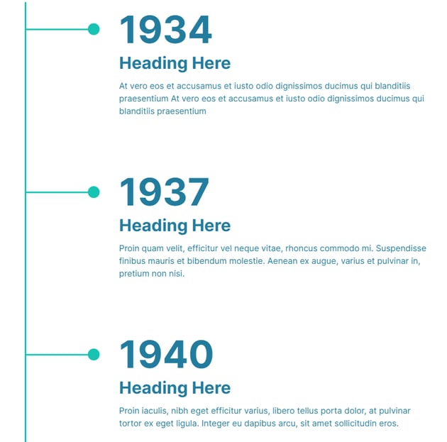
EXTRA: Timeline v2
Let’s now build an alternative timeline variation :)
Below you can see the timeline layout across various screens.

Concerning the development, let’s highlight the key aspects:
- We’ll add a little bit of extra markup within the timeline elements.
- We’ll use the Intersection Observer API to animate the contents of each timeline element as they become visible on scroll. As a reminder, we’ve used this API many times in previous tutorials to create effects on scroll, so I won’t discuss how the JavaScript code works.
- We’ll use proper delays to create the sequential animations. If you need something more elegant, consider using an animation library like GSAP. There are many tutorials about it here in Tuts+.
Here’s our timeline—for a better experience, be sure to view it from a large screen:
Conclusion
In this tutorial, we created a responsive vertical timeline. We’ve covered a lot of things, so let’s recap:
- By using a simple unordered list and CSS pseudo-elements, we managed to build the main structure of our timeline. One downside to this approach though is that, as I’ve already mentioned in another article, CSS pseudo-elements aren’t 100% accessible, so keep that in mind.
- We took advantage of a code snippet taken from a popular thread on Stack Overflow to test whether the list items are in view or not. Then, we wrote our own CSS to animate their child elements. Alternatively, we could have used a JavaScript library or written our own code.
But we didn’t stop there! As a bonus, we built an alternative fully responsive vertical timeline component that you can use in different scenarios. If you like it, don’t forget to express your ❤!
I hope you enjoyed the tutorial and you’ll use any of these timelines as the basis for building something interesting. You may also like reading my follow-up tutorial Building a Horizontal Timeline With CSS and JavaScript – give it a try!
If you have any questions, let me know. As always, thanks a lot for reading!