
Composition is about laying out all your ideas and design elements into a whole; composing your design. We’re going to combine all of the previous lessons that we’ve covered, and because of that it makes composition one of those really difficult aspects of designing anything.
Creating a good composition will boost the users’ experience when navigating around your site and will help mould a better design overall. We’re aiming for alignment, consistency and strong unity. Composition also helps us to add a visual relevance to our layouts so that we can help our users understand more about their journey on a website, where they should head next.
Composition is arguably the most important part of your design process – full stop.
As we learned at the beginning of this series, to design is to “decide upon the look and function of (a building, garment or other object), typically by making a detailed drawing of it” – and composition means to “write or create”. Therefore, when we put these two together, in our composition stage we are composing (creating) the look and function of our design – essentially, we are now putting everything together.
Common Compositions and Layouts
In traditional print design, there are a lot of print compositions and layouts that have proven themselves to work well over time. Many of these are now finding their way onto the web – and with good reason. Although it can be difficult to translate these layouts into absolute terms for designing on the web, it can at least lend us a little idea and focus to the layouts we might want to try our hand at creating.
There are many composition types or popular layouts around – but I’m going to talk about just a few here.There are so many resources online for looking at these further, and while these traditional layouts are important I want to also go into more detail on other aspects of composition.
Single Visual
First up is the single visual layout.
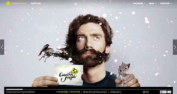
This is quite simple really – it’s where there is one major aspect of a design which acts as the single visual focus. For example, you might create a design with a large photograph in the background, with plenty of whitespace and simple typography overlaid.
Z Layout
The Z-layout is quite self-explanatory and relates heavily to the layout that you choose for your design elements.
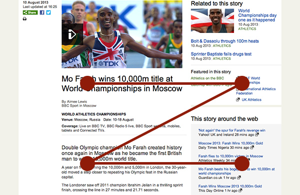
Simply put, the Z layout follows the natural pattern that our eyes might normally take when we’re scanning over a website. If you can’t already imagine it, this is sometimes in research shown to be in the pattern of the letter “Z” – flowing from the top left, along to the right, down diagonally and then across again.
This can be quite useful when you’re thinking of where to place your items so that they are relevant to the user. It can help you give weight to important elements.
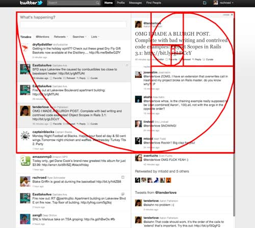
Rule of Thirds
A design principle used in photography and film-making (and much more), the rule of thirds is a good compositional layout for designing for the web.
The rule of thirds is a guideline which proposes that an image should be split into nine equal parts (three across, three down) with elements of that image or design aligning to the edges of each of these parts. This is particularly useful in web design, as it can help us create better proportions and layouts in our designs.
The rule of thirds is a great compositional tool and layout. While not something that should always strictly be followed, it can be a great aid in designing with more balance. It can also be used alongside other visual or composition layouts, such as the single visual, or even when creating your grid systems.
Golden Ratio (Section)
Heavily involved with mathematics, the Golden Ratio (or Golden Section if you’d prefer to call it that) is one of the most recognisable (in name, at least) composition layouts or tools in any form of design.
Often thought to be created by the Ancient Greeks (clever folk, they were) the Golden Ratio describes the relationship between two proportions. The Golden Ratio is 1.618(03398875…) and it seems that a lot of elements in nature are often found corresponding to this ratio. It’s therefore always something that is more reassuring and pleasing to our human eyes.
Because it is such a familiar pattern to us, it makes sense to try and use the golden ratio in our designs; to create an harmonious balance that just seems to feel right and make sense.
An easy way we can implement this in our designs is to take the golden ratio number (1.618) and use a tiny bit of maths. In our design we might have an area where we, for example, want to put some content and a small aside or sidebar. Just splitting this up in our designs without thinking about it may be easy – particularly if you have a simple grid system in place – but when we think about it in terms of the golden ratio, we might get a better looking outcome in the end.
So we have this area that we want to split into two, using our golden ratio number. To do this, measure the width of the available area (let’s go with 950px for the sake of this article) and divide it by 1.618.
If our available width is 950px, this means our first calculation (for our main content) should be: 950 / 1.618 = 587.144622991 (which we’ll round down to 587px).
Next, we’ll simply subtract that figure from our original available width to get our second width, for the sidebar or aside: 950 – 587 = 363px.
As our main content is more relevant and we want that to be the focus in this part of the design, we can use the larger of the two final figures for the width of that content. We can then use the smaller figure for our aside or sidebar. And there we have it – our perfectly golden ratio’d up design!
Note: Extrapolating this relationship is all part of creating a modular scale for your design.
Space
Composition is also about space. This doesn’t mean that you leave vast, empty areas in your designs, but is instead about being clever with the space that you have available to you. Harnessing whitespace is as much about providing focus for your content, as leaving empty areas.
That said, use padding and whitespace to your advantage – nobody will find it easy to navigate a website that is cluttered, has little hierarchy and where the elements are cramped and have no breathing room. Instead, introduce space into places that you can to allow for a better overall experience for your designers.
Next up…
Having introduced ourselves to the concept of composition, in the next section we’ll further examine space in our designs. See you there!