A long time ago, in a movie studio quite far away, George Lucas and his team produced the first Star Wars movie in 1977. Today, with a slew of popular movies and TV series having been produced across almost half a century, Star Wars typography has become iconic.
Today we’re taking an X-wing-fighter ride through Star Wars font history, where we will take a look at various logos and posters, and of course that famous Star Wars opening crawl text.
What Is the Font for Star Wars?
Let’s start with the original 1977 film. Here’s a logo you’ll recognise:
But who designed it, and what is the Star Wars font called? Interestingly, the now-iconic logo was not the first choice. An earlier Star Wars logo was created by Dan Perri, a designer who had worked on films like The Exorcist and Taxi Driver. His design used large block letters, with a perspective designed to mimic the Star Wars opening crawl text:

The logo we all know and love today as the “Star Wars font” came from a promotional brochure designed by Suzy Rice. George Lucas reportedly told her to make a logo that would look “very fascist” and would intimidate the viewer.
So what is the Star Wars font called? You might be surprised to learn that it’s based on plain old Helvetica Black. Rice created an outline, all-caps version of the font and made various modifications, such as joining the “S” and “T” of “Stars” and the “R” and “S” of “Wars”, as well as flattening the “W” and extending the “R”. With these simple but effective modifications, movie title history was made.
Find out more about the development of the Star Wars letter font and other famous movie logos:
Of course, the film also used other fonts. What was that Star Wars title crawl font, for example?
Star Wars Title Crawl Font and Captions
Each Star Wars film begins with a text introduction setting the scene. The text famously crawls across the screen before fading away into the distant stars.

The font used here is Trade Gothic Bold, a clean sans serif designed by Linotype in 1948.
Remember the scenes when characters were speaking in an alien language? The English subtitles for their speech also appeared in Trade Gothic Bold.
Later Star Wars Typefaces
Of course, there have been many more Star Wars movies and TV spinoffs over the years since 1977. Here’s a rundown of the main developments in Star Wars typography.
The Empire Strikes Back Font
As with the original Star Wars movie, the logo for the 1980 sequel is a custom design, not a font in itself. So there is no “Empire Strikes Back font” per se. What we have, instead, is a logo that’s based on the same Helvetica Bold text as the original film, but with some major modifications.
.jpg)
As you can see, this logo cleverly incorporates Suzy Rice’s original Star Wars logo and uses it as the frame for the angled text of the movie title, “The Empire Strikes Back”. Again, there are some major modifications to the text, with the top arm of the “E” of “Empire” extended all the way across to form a top bar, and the tails of various letters being curved. These changes, along with the angled text, make the logo feel quite dynamic and futuristic.
Return of the Jedi Font
Would you be surprised to learn that the Return of the Jedi font is just the same Times New Roman that spawned a gazillion Word documents and PowerPoint presentations?
Again, of course, the designers made modifications to create an effective logo. We see Rice’s now-familiar logo being used in the frame again to reinforce the viewer’s sense that this is part of a series. The “J” of “Jedi” is extended beyond the bottom frame to emphasise that this is the most important word in the title, while the less-important words “of the” are reduced in size. These changes make for a satisfying and effective logo.

But when it comes down to it, the Return of the Jedi font is still pretty much Times New Roman!
Fonts Used for the Star Wars Prequels
After a long gap between 1983 and 1999, Star Wars fans were finally able to watch the three prequel films that Lucas had originally planned back in the 1970s:
- Episode I: The Phantom Menace (1999)
- Episode II: Attack of the Clones (2002)
- Episode III: Revenge of the Sith (2005)
Unlike with the original trilogy, the posters and text for these movies are all very consistent in their design.
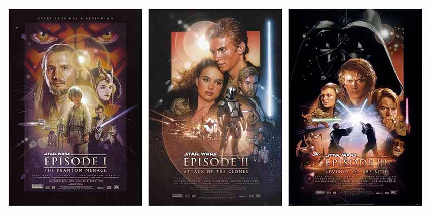
Notice the continuity between the three designs and the references back to the original series. Suzy Rice’s original logo is still in use, and the title text uses the same colour and Times New Roman style serif font as Return of the Jedi. Also notice that the episode numbers are given more prominence than the actual titles, reminding viewers that these are prequels, not sequels.
Mandalorian Fonts
Now let’s do a little hyperspace jump forward to 2019 and the appearance of the Disney+ TV series The Mandalorian.

So what font is the Mandalorian logo? Again, it was a custom design for the TV series, but Dan Zadorozny of Iconian Fonts has created a version that’s free for non-commercial use. So in this case, we can actually give the precise name of a Star Wars font! It’s called Mandalore, and you can download it from Iconian Fonts.
Star Wars Andor Font
There are so many Star Wars spinoffs these days, and I don’t want to bore you by looking at every single one, but let’s cover one more recent example. What is the font for Star Wars: Andor?
#/media/File:Andor.svg)
Even so many years later, we can still see Suzy Rice’s original Star Wars letter font in use on this poster, but the “Andor” text is a highly customised sans serif typeface with a grunge texture applied. There’s no official source for the Star Wars Andor font name, but it could be a modified version of Agency FB. If you remove the bar of the “A” and make the letters “DOR” blend into each other as in the poster above, it looks like a good match.
Download Star Wars Font Alternatives
I hope you’ve enjoyed this look at Star Wars typeface design. You can find hundreds of fonts inspired by Star Wars in the font library on Envato Elements. They all come with full licensing, so you can download them and use them in your projects.