The Futura font is one of the most famous geometric fonts, and it’s still popular to this day. In this article, we tell you all about the Futura font history and its impact on the design world.
What Is Futura?
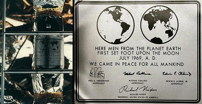
Designed in 1927, Futura is still considered a modern font that conveys progress. We’ve seen it everywhere from cars to furniture stores to the Moon. That’s correct: the Futura font was used on the plaque that was left on the Moon in the Apollo 11 mission. In this article, we’ll talk all about the Futura font history, its conception, the font anatomy, its influence through time, and the endless versions that exist.
If you’re looking for a Futura display font dupe, be sure to check out Envato Elements and GraphicRiver. There are many options for font fanatics like us!
Futura Font: Quick Facts
Before we dive deep into the Futura history, let’s take a look at some quick facts to get us started:
- A geometric sans serif, designed in 1927 by Paul Renner.
- Considered a progressive font that represented the European Avante-Garde.
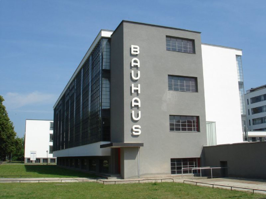
- It was representative of the Bauhaus ideology, function over form. Contrary to popular belief, the Futura font was not designed in conjunction with the famous school.
- Futura was used on the plaque left on the Moon by the Apollo 11 mission in 1969.
- The Futura font is still one of the most important typefaces being used to this day.
- The Futura font was marketed as “die Schrift unserer Zeit,” or in English, “the font of our time” by the Bauer type foundry.
- Over the years, there have been many versions of Futura from type foundries.

Futura Font History
Futura was designed by renowned German type designer Paul Renner in 1927. It was commissioned as a typeface by the Bauer Type Foundry for the New Frankfurt project, which was an affordable modernist housing project. The typeface was based on the geometric Bauhaus design style that had its boom between 1919 and 1933. The Bauhaus ideology was based on simple, modern, and functional geometry. Function over form resulted in a typeface that didn’t include unnecessary ornamental elements.
Renner wasn’t involved with the Bauhaus but did share the same ideology of stripping forms down to their essence. The Futura font resulted in clean, simple shapes that conveyed a modern and forward-looking idea. It became instantly popular upon its release, and now it’s pretty much everywhere.
The Futura Font Anatomy
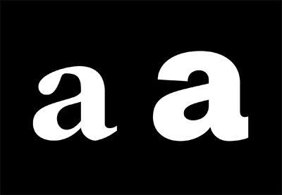
The font uses basic geometric forms and even-width strokes that eliminate any type of contrast. Lowercase letters like the ‘a’ are the exception when it comes to the even width. Ascenders and descenders in the lowercase letters are tall and go over the height of uppercase characters. This makes the font look elegant and sets it apart from other geometric fonts. That also implies that in a paragraph of text, the font needs more line spacing.
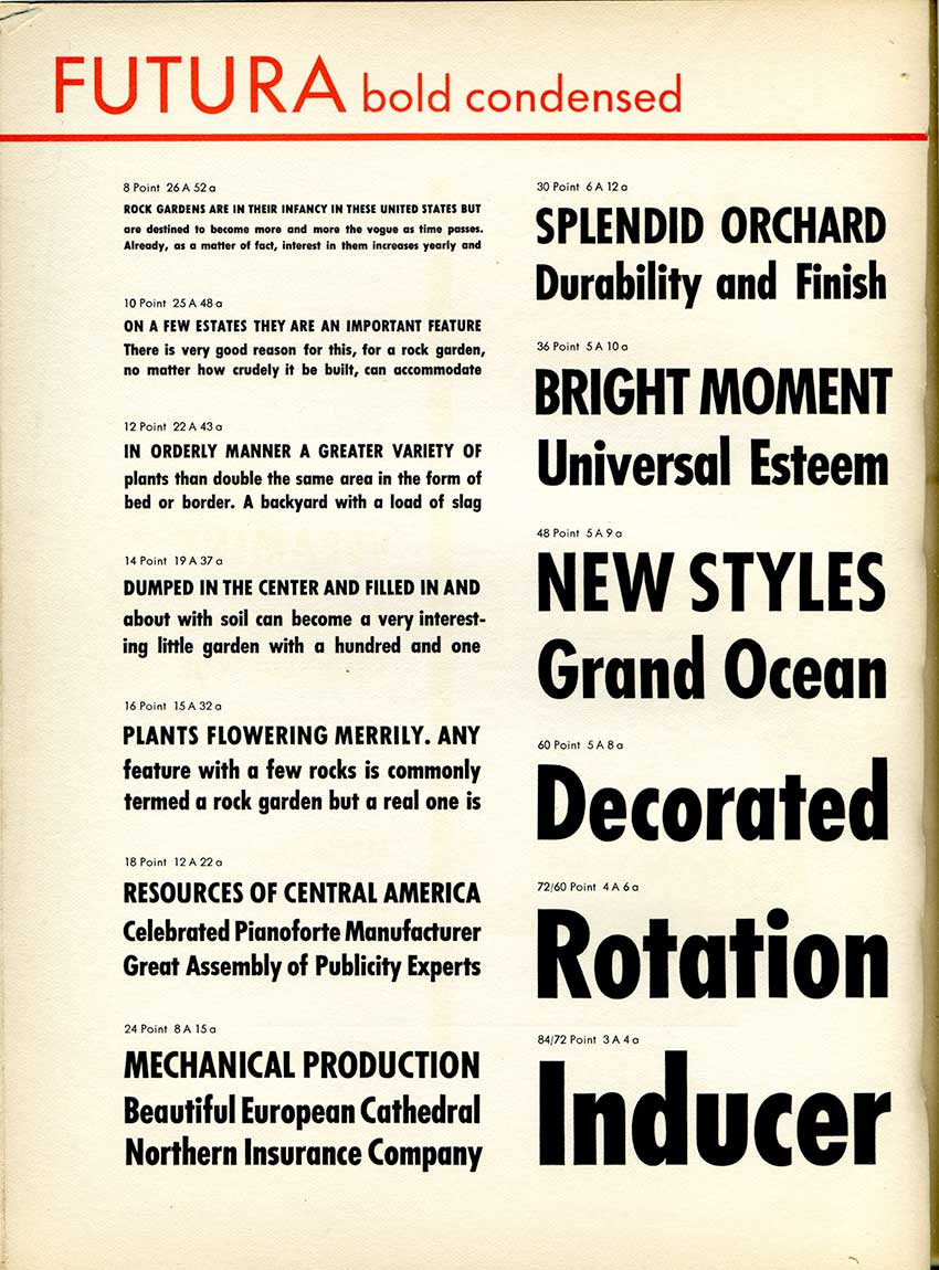
The Futura display font can create particularly catchy headlines. Over the years, many versions have emerged from different type foundries. Families like the Futura condensed font or the Futura bold font can be used on display copy. The font has a low x-height, making it slightly difficult to read in long-form paragraphs of text.

The Futura Font in History
In Nazi Germany, typefaces were one of the strongest ways of showing identity. Part of this identity was the German Blackletter (Fraktur), which was preferred over Roman letters and became the standard font used for texts. Modern typefaces, including Futura, were rejected. The Nazi Party used the Futura font as a way to shame modern art. Then, in the 1940s, the Nazi regime considered Blackletter too similar to Hebrew and banned it. The new standard fonts included Futura because it had a higher level of legibility over Blackletter fonts.
During WWII, many different modern-looking sans serifs were used by the American military. People chose fonts from metal type, and Futura stood out from the crowd. When NASA later needed a font for the plaque that Apollo 11 would leave on the moon, they chose Futura.
Futura in Advertising and Design
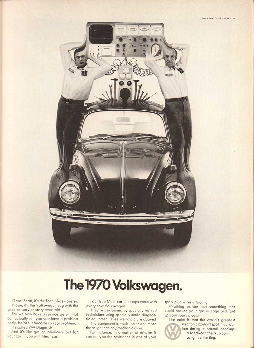
Futura is part of a group of fonts that work well both as body copy and display. You’ve probably seen Futura being used in many different industries, from film posters to advertising and album covers. The Futura font is used in many ads and logos, including Ikea (before its brand redesign in 2010), Absolut Vodka, Domino’s Pizza, Nike, and Volkswagen. In movies, it’s been used in V for Vendetta, American Beauty, 2001: A Space Odyssey, Gravity, and in many of Wes Anderson’s films.
The famous artist Barbara Kruger layers the Futura bold font, in the oblique version, over her artwork. She challenges viewers to reflect on sexism and consumerism. A Cyrillic version of Futura Medium font was released by Anatoli Muzanov for the 1980 Summer Olympics. Another example using the Futura Medium font is the comic strip Barnaby and the science-fiction film City of Embers.
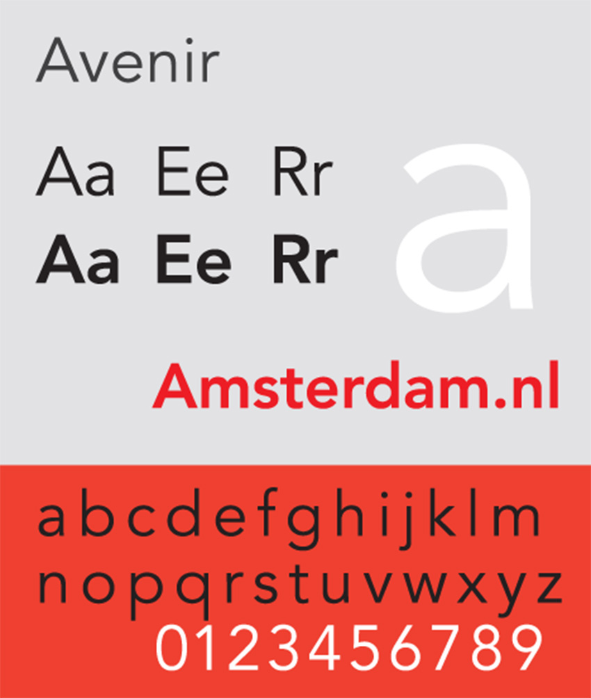
Futura had great commercial success and inspired many other geometric sans serif typefaces. More recently, we’ve seen Avenir and Brandon Grotesque. Shortly after its release, Futura had already been replicated to adapt to American demands. Vanity Fair redesigned its magazine with an all Futura version in the late 1920s. Vogue commissioned a custom version of Futura for its own redesign. Other type foundries like Linotype commissioned W.A. Dwiggins to design a typeface that was loosely based on geometric forms but with a humanistic style. His version was called Metro. Within a few years, many type foundries had versions of the Futura font in their catalogs.
More recently, the Futura font has been redrawn and upgraded by many type foundries. URW++ has released several families, a Futura book font, and a Futura light font version. ParaType foundry has also released different weights of Futura and added Cyrillic characters. Some versions like Futura PT include seven weights, a Futura book font, medium, bold, and extra bold for condensed fonts. Futura Futuris includes a Futura light font weight, along with three other weights and condensed fonts. This last typeface also includes black in reverse characters.
The Futura Font Is Versatile
The Futura font includes an extensive family of different fonts and weights, making it incredibly versatile for any project. The typeface works quite well in both print and digital copy and display copy. It’s one of the most popular typefaces in the world, but its uses are different than the typical Times New Roman or Helvetica. Many aerospace-inspired movies use it on posters, album covers, car advertising, etc.
In metal type, a Futura Bold version was designed along with many weights. The Futura Condensed font is a condensed version of the original Futura font family. The family was released between 1930, and the last weight to be released was the light and light oblique in the 1950s. Futura Display used angular strokes compared to the regular font family. The letterforms look more rectangular. This version was used in the Star Trek novels, and a variant of it has been used by the Canadian Tire Corporation.
In digital, the font has been reissued and redrawn by many type foundries, adding their own fixes and features to it, so there are many different versions of Futura. Additionally, there are revival versions in which some characters can have slight variations. Many of these versions have a Futura webfont available to use.
Volkswagen’s VAG Rounded font resembles the essence of Futura; we could call it a Futura round bold font. This geometric sans serif was designed as part of the corporate brand. Initially, Volkswagen used Futura as its typeface. Once the company merged with Audi, the company envisioned itself as an umbrella company for different brands. Volkswagen wanted a distinct typeface and started developing its own rounded Futura, but it stopped using this version in the early 1990s. The original version of the Futura round bold font is available today through Adobe Systems.
Futura is a great retro-futuristic font. Since its creation, it has been used for advertising and editorial design—anywhere from display copy to long-form copy, as long as you typeset it correctly. The long ascenders/descenders require more line spacing than a regular serif font.

Conclusion
The Futura font is just as popular as Helvetica. This versatile, modern, and geometric font was created to reflect the industrial age of today and tomorrow. After more than 90 years, Futura is still being used and is one of the most favored fonts for forward-looking brands. Throughout the years, it has made appearances everywhere from Nazi propaganda to fashion and automotive brands. The Futura font was even the first font to go to the Moon during the Apollo 11 mission. While some may say it’s overused, one thing is for sure: it’s timeless, concise, and gets the job done.
We hope you enjoyed this Futura font history article. Do you have a favorite font that has stood the test of time? Let us know in the comments below!
If you’re looking for high-quality assets similar to the Futura web font, be sure to check out Envato Elements and GraphicRiver.
If you liked this Futura history article, you might like:
 TypographyA Brief History of Type
-
FontsA Brief History of Display Fonts
-
FontsEverything You Wanted to Know About Helvetica
-
Typography10 Typefaces That Changed the World
-
FontsWhat Is a Monospaced Font?
-
FontsThe Rise of the Sans Serif