In this roundup we’ll take a look at some important things to consider when building an online photography portfolio with WordPress. We’ll go over eight tips and ideas, simultaneously looking at some top selling themes from Envato Market to help demonstrate each point. Say cheese!
1. Introduce Yourself
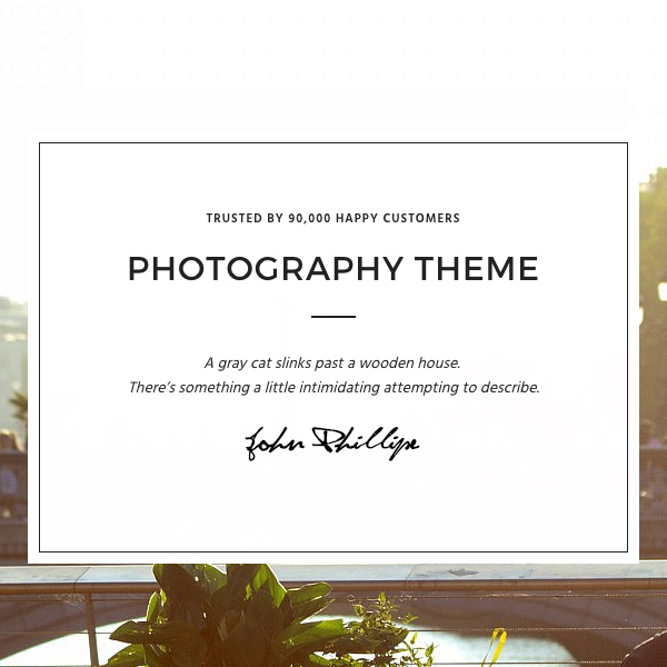
Emotional design is hugely important on the web; add the “human element” to your portfolio and your visitors will more likely connect with the work you show them. Make sure they know who they’re dealing with, who’s responsible for the photos, and who it is they’ll need to get in touch with if they want to know more.
The Responsive Photography Theme by ThemeGoods offers a homepage layout which does this really well. Your name, your signature, a touch of personality–up front and centre.
2. Let Your Photos do the Talking
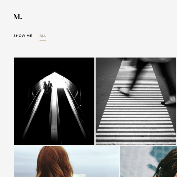
It’s important that nothing distracts visitors from the photography you’re presenting. Don’t overwhelm your wonderful images by using colors and typography with overpowering character.
Turin is a WordPress theme which does a great job of this. Clean and elegant, it gets out of the way and gives the photography room to shine.
3. Consider Your Target Audience
Do you specialize in landscapes? Night photography? Product images? Perhaps you’re a wedding photographer, or make it your business to make pets look amazing? Whatever your niche, be sure your collection reflects what you do and your portfolio website conveys the mood your potential clients will want to see.
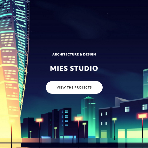
MIES, an “avant-garde architecture WordPress theme” is tailored towards (guess) architectural photography. It presents full screen images, along with other thumbnails and commentary from each project.
4. Give Your Photos Context
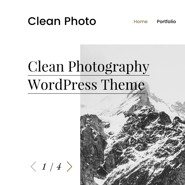
We discussed finding that balance, where portfolios look great but don’t get in the way of the content. However, sometimes it’s necessary to give your photos more context, by presenting them in a stylized way, and perhaps with additional resources such as stories, location details etc. Take travel and adventure photography for example. I’m a huge fan of magazines like www.sidetracked.com and www.thefieldmag.com whose beautiful photos would lose much of their power without the accompanying essays.
Why not try something similar, using Clean Photo–a magazine style theme from wphunters?
5. Performance Matters
We say it almost daily at Envato Tuts+ Web Design; performance really does matter. We’re dealing with photography portfolios here, so there’s a high risk of building slow, unwieldily beasts, weighed down with heavy images and other assets.
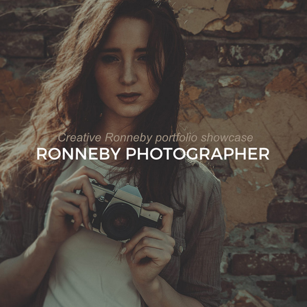
Make sure you check how a theme’s demo performs; something like Ronneby (self-proclaimed “High-Performance WordPress Theme”) does very well out of the box.
A test on Pingdom gives it 91 out of 100; the homepage loads in a little over two seconds.

Saying that, at 2.6Mb things could probably be improved further, so it’s always up to you to do your best and keep your WordPress website in trim. Consider using:
6. Keep it Flexible
Separating presentation from functionality (by letting theme files take care of the way things look, while plugins handle the inner workings) is an important aspect of quality WordPress themes. When this isn’t adhered to you may inadvertently lock your content to one theme, unable to change in the future without complex data migration.
Cr3ativThemes are one band of theme developers who insist on keeping things separate. Here’s Rare, their Material Design theme which may suit your photography portfolio needs just perfectly.

7. Make the Most of Hi Resolution
With many devices offering hi-res screens (such as retina) there’s a good chance your visitors will be viewing your work in glorious detail. Make the most of technology and choose a theme which shows off large, hi-res images (though give users the option of viewing a heavy file, don’t just throw it at their bandwidth without asking).
Consider also running a local copy of your portfolio on your machine. Take your laptop with you to interviews and, in the event of no internet or poor wifi, you’ll still be able to show off your work in style. WP Migrate DB Pro is a tried and trusted way of keeping your local and production websites in perfect sync.
SOHO is a great theme for showing off photos and video, in a slick fullscreen environment.
8. Don’t Forget the Main Purpose
Why are you putting your portfolio online in the first place? Is it to pull in clients, or simply to make your portfolio open for browsing by whoever stumbles across it? Either way, keep the main purpose in mind. And if your portfolio is to pull in clients, make sure visitors know how to get in touch if they feel compelled!
Wolfe includes a footer with all kinds of communication channels, just to make sure folk can reach out.

That’s a Wrap
Hopefully these tips and themes have given you some inspiration for your own WordPress photography portfolio. If you have any other thoughts, let us know in the comments!