Keeping up with emerging web design trends allows you to take on new opportunities, helping you stay ahead of the curve. By keeping track of the popular practices, you won’t have to play catch-up against other well-established designers. You’ll be able to show potential clients that you have the tools to make their website relevant and competitive.
In this article, we’ll look at some of the trends we think will boom in 2021. Trends that, if you utilize them early enough, might give you an edge over other web designers in the market today.
1. Artificial Intelligence

AI has made its way into almost every sphere of life. From medicine to entertainment, you’ll find so many applications of this destructive technology. It’s only in recent years that it has penetrated web design, where designers use the technology to meet web user’s needs.
AI has made doing labor-intensive tasks much easier. Not too long ago, you’d spend hours pouring over the perfect layout for a website. Exploration is now stress-free, thanks to tools like Designscape — a program that uses machine learning to recommend layout variations. It allows you to navigate through various designs and brainstorm ideas.
If you are aware of the intent and aesthetic you’re aiming for, getting color and font suggestions is also straightforward, with the help of some tools powered by machine learning.
In 2021, expect more and more designers to leverage artificial intelligence to develop functional, accessible, and easy to use websites.
2. Dark Mode
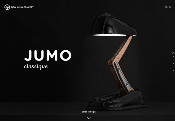
Dark mode has been more or less an obsession among many web developers in recent times. It features black backgrounds and lighter fonts, with light-on-dark types of displays.
This trend has changed the conventional web design massively. Traditionally, a site had to have a white background. But these days, almost all popular sites offer an alternative dark theme for users who enjoy the aesthetically pleasing backgrounds.
There are various reasons why many designers have opted for dark modes. Aside from being enticing to look at, dark themes offer a range of other perks.
They can help improve your health, preventing you from getting eye strain that’s common among users of bright screens. Unlike brighter themes, they don’t impede melanin production, so they might improve the quality of your sleep.
Also, dark themed websites have been proven to extend your battery’s life. In a study by XDA developers, the aesthetically pleasing themes were discovered to cut off battery usage by 63% on phones with AMOLED displays, even with brightness set to maximum.
Considering these benefits, it’s obvious that dark mode will continue to be a hit in 2021.
3. Web Accessibility
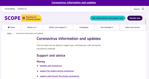
Conditions such as deafness, visual impairment, and autism can hinder someone’s ability to surf the web using a mobile phone or PC. Designers are increasingly making accommodations for users suffering from such conditions.
For instance, navigation systems are more consistent in most of a website’s pages. Icons have a similar look across all the sections, and the way users navigate a site has become more streamlined.
Some of the website redesign and changes you can do to make it more accessible include:
- For visitors who can’t properly grasp a PC’s mouse, make a site more keyboard friendly to enable them to navigate it using a keyboard only.
- Add colors to complement the already available information. Avoid using color as the sole visual method of displaying info. By doing so, you’ll be helping visitors who can’t differentiate colors easily.
- Include alt text to all images. This will help visitors ‘read’ your visual images, giving them context to things they’d maybe miss.
By making these choices, you’ll eliminate any barriers that may keep certain users away from your site. You’ll reach a wider audience. Taking a stance on accessibility also gives the sites you design more positive brand images.
Accessibility also improves SEO, boosting a site’s visibility with search engines. Bounce rates may, consequently, rise, as visitors are more likely to stay on the site for longer periods.
With disabled people increasingly using the internet, our forecasts point to designers continuing to improve website accessibility in 2021.
4. Larger Typography
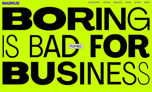
Typography has evolved in recent years. Previously, you only had to make do with a handful of basic fonts. Right now, though, you have truckloads of font options available, allowing you to satisfy readers’ appetites for stunning, attention-grabbing content.
If you’ve been paying attention to new design trends, then you probably know that typography is getting larger and more eye-catching.
Getting the right typography size is crucial for websites. Large text fonts make messages clearer, enabling readers to get their information quickly. The big headlines are often read first. They give readers their first impression of your site. Different fonts enhance readability, and guides readers, making them instantly aware of your message.
Also, ensuring your headers feature a similar attention-grabbing font helps establish consistency and draws them to the message that matters.
Ensuring that your fonts are large and readable, without going overboard, can be a daunting task. Too often, website owners place large texts in all their site’s sections, eventually making their content tedious to read. Enlisting for the services of web design professionals can help you get huge typography that’s not only eye-catching but also well-placed.
5. Minimalism
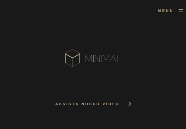
With the focus now turning to faster speeds, minimalistic designs are now gaining traction with web designers. There’s more need for stripped-down sites than there’s ever been.
It’s easy to think, however, that being minimalistic means that you have to strip your site down to its bare bones, leaving plain white space. This isn’t the case, though, as there’s also a new trend arising: colorful minimalism.
Bold background colors play important roles in colorful minimalism, as they help in grabbing visitor’s attention. Gradient colors, equally as important, offer rich, layered structures, and are quickly becoming a favorite for web users.
The idea is to remove all possible clutter. You have to discard pop-up videos, tabs, and dropdown menus to achieve the look. In their place, you have to introduce simple elements like a few buttons, large lettering, and full-screen forms.
Developers are continuously making these types as their go-to designs. Here are a few reasons why:
- Easier navigation — Users are hardly overwhelmed by the number of options available, so navigation is much more straight-forward.
- Higher loading speeds — Because of the little clutter in pages, minimalistic websites tend to load faster. With faster speeds, bounce rates also improve.
- SEO friendly — Search engine bots can easily crawl stripped-down websites.
- Style lasts longer — Even though web designs change regularly and new trends will likely come up, minimalism looks set to stay.
- Easy to remember — Cluttered sites are often filled with too much information, making it difficult for you to remember much about the website. Minimalist websites, however, make more powerful statements.
Accessibility also improves SEO, boosting a site’s visibility with search engines. Bounce rates may, consequently, rise, as visitors are more likely to stay on the site for longer periods.
6. Virtual Reality/ Augmented Reality
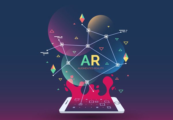
We can no longer talk of VR and AR as growing technology. You’ve probably made use of them already with social media apps like Snapchat. Now, the technology’s influence can be felt in web design, as it’s transforming the industry with its innovations.
Web designers are getting on board with VR to stay ahead of other brands. Applications, such as WordPress VR, are boosting the disruptive tech’s influence in the web development world even more.
WordPress VR allows you to upload 360-degree films to your site.
VR is also changing the advertising and marketing industries for the better. Interactions between users and online products are now possible. On a website, customers can now engage with your merchandise, before deciding to buy them.
As the seller, you can easily showcase your commodities to visitors, through the simulated environment that AR creates. In return, you’ll be able to boost customer engagement. Users get a world where they can experience and enjoy the service themselves.
Another reason why AR will continue to be a common feature in several websites in 2020 is that the tech is now integrating with online browsers. WebVR, for instance, allows you to get a virtual experience on your online browser.
Browsers have started supporting the plugin, meaning we could see more and more users in the coming years. Chromium, Chrome 56+, and Firefox Nightly, for example, are already on board with the technology.
The average customer will be able to get the virtual experience with the click of a button, without having to make any downloads.
Looking ahead, more developers will use VR and AR to make interactive websites, with the technologies becoming more readily available.
Special Mention: White Space
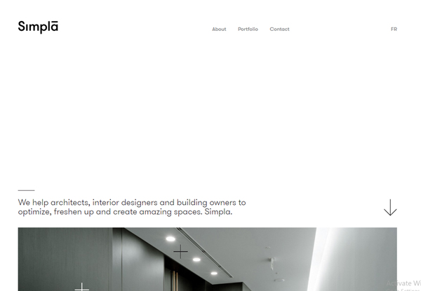
White space isn’t a new trend among designers. It has always been there, but now it’s more apparent than ever. Adding white space in sites creates a balance that not all tools in this article can provide.
It creates separation between chunks of text — an important feature, given no designers to put their readers asleep with too much text. By preventing distractions that slow readers down, it also increases interactions.
As we move into 20221, we predict that site owners will take bolder steps with their site’s negative space, as they aim for elegance.
Final Thoughts
Finding out what the future holds for the web design industry can be difficult. Trends change on a dime. What was popular two years ago, may no longer be functional today.
That said, we’ve tried to predict 2021’s trends by looking at how the industry has been progressing in recent times. While not all of them may happen, we expect at least a few of these predictions to be on the money.
