
Newspapers are the oldest form of media. Since the 17th century, newspapers have become a way to disseminate information to people. A newspaper’s front page is very important because it acts as a first impression to people. This eventually convinces them to read more. Making an impression and convincing the reader to stay on your website is also one of the goals of web design. From here on out, we’re going to look at how the layout of a newspaper can be integrated into website design.
Above The Fold

The phrase, “Above The Fold,” is a known phrase in web design. It’s a phrase that actually originates from newspapers. Since newspapers are usually folded due to its size, the always visible to the people is the one that’s above the fold. This means that headlines, eye-catching images, and intriguing content are placed above the fold so that people are convinced to look more. Web design also shares the same goal, a website’s homepage should have that. Any content that you’d see after scrolling is already considered “below the fold”.
However, unlike newspapers that have to put every attention-grabbing content above the fold, websites don’t necessarily have to do that. Slow internet in the past made it so that the homepage has to make a really good impression. However, since then, loading web pages have become faster, and scrolling has become easier than ever with our tablets and smartphones. Today, a website’s homepage main goal is to introduce the brand or the business, and immediately let the reader know what the business is all about (and what to expect).
Z and F-Patterns
 Image Credit: Yoast
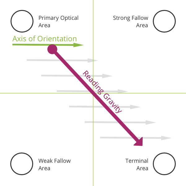 Image Credit: Yoast
There are two ways people read content. One is in a Z-Pattern called the Gutenberg Diagram, and newspaper layouts follow this principle. They say that when people read homogenous content, their eyes process information in a Z pattern. The diagram divides the space into four quadrants: the primary optical area (top left), strong fallow area (top right), weak fallow area (bottom left), and terminal area (bottom right). The primary optical area is where a reader will automatically focus when the person starts reading. The strong fallow area is a follow up while the weak fallow area is a blind spot. The terminal area is what the reader last sees before exiting the page – this is where call-to-actions are ideally placed.
People who normally read from left to right will follow the Z pattern of top left to bottom right. On the other hand, people who read from right to left will follow a flipped Z pattern – top right to bottom left. Once you are able to understand this concept, you can now control the information you want to jump out in your design – and even the order of information received.
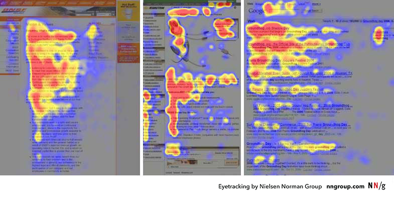
However, this kind of pattern only applies when someone is actually invested in your content. If one is simply skimming your website, the Z pattern may not be that effective. Rather, people scan a page in an F-pattern. A person will first read the upper part horizontally, then go back to the left side of the page to scan vertically. The process repeats, forming an F-shaped reading pattern.
Grid-based Layout
Just like a newspaper, if your website design is going to be full of content, a grid-based layout is recommended. Since newspapers are mostly filled with words, the stories are just easier to rid when it’s arranged in blocks. This kind of layout has been used by newspapers for a long time.

Of course, you cannot just simply put everything in blocks and call it a day. There are ways that these grids or blocks are arranged that they complement each other, thus making it easier for readers to follow the story. This kind of layout is also effective with advertisements.
Limitations
Using a newspaper layout for your website design as a guide is a great thing – especially if your website is going to be a heavily content-based one. However, there are also elements of a newspaper format that is not practical for the web. One example are the jumps found in newspapers. A newspaper’s front page does not contain whole stories; it gives you an idea of what the story is going to be about and then tells you to continue on page X. Using this kind of format won’t be effective on web design since a web page has unlimited space. And scrolling exists.
Another thing to keep in mind is that websites can change dimensions depending on where it is accessed. On the other hand, the newspaper’s size always stays the same. A newspaper’s layout merely acts as a guideline when it comes to web designing but, it should not be strictly followed. Knowing how newspapers have attracted readers over the years is a great thing to know so that you’ll also know what will work with your web design.
You might also enjoy:
49 Essential Elements of Ecommerce Product Page Design
5 Things That Can Make (or break) A Killer Website Design