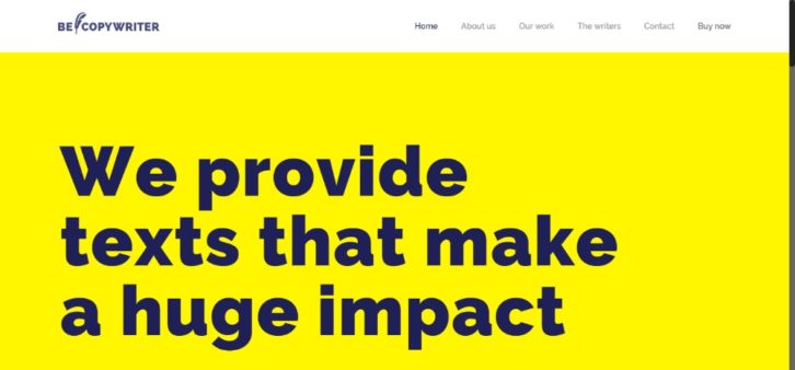
Web designers have a full plate when it comes to trying to keep up to date with the latest trends. This is especially true in 2018. These days, several different approaches to web design have surfaced.
It takes time to acquaint yourself with each of these trends. This is the time you would rather spend doing actual design work. You can stick to the tried and true and ignore the latest trends. The problem is you run the risk of having the competition leave you in the dust.
With each emerging trend, the competitive bar is raised a bit higher. This makes your work that much more difficult.
The good news is there is a WordPress theme that has always kept up with the latest creative trends. It incorporated them into its selection of more than 330 professionally-designed pre-built websites.
Here are examples of how BeTheme has put 8 recent trends to good use.
How BeTheme Has Put Current Design Trends into Practice
Design Trend #1: Illustration & Graphic Art
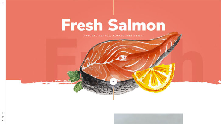
Custom art is the current rage in website design and is expected to continue to be so for some time to come. Designers and their clients have taken vintage watercolor illustrations to heart. This is due to the feelings of comfort and relaxation they generate. These are coupled with a sense of nostalgia.
The use of bold fonts plays an important role. It helps to get a message across without taking anything away from the illustrations.
Design Trend #2: Light, Shadow & Smoke
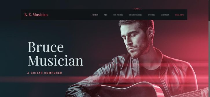
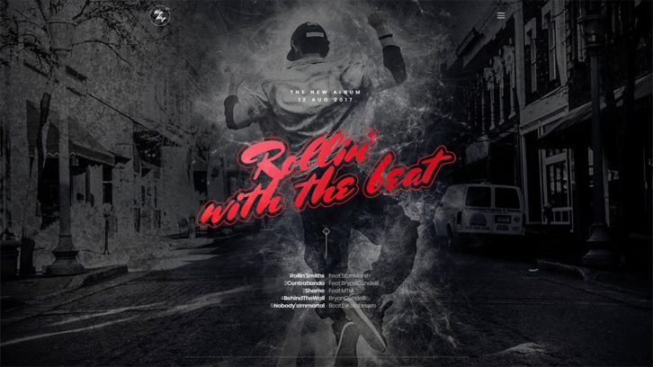
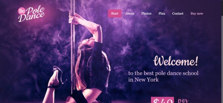
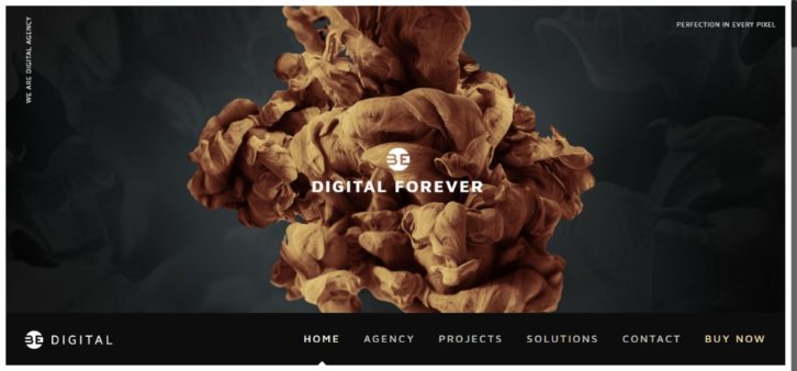
There is much that can be accomplished in the art of creative design. You can experiment with light and shadow. When you’ve achieved the look you want, add smoke to the mix and see what happens. Typically, your design will take on a completely different look.
The right mix can produce an easy-going or romantic look –
Or a make a dynamic statement –
How about a sultry look?
Design Trend #3: Gradients aka Color Transitions
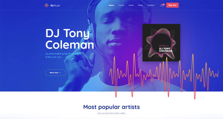
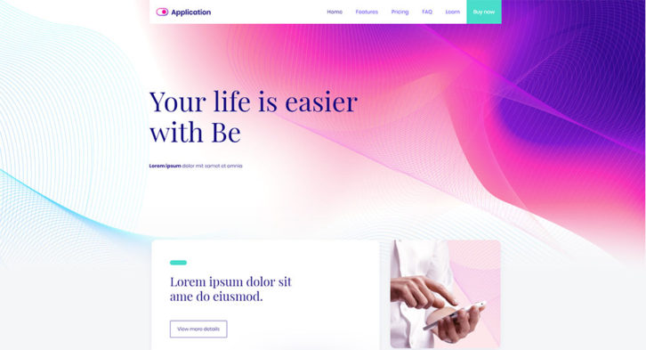
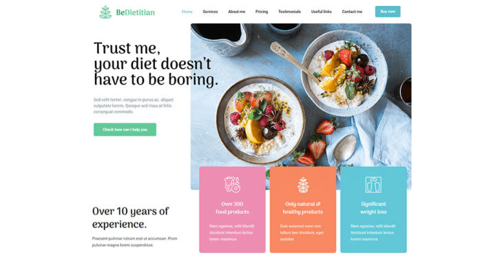
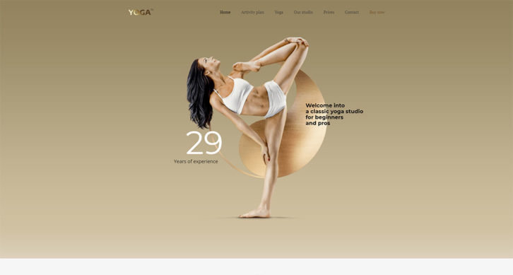
As is the case with custom art, gradients are also hot at the moment. Gradients work especially well with pastel colors. But they also fit in nicely with many of the other trends. Try using them in your next projects. The results might surprise you.
Design Trend #4: 3D “Moving” Stills
A 3D illusion of motion is not the easiest look to achieve, but when done right it can be a genuine attention-getter. An animation is fine, but an illusion of motion tends to be more engaging and attractive in the eyes of the users. Here are two examples where the image appears to flow –
Or, grow.
3D “moving” stills like these lend themselves to different textures, light, and shadow. They involve the use of gradients and a generous use of white space.
Design Trend #5: 2018 Still Life
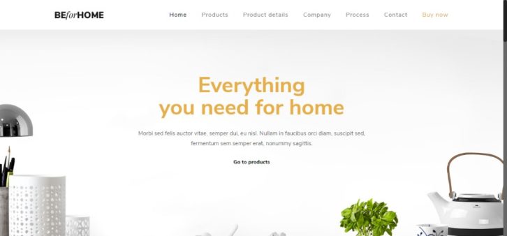
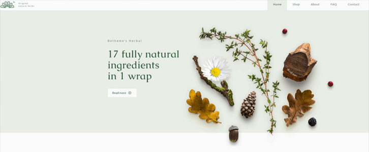
Still life will likely always be a popular trend. It’s been around for some time. But there have been recent improvements that have made this trend more popular than ever.
You can also use photography for still life examples. These two examples benefit greatly from an excellent use of white space:
Design Trend #6: Metallic Shine
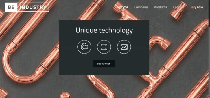
Metallic shine can be used throughout an image. Or, as is the case with gradients, used in carefully selected elements of an image. This trend has become so much of a craze that you’ll find it used in a variety of industry segments, sectors, and niches.
Making plumbing a case study in elegance!
Metallic shine works particularly well with 3D elements, as attention-getting insertions in illustrations, and is even used to great effect in typography.
Design Trend #7: Chaotic Typography
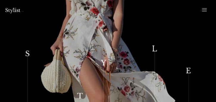
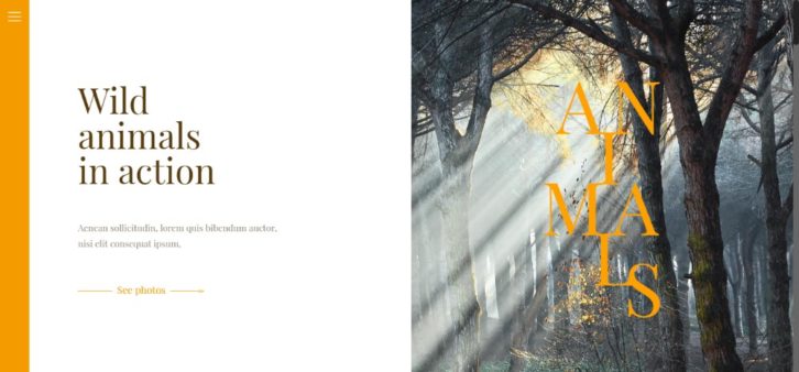
Once upon a time, if you didn’t keep your letters perfectly aligned you’d get your hand slapped with a ruler. That was a long, long time ago, but the lesson has stayed with us. Chaotic typography is a definite break with tradition. It’s fun to work with, and the results can be impressive.
Be careful not to get too carried away. Keep UX in mind. Users should not have to spend more than a fraction of a second deciphering your message. Don’t make them have to think.
Design Trend #8: Brutalism is Back
This in-your-face approach will get a visitor’s attention. Depending on your brand and goals, you might want to embrace brutalism. You need to use it judiciously or avoid it completely.
Summary & Conclusion
- Go creative with custom graphic art
- Start with light and shadow; add smoke to the mix for some surprising effects
- Combine gradients, a.k.a. color transitions, with your favorite trends
- Looking for a mesmerizing effect? 3D with “moving stills” will give you that
- Create your modern still-life. 3D or a crafty use of photography will do that
- Go glam by adding metallic elements whenever and wherever you can
- Use brutalism to send crystal-clear messages
- Take a simpler path: Use BeTheme’s pre-built websites to follow each and every one of these trends
0 Comments
