 Okay, let’s just get this out of the way: on this, the verge of a new year, the Verge got a redesign. Now the punnery is over and we can get on with our lives. It had to be done, or I could not call myself a writer.
So let’s get to the good bit: this is what it looked like before:
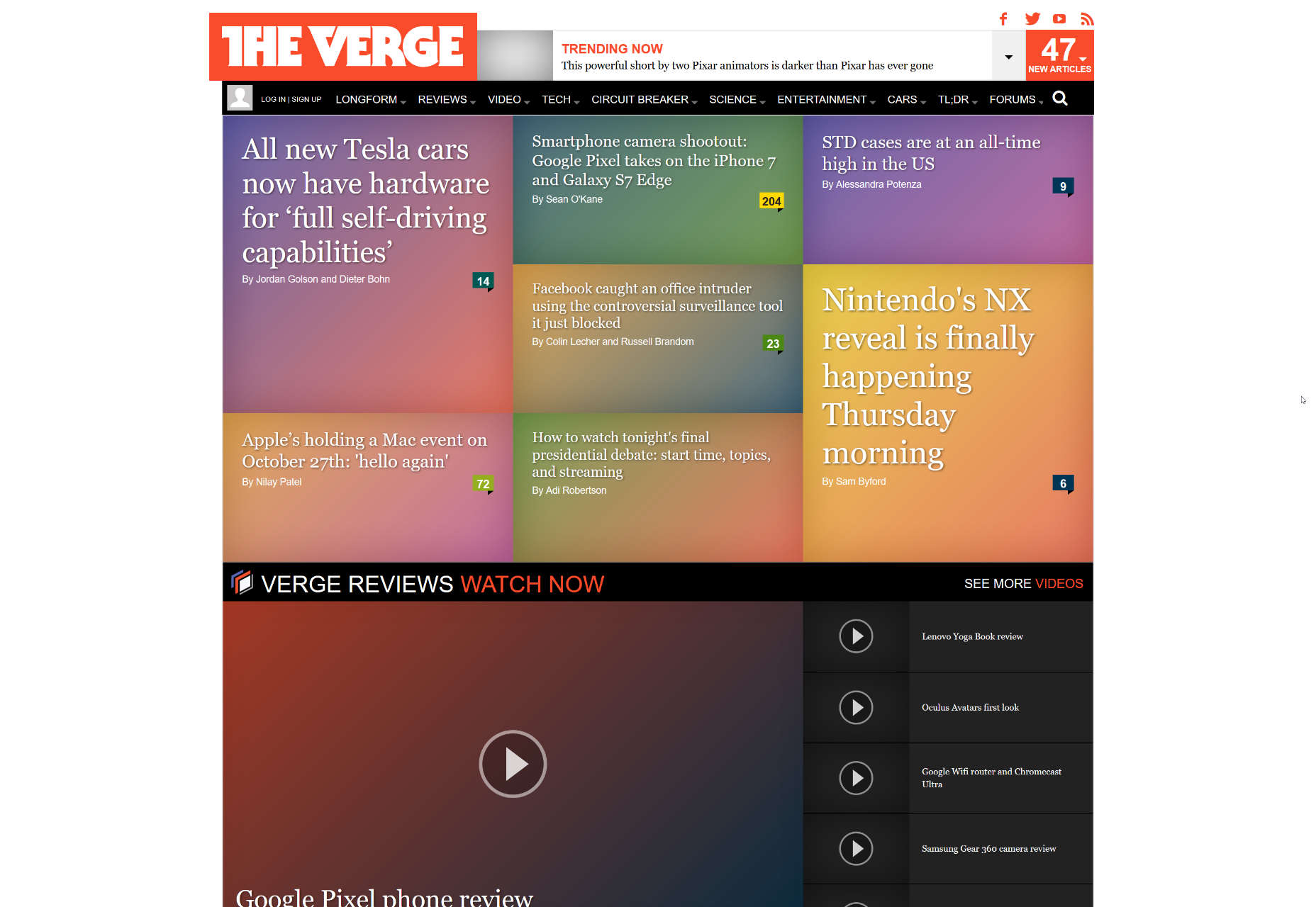
It should be noted that the previous version actually had some pictures. The screenshot is courtesy of the WayBack machine, which doesn’t seem to store background images.
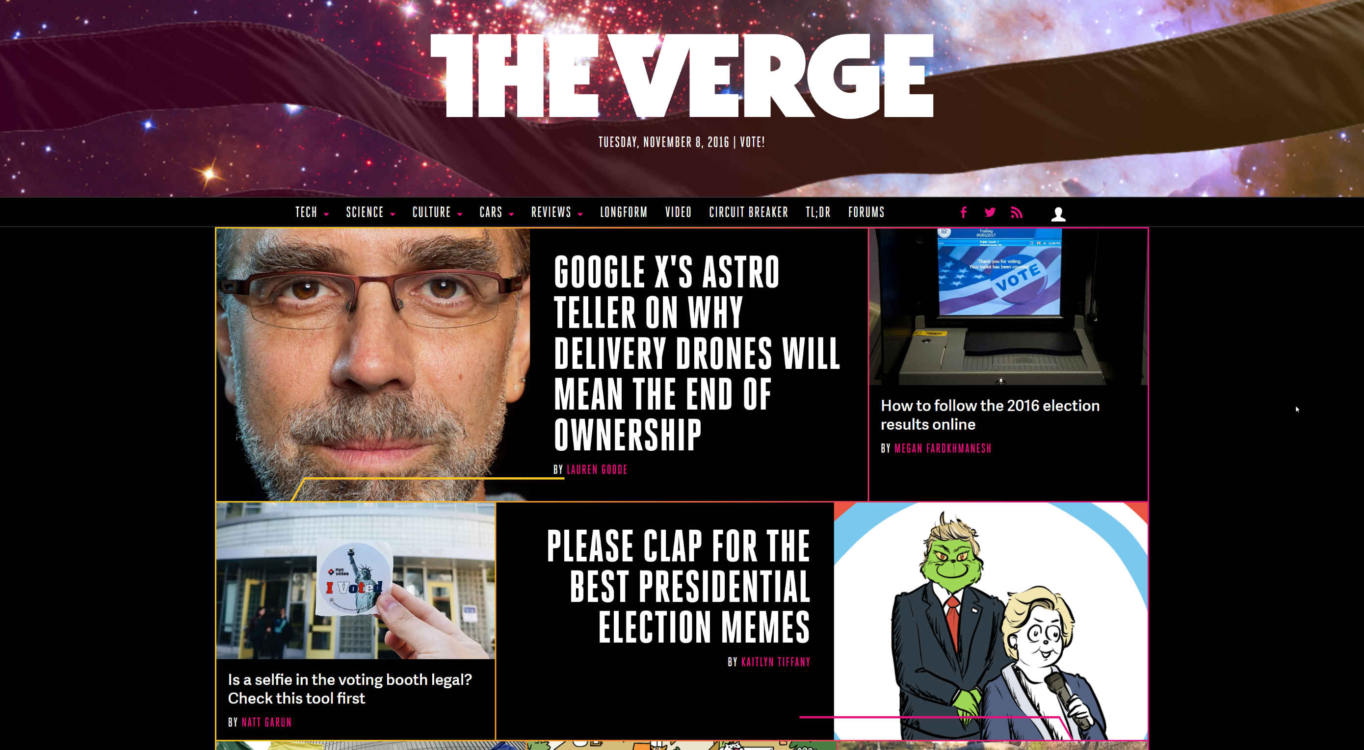
And this is what it looks like now:
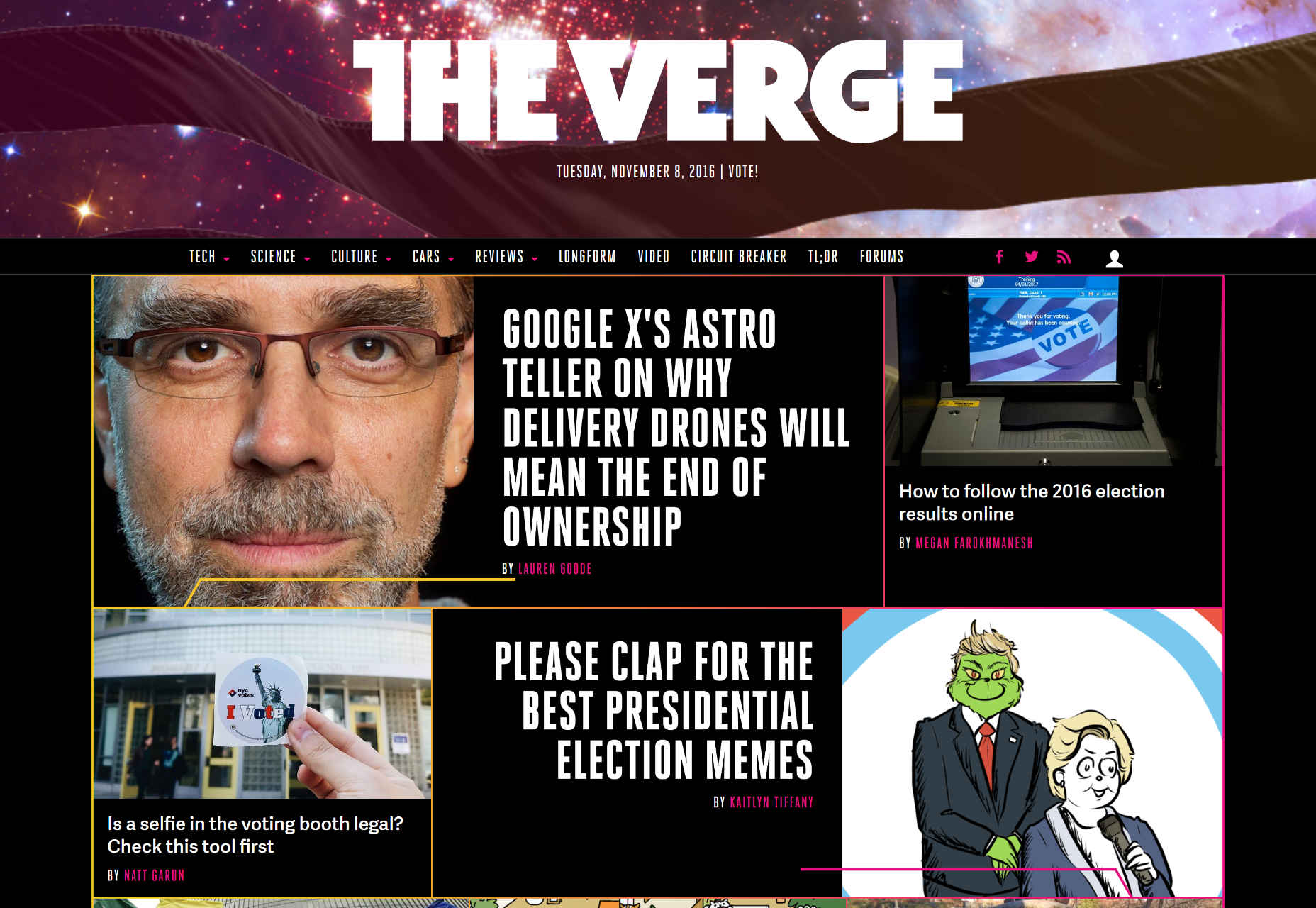
It’s more than a simple visual refresh. An entirely new design system (dubbed “Pathways”) has been brought into play. Like many other design systems these days, it’s intended to be used on the website, in video motion graphics, and even in print design. Another part of the redesign is a heavy investment in photography. The old days of putting gradients over an average stock photo are out.
Other changes include:
- A significant performance boost
- Some small changes to the logotype, in an effort to clean it up
- A back end overhaul to Vox Media’s CMS, Chorus
- Tons of smaller changes and updates to… everything.
But now, the big questions: why did they redesign the site in the first place, and did that redesign accomplish its goal? Well, according to the new mission statement, there’s going to be a renewed focus on writing about technology, and how it’s shaping the future. If that was the focus of this redesign as well, then I’d say they did it.
The new design makes one reminisce a bit about the ’80s mostly-hopeful style of sci-fi. Well, either that, or it will bring back painful memories of neon everything. In any case, it looks good, and it works well. The rest is up to the content.
| UX Flowchart Cards to Easily Plan Your Website Structure – only $24! |
|
p img {display:inline-block; margin-right:10px;}
.alignleft {float:left;}
p.showcase {clear:both;}
body#browserfriendly p, body#podcast p, div#emailbody p{margin:0;}
![]()