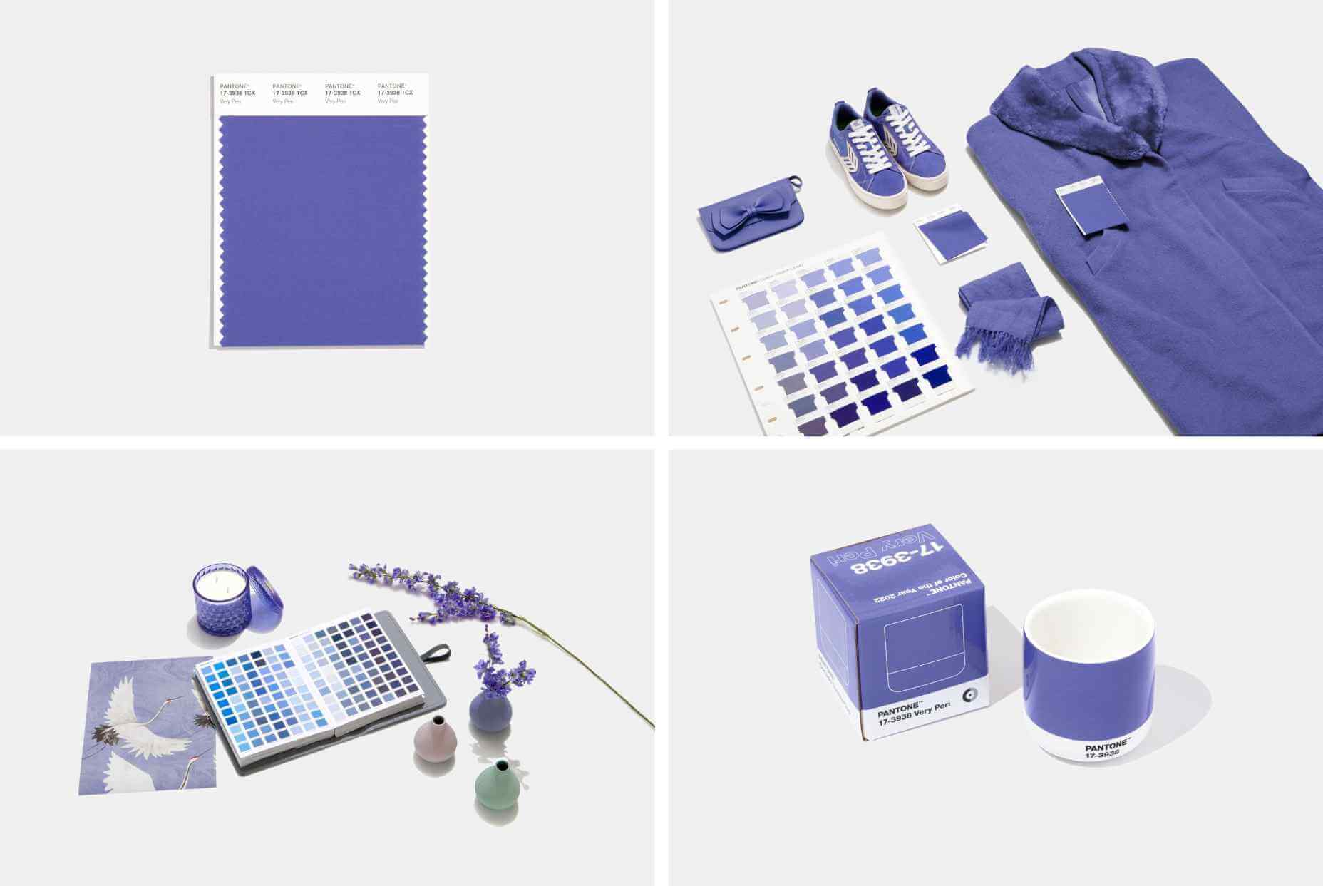
At this time every year, Pantone announces its choice for Color of the Year for the coming 12 months. The last year has been uncertain, to say the least, and although a tentative optimism seems to be piercing the general gloom, it’s difficult to see how that can be expressed in color.
On this occasion, for the first time, Pantone has elected to create a brand new color for its Color of the Year. Normally colors are chosen from Pantone’s extensive swatch books, so this new shade either reflects new beginnings or Pantone’s design team has been underemployed in the last year.
In either case, the shade created for 2022 is Very Peri. It’s a lilac — a bit more blue than violet, but still on the warm end of the spectrum.
The color feels a little retro — like the color of one of Jerry’s shirts in Seinfeld — and also spring-like — fields of bluebells leap to mind.
Pantone describes the color as having a “courageous presence,” but for that, I tend to think of neons; something with a little more saturation.
In fact, looking back over the past few years of Pantone colors, a soft purple (or adjoining shades) has traditionally been a safe choice for Pantone. 2014 was Radiant Orchid (lilac), 2016 was Rose Quartz and Serenity (pastel pink and blue respectively), 2018 was Ultra Violet (purple).
If Pantone was looking for a genuinely “courageous” choice, it should perhaps have reissued 2020’s Classic Blue, and called a do-over on the last couple of years.
Occasionally the Pantone Color of the Year has hinted at something more than a single shade. 2019’s Living Coral felt like attention was being drawn to the horrifying state of our ocean. Designers didn’t adopt the shade en masse, but environmentally conscious design has certainly become more prominent.
As we complain about homogenous design, is it right to even nominate a single color of the year? If what we’re lacking in the design industry is diversity, shouldn’t we ignore a color trend? (The irony of that question is not lost on me.)
In that spirit, rather than dishing out another bland lilac for 2022, Pantone should have presented us with Pure White #FFFFFF. A blank page to do with what we will. That would have been courageous.
