The correct font for your project depends on its use. Consider what your website is for, and what the user will do when they arrive. Do you have long stretches of text, or just smaller headlines and descriptive language? Chose the best font based on how the website works, not what you like the look of.
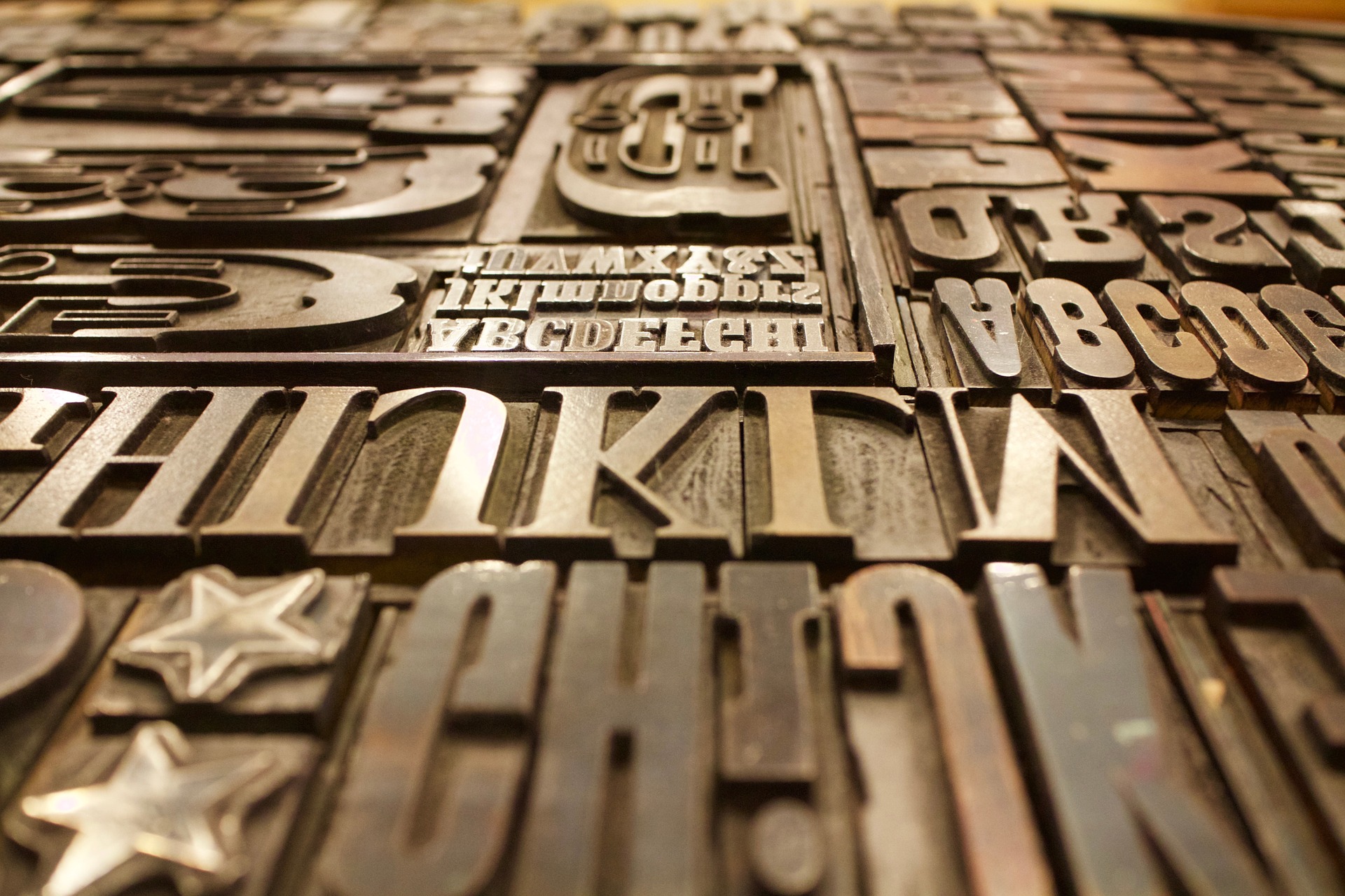
Font Types
Fonts come in several broad families, and you need to be familiar with their basic terminology to browse fonts effectively.
Serif vs San-Serif
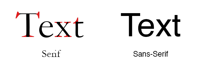
If you’re unfamiliar with the distinction, serif fonts are the “old” looking ones. They’re marked by their extra extenders, called “serifs,” which help users read long blocks of text by clearly distinguishing similar-looking letters and guiding the reader’s eye from one letter and word to the next. Sans-serif fonts lack those ornaments and use simple geometric lines to create letters. These a smooth and modern, blending into the background while remaining decently readable.
Display Fonts

Some fonts aren’t intended to be readable. Script fonts, for example, can only be used on short runs of text: you’d never see a novel set in a cursive-style font. They make up part of the category of “display fonts,” which are primarily designed for aesthetic impact, and not for readability. Display fonts are used for attention-grabbing headlines, company names, logos, branding, and other short and sweet uses. Don’t try to use a display font for body copy: they’re hard to read by definition, since they prioritizes visual appearance over readability.
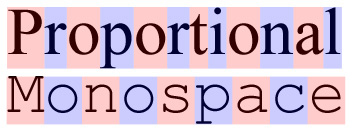
Monospace Fonts
The same goes for monospace fonts, which are rarely used except for code display. A reliable monospace like Consolas or Monaco, or Input Mono will serve you well.
Quick Rules For Font Selection
- Sans-serif for headlines, captions, short descriptions, user interface elements, and numerals
- Serif for body copy, articles, narratives, blog posts
- Display fonts should be limited to logos and decorative uses, not used for lengthy text
- Monospace font for code and data, not long text blocks
Reliably Good Fonts
If you’re not sure what fonts to choose, stick with a selection of the basics. New fonts aren’t any more attractive than old fonts, and with old fonts, you benefit from the certainty of functionality: a font wouldn’t stay around for 30 years unless it looked at least decent.
Serif Options: Georgia, Palatino, Baskerville, Garamond, Caslon, Minion, Calluna, Plantain, FF Tisa
Sans-serif Options: Helvetica, Open Sans, PT Sans, Roboto Sans, Futura, Proxima Nova, Gortham, Avenier, Brandon Grotesque, Franklin Gothic
Display Fonts: Pacifco, Lobster, Kaushan Script, Playfair Display, Josefin Sans, Museo Slab, Isidora, Neo Sans, Brothers, Brandon Printed, ITC Avant Garde Gothic, Grand Hotel, Code Pro
What’s Your Design Like?
Is your website more modern, or more traditional? While these considerations don’t overpower recommendations based on function, the form of the site provides a useful clue abut the problem if you feel like it doesn’t quite “fit” with the rest of the design. For a more traditional design, a serif font will fit better. Sans-serif fonts fit best with modern, sleek designs.
How Much Text Do You Have?
Is your text small descriptive chunks, like item descriptions for your ecommerce site? Or is the text lengthy and extended, like a blog?
You can think about the difference as Twitter vs WordPress. Look at twitter.com, and you see that all the text is sans-serif. There are no helpful ears and feet on the letters, but the individual text blocks are still easy to read.
The sans-serif font looks clean and modern, fitting the user’s purpose and minimalist aesthetic. Because you read shorter text blocks more quickly, the helpful serifs we find in body copy aren’t necessary.
Serifs help the user flow, but there’s an acceleration period, a “ramp up” to reading quickly. If the text is too short to accommodate that ramp, then a serif font won’t be any more readable than a sans-serif font. If shorter text blocks are your primary content, then aesthetics can guide the font choice, provided you don’t use a script or display font.
How Do Users Use Your Site?
There’s also something to be said for the user perspective on your site. If users are intended to spend hours on your site, you’ll want to focus on ease of use. Pick a font type that will give the users what they want.
You can also provide customization options for users, but be careful not to be too flexible. If you give the user the power to break your website, they’ll only blame you when it stops working.
You might also like the following pages:
Kerning, Leading, Tracking, and Everything You Need to Know About Text Spacing
Modern Handwritten Fonts for Fresh Design Trends
Catchy Free Font Pairings For Headings and Paragraphs
Author: Alex Fox