Learning to design better buttons for UI may be an important skill many designers take for granted. Buttons are more than just what we all think they are, they affect users’ overall experience for websites and apps. It is one of the main elements linking an interaction between a user and the website. If there is a more effective control in a website, the more it improves the user’s experience.
There are many ways to design better buttons. Most of the time it takes the most minute of details to make all the difference.
Design better buttons for UI using shapes
Believe it or not, the safest way to create a button is to make sure it is either square or rectangular in shape. This is because all major elements in a computer, when it was first designed in the ’80s and ’90s are rectangular or square in shape. The shape is familiar for users and it gives them an automatic visual cue that what they are seeing is a button.
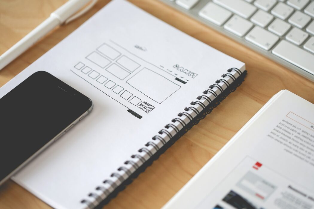
Image Source: Pixabay
Always make it look like a button
Creativity can sometimes get the better of us. Artistic spurs can lead us to create the most innovative, but not necessarily the most efficient, designs. In many cases, designers have designed incredible looking buttons, all with unique color and design. But editing will always take it back to the basics. There are many kinds of buttons. This is why the number one rule in creating better buttons for UI is to make it look like a button. These visual cues will provide ease for user experience. Let the button look embossed. Allow the buttons to contrast against a background. The more clickable looking it is, the better it serves its purpose.
The Labels do matter
Make sure that the buttons are correctly labeled for their function. The button should describe the actions that it is called for. For instance, buttons for the ‘Next’ and ‘Exit’ functions are clear. Also, buttons for ‘Create Account’, ‘Agree’, or ‘OK’ are obvious labels for buttons. If the user is unsure what the buttons are for or what it does, the chances are high that they are going to press exit instead.
The more visible the better
There are some landing pages where the ‘Exit’ or ‘Next’ buttons seem to be hidden away from the users’ view. This seriously affects the interaction between the landing page and the user. With the many times the users interact with the internet, there seems to be muscle memory to locate where buttons are usually found. Always determine the most effective button location for all types of modes and devices.
Also read: Avoid These When Working on Open Source Projects
Author: Sangalang Kristine
Civil Engineer by profession, Writer by passion. Serving readers since 2014 on different niches like Science, Current Events, Tech, and Travel.