As a web designer, it’s easy to jump right in to the visual part of web design. We start messing with templates and wireframing pages right away, excited to start a new project. But that’s really the last step of the process. First, we need to think about how our users will progress through the site. What is their goals, and how will they achieve them? Those processes are called user pathways, and smooth user pathways mean you can gently push users in the direction you want them to go.
What are user pathways?
User pathways or user flows are built from the steps a user must take to reach a particular goal. Something like registering for an account, purchasing a product, or downloading a file requires multiple interaction. The pathway for those events is collectively refereed to as a flow.
Effective user pathways are built on low-friction designs. While high friction designs can be appropriate for confirming dangerous actions, funneling users towards conversion metrics should be the smoothest and most gradual slope possible. Low friction means low resistance. Make it as easy as you can for the user to do what you want. In fact, make it easier than other available options.

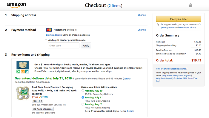
Consider Amazon’s checkout user flow. It encourages users in the checkout process to stay there, providing only one link back to the rest of the website. And clicking on that link prompts a confirmation dialog that encourages users to stay in the checkout funnel.
The idea of a gentle slope is crucial to imaging user flows. Users should not feel forced or prodded towards conversions. Flashing banners and full-page pop overs might convert some people, but multiple, gradual touches are more effective. Think about riding your bike down a gentle slope. You might not even sense that you’re going down hill, but suddenly your bike is faster, your peddling easier, your speed faster than it typically is. Going down the hill is the easiest thing you can do right now, and reversing back up the hill would be only slightly harder. Not impossible, not unthinkable, but slightly more difficult.
Embracing Least Resistance
Your pathways should operate on the principle of the path of least resistance. Water, electricity, and users will all naturally follow the path of least resistance. This is especially true when user’s own desires are pushing them in the same direction. If your design encourages them to go with their initial desires AND makes it easier than any other action, you’ll find you can encourage users to make the choices you’d like them to make.
When working on your designs, you have to remember a crucial factor: your viewpoint is utterly unique. Not only are you a designer, which gives you rare insights over and above what the general population carries. But furthermore, you (and your co-workers) are the only ones building this site or service. You are the only ones with your particular viewpoint. That can very quickly become myopia, so take care to constantly check your perspective. That’s why user interface interviews are so important: you must ask your users what they want, because you don’t know as much as you thought you did.
Building User Pathways
User pathways depends on the goal, but should be planned in detail before they’re implemented.
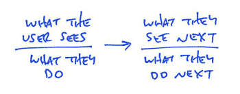
Start by describing the steps the user needs to take to achieve their goal. At each step, name what the user sees and what action they perform. Ryan Singer at Basecamp developed a shorthand for this type of step writing, seen below.
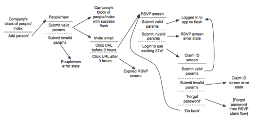
You can envision a more completed user workflow below.
You can create this software with any chart creation tools, or even on a piece of paper. What’s important is that each step is clearly explained in text. Arrows should describe how the user might pass through the stages.
This part of UX doesn’t depend on visual design or layout. We’ll manage that later, when we implement our flows. For now, we’re simply constructing the pathways that our users will eventually walk.
If you’re unsure how to start your flow, think about what users might scan for if they have a particular goal in mind. You might also imagine user flows you’ve seen online for particular tasks, and how you might implement them more effectively. If you’re truly stumped, consider your list of goals and conversions. Then design the user pathways that should lead to that conversion.
One you have a completed flow, you should critique the process and begin to imagine how you can improve it. Consider how you might implement path of least resistance flow, guiding users towards the goals you want them to reach. Remember that UX is an iterative process, and the first draft is never the last.
If you’re interested in user interface design, you might also like these other posts:


