
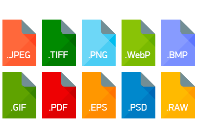
What, did you think JPEG would live forever? It was introduced in 1992, more than twenty-five years ago! The modern generation of web developers uses WebP for images, not the archeological specimen that is JPEG. Here’s a quick introduction to WebP, SVG, and why they’re better. TL;DR: they’re way smaller, producing faster, and more responsive websites.
What is WebP?
The WebP standard is something of an meta image format, including several modes under one heading. It’s both a file extension (.webp) as well as a compression algorithm. To use the language of video encoders, WebP is both a container format and a codec.
Because the compression algorithm can save images both lossily and losslessly, describing an image as a “WebP” doesn’t really make as much as sense as calling an image a “jpeg”. It’s like saying it’s a file: that can mean so many things that the word isn’t vastly useful, except in the most general of terms. To illustrate, here are some of WebP’s feature highlights.
- Lossless compression
- Lossy compression, similar to JPEG
- Lossless transparency/alpha layers
- Compressed transparency/alpha layers
- Animated images, similar to WebM
It’s also related to the WebM standard, which is used for moving images.
In fact, the WebP compression algorithm uses the intra-frame encoding algorithm of the VP8 video compression algorithm. As with VP8, it is a block-based transformation scheme with eight bits of color depth and a YUV 1:2 chroma subsampling ratio (YCbCr 4:2:0), which is the same as the default chroma subsampling ratio on MPEG2 and MP4.
WebP also features one of the more trendy feature of modern encoding algorithms: predictive encoding. Using complex mathematical formulas, the encoding algorithm will try to “predict” the value of the next block. Good prediction can remove redundant or unnecessary data. Most important, it works especially well on the most common types of images. That makes it a valuable tool in compression, where it can save considerable space over non-predictive algorithms.
You can learn more about WebP or check out Google’s technical documentation.
What is SVG?
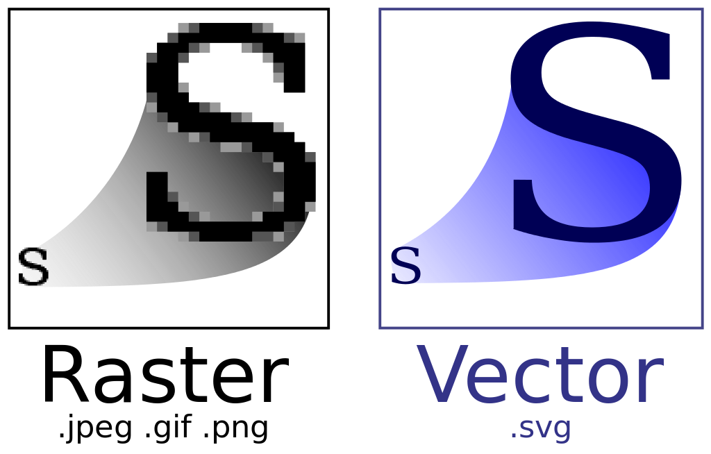
An SVG is a vector graphics file. Rather than saving the pixel values as an image would, a vector saves the mathematical relationship between the points defining a shape or design. In that way, the design can be infinitely scaled and endlessly edited, all without loss of data. Whereas images tend to degrade each time they are processed, an SVG will always be flawless. This is because compression algorithms often save space by using a type of destructive rounding called lossy encoding. Because SVG stores the exact mathematical values of the point relationships, there is no data to round off and destroy.
An SVG image is actually completely defined via text in an XML document. All the features of SVG are triggered by XML tags, meaning that any text editor can also be a fully-featured SVG image editor. For an inside look at this XML code, check out the SVG source for the standard’s logo.
This also means that SVGs take up very little space. The text descriptions of SVG files take up far less space than a JPG or PNG showing an equivalent image. The downside is that SVG completely falls down when trying to save a photograph. But of course it does. The standard is designed to process and save mathematically-calculated point relationships in somewhat regular two-dimensional polygons, which are famously absent in photographs. That’s exactly what WebP is good at, making SVG a natural companion to the jack-of-all-trades image format.
For geometric designs and illustrations—logos, especially—SVG is the perfect format. They scale infinitely, just like vector images. One SVG of your company’s logo can be losslessly scaled to any size necessary and displayed anywhere on the website, at any pixel scale or display density. And because all web browser are also native SVG pre-processors, your image will show up flawless in every web browser.
SVG gets some flack for being a bit of a Hunchback of Notre Dame: it’s ugly and misunderstood by the masses, but pure of heart and earnest if you give it the time of day. Don’t let that prejudice stop you!
Everyone Else
In our war of image formats, WebP and SVG make up one army. Every other image format is on the other side. Because with SVG and WebP, you can save and display just about all graphical content you can imagine. There both well-supported by browsers, space-efficient, and fully-featured enough that you won’t regret implementing them.
That said, there are some perks of being on the “everyone else” team. First, JPG is the single most widely spread file format. More than PDF, more than DOC, more than any other file format, JPG is essentially the lingua Franca of the file processing world: everyone speaks it. So, naturally, WebP isn’t as widely supported as JPG: yet.
It’s becoming more popular as Google pushes it harder, and is already supported by something like 80-percent of web browsers. Mobile is the big hold out: Apple doesn’t include support for WebP/WebM in either version of Safari, preferring to push their preferred HEIC/H.265 standards instead. As in any standards war, it’s the consumer who loses while the companies duke it out.
So What?
Why are we so hot under the collar about WebP and SVG? What makes these formats so much better than their competitors?
BETTER ALGORITHMS MAKE SMALLER FILES
Everything you put on your website costs the user time and money. They pay, with their time and their money, to download your content. With good content, the value typically exceeds the annoyance of having to download the file. With bad content, the relationship is exactly inverted.
As internet speeds have improved, the cost of including new doohickeys on your website has been lowered to the verge of insignificance, at least when you’re on a broadband connection. But mobile users the world over still live in The Land That Broadband Forgot, with spotty and slow connections more typical than wireless carriers like to admit. Smaller files of equivalent size are still better: the advent of broadband didn’t wipe out the rules of entropy, but instead make them less abysmally restrictive.
The only current downside of WebP is it’s slightly spotty support by browsers. For the time being, the best option is to include JPEG polyfills for unsupported browsers. As with any new technology, it pays to start using it now and learn the ropes before it explodes in popularity. Your users won’t know much of a difference in the quality of your images. But your website will be magically faster, and everyone loves that
You might also like the following posts:
The Developer’s Guide to the WebP Image Format
31 Fresh Design Elements for Spring and Easter
4 Examples of Bad UI and How to Avoid Them
Author: Alex Fox