A sense of composition in the photographer – it’s like a musician’s rumor, you have it, or you need to develop it through tireless everyday work. If you manage you Instagram account and would like to make it looks more professional and impressive you should know some essentials of photo design principles. They will help you to create extraordinary pics that will shurely increase your followers number.
You, propably have found some Instagram pages that looks very estetic, with all eye-catching photos in harmony. Do you think that profiles are managed by designers? It’s not always true.
Some professional photographers argue that learning “aesthetic perception” is impossible, while others give an example of the theory of constructing a composition. But most of them recommend you the next tips to make your Instagram and all photos perfect:
1. Rule of thirds. Place an interesting object at the intersection of the lines of the third frame. Important elements of the frame can be placed along the lines of the third as well.
2. Leading lines. Use natural lines to hold the viewer’s eye through the photo to an important object.

3. Diagonals. Diagonal lines are a great way to create motion in a picture. It also can be used as the directions to focus the attention on some objects
4. Framing. Use natural frames, such as windows and doors to focus the “hero” frame. The awesome shots can be created with different types of the frames like architecture, environment elements, shapes of the things or shadow. In such way you can focus the attention on the main object and show it in the way you like.

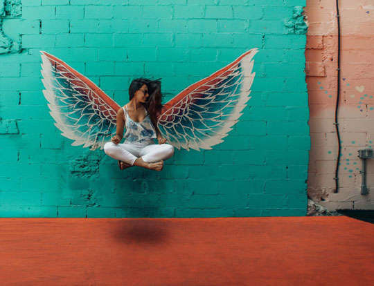
5. The tonal contrast between the object and the background. Find the contrast background for the photo object, add some tones, shadows. It can be high or low depending on the main object, its location and general photo style. So, using the contrast you can highlight some object insead of others.
You can choose the contrast background depending on the photo style. It can be, for examples, the wall, green plants, some buildings or graffiti on the wall, if you like it. But if you don’t know whether grffiti is bad or not find out great arguments for each point on artscolumbia.org/essays/graffiti-art-vandalism-43288/.

6. Fill the frame. Come closer to the subject of photography (close-up is one of the easiest ways to get rid of debris in the frame).
7. Center the dominant eye in the portrait. Arrange the dominant eye in the center of the photo. This technique gives special expression to the eyes that watch you.
8. Patterns, repetitions, rhythms. Repeating details bring an aesthetic pleasure to our eye. But repetition should be broken by a contrasting object.

9. Symmetry. Use symmetry, as it is always pleasing to the eye. You can mix different combination of reflecting vertical and horizontal lines on your photos. It depends on how you hold the camera and what part of the scene you’d like to show.
10. Pay attention to the background of the lines, how they combine together. When you are a beginner, there are many things that you need to study, do, take into account, even without mentioning the fact, that technologies are constantly evolving, new programs are emerging, new trends are in fashion. Frankly, all this can have serious pressure.
That’s why we’ve tried to provide you with the most important principles of design in photography. Just remember, that photo design is a complex business, full of principles, chips, and techniques: some will be told to you, and some will have to be studied by yourself.
Treat each “rule” skeptically and apply it only when it is appropriate (and if inappropriate – hammer in the rules!). The design is a constantly evolving and changing area, and each case is complex, unique and interesting in its own way. Develop in yourself a “designer’s look” and collect interesting cases of using its principles.
