
Landing pages are your number one conversion tool – they are there to catch the eye of prospective leads, and slowly but surely push them down your sales funnel.
That’s why landing page design is a crucial step in your marketing, sales, and overarching business strategy. Sadly, many websites and brands forget this fact and slap just about anything onto a page, cross their fingers, and hope for the best.
If you are looking to take your conversions into your own hands, take a look at these six examples of eye-catching landing pages.
Have a clean and straightforward homepage
While the homepage of a website is not a dedicated landing page, it is certainly a page where a lot of your visitors will land. And as such, it needs to be compelling.
Let’s take a look at our example:
Source: theadventurejunkies.com
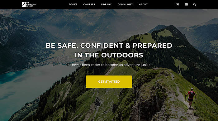
The Adventure Junkies offers courses and product reviews for outdoor enthusiasts, and their homepage represents just that: there are some great images of the great outdoors, the layout is smooth and fast, and there is a section for everything they offer – courses, books, video.
It is easy to navigate and works really well as a hook – their other landing pages are there to maximize conversions.
Make sure your hero is spot on
The hero image you choose can make or break you. A lead can be attracted by it and choose to stay and explore further, or they may decide that what you are offering is not what they are looking for, and leave.
Here is an example to show you what we mean:
Source: thefarmersdog.com
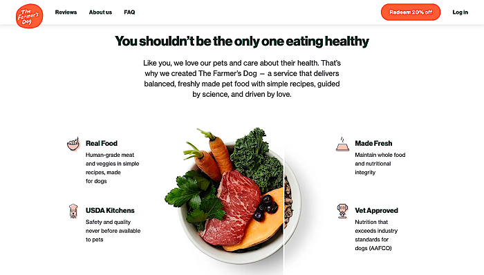
The Farmer’s Dog, a brand of fresh pet food, has chosen to show their product in the hero. It will instantly reveal what it is you’re getting, and you can tell at a glance if your pet will like it. Coupled with some clear copy and all the essential facts about the product, this hero just works.
Even if you don’t have a product to show and are selling a service, make sure you choose an original image (as opposed to a stock photo), and that it is an accurate representation of what the customer can expect to get if they convert.
Focus on your tagline
Second to the hero image is your tagline – and what it is you choose to tell your potential customers the first time they come in contact with you. Since we all know how important first impressions are, it is clear that the tagline you go for needs to tick several boxes: showcase who you are as a brand and what it is you are offering, appeal to your target audience, and provoke some sort of response.
Writing clever taglines is an art and a strenuous task, so here is an example to illustrate the point:
Source: codecademy.com
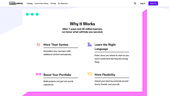
Codecademy, a website for learning how to code, has done it with “the easiest way to learn to code” – to the point, clear, eye-catching, and certainly bound to provoke some interest. It is also in line with what they believe to be true of their product: that there is no easier way to learn how to code.
Use social proof to your advantage
Social proof is an excellent way to attract valuable leads – it’s a clear statement that you can be trusted, that you know what you’re doing, and that you are a brand recommended by so many others.
Here is our example:
Source: formsonfire.com
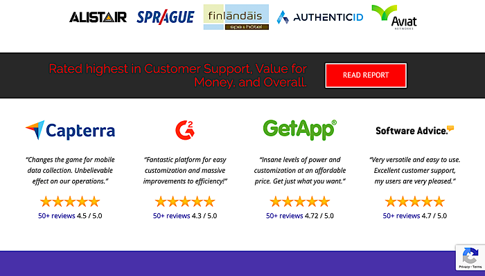
Forms on Fire creates software to help businesses manage data, and they have some great social proof on their page. First, they have a section where they have showcased some of their more prominent clients, and they also have a section with reviews just below that.
This way, they’re not only bragging about the companies that use their solutions, but they are also letting leads look at what people have said (not all of it good, naturally), showing they have nothing to hide and how proud they are of their product.
Utilize video to your advantage
Video is becoming increasingly popular, and landing pages are also using it more and more. True, there is a clear pro here: video allows you to speak to your audience in a more direct way and communicate your message better. But there is also a con: what if someone just doesn’t want to look at your video?
The best way around this issue is to use both copy and video. The copy should be clear about the message and the product or service, and the video should be there to enhance the experience without taking anything away from the power of your words.
Here is an example, this time from Touch Bistro, a restaurant POS system:
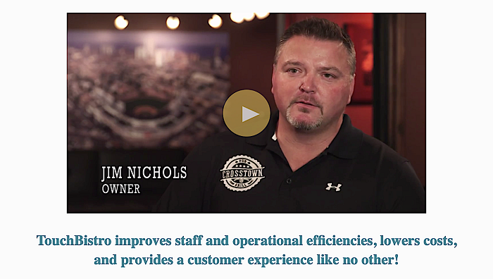
Source: touchbistro.com
Its clearest benefit is that it uses a real person to talk about real solutions, which is something you should do whenever you can. That way, you will be making a connection with your audience and leads better than if you were to resort to just words.
Focus on your users
Showcasing real people is always better than talking about abstract situations and issues, so using stock photos and unreal examples will never be as good as the real thing.
If you can, use the examples of your customers – keep them anonymous, but give real data about how your product or service can benefit a user.
Here is an example from Upwork, a platform that connects freelancers and employers:
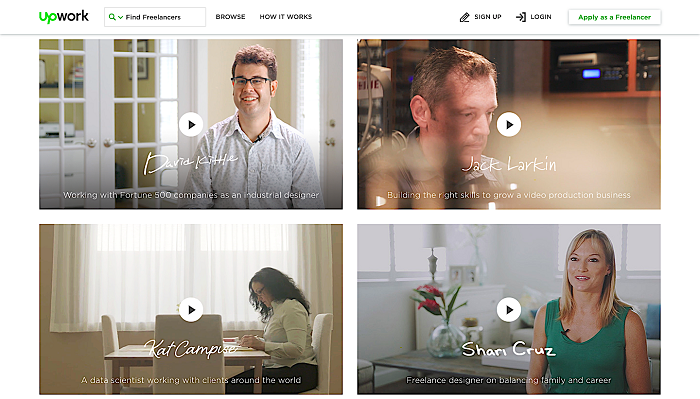
Source: upwork.com
Their landing pages feature one of their freelancers, which not only puts a face to the faceless process of hiring online, but it also shows the people behind the brand and how they are thriving through the platform.
Final thoughts
As you can see, designing a landing page that works well is a process that will take some time and a lot of thought – and your best bet is to try several different solutions before you commit to a final version. Test out different features and see how your conversions improve (or don’t).
Remember that your landing page is the first point of contact someone has with your brand and that you can never undo it. So think in terms of benefits for your customer and how you can best deliver your message, as opposed to how to convert more of them. After all, value remains the best conversion tool to date.