We live in an era where much of the communication and business has moved to the internet, and having a good website has never been as important as it is today. Design of your website is as important as the content on the website. No matter how good the content on a website is, if it is not appealing and easy to use it will drive people away. ![]()
In this post, we will go over a few design tips which can boost the quality of your website.
Golden ratio

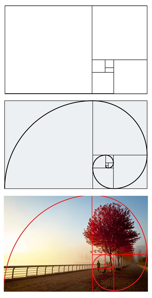
If you haven’t heard of the golden ratio you have certainly encountered it. It is present all around us in nature, art, architecture, and design. Even your face follows the proportions of the golden ratio, so what is it and why is it important?
The golden ratio is a mathematical term used to describe the ratio of the two numbers which is the same as the ratio of the sum of the two and the larger of the numbers. When things in nature, art, and design follow the proportions of the golden ratio it provides a sense of harmony and is naturally appealing to the human eye.
It has been used for thousands of years. The Pyramids in Giza are built in proportions of the golden ratio. Leonardo Da Vinci used the golden ratio in his art, including the Mona Lisa. Google uses the golden ratio in its logo, other symbols, and search page layout.
Once you know about the golden ratio it is not hard to implement it on your website. Considering the appeal it adds to your website, you really should use it. It’s a simple improvement but still an improvement that could have a significant impact.
The greatest artists in history and biggest companies of the world today haven’t ignored the golden ratio, and neither should you!
Overlapping and contrast

Overlapping is a term used to describe a design in which one of the elements covers a part of the other. This is another element that is easy to implement and could make a significant impact on your website.
When someone lands on your site, you will want them to focus on certain parts of your website more. If those parts are overlapping with other elements of your site, their attention will be more naturally drawn to it.
If you want to make those elements stand out even more, you can use contrast in combination with overlapping. This combination of overlapping and contrast is another design trick you encounter on daily basis, but not many websites use it. You can see it on your mobile phone and Facebook page when you have a new notification. A circle on the edge of the application icon will overlap with the icon and draw attention to the app. If the notification and app icon didn’t use overlapping and contrast, the notification would be much harder to notice.
Using this simple trick will help you lead your website’s visitors to the parts that really matter, and given the simplicity of implementing such a design, you should use it on the parts wherever and whenever it makes sense.
Use of white space

Many website designers use as much space as possible. By doing this they are ignoring the importance of white space. It may seem that white space is just empty wasted space but skillful usage of such space is important for several reasons.
A website with a smaller amount of content compared to the amount of empty space is much more attractive than one which is cluttered with text or images. Besides making the website look more attractive and sophisticated, with good use of white space you can easily create an intelligent organization of elements of your website. It highlights parts of your website and leads the eye logically to the parts of the website you want your users to look at.
Just read more about white space in design and you will easily see how much white space between the lines helps in reading a text. Not all web designers know how to utilize white space well and when hiring one you should find one that knows how to do it.
Loading speed

Loading speed of your website is as important as the content and visual design of the website. If your website takes too long to load, users of the website will lose patience and leave. That part is probably logical to you and your web designer will know about it, however, there are other things that loading speed of your website impacts.
One important fact that your web designer might not know is that Google is taking load speed of websites in consideration in algorithms, which determine website rankings. No matter what your website is about, you should strive to rank in the top ten websites for the keywords relevant for your website.
Your loading speed will be affected by various factors and you can improve two of those factors quite easily. The first one concerns the design of the website. You should take into account how “heavy” your website is. This means that websites with more elements and data on them will load slower. Good use of white space, that we talked about earlier, can help reduce the number of elements on your website and improve the loading speed of the website.
The other factor is the hosting. Be careful when choosing a hosting package for your website. Do a little bit of research and find a good hosting service. It might cost you a bit more, but the speed it offers will impact both the Google ranking and user experience of your website.
Conclusion
The above four design tips are among the less known tricks of the trade that are easily implemented and make a huge impact on the quality of your website.
