
Every page on your website tells a story, but few say as much about the brand as the homepage. This is the portal to the rest of the online experience and sets the stage for what visitors think about your brand. That’s why it’s helpful to study what others are doing and apply the same principles to your own work.
Here’s What Effective Homepage Design Looks Like
Your homepage isn’t just another URL. It’s a page that tells your brand’s story and attempts to engage visitors in meaningful ways. And while you can choose from any number of preconfigured layouts when designing a website, there’s something about blazing your own path and designing something that’s unique and specific to your brand. Here are four examples of brands that have invested in high-quality homepage design and reaped the rewards.

The first thing you’ll notice upon visiting the Uncharted Waters website is how immersive it is. The homepage features a large background video with compelling imagery from the documentary auto-playing from the moment you access the site.
Other than the video, the simplicity of the page is what grabs your attention next. There’s a play icon in the middle of the page that will actually let you watch the documentary straight from the website, as well as a simplified menu at the bottom of the screen that allows visitors to navigate to four other sections within the website.
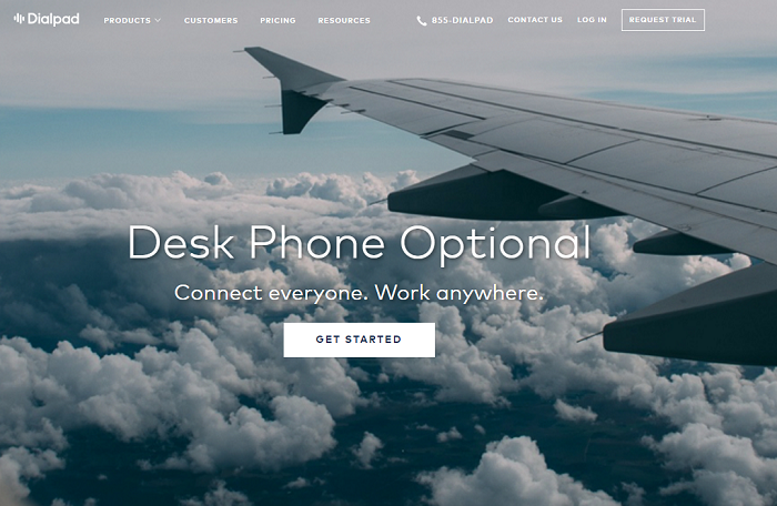
For companies that have a lot to tell their visitors, designing a clean and concise homepage that adds value to the brand without overwhelming customers is an immense challenge that’s very rarely met with as much precision as Dialpad is able to accomplish.
The Dialpad homepage perfectly walks the line between simplicity and the delivery of relevant information. Above the fold, you’ll see a minimalistic navigation menu, a large banner image, a clear value proposition, and a singular CTA. Scroll a little further and you’re exposed to multiple elements of social proof, which are organized in a very concise and systematic format. Overall, this website is incredibly pleasing to experience.
When your business is creative web design, the expectations for your own website couldn’t be higher. What’s amazing is that Big Drop is able to far exceed these expectations with a homepage that’s fully immersive, yet simple.
Above the fold, visitors are exposed to one large image with a simple byline, value proposition, and call to visit the portfolio. Users are then able to scroll down, which reveals a series of colorful sections with compelling imagery and brand-empowering claims. At the top right hand corner of the page, make sure you check out the yellow banner that reads, “drag down.” Upon clicking and dragging the tab, a contact form is revealed. It’s just another way this homepage incorporates unique design elements that pleasantly surprise visitors.
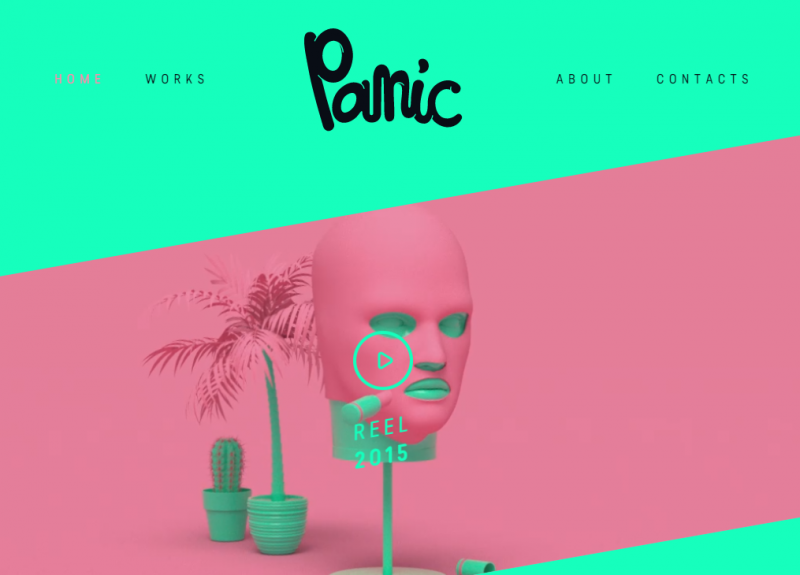
It makes sense that an animation studio would make this list. The first thing you’ll notice upon landing on the homepage is the unique blend of eye-popping color and wacky animations playing in the background. Scroll down a bit more and you’ll see some other selected works, as well as a simple footer with social media and contact information.
If a visitor wants to see more animation examples, all you have to do is click the play button in the middle of the page and a 75-second full screen video pops up with some examples of the work they do. The thing you’ll notice most about this homepage design is that it doesn’t follow any of the “rules.” It’s totally unique, which speaks to the story PANIC is attempting to tell its visitors.
Is Your Homepage Ready for a Redesign?
If your homepage doesn’t stand out, then you have to consider the possibility that your website is ineffective in telling your brand’s story. You may be in need of a redesign and shouldn’t delay any longer. In this article, we discussed four excellent examples. Can you use any of the design nuggets found within to shape your own homepage design strategy moving forward? A fresh homepage may be just what your branding strategy needs.