Online animation has become much more than a parlor trick for developers to show off their skills. Animation is used to create more sultry interfaces that feel smoother and easier to use. Natural animation gives off a certain vibe of corporeality to interface design.
One area that’s seen a lot of attention is the scroll-to-animate technique. Basically whenever a user scrolls down the page, some elements animate. The effects are tied to the scrollbar or the viewport and require a threshold before activating.
I’d like to cover some design ideas from websites using the scroll-to-animate feature. Although this trend is fairly new, it has evolved rapidly with greater browser support and lots of JavaScript libraries. By studying other websites you can determine what you like and how you might want to clone this effect for your own design work.
Icons and Graphics in Motion
In-page graphics are one of the more common items to animate. Since graphics are primarily used for visual effect, the added animation gives a greater sense of mysticism.
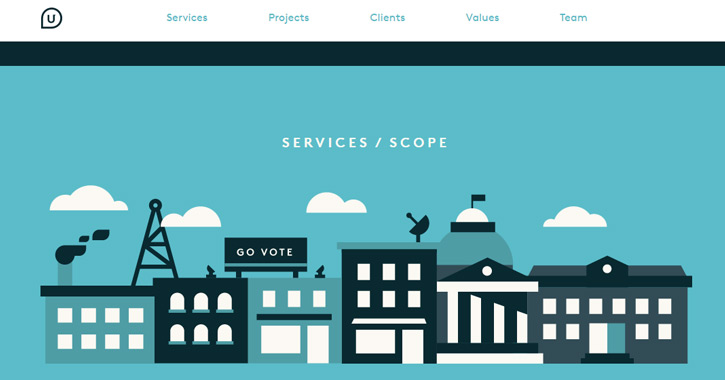
The most popular animation style is to reveal icons once the user scrolls into view. This usually happens just one time, and then the icons stay in their place until the page is refreshed. Take a look at Upturn’s website to see this effect in action.
After scrolling beyond the header, you’ll notice little vector buildings animate into view. That part of the page is built with SVG images so they’re much more flexible.
Moving down a bit further, you’ll notice a services list with smaller icons. These are also SVGs that animate on hover. The page itself is rather simple but utilizes just a few animated effects to seem relevant.
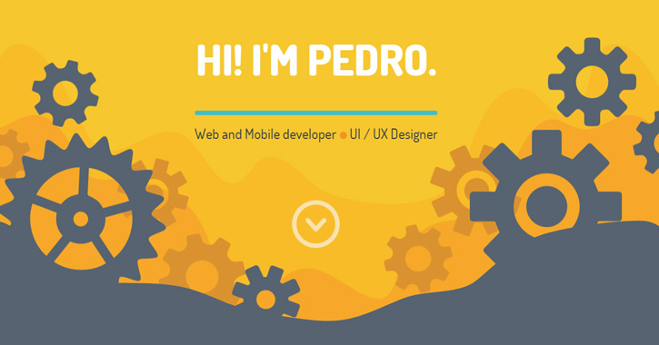
One other really cool example is the portfolio of Pedro Landaverde. The header section uses SVGs written in base64 as CSS backgrounds. When scrolling down the page, each gear will animate as if turning inside a larger machine.
Keep scrolling down and you’ll find all sorts of cool animated effects. Everything seems to be controlled via SVG files and scroll trigger events. Pedro’s website is also an example of how to reverse the animation.
In this case when you scroll back up to the top, you’ll notice the animations reverse order back to the starting position. It’s just one other technique you can try for in-page scrolling animated effects.
Parallax Motion on a Track
Another style of scrolling animation is traditionally dubbed parallax motion. Although this is a rather generalized term, parallax layouts do rely heavily on scrolling to animate page content.
Parallax motion layouts are used to tell a story. Content is the center of attention, but it’s conveyed to be more like an infographic. Lots of icons and background effects are pushed into the layout. Most notably, you’ll feel like one part of the layout stays “fixed” as you scroll.
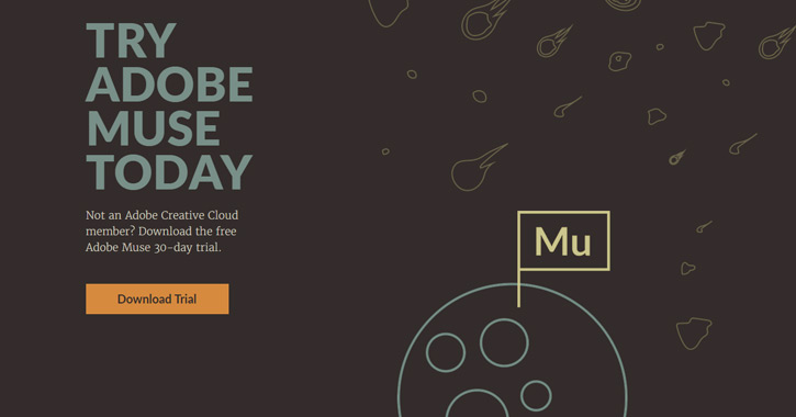
Take a look at the Adobe Muse webpage to see what I mean.
As you scroll down the page, bits of content will swap in and out of view. For the first part of the site, a rocketship graphic stays fixed in the center. Then other areas of the site have little elements that remain fixed no matter how far you scroll.
This technique is very popular with parallax design because it conveys a relationship between different areas on the page. All of the parallax effects are fixed onto a track which is controlled via the scrollbar. Try scrolling back up the page, and you’ll notice the animations go in reverse.
A more consistent example is the Atlassian InfoQuest page. This is a self-described infographic built in the form of a parallax website.
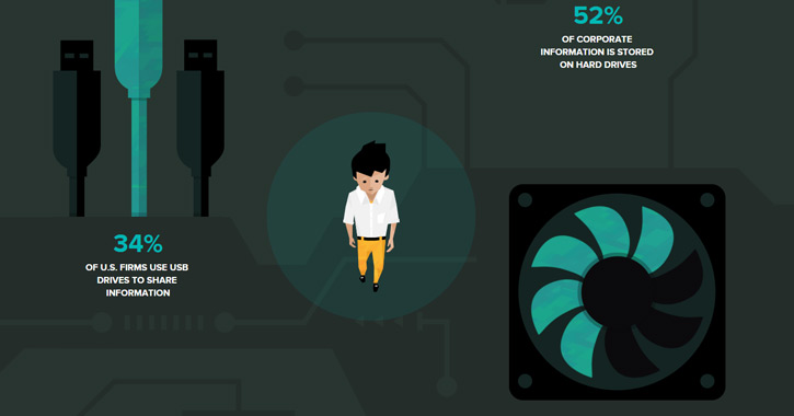
While scrolling, you’ll notice a vector character fixed at the center of the page. This little dude’s method of transportation changes from walking to boating and flying – yet they all remain fixed at the center of the page.
Other small graphics do have some animation, but they’re tied to the individual sections. These parallax animations use fixed content to give the layout an interrelated structure.
Morphing Page Elements
Complex animations are rarely seen outside of very abstract websites. These layouts are often more experimental – the perfect place to use crazy animations and push the boundaries of browser support.
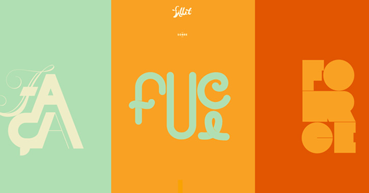
Morphing elements rely on simple ideas. Shapes and colors are manipulated to create a unique effect. The Fillet homepage, for example, splits content and switches between areas of high contrast.
As you scroll, the content sections transform with new styles of typography and iconography. The text itself is rendered with PNGs, but the individual letters can be animated separately.
One thing you should notice about Fillet’s site is that it’s confusing. You may have no idea what’s going on or why this website even exists. Abstract animation can be a deterrent to new visitors, so it’s best in small doses.
And while these effects won’t prove useful in many projects, you can test out abstract animation ideas when they feel appropriate.
Transformational Page Sections
If abstract animated scroll effects were put to good use, they might be applied as page transitions. Think about the different parallax layouts that require animated blocks to switch between content sections.
Custom animations are great for transforming areas of a page. Again this idea is very “out there” and may not fit every type of website. A little bit goes a long way, but if you’re designing a fully-parallax layout, you can get away with a lot more.
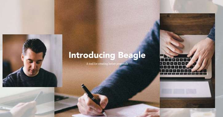
Beagle is a new proposal program with a funky landing page. It could be considered a parallax design with crazy abstract animations. Everything runs through scrolling but the animations aren’t tied to actual scroll notches on the mouse wheel.
Instead the page transitions occur even with just a single scroll. One page to the next is a seamless animation – there is no inbetween. Some users don’t like this effect because it hijacks the normal scrolling behavior of a page.
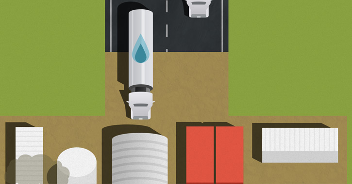
A more traditional style can be seen on the Dangers of Fracking website. It’s another parallax layout, but in this case the animations are tied to individual scroll notches.
Dangers of Fracking uses a number of combined animation techniques in one layout. It’s a great example of parallax design and how to transition between different areas on a single page layout.
Custom SVG Animation
The newest style of animation is controlled solely through SVG images. These are vector graphics typically rendered onto a page via canvas elements or through an HTML5 SVG tag.
Animated effects can be written into the SVG file, or they can be controlled through CSS3/JavaScript. SVG is an older specification that has only recently gained widespread approval for the web.
Many posts have been written about SVG animation and it’s surprisingly easy to learn. The difficult part is coming up with an idea that’s worth creating and putting into a website.
Square Cash uses a handful of SVGs on different areas in the homepage. Everything from drop shadows to animated characters are controlled via the scrollbar.
If you want to get into SVG animation, start by learning the basics of SVG files and how to create them for websites. Foundational knowledge of SVG structure will help you create more advanced and believable animations.
Free Open Source Plugins
You don’t need any special images or content styles to create scroll effects. There are plenty of free open source JavaScript libraries to help you get the job done. If you want to build your own scroll-to-animate effect, then save yourself some time by using one of these great open source solutions:
scrollReveal.js
Scroll Magic
CSS3 Animate It
ScrollMe
WOW.js
Skrollr
Scroll ‘Em
Story Tale
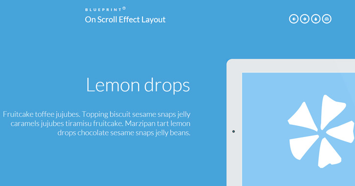
On Scroll Effect
