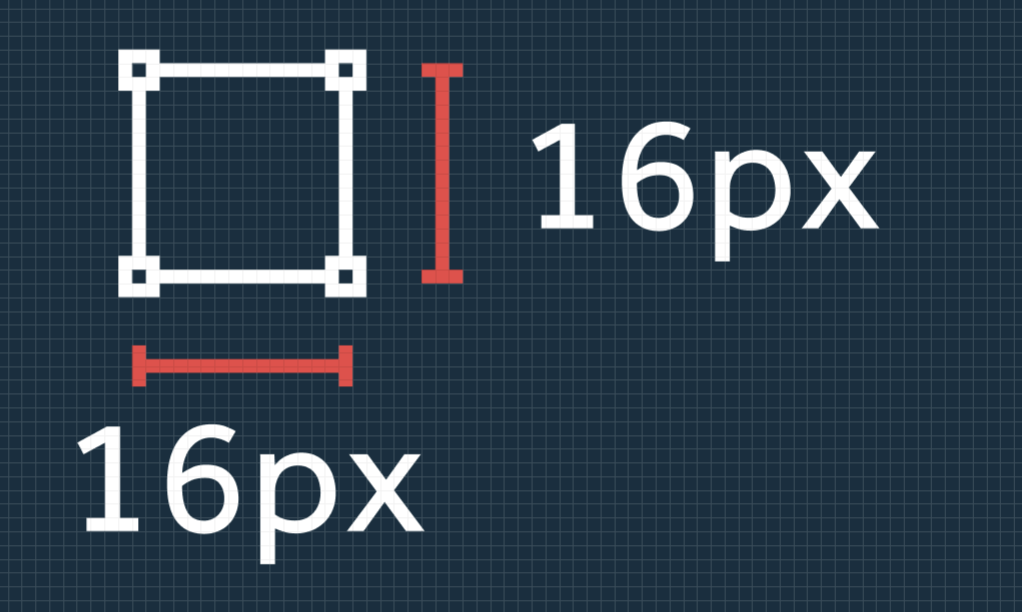
Always keep your frame consistent and export icons out at that frame size.
Try and fill as much of the bounding box as possible. This helps if you have tool bars or want to align multiple icons together.


Always use strokes at 1px (or your own scale) and inside the shape, this will reduce pixelation when exported.
Keeping strokes to the pxiel grid will reduce pixelation when exported, keeping icons looking crisp and sharp.

In this example of pixel aligned strokes vs center aligned strokes shows the difference on lower resolutions displays. The shopping trolley becomes barely recognisable when strokes are not pixel perfect.
One way of making sure that your icons are aligned is by manually adjusting the X and Y positions. This is especially helpful if you have pixel grid snapping on, where center aligned strokes snap to the grid and not fill the pixel.

Adding .5 to the X and/or Y position makes sure that your icons are aligned to pixels and not the grid.

Using this technique allows for fine-tuning of your icons to make sure that every viewer has a recognisable experience.

OK, so I’m going to slightly contradict some of the pixel alignment rules above here…

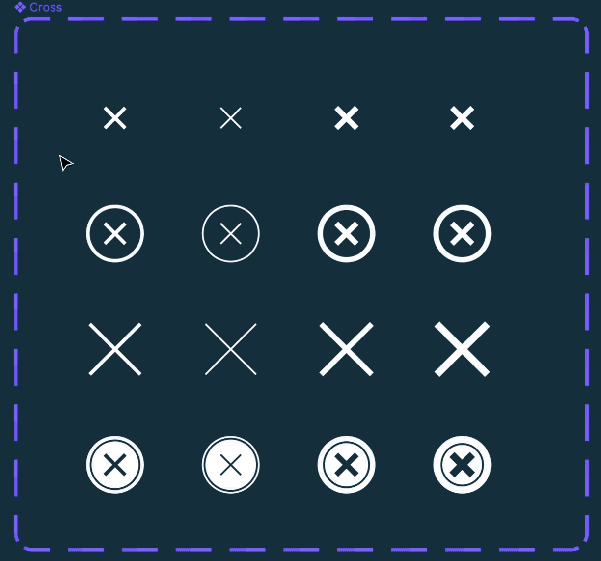
Adding finer detail; Sometimes icons need just a little extra detail to make the difference between a circle or a coin. I’m using a 0.5px stroke to add a little bit of detail, this helps when you have a large number of icons and icons of similar shapes. Make sure, where possible, to keep the stroke within one pixel grid and avoid the ‘pixel puke’ rasterisation on lower resolution screens.

I like my icons a little softer and introduce a small corner radius, at 16px I use the corner radius of 1px.

The corner radius can be adjusted depending on the use, e.g. arrow or pointy objects should have no corner radius (unless that’s your design language).

To adjust the corner radius at each corner use the top right panel or select the corner that you want to adjust.
As a general rule, stroke caps are a bit painful in icons, not adding them this makes it easier to keep the strokes aligned to the pixel grid.

Depending on the style of icons and your preference, you can change the caps on all endpoints or individually by selecting the Edit object icon.

Much like the aligning strokes the stroke cap needs to sit within the pixel. Adding caps adds .5 pixels to the length of your line.
To accomodate this, lines with caps at both ends need to be 1px shorter than those without caps.

For example, aline with a length of 26px will be 27px with caps at both ends. To make things consistent reduce the length of capped strokes by 1px.

You also need to adjust the X or Y position to reflect the new start point of a capped stroke. Your strokes will have to sit .5 px in to align with the pixel grid.
Always make your icon constraints set to ‘Scale’ — select all the layers in your icon and change to ‘Scale’.

This helps to scale the size when used in nested components, e.g. buttons with icons.


You can manually scale an icon, using Figma, with the Scale tool (K). To note, this only helps if you’re not using nested components. Icons that are using strokes vs icons that are outlined will only scale the shape and not the stroke or corner radius.

There are pros and cons to keeping the strokes in your icons. Keeping the stroke allows for easier editing in the future. While outlining a stroke makes corners and strokes scale wherever you use them. To outline a stroke, using Figma, SHIFT + CMD + O.


Icons work best at the power of 8. So always try and make your icon sizes divisible by 8 — this depends on what grid you’re using, if you’re using a 10×10 grid then make icons divisible by 10. For best results keep icon sizes consistent with your font sizes. For example, if you’re using a 16pt/px font then use icons divisible by 8. If you’re using a 20pt/px font then use icons divisible by 10.

Icons should be scaled to a maximum of 48px, beyond that use a spot illustration.
Strokes and corner radius should always be scaled in relation to the size of the icon.
For example:
16px icon = 1px stroke
24px icon = 1.5px stroke
32px icon = 2px stroke
16px icon = 1px corner radius
24px icon = 1.5px corner radius
32px icon = 2px corner radius
Just like font weights, icons can have weights. As a rule of thumb, icons should match the font weight used near them.

Again, just like normal strokes these should be scaled (K) if the icon is scaled.


