Evolving the Office brand for a new world of collaboration

This article was originally posted on LinkedIn on March 23, 2020.
When I first began my design career in Rio de Janeiro, Brazil, where my early work was founded in branding, the idea of working with such a well-established and recognizable brand such as Microsoft’s seemed like a far-fetched dream. Fast forward two decades and I find myself right in the midst of an exciting transformation here at Office, where both the experience and its brand are evolving into an exciting new direction.
Some of the most obvious catalysts for this evolution were both the simplification of our core experiences and later, the redesign of our experience icons, both of which contributed significantly to the overall aesthetic and functionality of the new and modern Office.
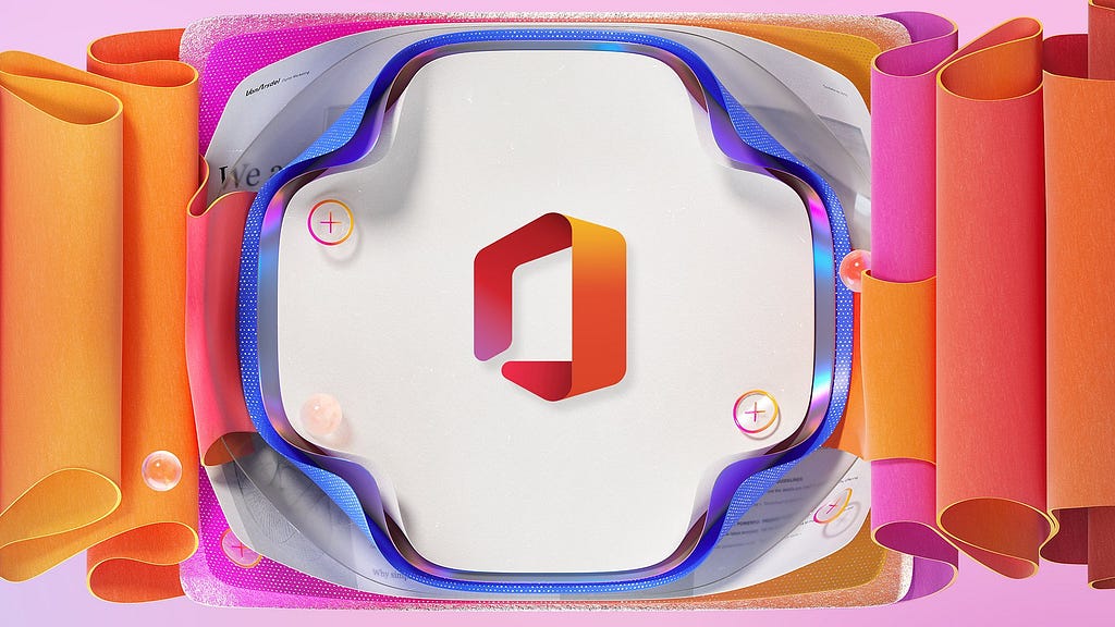
Last December, we revealed yet another set of icon designs, including one for Office itself. The timing of this brand evolution was in sync with the reveal of the brand-new Office mobile app, which combines Word, Excel and PowerPoint with uniquely mobile ways that make document creation easier.
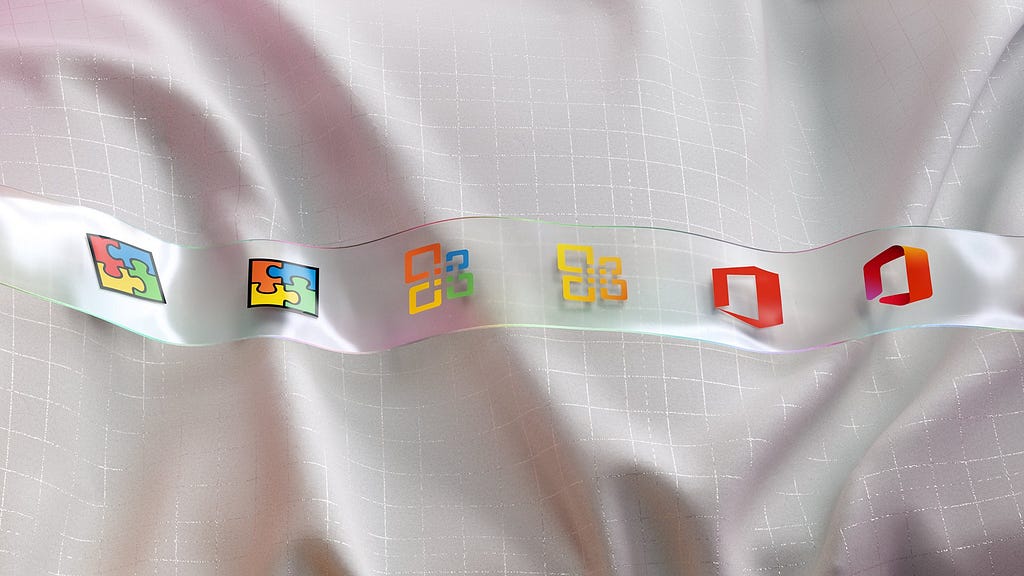
As we began the redesign process for the Office icon, we were eager to simply crack open Adobe Illustrator and begin generating ideas. Although we did some of that, we also discovered that the challenges of revisiting such a widely known icon were actually much larger than we had expected. After all, for many, it represented a beloved and familiar set of creation tools that had been around since the 1980's.

With many variations of the icon pinned across our design studio and research results starting to fill our inboxes, we began to collectively gravitate towards the familiar threshold shape that our customers were already accustomed to. We added depth, a richer color palette and softer, friendlier silhouette to align its aesthetics with our other icons.


Below are just a few among the many shapes we explored over many weeks of iteration. These largely revolved around the metaphor of an opening, a vessel or a container for creation tools.
https://medium.com/media/8c7ba7a61ffebf3a631586d658a6b65d/href
In retrospect, this project wasn’t all that different from the smaller brand assignments I had worked on early in my career. It took some creativity, attention to detail and rigor, as well as some courage and gut instinct.
Ultimately what really set this apart from my previous experiences was all the cross-team collaboration. Instead of relying on a traditional design and approval processes, we inspired each other along the way and depended heavily on our collective insights, intuition, experience and candor.
I’ll let you be the judge of the final result, but I am incredibly proud of this group of people below and excited about where the Office experience along with its brand-new icon is headed.
Credits: Alberto Cerriteno, Annice Jumani, Austin Taylor, Becky Brown, Bo Smith, Burns Montgomery, David Hose, David Huang, Jon Friedman, Lauren Keckley, Mistelle Taylor, Nando Costa, Phil Evans, Sunmin Chung, Sven Seger, Therese Okraku, Tim Garret and Tracy Childers.
Images & Videos: Alexis Copeland, Michael Yoon, Ryan Gagnier, and Buck Design.
If you are interested in reading more stories and seeing content from Microsoft Design, follow us on Instagram, Medium, Dribbble, Behance, Facebook & Twitter.
The rebirth of Office was originally published in UX Collective on Medium, where people are continuing the conversation by highlighting and responding to this story.