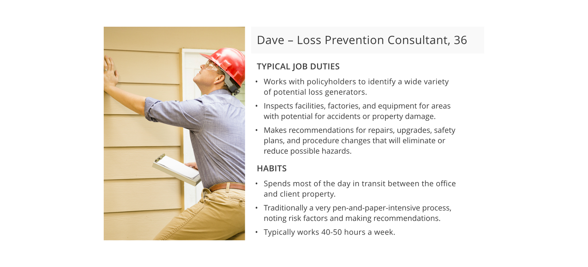
The User
Loss-prevention consultants inspect residential and commercial buildings to help ensure systems (such as fire protection systems and fuel-fired equipment systems) meet local, national, and industry standards.
These consultants compare different risk factors across multiple assigned locations. This comparison allows them to make recommendations to property owners of how to mitigate risks and thus reduce their insurance premiums. Using their web-based risk-logging system, they can view recommendation history, upload photos, and add comments specific to a site location.
The client wanted this functionality available to their consultants on mobile, given their on-the-go workday and need for at-hand information while onsite at client locations.
Enter: The Table 😱
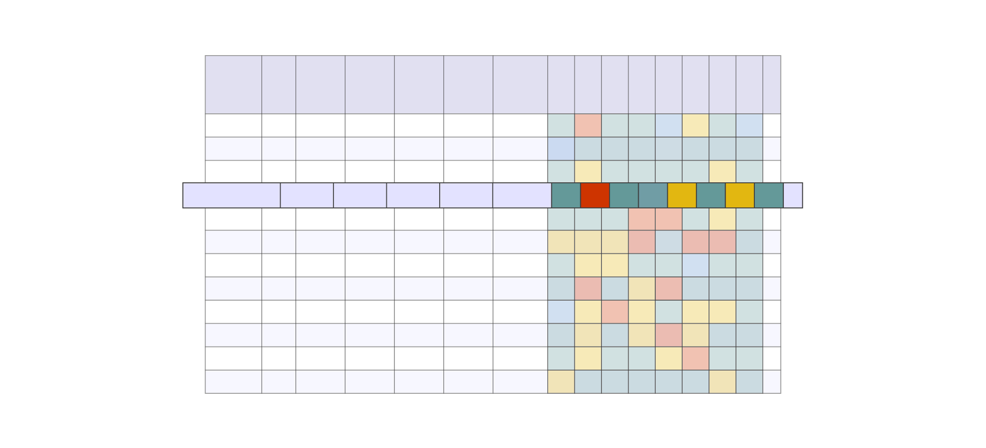
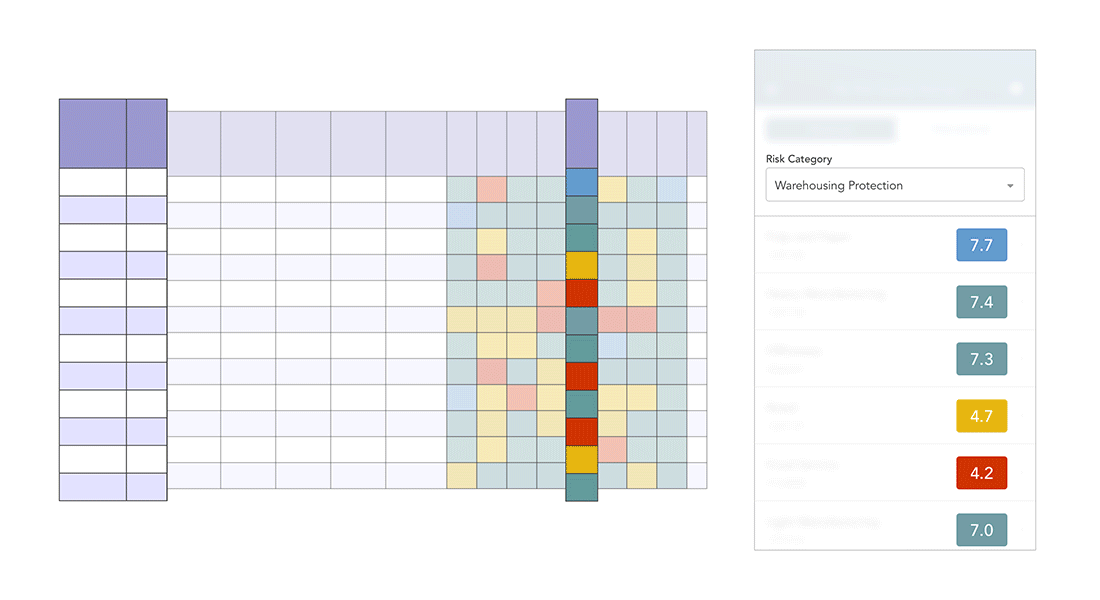
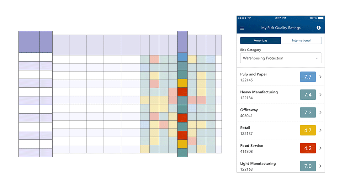
The data table I was tasked with mobilizing contained various locations distributed in 20 rows and risk categories distributed in 8 columns. The client informed us that the color-based risk score system was the critical UI element that users needed to make risk comparisons.
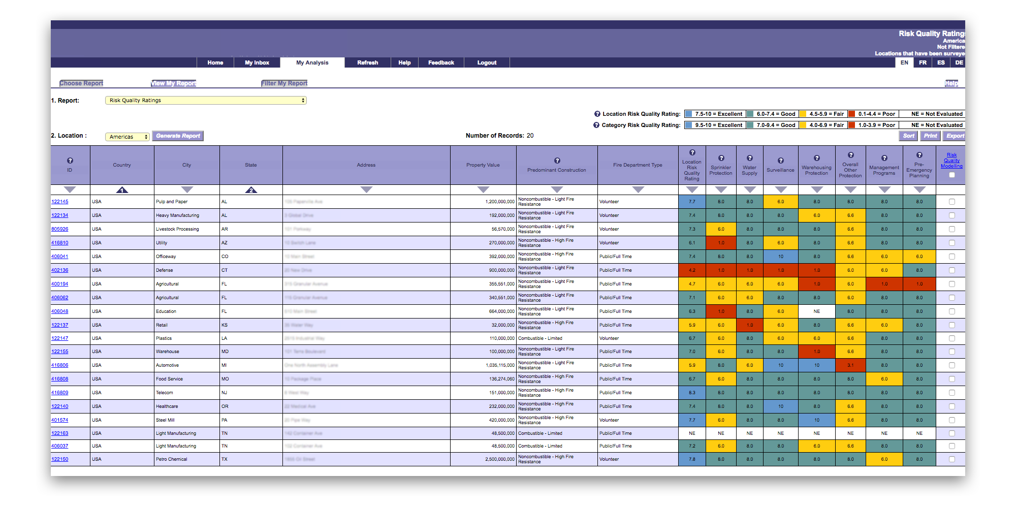
On desktop, displaying a table this size is not a problem. With the benefit of excess screen space, users are free to scan left to right, top to bottom, and perhaps take advantage of filtering and sorting options. But in a mobile context, it’s important to remember that screen real estate is limited and the user’s attention is short.
For this design to be successful, I knew that actionable content needed to be presented as soon as possible.
Design Approach
How do users consume this information?
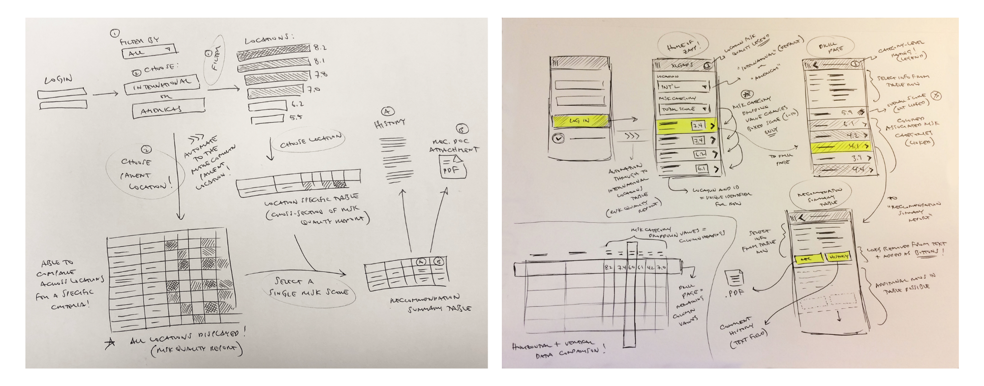
The first step was to understand how consultants used and interacted with this data in its native web-based form. The different ways that users consumed the data determined the design of its mobile counterpart. Insight from the client highlighted two different approaches:
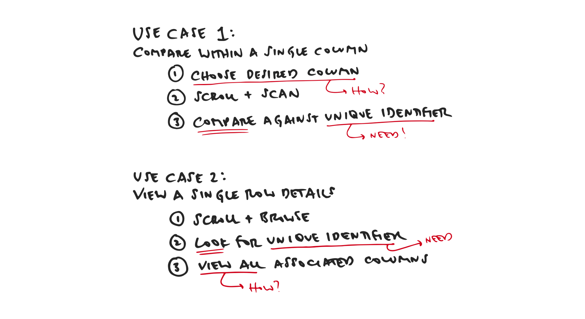
Use Case #1: Comparison of a single risk category score across multiple locations (i.e. vertical scanning, column-specific)
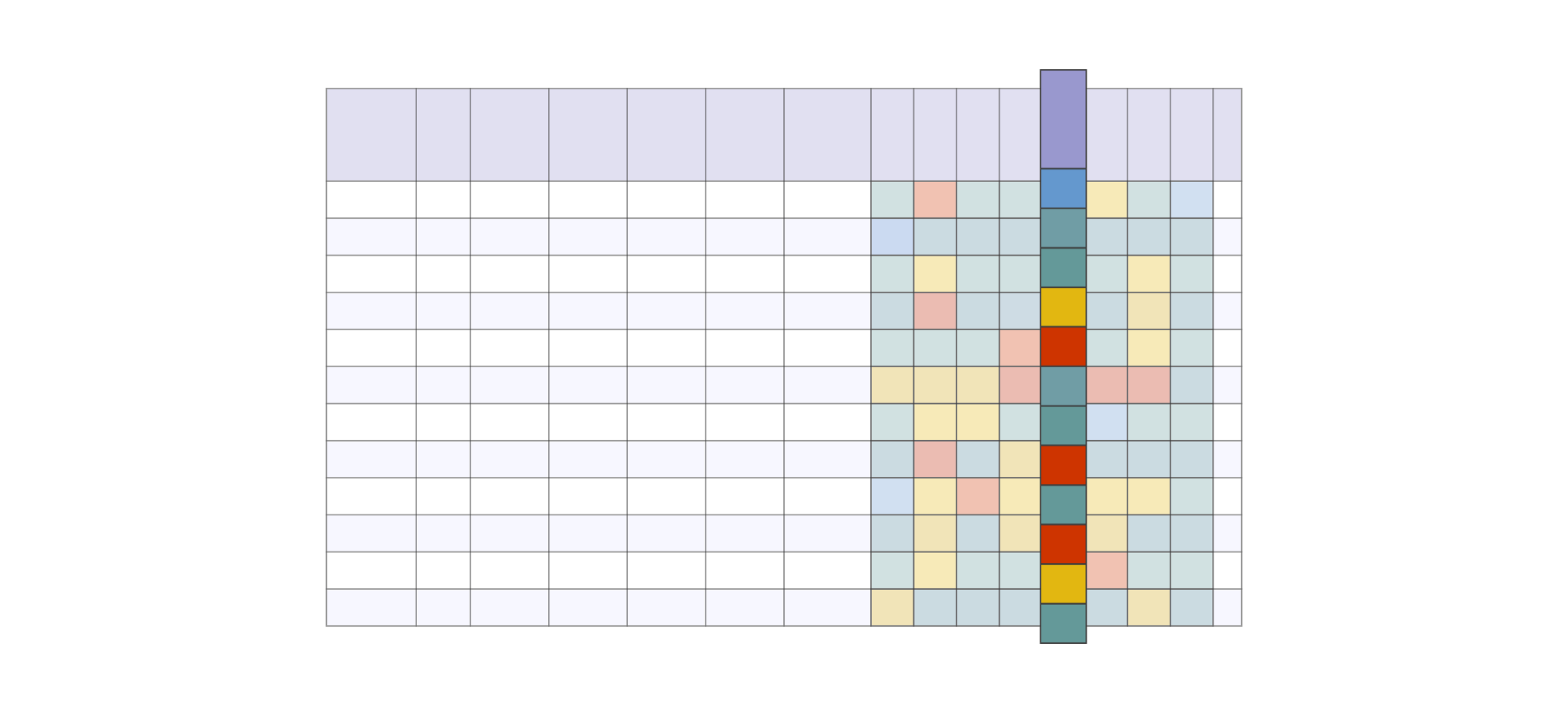
Use Case #2: Comparison of multiple risk categories within a single location (i.e. horizontal scanning, row-specific)
Our discussions with the client revealed that users didn’t need all information presented at once to achieve their goal. Limiting the display of this table by catering to these two use cases allowed us to ideate different layouts appropriate for a mobile form factor. I divided each use case into discrete steps to help guide the design.
Flexible UI FTW
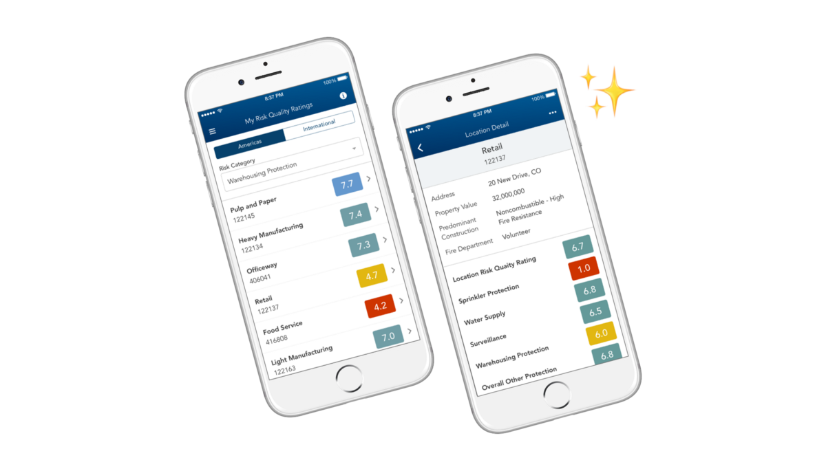
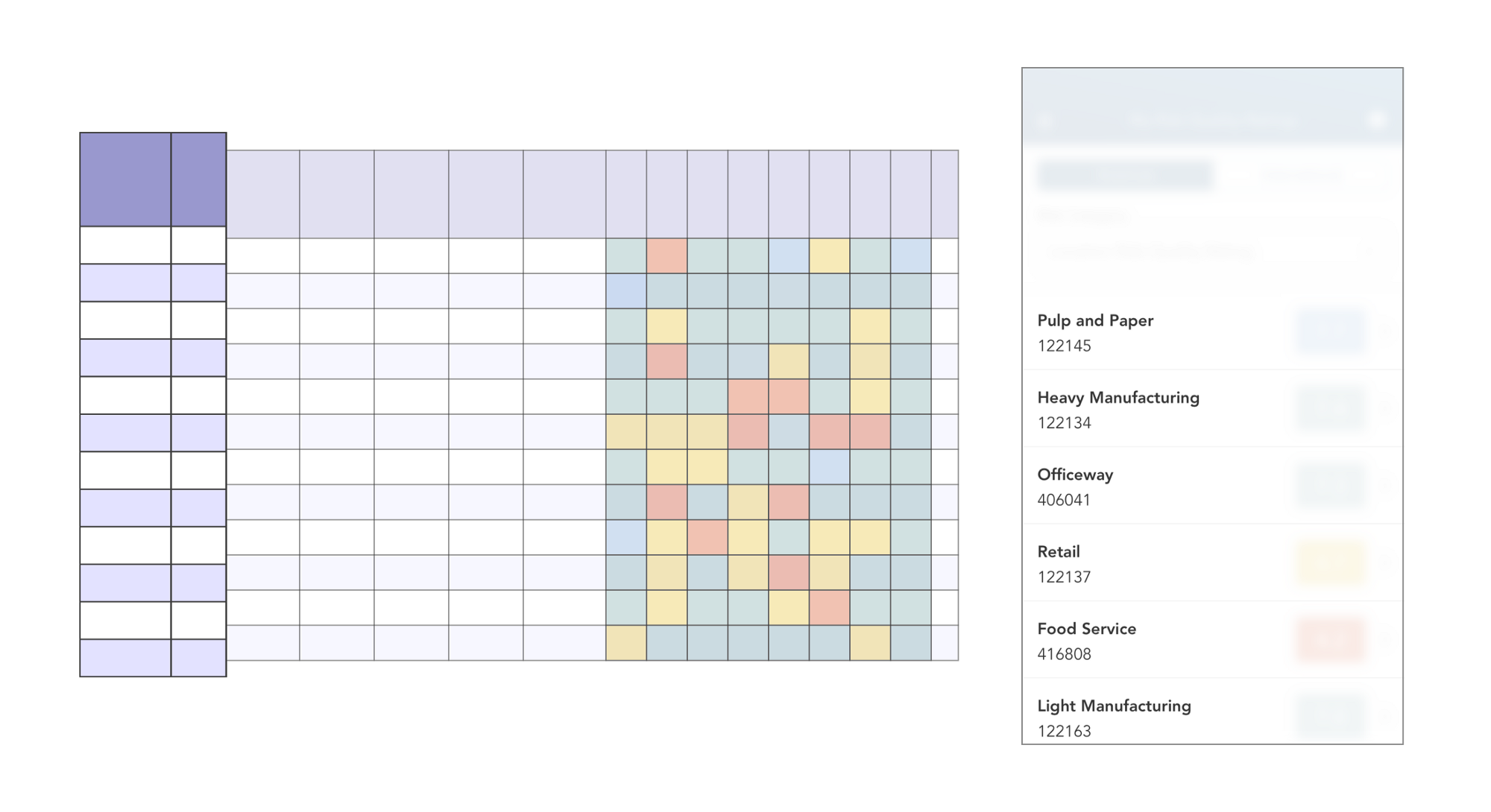
After dissecting the two use cases, I realized the user would need a persistent, unique identifier to identify the table row. These were the first two columns, “Class” and “ID”.
Satisfying Use Case #1
Which risk category (column) does the user want to compare?
Only after identifying a target risk category (column) would the user then compare down vertically across locations. To facilitate this comparison, a virtual dropdown was added that contained the column headings in the table. Selecting one would update a single colored value in each table row.
Our engineering team nicknamed this mobile table implementation a “rotating table” given that columns are actively “rotated out” at the top level.
Satisfying Use Case #2
Which location (row) does the user want to investigate in detail?
If the user wanted to view all risk categories within a single location, they would first locate the desired row and then tap it to view the location’s full report (i.e. all column values in the table row) in a separate page. This list-detail relationship, an established mobile design pattern, fit very well.
A Mobile Design Pattern is Born
This relationship of viewing data horizontally within a table row and vertically within a column is one that we at Capriza found in several workflows.
Most notably, timesheet entry is a very common use case for companies with hourly contractors who need to log time against multiple projects. Using complex data tables with editable hour entry cells, some users diligently divided their eight hours by each project every day (vertically within a column), where others entered all their time at the end of the week within individual projects (horizontally within a row).
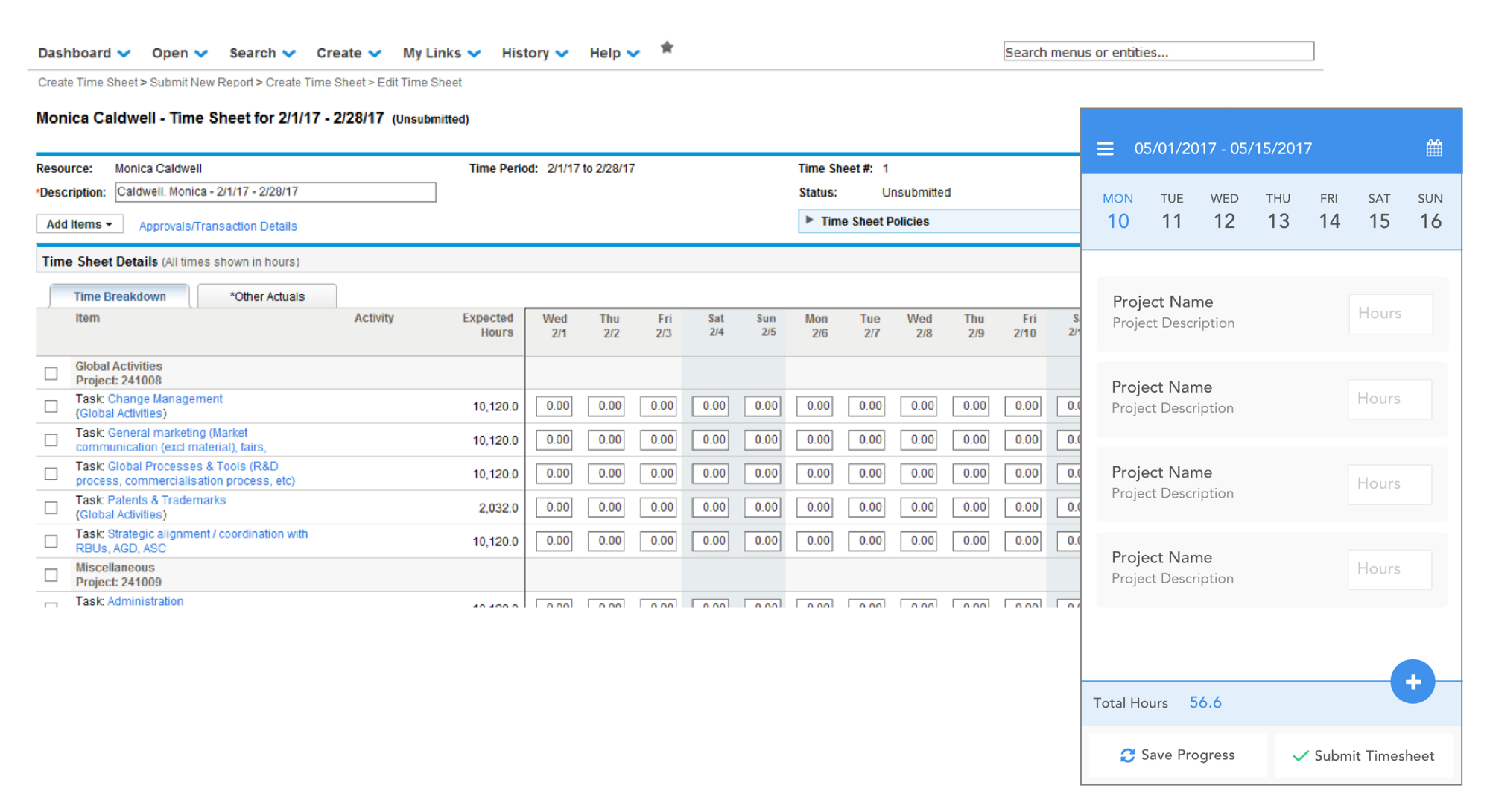
The design pattern born from this risk assessment engagement formed the foundation of Capriza’s timesheet entry app (full details on its design here!). The flexible table display catered to users of both habits and has since been applied to many more workflows and use cases.
The game changer in this project was the realization that users don’t need to view a large data set all at once. By focusing on the discrete steps of how information is consumed, we were able to limit the presented content to the absolutely relevant. In the end, the client was pleased with the result as our engineers were with the new design pattern.