The effect of small animations on the user experience and how they improve important KPIs such as conversion rates and discoverability. Two user studies were carried out with more than 140 participants to underpin the findings.
Animations are often included in modern user interfaces to bring life into the design and delight users. Animations can also help the users to understand the inner mechanics of a design. Moving elements draw attention and make the conceptual connection between different elements visible. One cannot underestimate the impact that even a subtle animation has on the user’s perception. To better understand this, I recommend taking a look at the Google Material Design guide or Issara Willenskomer outstanding article about the different motion principles.
I was curious to understand better to what extent animations can improve the user experience and to measure and quantify their impact. To study this, I ran two UX experiments around a mobile shopping application in which I asked the users to fulfill a simple task. I choose the shopping domain, as I expected that most of the users would be familiar with the tasks at hand.
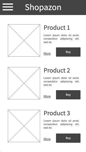
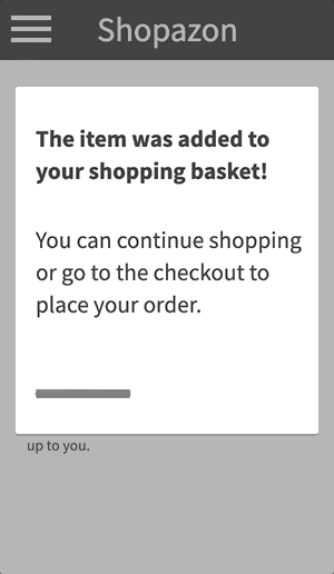
The experiment got inspiration from the design of the current Amazon mobile app. The users were presented with the product page and asked to add the given item to their shopping basket. Once done, a page with related articles was displayed. This page also included a “checkout” button in the top navigation bar, linking to the checkout page: on click, the test was finished; if the user did not click on the checkout button, a popup with task instructions was shown.
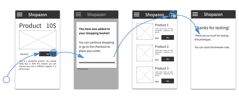
To measure the impact of animations, I created two versions of the prototype in Quant-UX and ran an A/B test. In the static version, the checkout button is immediately visible whereas in the animated version the button fades in after 0.7 seconds. This animation has a duration of 0.5 seconds. An additional status indicator, to show the number of items in the basket, slides in after 1.2 seconds.
The goal was to find out if the users of the static version would take longer to discover the checkout button and click on it. Consequently, I had to measure the time between the moment one arrives on the second page and the moment the checkout button is clicked.
I asked 78 users to participate remotely in the experiment. Each user was randomly assigned to the static or animated prototype. The users of the static prototype took, on average, 8.6 seconds and 2.9 interactions to click on the checkout button, whereas the users of the animated prototype took, on average, 6.6 seconds and 1.9 interactions. This translates to an average improvement of 21% with regards to the completion time and a reduction of 30% with regards to clicks.
Animations improved the task duration by 21%
The simple calculation of the means indicates that the animation made it easier for the users to discover the checkout button. However, as the statistical mean is sensitive to outliers, a single user — one that did not find the checkout button — can distort the results, leading to wrong conclusions.
Therefore, a more in-depth look at the time and number of interactions was needed. To do this, I used a box-plot. A box-plot summarizes how the observed measurements are distributed. It shows the minimal and maximal values as a line and the mean as a red bar. In addition, it shows a band around the mean. The size of the band corresponds to the variance within the data set. The larger the band is, the higher the variance. A high variance means in this context that the users behave very differently to each other and that there might be several groups of users where some have problems understanding the design.
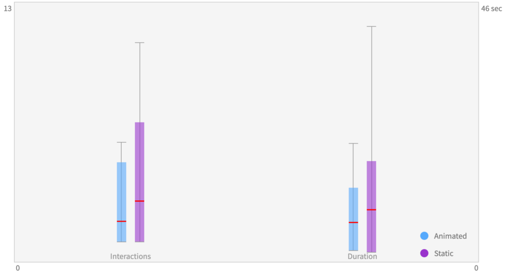
So what does this mean for my designs? The lower mean values indicate that it is easier for the users of the animated version to discover the checkout button. But a more detailed look revealed something slightly different. The majority of the users did not have any problems fulfilling the tasks, but more users in the static version had issues discovering the checkout button: 10 out of 38 users took more than 4 clicks in the static version, whereas only 2 out of 40 had problems in the animated prototype. These results indicate that the animation helped to discover the button and reduce the rate of lost users.
To further confirm my hypothesis, I ran a second experiment. In this case, I changed slightly the design and placed the checkout button at the lower right corner of the screen. Very much like the Material Design floating action button.
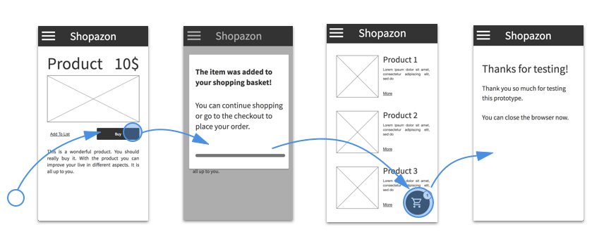
Again, I created a static and an animated version of the third page. In contrast to the first prototype, I did not fade or move-in the button but transformed the progress-bar into the checkout button to highlight the relation between the elements and the logical order in the checkout process.
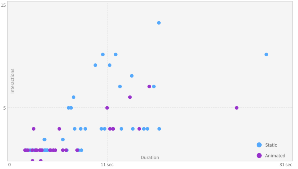
I ran another A / B test, this time with 72 participants. The users of the static version took 8.8 seconds to discover the checkout button and needed 3.8 clicks, whereas the users of the animated version took 6.6 seconds and, once again, 1.9 clicks. The scatter plot confirms the observations from the first test: the majority of the users had no issues finding the checkout button, but the number of lost users was significantly lower; 12 of 40 users took 4 or more clicks, whereas 4 of 32 users experienced these issues in the animated prototype.
Both experiments confirm that animations can steer the user’s attention towards certain UI elements. Well placed animation helps the users to discover the next actions faster and reduce the time and interactions needed to fulfil a task. In both cases, users of the animated version were 30% faster and used 30 % fewer interactions. The animations prevented the users from getting lost in the design and helped them to better understand the application process.
The number of lost users was reduced by more than 300%.
The most interesting insight was that only a subset of the users benefited from the additional guidance. Experienced users did not benefit much; however, new or inexperienced users benefit from the supplementary advice that was provided by the animation. In both studies, the number of lost users was reduced by more than 300%. This finding is important. Even small animation, that are easy to implement, can have a big impact on conversation rates und the general user satisfaction.
I used Quant-UX to create both prototypes and conduct the analysis. Quant UX is an open-source tool that anyone can build upon. All graphics were directly copied from Quant-UX. You can try out the prototypes here and here.
![]()
Small animations; big impact was originally published in UX Collective on Medium, where people are continuing the conversation by highlighting and responding to this story.