Introduction
At one point, you’ll have to start working on the library. From what I’ve seen, starting with the typography system helps standardize concepts such as spacing, rythme, and overall style. You can find lots of different resources, so much that it can feel overwhelming.
For the most part, I followed this methodology from Priyanka Godbole which is the most insightful I’ve read.
Pick a font
You can use SF Pro for iOS and Roboto for Android. There’s nothing wrong with native fonts, on the contrary! If you want to use a custom font, make sure it matches a specific purpose, and don’t forget to care for readability.
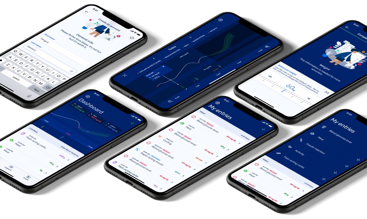
At Hillo, given the broad array of users, I knew I would use lots of native elements to have the easiest and most relatable application possible. That being said, we truly wanted to have our own identity. Colors can help, and so can fonts. After a few style experimentation, I settled on Rubik. It’s a well known, playful but straightforward font.
The first thing I did was to determine the default « body » specs. After tweaking and testing, I settled on these Sketch values: Size 17, Character -0.3, Line 21, Paragraph 15. The takeout from this was that I was going for a 3px grid system (more on this later).
Then, following the above methodology, I was able to create:
- All the text styles I would need. You want to future proof your system, but you don’t want to clutter it with useless styles. Keep in mind the product and people you are designing for.
- Their values such as size, letter spacing, line spacing or paragraph spacing using a modular scale. I used a scale of 1.235, but I rounded the output values to work with my 3px grid.
Remember a system must breath, so feel free to break a rule if it better fits your product.

Mobile specificities
Looking for accessibility guidelines, you may have read articles saying your layout should adapt to any accessibility feature enabled by a user on his device. It’s true.
On android for example, you would use SP units instead of DP units for all texts. SP allows the system to resize the font according to user settings. It’s important for visually impaired people.
On iOS, from what I understand, the dynamic text size comes from the use of text styles. If you’re interested in knowing more about this, you can check this link.
At first, all my texts were responding to accessibility features. But later down the road, we implemented exceptions to this rule. In the type system above, here are the styles that aren’t scalable and the reasoning behind this:
- heading_60, heading_48, heading_39, heading_33, heading_27: primarily used for large titles, these styles were already big enough for users to read.
- heading_17: primarily used for titles in appbar. Appbars can be cluttered elements with icons. Scaling the title would truncate it too much, which is counter intuitive.
- CAPS_17, CAPS_14: primarily used for CTAs. Sizing and letter spacing offer good readability.
- highlight_11: primarily used for bottom navigation titles. Bottom navigation bars are cluttered elements with icons. Scaling the title would truncate it too much, which is counter intuitive.
For now, I’ve seen apps:
- Ignore user’s choices regarding text sizes (most);
- Implement the scaling but applying it on all text strings (some);
- Do things dynamically, which I find is a good balance (a few).

The idea here is not to shame any app. After all, my portfolio is all but accessible… I’m sure there are reasons to these choices. We would have to think in terms of the entire projects to understand these choices. Pick the solution that seems right to you.
Naming
Don’t use descriptive names for the different text styles. When you’re starting a project, you’re far from being sure of how things will evolve. That’s how I found myself using a style called Tabs for a caption… I then changed every font name, based on their specificities. For example, Tabs became highlight_11. It may sound easy but it’s not always that simple. We designers are not the only one involved! Changing a little detail on your design system can and will impact all teams.
While reading my final draft, one of my friends and talented product designer shared some concerns about this naming scheme. If you ever chose to change your font some day, you may want to make a few modifications to accommodate. If you have to reduce from 39px to 38px, the naming would not make sense anymore. That being said, it’s a tough call. If we rename highlight_11 and highlight_14 to highlight_2 and highlight_1, we may be stuck if we want to add a third option in between. Let me know what you think!
Handoff
I can hear you shouting: Zeplin, InVision! Amazing tools, there is no denying. But I’ve yet to find one that can correctly translate all text styles values into usable Kotlin or Swift specs. In this project at least, I wasn’t happy with the results.
Given text styles should not change every day, I encourage you to work with developers or to do the math yourself to find the right values. I tried various formulas and then rounded the results to match my grid.
Here are the formulas that worked better for us. I either found them on the internet or created them:

Then, I created a simple HTML page that I forwarded to the developers. They can hover a specific line matching a text style and have every value highlighted. The three styles showcased here are: body_21, body_17, body_14 and CAPS_14. A bit old school but it served its purpose.