Oct.21.10–Nov.25.10

Global wordless communication
Artist Ryan McGinness once stated that visual symbols are read as embedded forms of cultural knowledge. We no longer consciously acknowledge graphic symbols. Contemporary audiences are intimately familiar with visual iconography. Wordless communication systems are interpreted effortlessly, subconsciously. The information conveyed is internalized, requiring minimal energy deployed for translating graphic forms into tangible meaning. The cultural knowledge acquired has made this comprehension innate. When searching for a public amenity — say a public bathroom — we no longer read the symbol for male/female washroom as such. We simply understand intrinsically the referent to which the symbol signifies, and we act upon this knowledge.
Graphic symbols are deployed throughout public and private spaces. They are integrated into every context imaginable, as ubiquitous as air. The goal of the symbol is to communicate complex information wordlessly, through formal graphic means. This form of global wordless communication is highly adaptable, able to perform effectively and efficiently within any and all points around the globe, across borders, regardless of language or culture. These forms of adaptive communication are highly suitable for societies undergoing profound change; effective for accelerated speed of life, increased multilingual populations, and progressively more visually-sophisticated audiences. The transportation sector, for instance, has benefited greatly through the implementation of a symbol system designed to relay complex information quickly and clearly. The facility that symbolic information systems possess in order to communicate rapidly keeps pace with the ever-increasing velocity of human life and culture.

Symbol systems are also adaptive forms of communication within contexts where the deployment of spoken or written language is problematic. Throughout the 20th century, the ever-expanding movement of human beings became increasingly more international in scope. The intensifying multilingual membership of cities presented certain challenges for communication between occupants and itinerant travellers. The international airport became the site of focus for the incorporation of wordless communication systems. Signage and way-finding programs incorporated visual symbol systems integral for communicating above and beyond spoken and written language. Visual symbols were tasked with the role of communicating important information to international audiences through graphic form. This strategy bypassed the problematic nature inherent within communication systems composed of words and language imperceptible to foreign audiences. The brilliance of well-designed symbols resides in their ability to communicate to audiences beyond the limitations of spoken and written language. Visual symbols strive to serve as a universal language through graphic and image-based media.
“Symbols are specifically designed graphic elements intended for wordless communication. If your symbol requires a description, you’ve failed as a designer and communicator.”
Like any language, symbol systems are learned. Nothing is intuitive, contrary to contemporary sales pitches for platform-based icon systems. Experience within the world, with objects, and ultimately with the words and symbols referencing everything within our life, is required for shaping creative symbolic comprehension. One of the major Western rituals determining the passage into adulthood is made through the acquisition of one’s drivers license. To fully understand the graphic language of the roadway infrastructure requires intense study. This expansive language including graphic form, colour, primary and secondary icons, and terminology, simply cannot be intuitively understood. The expansive graphic, colour, and structural complexity of the roadway system is overwhelming. The sales pitch made by UX technicians suggesting that UX principles lead to intuitive audience comprehension into forms of graphic language is both dangerous and irresponsible. New languages, dialects, visual systems, and foreign linguistic communication requires considerable education and familiarization. If a symbol is to function effectively, comprehension of its reference is required. A symbol of an escalator, viewed by an aeroplane passenger having no prior interaction with an escalator, will fail to communicate. In order for symbols to function effectively, their referents require a high degree of familiarity. Knowledge of wordless graphic communication systems is acquired through active participation within contexts where symbols are prevalent — mainly, highly industrialized, Western states. This suggests that symbols, primarily, are designed for audiences residing in nations of considerable technological capacity, familiar with the daily interactions, mechanisms, and technologies prevalent within industrial nations.


Effective communication is enhanced through the proximity to which a symbol is placed to the object/subject to which it refers. A symbol of an escalator will enhance comprehension and prepare a pedestrian for interaction when it is placed in proximity to an actual escalator. A symbol communicating an upcoming bend in the road will enhance understanding for an automobile driver when placed in proximity to the roadway deviation. Symbols form relationships to the object/subject to which they refer. Similarly, a symbol will no doubt cause confusion if placed within a location absent of its referent. A symbol of a water fountain placed within a desert (where no fountain exists) serves no purpose for the viewer. It will no doubt cause the viewer needless (and possible harmful) stress and strain searching for the object’s location to which it refers. Similarly, a symbol alerting an upcoming bend in the road placed beyond said curve will be useless and dangerous to an automobile driver.
The design, relationship, and proximity of a symbol to its referent provides comprehensive, clear, and efficient communication. Symbols may be paired with additional graphic devices, such as an arrow, designating a direction in which the object/subject may be located. This combination is helpful in instances when the referent cannot be easily located from the viewer’s present perspective. Our automobile driver is now able to anticipate the upcoming bend in the road alongside the advised speed reduction.
These are examples of open symbol systems: symbols intended for consumption across wide social landscapes. Symbols are designed to be efficiently recognized. This is made possible through the formal graphic representation of objects, actions, interactions, consequences, and processes experienced throughout the physical world. A symbol representing an escalator is communicated through a simplified two-dimensional graphic of an escalator, usually incorporating a passenger. A symbol of a bicycle lane will be expressed through a simplified two-dimensional graphic of a bicycle. Open symbols are designed to be familiar and recognizable based on their formal relationship to the thing they reference; they leverage recognizable cross-cultural imagery for wide interpretation and comprehension.


Closed systems are symbol families designed for audiences with shared specialized knowledge. These symbol systems tend to be designed with more abstract formal graphic languages. The symbols incorporated by architects and engineers into plans, elevations, and perspective drawings, are designed for a limited audience within a specific field of practice. These symbol systems are primarily incorporated into closed and more private contexts; a form of shorthand, implemented in order to save time, enhance understanding, and preserve resources. These systems will be explored in future articles.
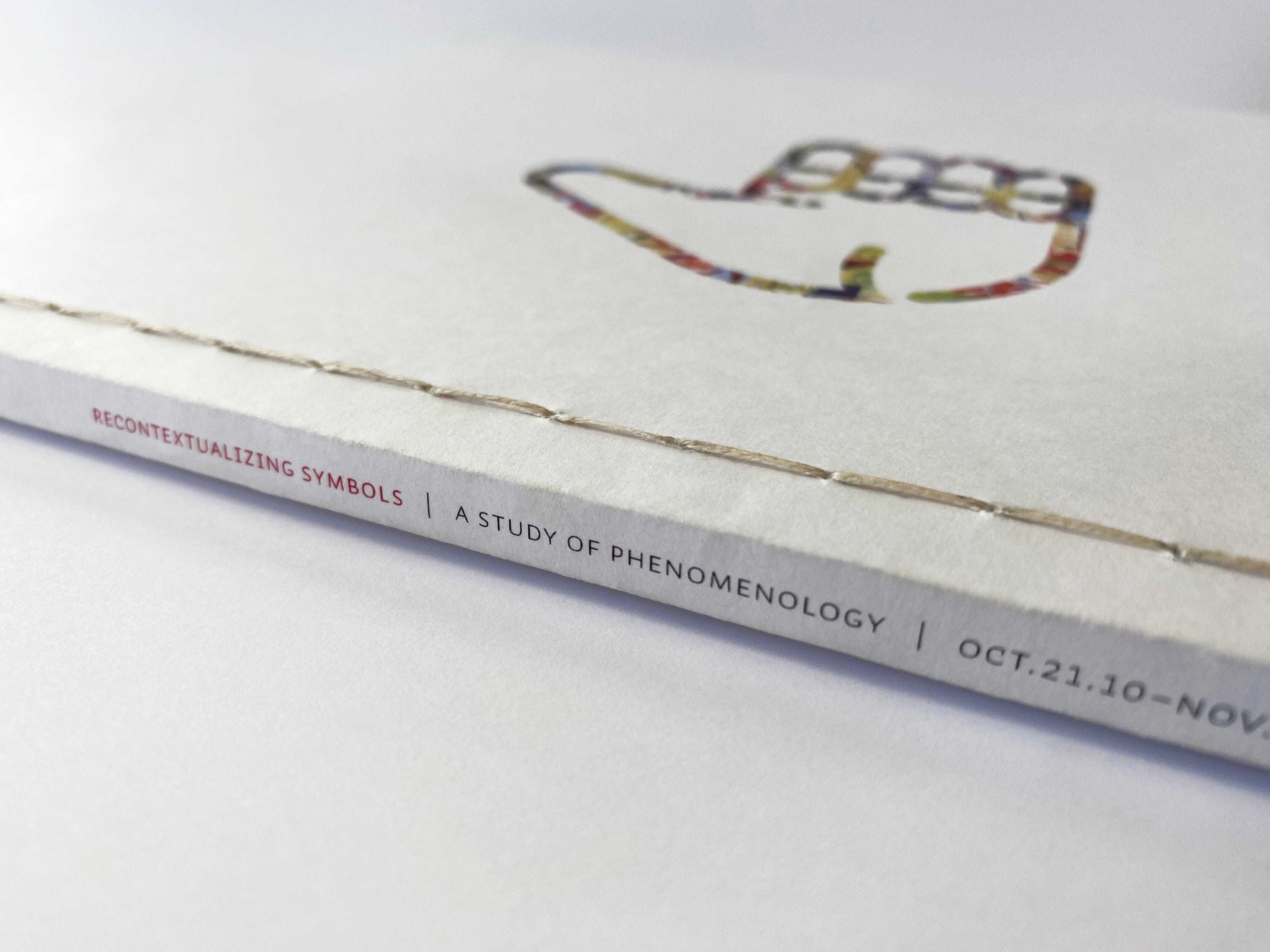
Re-contextualizing Symbols — A Process-Driven Form of Production
What, then, happens to operative communication when proximity and referent relationships for symbols are altered? Within this work, I am interested in exploring possibilities for establishing new forms of interpretive meaning through the modification of formal graphic properties traditionally associated with symbols through alterations of colour, proximity, and application. Historically, symbols have been designed to efficiently communicate meaning. This meaning is learned, as is most of what we receive from the designed realm. Heidegger, describing phenomenology, was interested in “the process of letting things manifest themselves.” This thought experiment served as inspiration for shoehorning new narratives into these wonderful little graphic elements that we’ve all come to seamlessly extract meaning. What might an altered set of relationships produce — using these commonly recognized design elements permeating our living and social spaces — as vehicles for disseminating fresh new narratives?

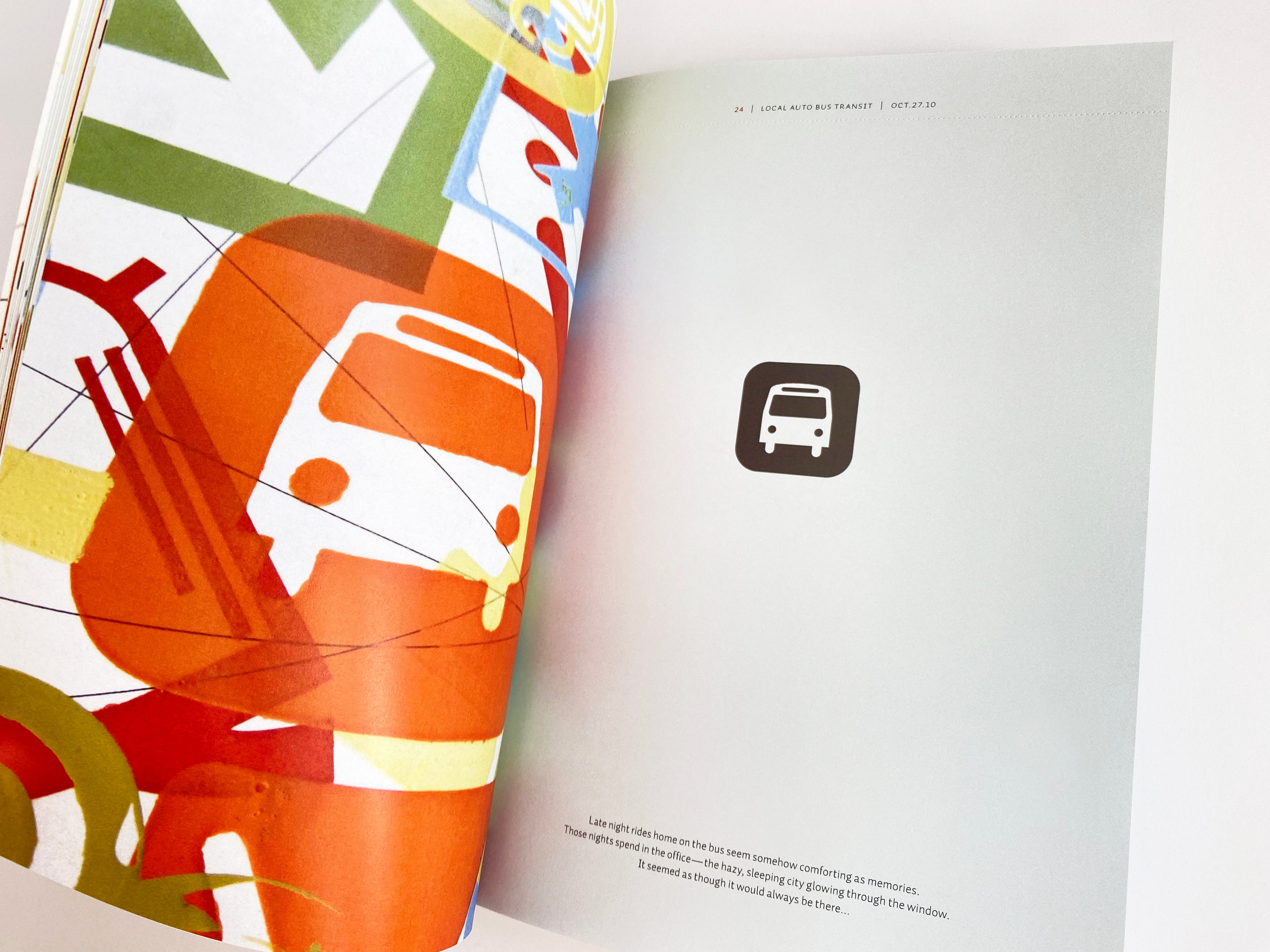
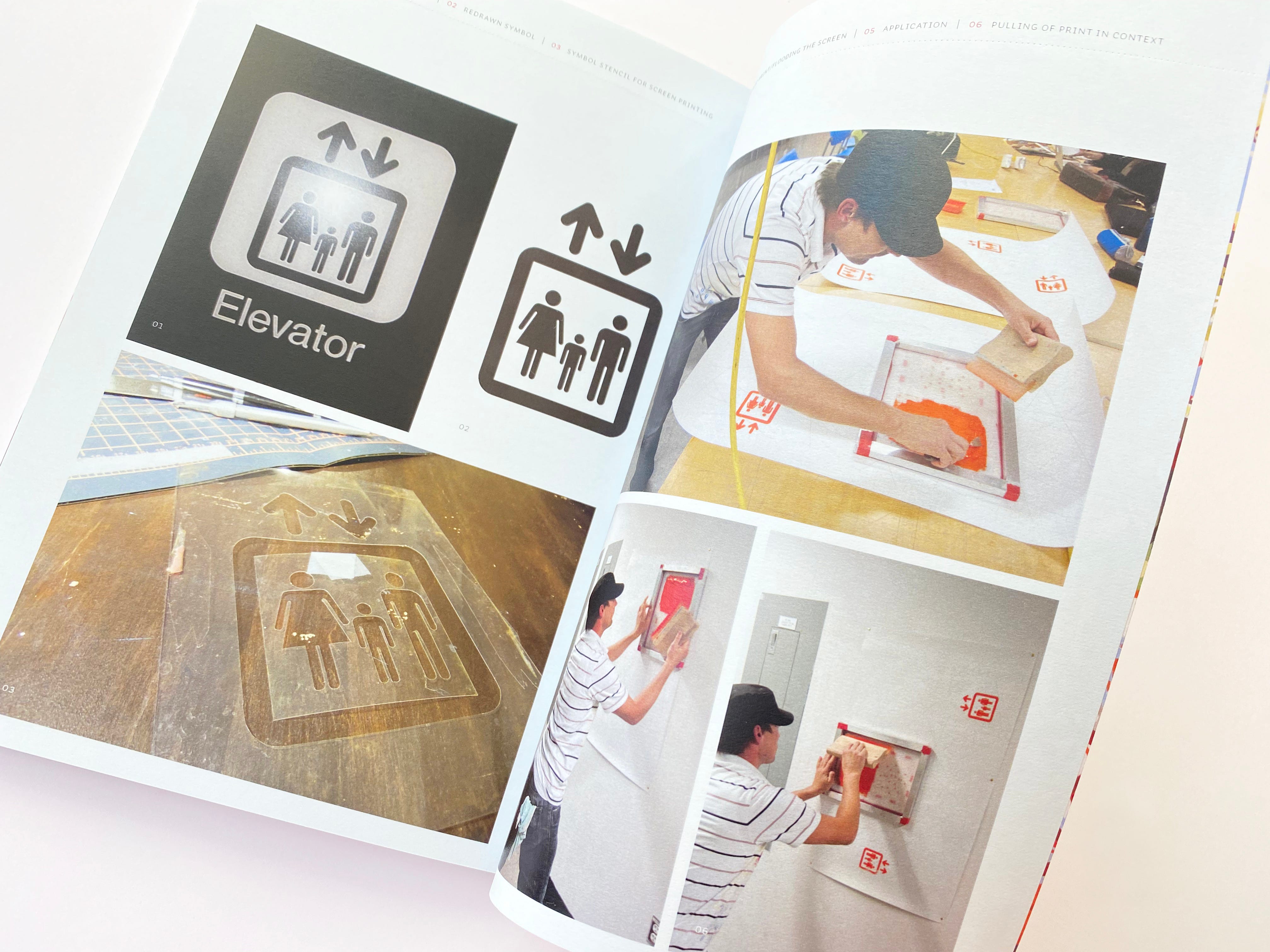
The exploration into the re-contextualization of symbols was primarily a process-driven form of production. Both digital and analog forms of reproduction were incorporated into the process of mark making. Simple analog tools shaped the aesthetic of the final output; stencils were cut based on photographs of symbols located in public spaces. These stencils were then adhered to silk screens, transferring the graphics onto publicly-placed blank posters over a set period of time. An interest to move beyond the confines of the studio and to explore processes of ‘performativity’ in public spaces, influenced the form of the final output.
The following photographs document the creation and application of the symbols incorporated within the work. The symbols researched, documented, and obtained from public spaces served as the raw materials incorporated and re-contextualized within the exploration. Symbols act as public forms of communication; they require set contexts with their referents. If these relationships are stressed, communication ultimately breaks down — the clarity and efficiency of communication suffers. This exploration challenges the inherent nature of symbols in public. It re-contextualizes the process of familiar public address under alternative circumstances. I was interested in establishing modes of communication based on new relationships through re-written narratives.


Symbols were photographed from both public and private spaces. They were then redrawn in vector form. These symbols were then printed in black, serving as guidelines for the cutting of stencils from clear acetate. Once the acetate stencils were cut, they were taped to silk screens and printed onto paper substrates, hanging within public spaces. This process of “printing in public” allowed for two things:
1) it allowed performative aspects of production to influence the final output of form: limited time available for the completion of each application affected the quality of mark-making, influencing the outcome of the final works;
2) it created a constantly changing printed medium that has traditionally produced static formal expressions.
These aspects increased overall engagement — both from the standpoint of the designer and the viewing public — influencing the outcome of the final form.

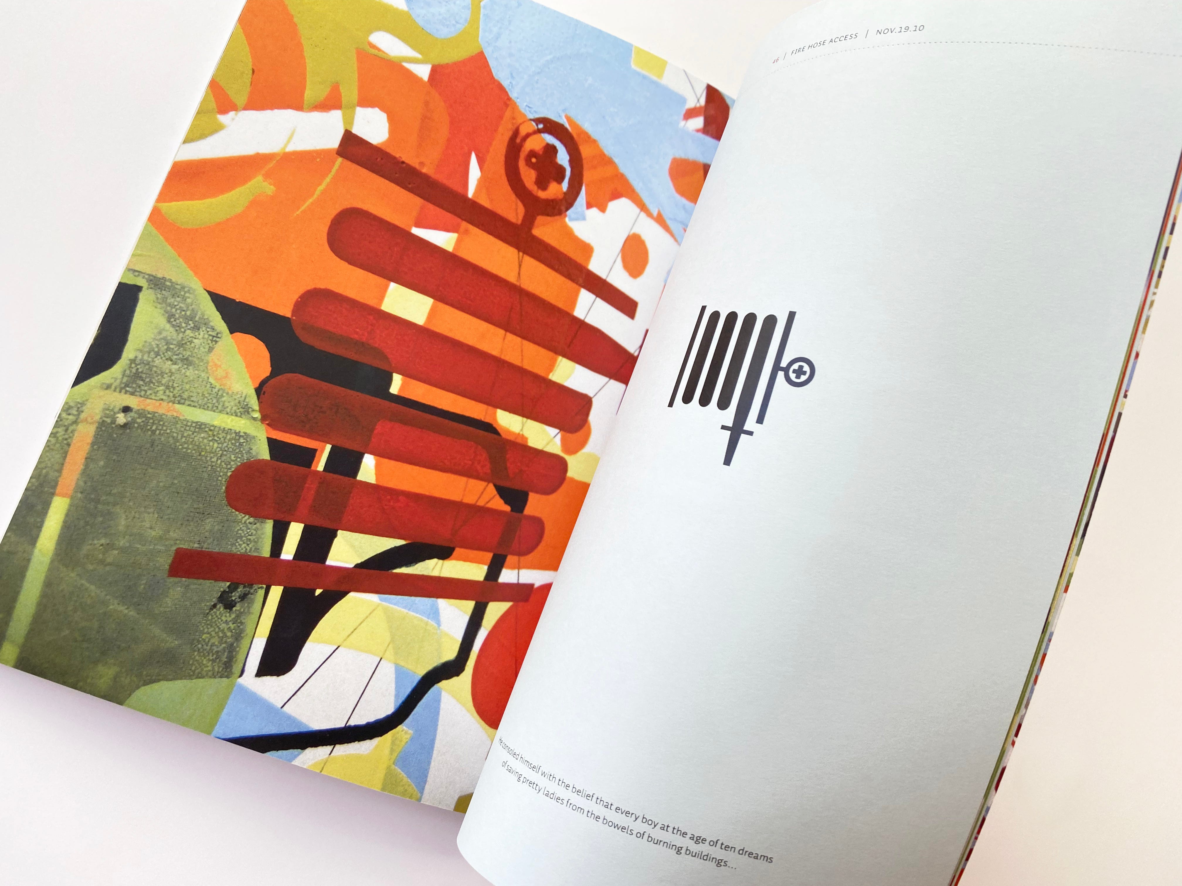
Each iterative application of symbols silk-screened onto the posters were documented through photography. The photographs were then collated into book form, binding their chronological sequence of development into place, documenting the layers of each application of ink. Through this process of combining symbols over top of one another, the timeline in which the palimpsestic buildup of images is made concrete. The book design serves to present the entire exploration, spanning from October 21 to November 25 of 2010.

The work
Re-contextualizing Symbols — A Study of Phenomenology is a process-led investigation into the functional forms of global wordless communication as an exercise over my advanced degree in design and communication. The ideas gleaned from the research, expressed through the text, and visualized within the work, has provoked a personal interest for editing and rewriting the initial text, presented within the above article. This project in development will ultimately lead to a redesign of the book, which will include the updated text.


See full body of work here.

==
Jayson designs, draws, writes, and documents his world at jaysonzaleski.com. He can be reached at [email protected].