
In the past couple of years, I was fortunate enough to work on many interesting products, some of which had to be designed in multiple languages.
Recently, I’ve bumped into some new issues with language selectors that I found quite exciting to take a closer look at. So, I decided to summarize my experience and findings around language selectors and share them with you.
Automation
Let me start with an approach that seems smart and might come to most designers’ mind when working on a product that’s offered in multiple languages: automatic redirect based on browser language.
Imagine that you’re designing a website in both German and English. The rules seem to be pretty straightforward:
- If browser language is English redirect to English site
- If browser language is German redirect to German site
- If browser language is set to a different language redirect to English (let’s say that’s the more common language, therefore you decided to use it as the default one in cases like this)
For the sake of the example, imagine that you have a French friend, Louis. Besides French, Louis also speaks German fluently but doesn’t speak English at all. His browser is set to French, therefore, he’ll land on the English site.
Since the automatic redirect wouldn’t give him a satisfactory solution, we’ll still need to design a language selector so he can switch to German.
So, while setting up rules for automatic redirect can help improve the user experience (although it might affect Google indexing), unfortunately, it doesn’t mean that we can just get rid of language pickers.
Flags
A couple of years back I worked on an online lifestyle magazine targeting mainly women in the Emirates. The main language was Arabic, but we also had to design an English version, therefore a language switcher was needed.
Our assumption was that users would find the language selector quicker if we use flags. Although the assumption was validated, soon I realized, that it was a bad solution. During the user tests, it turned out that quite a lot of people would find this solution offensive: the Arabic language, for example, is used in many countries and cannot be identified with one particular flag.
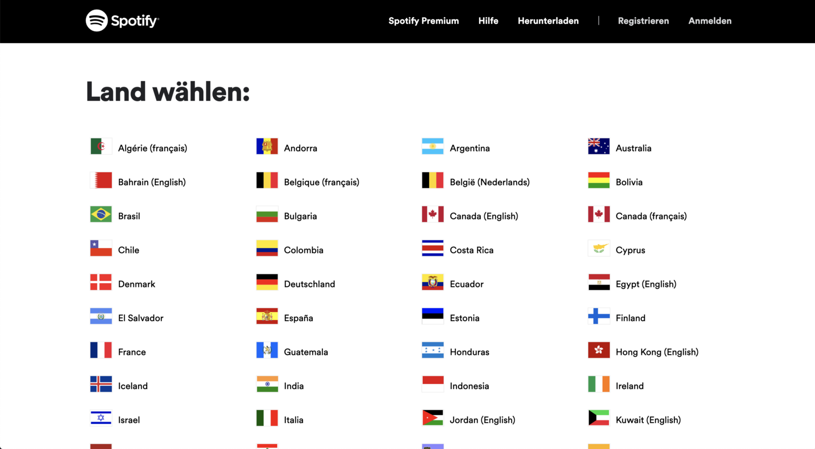
I learned that flags are only appropriate when actually selecting countries. Check out how Spotify uses them on their country selector page to help people find what they’re looking for faster.
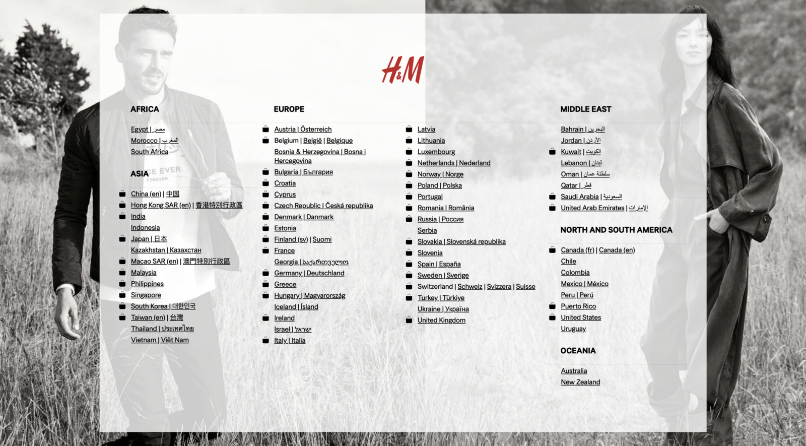
In contrast, you can take look at how HM, for example, doesn’t use flags in the same situation. Without flags, it might take a bit longer to find your country in a list like this.
Initials
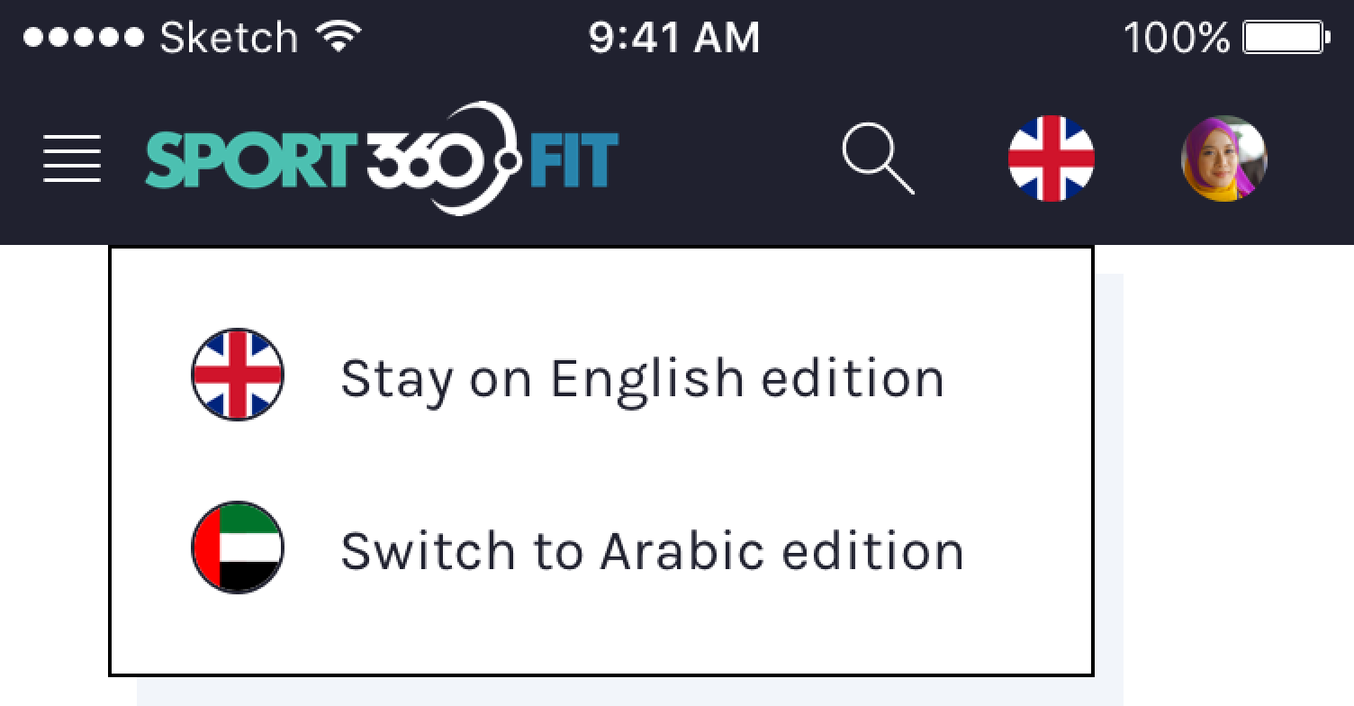
Let me continue with the Sport360.fit example. Instead of flags, we ended up using a UI element showing the shortened written name (initials) of the target language. In addition, we got rid of the dropdown menu, since there was only one language to choose from.
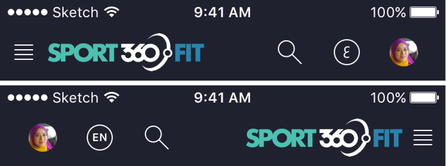
According to user tests, this approach was still easy to find (but even quicker to switch) and people didn’t find it offensive anymore. So, in the end, it turned out to be a good solution for switching between the two languages.
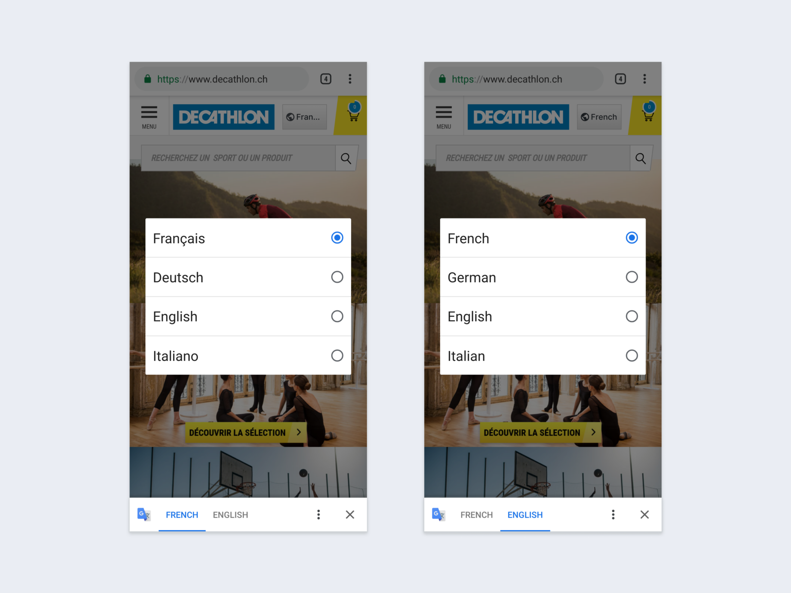
At least that’s what I thought until I landed on Decathlon’s Swiss website the other day. Chrome’s Translate webpages feature activated automatically and translated the page from French to English.
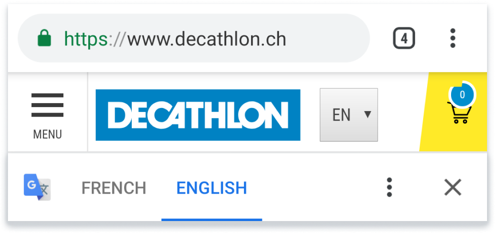
Since browsing the automatically translated website can be tricky sometimes, I decided to check if they have an English version. So, I opened the language picker and this is what I saw.
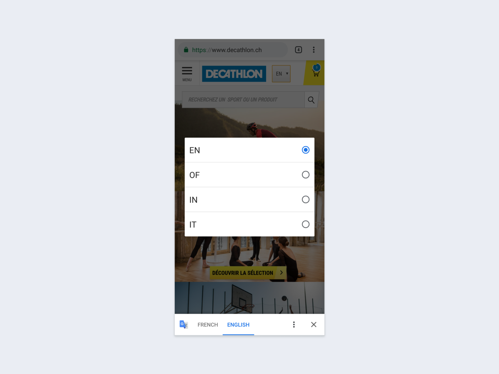
I didn’t really realize what had happened for a couple of seconds. Here’s my train of thoughts:
“Oh, it seems like English is already selected.”
“But wait… what? It makes no sense. Why does it say that the page was translated from French then? 🤔”
“And what are these languages? 😅 OF, IN?”
“Okay, let’s just turn off the translation and see what happens. 🤨”
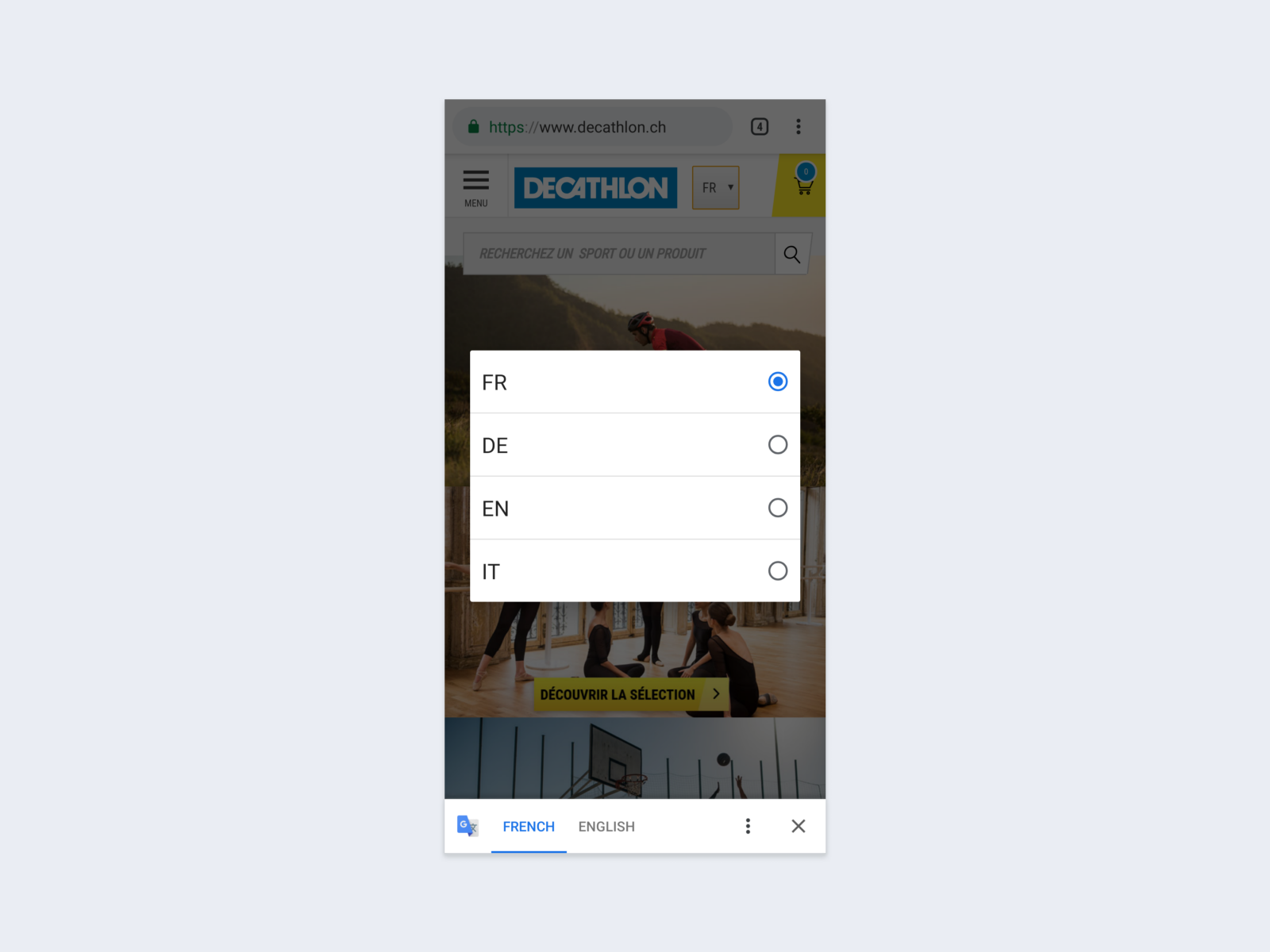
And then came my AHA moment. I realized that Chrome took those initials (FR, DE, EN, IT) and translated them from French to English.
I checked quite a lot of other websites right after this and realized that it’s a common problem when initials are used.
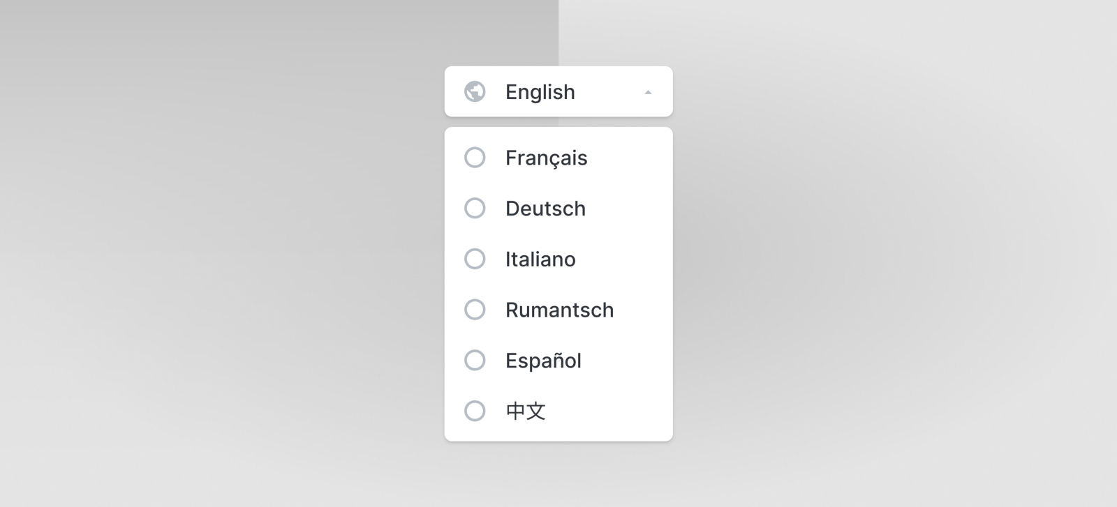
Full name
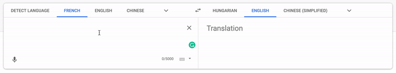
I found this issue so interesting that I started thinking about possible solutions. I ended up creating a mockup that would solve the problem quite well. I wrote the full name of the languages instead of using their initials.
And instead of showing them all in French, I used the foreign name of each language (how it’s written in that particular language that it applies to).
So, for example, instead of writing Allemand, (German in French), I used Deutsch, because if you don’t speak French, you probably don’t know how to say German in French.
Of course, this wouldn’t be a problem if you use Chrome and the page is translated, but let’s keep in mind that not every browser has such a feature.
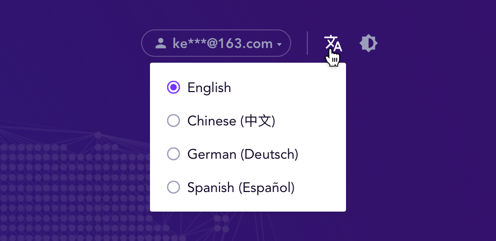
Icons
In my experience, using an icon can be risky because people might not understand what it stands for. However, based on past user research I was involved in, I found that people tend to look for either a globe icon or one that’s similar to Google Translate’s logo when they try to locate the language picker. See an example below.
When using an icon in the navigation bar, I strongly recommend placing another language picker (ideally using a label, too, next to the icon) in the footer. So, if someone fails to identify the icon, they can still switch to another language. Also, I found that many people actually look for it in the footer first.
Links
A fairly straightforward way of showing languages available is to use links — like how Google does it, for example.
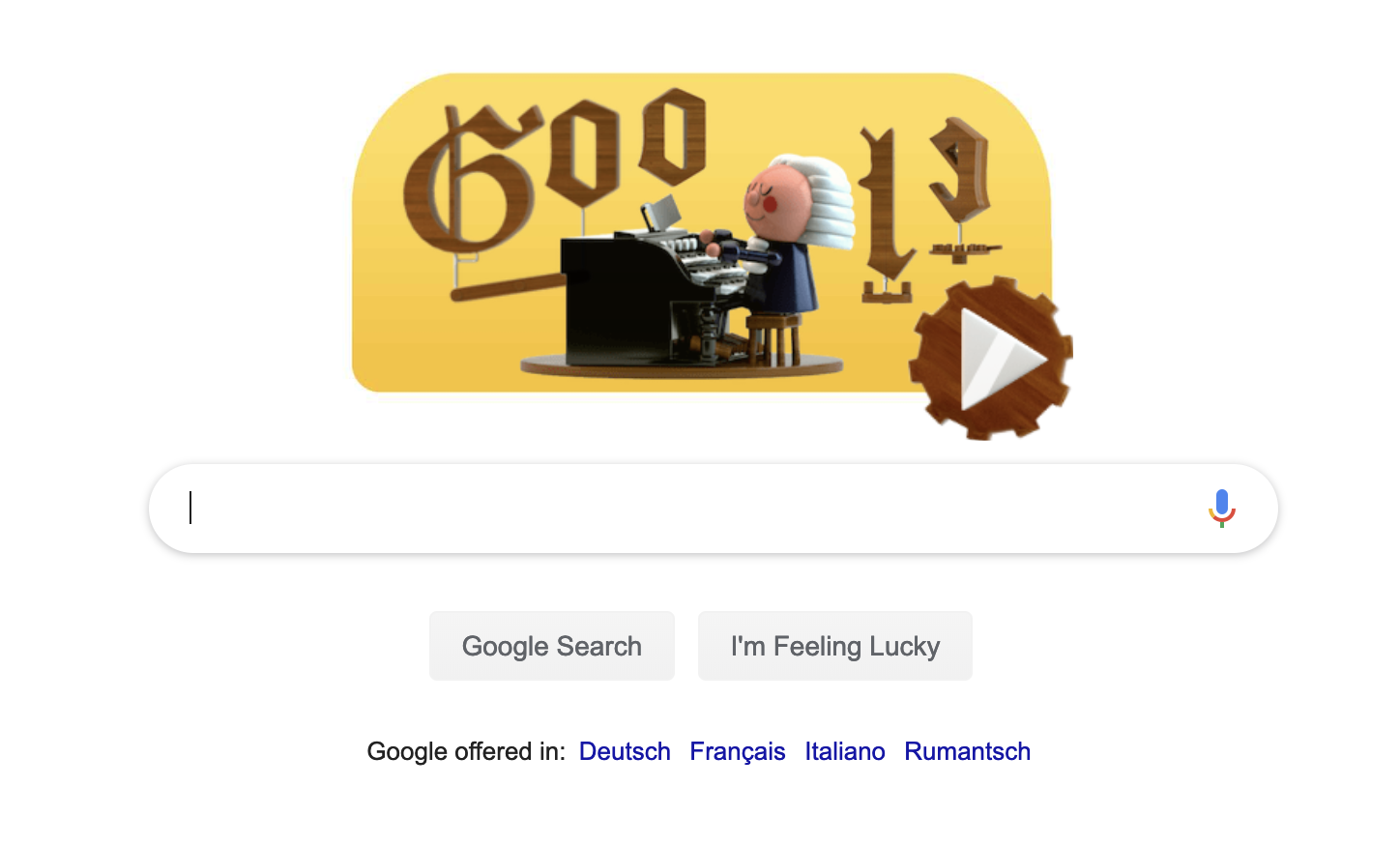
This solution definitely increases discoverability, and thus might be considered as one of the best solutions.
However, if you have tons of languages that users could choose from, you’ll probably end up hiding many of them to avoid having a cluttered interface. Google, for example, shows languages based on location.
This solution probably works well in most cases, but I started wondering how one could switch to Hungarian, for example. And I couldn’t figure it out. It might be an edge case, but still, I ended up redesigning Google’s interface and provided a quick fix, that in my opinion could work well.
Placing a “Show more” link at the end of the shortlist could cover the edge cases and enable people to find the language they’re looking for. Why using an icon, too? Well, someone who speaks neither English nor any of the listed languages might have a hard time figuring out where to switch — so, the icon could help them identify it a bit easier.
Takeaways
- Setting up automatic redirect rules can help improve the user experience, but you’ll probably still need to design a language selector.
- Identifying languages with flags is generally a bad idea. However, flags can come in handy when selecting countries instead of languages.
- Using the shortened written name (initials) of the languages can result in gibberish when the website is translated, for example, with Chrome’s Translate webpages feature.
- Be extremely careful when using just an icon to access the language selector — people might not understand what it stands for.
- Using the full foreign name of the languages (how they’re written in each particular language that they apply to) is better than showing them in the current language of the website.
- Placing links on the website might increase discoverability and help people find the language they’re looking for easier.