Your job title is just the first part of the story ????
At tado° nobody cared that I was just an intern. There was so much going on, that it wasn’t important what I was really appointed to do. We just tried to “get shit done”. I was given a lot of responsibility and wore hats I didn’t know existed during those 6 months.
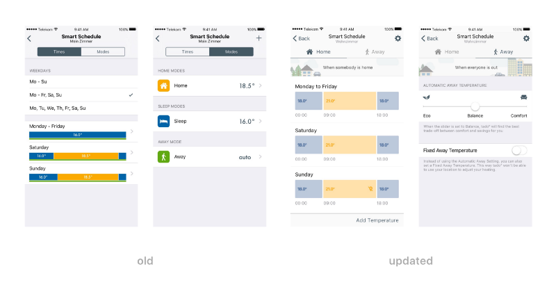
Once it was clear I could punch above my weight, I was assigned the task of redesigning the Smart Schedule, one of the product’s most complex elements for the user. I conducted quantitative and qualitative research, prototyped in various tools, exported final assets in Sketch/Illustrator, and tried out Zeplin with the developers.
There was a steep learning curve, but the designers and developers were awesome to work with and our high level of communication made up for any mistakes I made. When there’s no one else to stand-in for you, it makes it much easier to step up and give it your best even when you’re not yet sure whether your best is something to be proud of.
The updated Smart Schedule was the result of an iterative process of research, prototyping and testing. We removed a lot of complexity and made it easier for the users to grasp how tado° works.

In the updated version on the right it becomes clear that tado° can either be in “Home” or in “Away”. We removed complicated states and exceptions. It is now easier to adjust the temperatures and understand the system as a whole.
