Apr 2
Welcome to my last project of the Ironhack Bootcamp. Yes, it has been REALLY hard to arrive here. So many coffees, nights without sleeping well, hugs with my classmates… but finally, I am here.
But before starting with the story of my project I want to thank all the people that help me (or not), just for being there. All my classmates, my teacher, Nevan Scott, Héctor Rebollo Bollullo, Elise Mateu & JJ, the amazing TA’s (Teacher Assistants) for sure, family, friends and the Ironhack staff for making this real.
Introduction
I worked on this project for two weeks and I needed to deliver an App or a responsive website based on my own vision, research, findings and the UX/UI process that I’ve learned throughout the program.
Initial steps
My first thoughts were regarding the topic to focus on. I asked some friends and family about some problems they may be going through their daily routine.
The main challenge for me when starting this project was that I was thinking about a problem and I started ideating about the possible solution and that makes more difficult choosing a topic.
I began thinking about the following problems:
- Parking problems in the city
- Traffic and pollution
- Have ingredients on your kitchen and don’t know what to cook
But I already had solutions in mind about those problems and that makes the process more difficult for me. And that’s what my TA’s, Héctor and Elise told me, they helped me and put me in the right direction.
After the chat with Héctor and Elise, the problems were fitness or video games, two of my hobbies. And I really liked the idea of working in a project about games but I realized that all the problems I could think of were related to fitness and that’s why I decided to focus on Fitness.
This are some problems that came to my mind when thinking about fitness:
- Diet
- Motivation
- Progress & weights
And that’s how I started my research process to see if the people have the same problems as me or not. Let’s make the research process help me with that!
Starting the research (HMI’s)
To start with my research process I decided to use the HMW method. HMW or “How Might We” is a method to collect thoughts and questions on sticky notes to work on defining a design challenge. A method which can be used at different points in your challenge and will bring some questions and ideas to your board which can be used to develop and define the upcoming challenge. But in this case, as I’m working alone, is going to be “© How Might I or HMI”.
And this is the most important information gathered for the “HMI”:
- HMI change the way people keep track of their diet or performance?
- HMI do attractive training for people?
- HMI make increase their motivation?
A quick look at the competence (Competitive and Comparative Analysis)
To help figure out how is the market and what apps do the people use I had a quick look at competence and this is what I found out:
- Freeletics: Offers a host of workouts that are all centered around high-intensity interval training (HIIT). This platform revolves around four free platforms — Gym, Bodyweight Workouts, and Training, Nutrition and Running.
- 8fit: Creates a personalized program for your diet and exercise based on the results you want to see. It’s for people who like a lot of guidance, suggestions, reminders, and instructions for achieving their fitness goals.
- Daily Yoga: For the price of one hella bougie yoga class, you get 12 months of access to more than 100 guided beginner- to master-level yoga and meditation videos with audio instructions.
- Nike Training Club: Is a tracker app for anyone who likes to exercise daily. It uses GPS to track your running, walking, biking, and jogging routes. (Similar to Runtastic: Google Fit, Runtastic, Strava, Runkeeper and more…
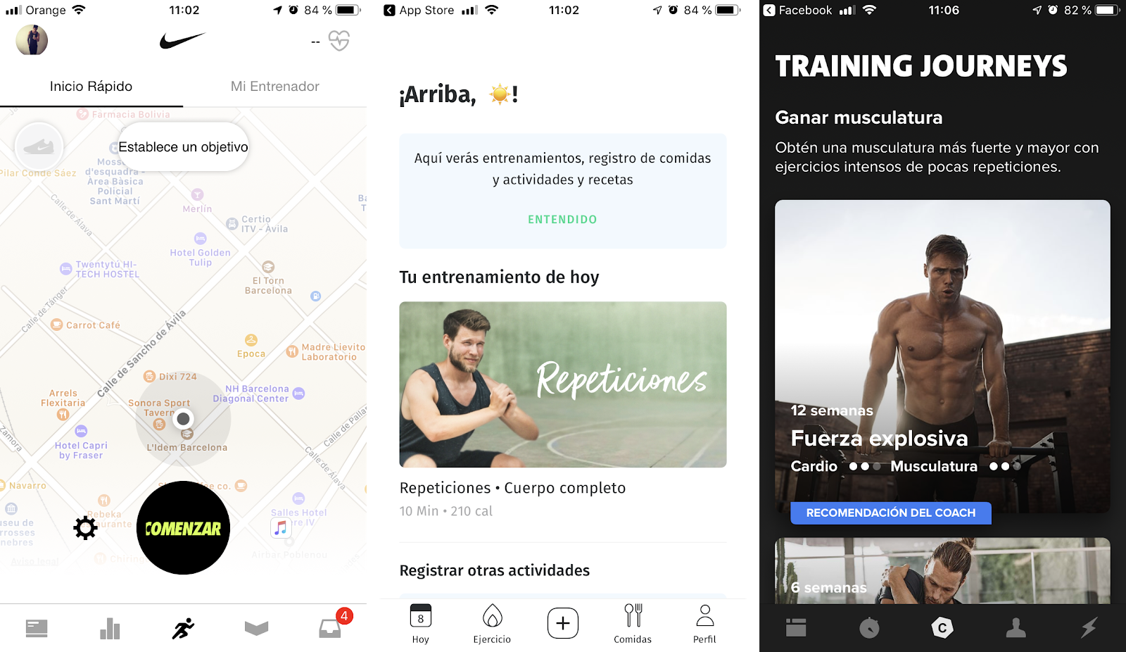
I only knew about 8fit and Nike Training Club and I am amazed by the number of apps about fitness, running and other different activities… I didn’t think they were so many!
Starting to get information (Lean Survey Canvas)
Surveys are great for quickly collecting large amounts of data about your users but preparing a great survey is challenging — writing good questions takes time, and the results can often be disappointing.
For me, the Lean Survey Canvas is the best way to get questions for my surveys quickly.
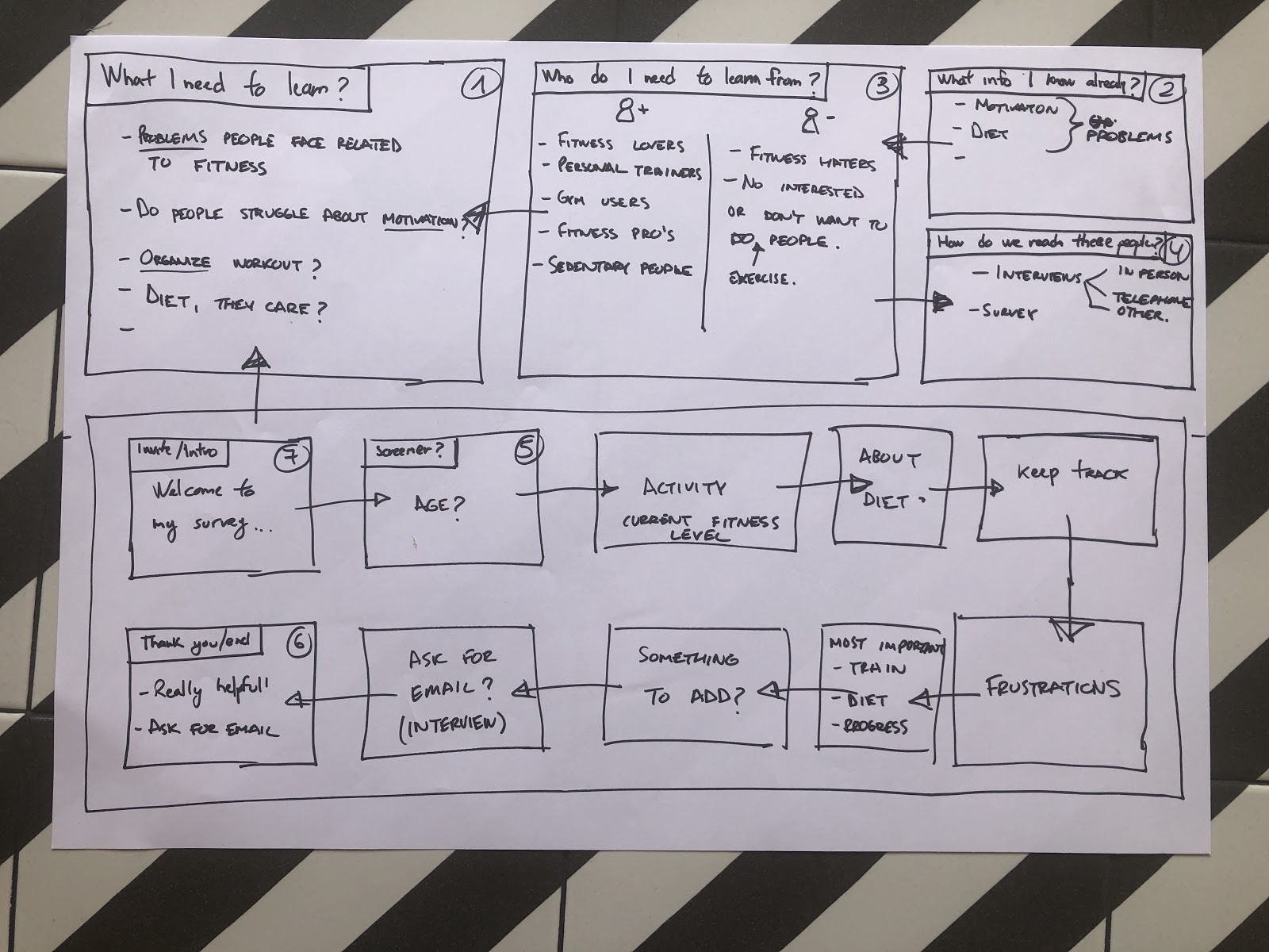
Onces I finished the Lean Survey Canvas I could create my form and send it everywhere in the world to get as many information as possible. Additionally, this process helps me find the right questions for my interviews.
Open-end”ing” the questions (Interviews)
While my survey is going across the internet to unknown places where really nice people will happily answer it I started ideating the question for my interviews with some help from the Lean Survey Canvas. With some responses that I’ve got from the survey in a few hours, I could create better questions so I can get as much valuable information as possible.
Organizing the information (Affinity map)
I used the affinity map to help me continue with the process. The purpose of an affinity diagram is to generate, organize, and consolidate information concerning a product, process, complex issue, or problem.
I could categorize some ideas into 3 categories; Motivation, Diet, and Frustrations.
This method helped me organize my ideas about the topic and continue to gather all the results and insights from the survey and the interviews.
Gathering the results
Is time to check my progress and have a better look at the insights and information gathered during the research process.
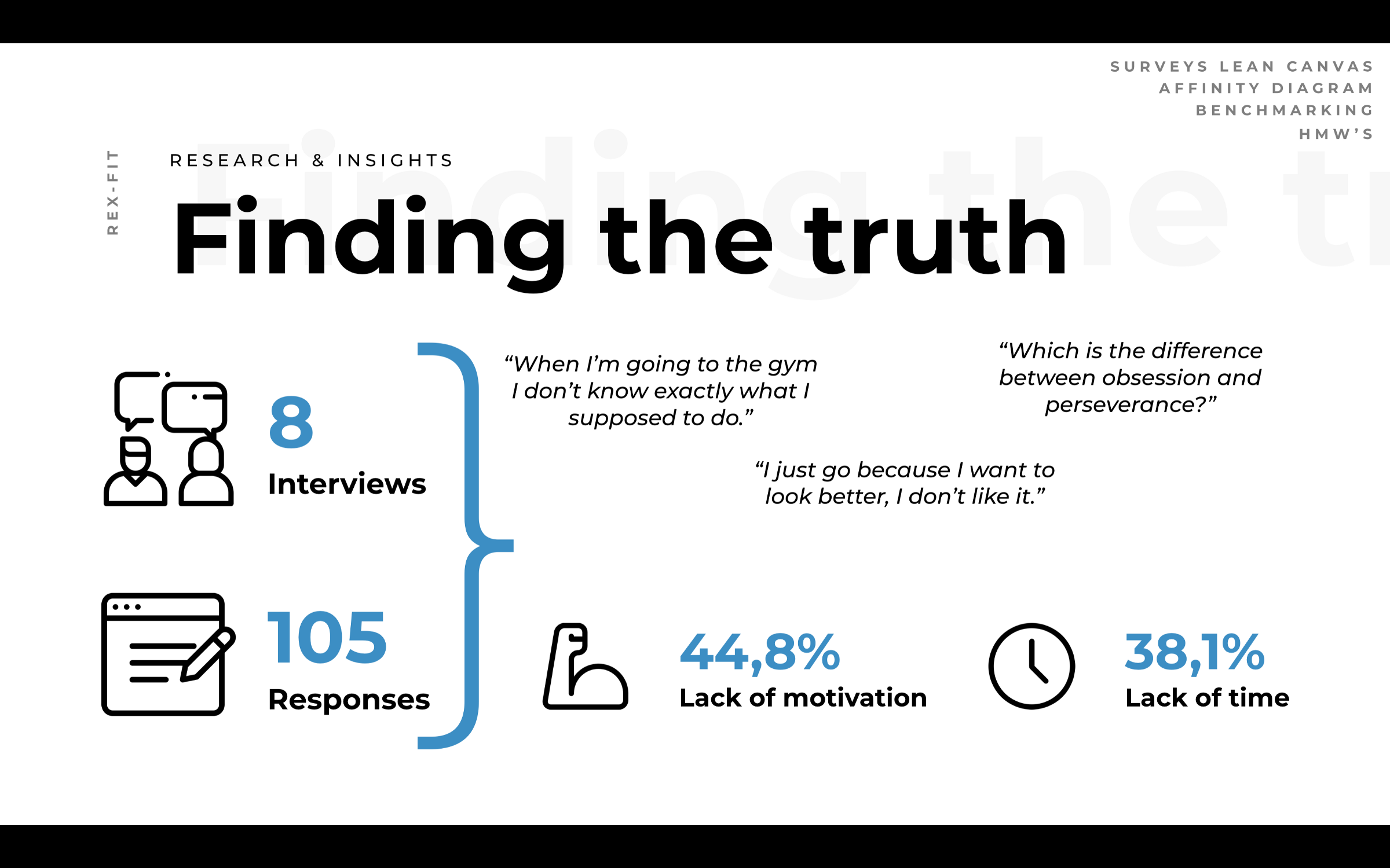
During the survey, I confirmed some of my suspicions, motivation and time lack of time are the main problem for these users. When asking about their frustration 44,8% chose motivation and 38,1% the rest chose the lack of results as frustration among others.
Furthermore, 51,4% thinks the diet is more important than exercise (32,4%) and the rest thinks both are important (16,2%).
From the survey, the information compared to the interviews was similar and consistent. But I could also get some valuable information about the differences between going to the gym or practice any sports like football. Most of the users interviewed believe that going to the gym is boring and that makes them feel a lack of motivation when deciding to go and others also feel frustration because they don’t know exactly what to do. On the other hand, when practicing sports they do it for fun apart from stay in shape.
After gathering the results we can mention this principal pain points:
- Motivation (including boredom & lack of knowledge): Problems in how to deal with it when they are tired after working and how to keep having it when doing sports.
- Lack of time: People that work during the week and has a stressful job can’t always go to the gym and during weekends they prefer to rest or do other activities rather than workout.
- Diet: Even though they know the importance of it, most users do nothing about it and when some of them try to do something they aren’t consistent with it.
I started thinking deeply about the pain points and finally decided that there were too much for the time I had to deliver the MVP and I decided to tackle Motivation and Lack of time and if I had time I would try to also tackle diet.
As Héctor would say, P-R-I-O-R-I-T-I-Z-E.
Trying new methods (User stories)
Before moving into the next steps I decided to use “User Stories”, this tool is used to identify the elements of a user story and differentiate between defining the problem and providing a solution.
They’re usually written in the format:
- As a… [who is the user?]
- I need/want/expect to… [what does the user want to do?]
- So that… [why does the user want to do this?]
And this is what I found out:
- As a gym user, I want to go to the gym so I can look better.
- As a gym user, I want to stay motivated when I’m tired so I can get the results I want.
Also, I included a few acceptance criteria for each story. Acceptance criteria are a list of outcomes that you use as a checklist to confirm that your service has done its job and is meeting that user needs.
- It’s done when the users keep going to the gym.
- It’s done when the users get the results they want.
And after all the process mentioned above, although it was the first time I used this method and I did not know if I had used it correctly, I realized how important motivation was for the users.
Connecting with the people (Empathy Map & User Persona)
To create a user persona my favorite tool, as I said in previous posts, is the empathy map.
An empathy map is a collaborative visualization used to articulate what we know about a particular type of user. It externalizes knowledge about users in order to 1) create a shared understanding of user needs, and 2) aid in decision making. (https://www.nngroup.com/articles/empathy-mapping/)
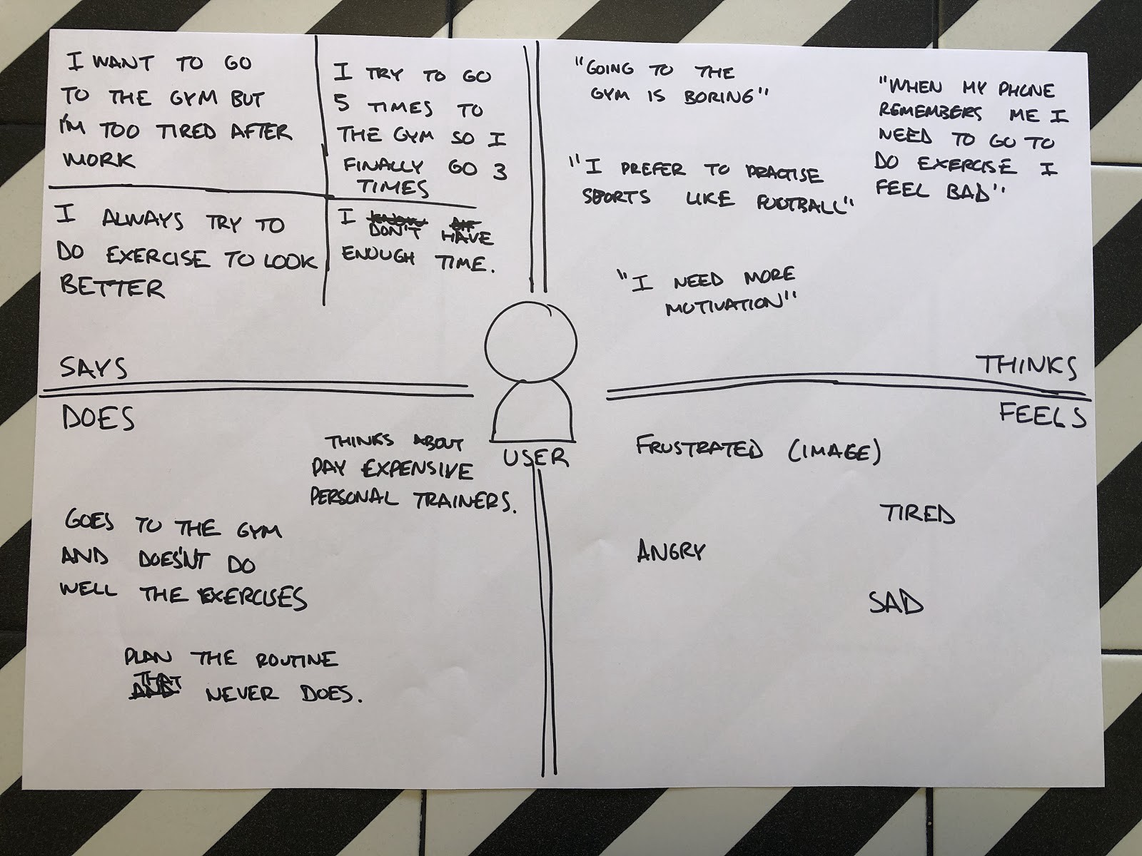
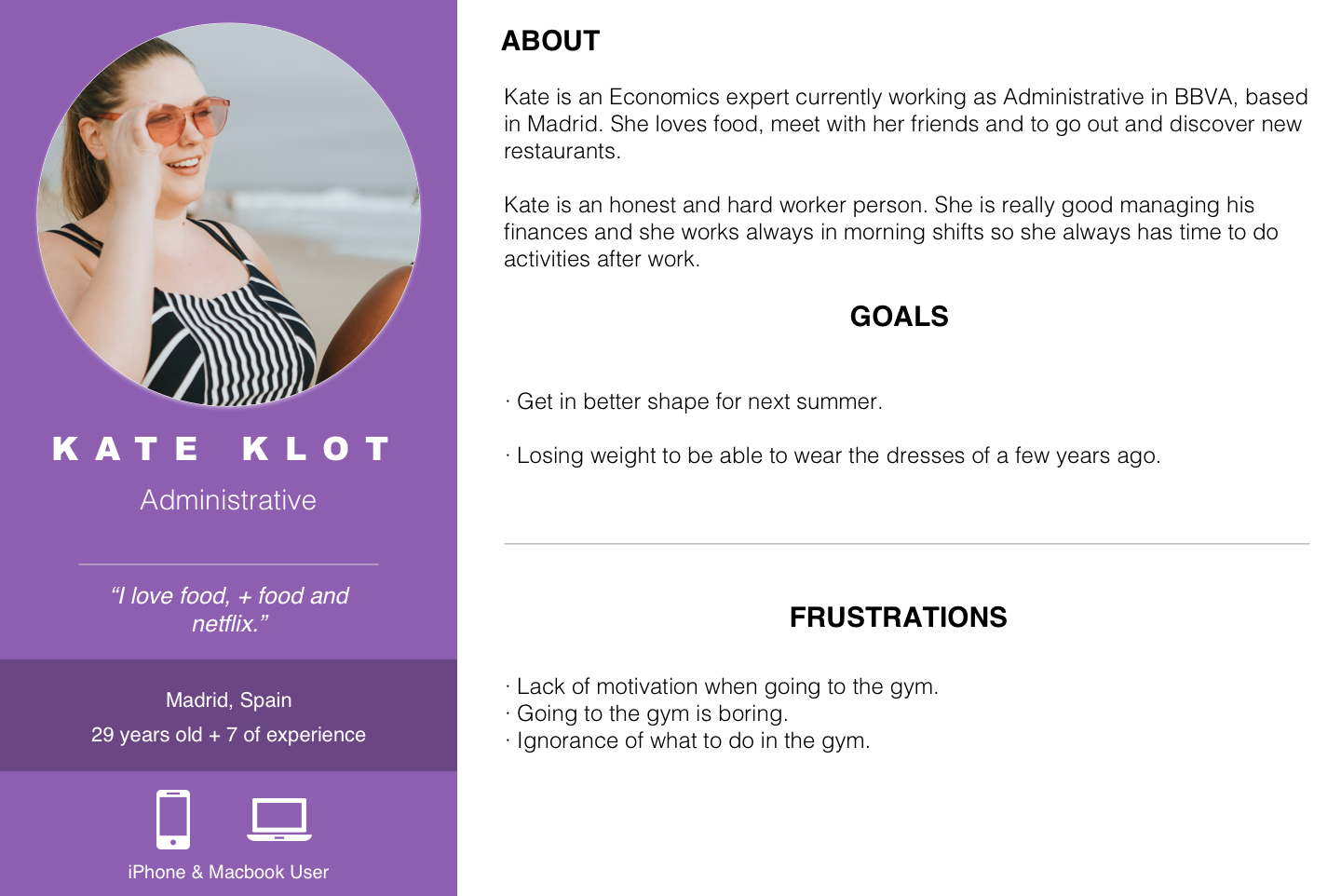
Once my empathy map was finished I decided to create Kate.
Kate is an Economics expert currently working as Administrative in BBVA, based in Madrid. She loves food, meet with her friends and to go out and discover new restaurants.
Kate is an honest and hard worker person. She is really good managing his finances and she works always in morning shifts so she always has time to do activities after work.
The problem in words (Problem Statement)
After my research process, it was time to start thinking about my problem statement and how to suit Kate’s needs.
As a previously said I realized how important motivation and lack of time is for the users but let me remember you what my research showed me (in short) about the users interviewed and the ones that replied to my survey:
- Going to the gym is boring compared to practice sports.
- Lack of motivation is a real problem, even more when they are tired.
Looking at my discoveries we can rephrase the problem statement following the formula:
User need a way to goals because research insights
“People that find sports boring but still want to be fit need a fun way to stay motivated because they lack knowledge on different kinds of workout.”
Finding features (User Journey)
Héctor, one of the teacher assistant’s recommended me to use this tool to better ideate the features that I could include in my project. The “User journey or Journey mapping” combines two powerful instruments: storytelling and visualization.
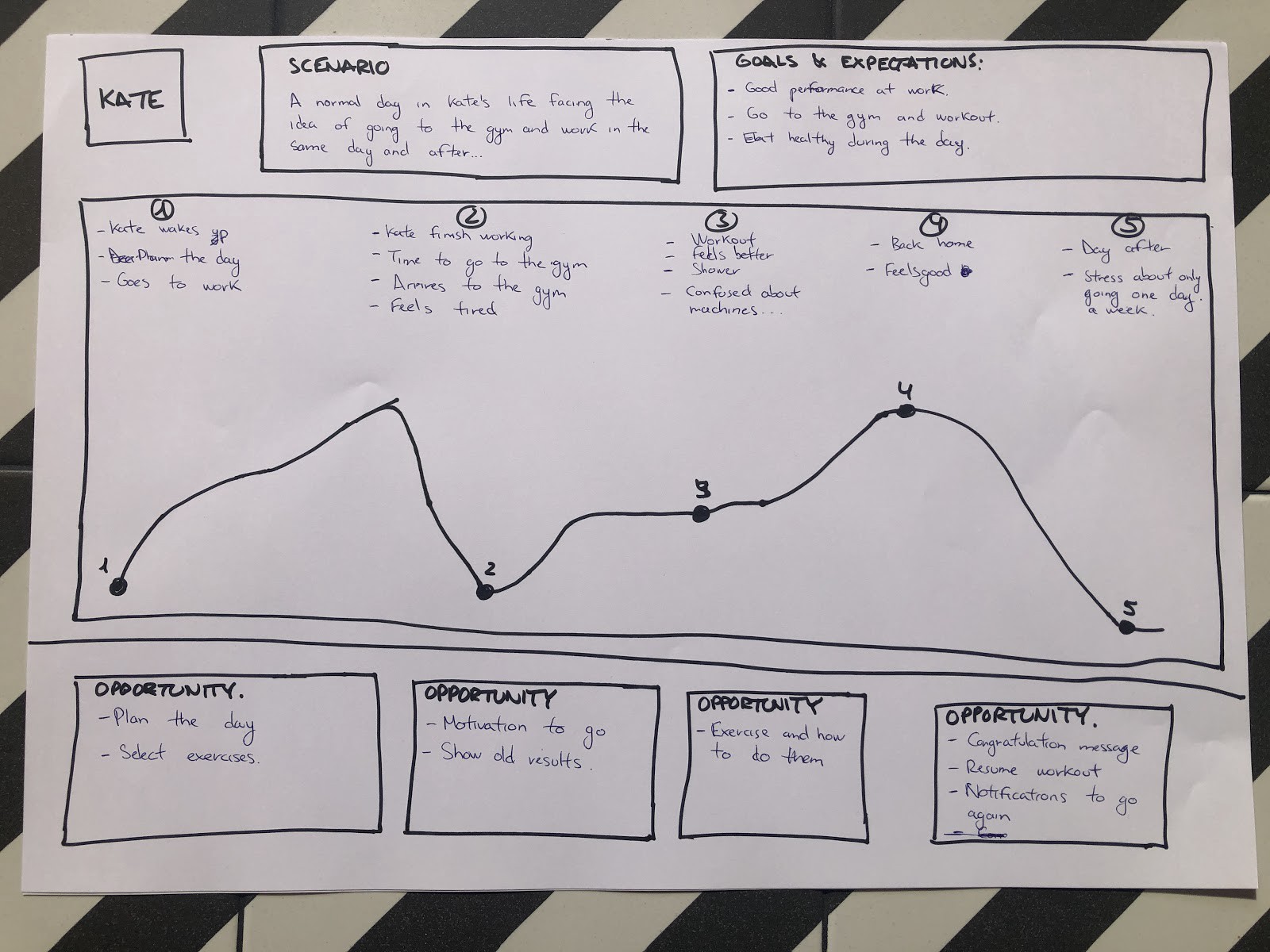
“Storytelling and visualization are essential facets of journey mapping because they are effective mechanisms for conveying information in a way that is memorable, concise and that creates a shared vision.” Nielsen Norman Group. https://www.nngroup.com/articles/customer-journey-mapping/
And once I’ve done the user journey as Héctor said I had a clear picture of the features I want in my project and started organizing them.
Choosing features (Brainstorming)
So, what features do I need to include to accomplish Kate’s needs? These are some ideas that I started thinking about:
- Play games between exercises, to make a bit funnier the times Kate waits between exercises at the gym.
- Find people around you and challenges, so you can go with them to the gym (Maybe sharing same “problems” like allergies, health conditions…) To keep them motivated to go to the gym and kind of force Kate to go when she meets with someone.
- Plan your day, so Kate can select the dates she wants to workout.
- Accomplishments in the feed (maybe show old results & pics), the feed so every time she opens the app she will see all her accomplishments
- During training, a list of exercises and how to do them. So she won’t feel lost when going to the gym or stay exercising at home. (Funny exercises)
- Notifications and congratulations messages, to keep her motivated and don’t let her skip workout days.
- Set your goals, so she will select what she thinks she wants and keeps her motivated to accomplish it.
Prioritizing features (MoSCoW Method)
After defining the features that my project should have I needed to prioritize which one is needed to accomplish Kate’s needs. The MoSCoW method is a prioritization technique for helping to understand and manage priorities. The letters stand for:
- Must Have
- Should Have
- Could Have
- Won’t Have this time
The use of MoSCoW works particularly well on projects. It also overcomes the problems associated with simpler prioritization approaches which are based on relative priorities…
Let me tell you this time my results:
Must have:
- Accomplishments in feed
- Plan your day
- Set your goals
Should have:
- Exercises & explanations (funny)
- Notifications
- Challenges
Could have:
Won’t have:
- Play games
- Find people around to workout with you.
But after prioritizing the features we did an activity in class with all my colleagues to get more features and these were their ideas:
- Videos for exercises
- Info about activities around you
- Do activities with others, go in groups
- Exercises you can do at home, workout at home
- Reward system
- Goal setting
- Gamification of the app
- Create music lists to do while working out
- Reminders
I’ve got super good ideas for the features but I did not have enough time for all of them so I pick some of them and move forward. The “Videos for exercises” gave me the idea of some funny videos of a dinosaur doing workouts and that is how I decided to create a Dinosaur themed app. “Workout at home”, “Reward system”, “Goal setting” and “Reminders” were the other ideas added to the project.
Creating the first prototype (Design studio)
I always use the crazy eight’s to start with the prototype, this tool helps me get the first screens of my project. I’m going to be creating a mobile app so I divided an A3 size paper in 8 and starting sketching the different parts of the flow.
And after a few times sketching using the crazy eight’s I had the final version of my first prototype but before start drawing the last version on paper I decided to create a user flow which helped me decide how my first prototype will look like…
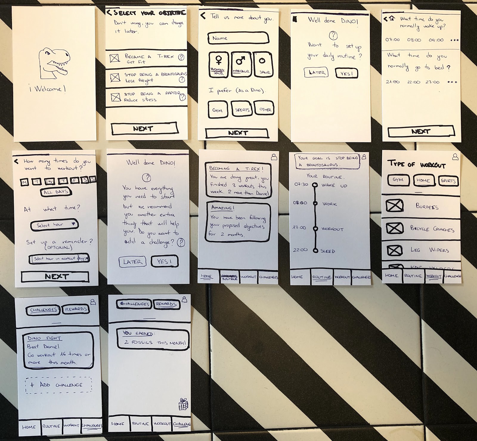
It was time to start testing my first prototype, but to do so I needed to create a scenario or task for the users that will test it.
Task 1:
- Set up your profile
- You are Kate and you want to lose weight and go to the gym.
- Set up your daily routine
- Wake up at 07:30 Sleep at 22:00
- Want to train 3 times a week at 17:00h and set a reminder.
Task 2
- Look at the app and let me know what you think
- Set up a new challenge with a friend
Testing my first prototype (Test Phase)
Test iterations:
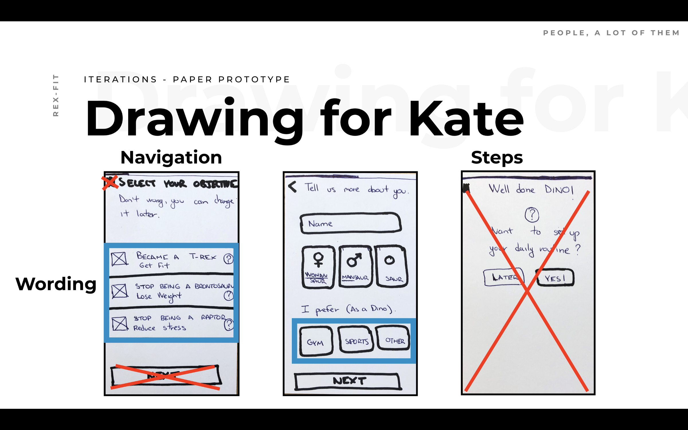
- Offensive names
- Workout categories — Microcopy issues
- Select times section — Not necessary for the user
- Unnecessary buttons

Getting feedback (Group critiques)
Before continuing with the testing process we did a group critiques with my teachers and some of my colleagues and I found out new problems.
The feature “workout” wasn’t clear for them and they didn’t know how to connect that with my persona. Also, they really like the dinosaurs theme for my app. Basically, they remember me to keep my user needs in mind, as I always need to.
Focusing on the user (Second paper prototype)
After the group critiques and the first prototype, I had a chat with one of my teachers, Elise. And we both realized that I was a bit lost and that it was time to remember my priorities and to keep on mind the user needs.
Iterations after tests:
- Too many steps in the onboarding phase — Simplify
- Objectives names can be offensive for someone — Change names
- Changes in “workout” screen to fit user persona’s needs
- Changes in “Routine” screen to see the overview of the week
- Changes in the feed to see the current situation
Giving meaning to my design (Mid-fidelity)
Once I finished with the changes made in my second paper prototype it was time to move to mid-fidelity. I always use Sketch since I discover it…
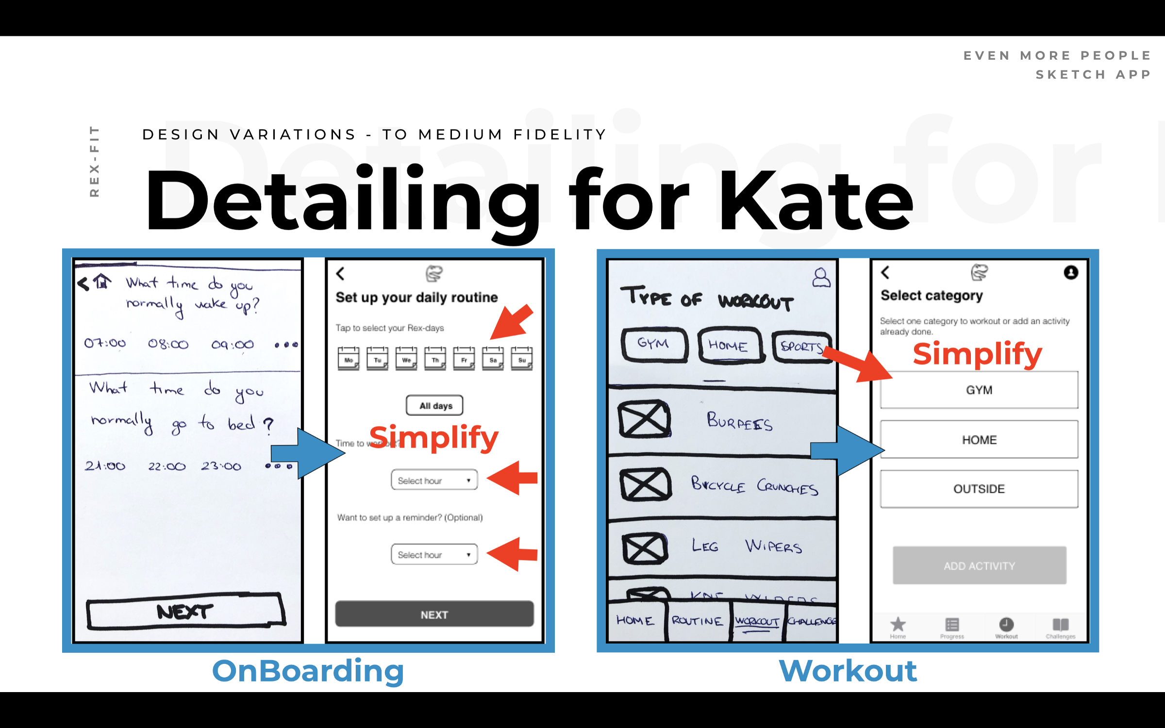
Sketch is a vector-based design tool for Mac with a focus on screen design. It’s used primarily by screen designers who create websites, icons, and user interfaces for desktop and mobile devices.
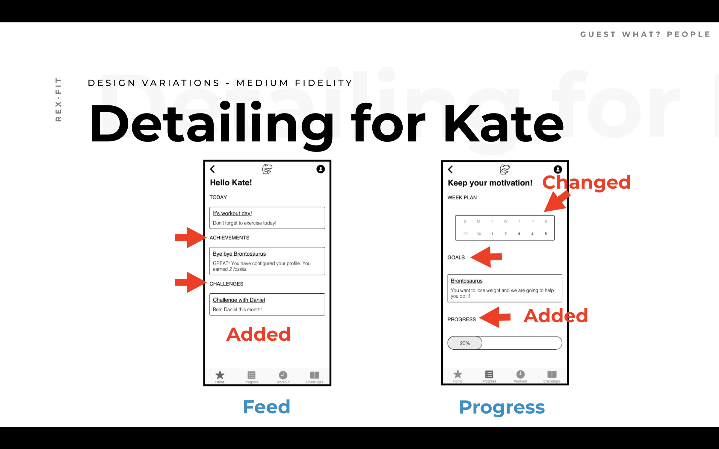
Iterations after tests:
- Daily to weekly routine
- Added Goals and Progress
- Simplified “on boarding” and “workout” steps
Making it nice (High Fidelity)
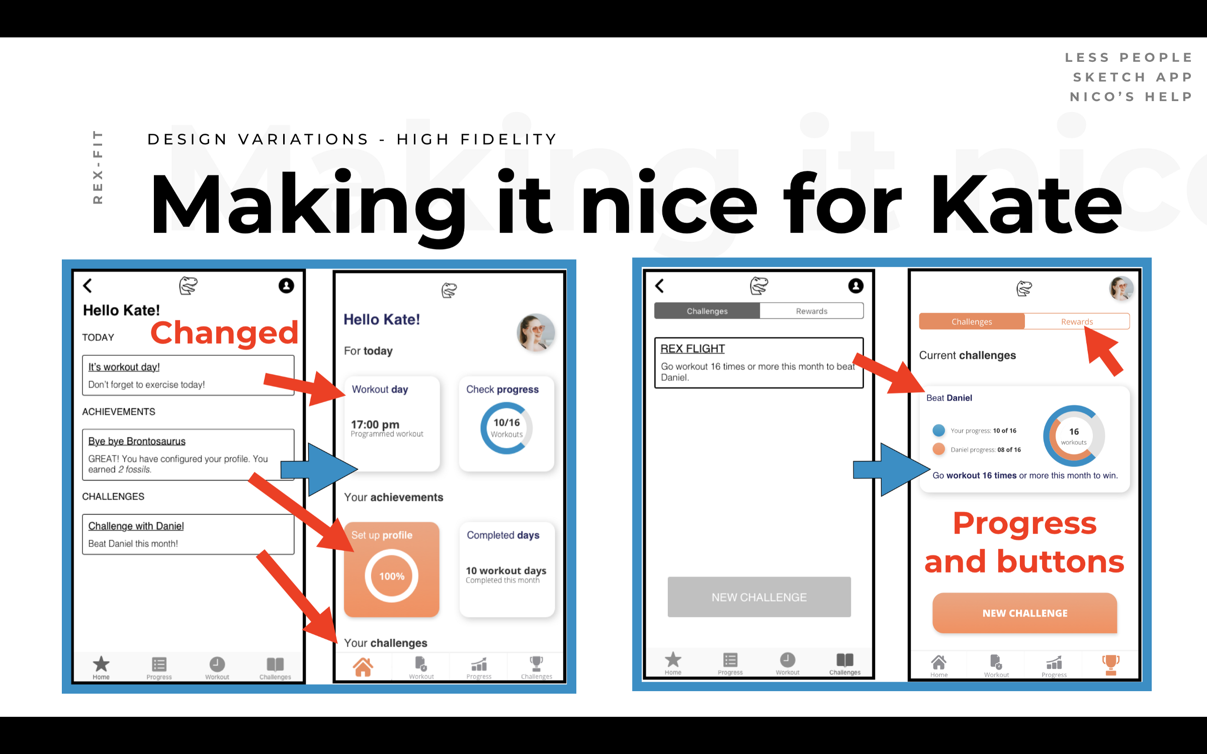
There are some cards that have more iterations, like the challenges card. I would have loved to make more iterations on every single card but I had a short scope and I needed to prioritize the ones that were more confusing in the testing phase.
During this project, I made a lot of changes in margins, size, and colors to try to be very consistent with my components, here are some changes after testing them several times.
Iterations after tests:
- Changed text notifications to more visual cards.
- Added percentages and stats.
- Colors, margins, and size— Consistency
The app (Prototype)
Finally, I am ready to show you my prototype but before going into it let me put you in a situation.
Imagine you are Kate, and Daniel, one of your best friends introduced RexFit to you. You want to try it, so you download the app and discover the things you can do with it before trying the “workout” feature.
The future of the app (Roadmap)
And after showing you my prototype I want to introduce you to a long period roadmap I created to tackle all the problems I couldn’t during this project because of my scope. The roadmap was created according to my research findings.
3 Months Roadmap
- Improve UI
- Improve workout menu
- Add diets
- Improve share feature (challenges)
6 Months Roadmap
- Daily training routine
- Personal trainer (Why not?)
- Social Interactions
- Different Rewards — Different Prizes (Merch)
Conclusion & Key Learning’s
I am really proud of the work I have done during this final project and the MVP that was delivered.
The project was presented in front of two UX/UI experts at Ironhack with Héctor and JJ. I have got really good feedback that I will use to improve the app.
As key learning’s I will have to say; Organization and Consistency. I am never tired of saying how important for a project is the organization of it and in this project particularly I need to mention consistency because at the end of the project it was always on my mind while doing the UI iterations.
Everyone said that it was going to be hard but WE DID IT, we finish the bootcamp PARROTHACK’S!
