Mar 27

What makes a product successful? Its Customers. And how do customers decide which product they want to use? The ease with which the product serves their purpose.
Discoverability is an important aspect while designing easy to use products. It is the ability for users to locate something they need to complete a certain task. This is applicable not only for digital products but also for physical products and services.
So I decided to list down the benefits of designing for discoverability with the help of various examples I have come across so far.
1) To facilitate ease of use
If the functions of a design are not discoverable, using it may lead to frustration. How? Have a look at the website for University of Advancing Technology.
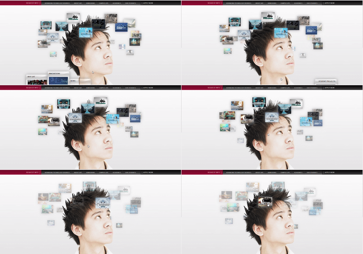
Imagine a student is looking for courses offered by this university. But there is no search functionality which makes it difficult for him to find the information he is searching for. To make it even worse he has to follow through the rotating list of courses to select one from. Many times, we designers tend to get carried away with the newest interaction styles or actions and forget the very purpose of user experience design which is to make it easy for the user.
There is one funny incident my friend had shared with me regarding the dishwater basket. So he used to pick up the silverware and utensils out of the basket in the dishwasher and put them away in their drawers then go back and pick up more out of the basket. One day he saw someone lift the entire basket out of the dishwasher and he stood there in shock. Because that poor guy never knew that the basket can be lifted out 😀. Only if this feature was little more discoverable it would have saved him some efforts.
Align the functionality you want to be discovered with existing user behavior.
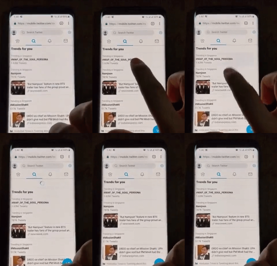
The best example of this method is ‘Pull down to refresh’ gesture which was first introduced by Tweepie, an iOS application for Twitter. They observed that users tend to scroll reflexively for more content on Twitter as it refreshes periodically and add more at the top. Noticing this behavior, even when there are no unread updates above, they decided to tie a manual refresh to it instead of it being a null event. And now you have ‘pull down to refresh’. Discoverable.
2) More customer engagement
For the longest time, hamburger or a side navigation drawer was considered the common design pattern to display all the features behind an icon to save screen real estate on devices like mobiles or tablets.
But the main downside of the hamburger menu was its low discoverability. That’s why many leading companies are ditching hamburger menus for tab bar or bottom navigation bar. This keeps the core features always visible making them easily discoverable.
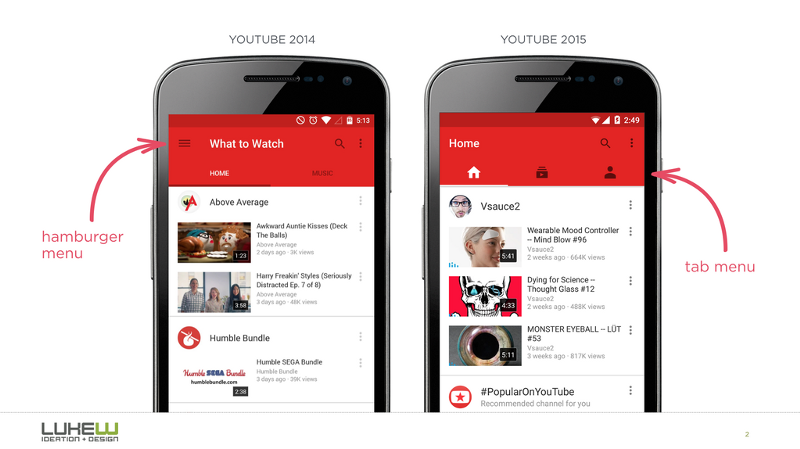
The study shows that making features discoverable leads to more customer engagement, improvement in business revenue and user satisfaction.
Out of Sight, Out of mind
Take an example of an e-commerce website Qoo10 which is a Southeast Asian e-commerce platform.
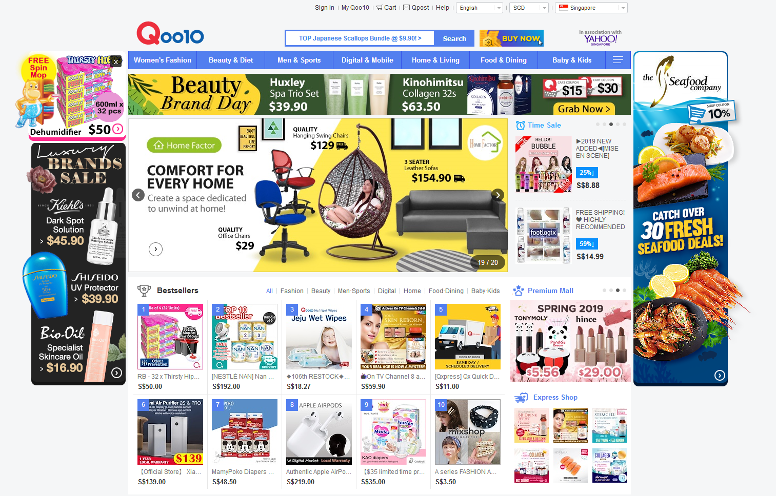
Their greatest issue revolves around inventory’s discoverability as it is inundated with advertisements, discounts, and offers for several different products. It can be a confusing experience for the customer to find desired products and may even drive away potential shoppers.
3) To follow stakeholder’s vision
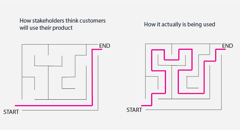
Sometimes even after designing a product which fulfills specific user need, customers don’t always use it the way stakeholders had envisaged. Simple reason being they don’t understand how a product works.
Some of you might argue that that’s where product manuals or application onboarding comes into picture where you can train users on how to use the product which can easily solve this problem. Yes, you are correct, but tell me honestly how many of you diligently read instructions before using the product.
Few may argue again that if they don’t find it in first use, they will eventually know from the second use onwards. But if they are never introduced to the feature, how many numbers of uses would it take for self-discovery? Maybe One? Perhaps Two? For some even five. However few may never end up using it.
That’s why I loved how Whatsapp had rolled out its new ‘swipe to reply’ feature for Android devices. Initially, users had to long press on a message and then click on reply. So when they would perform this action to reply, there used to be a tooltip saying “you can swipe on a message to reply”. This is a good way to introduce new features or changes in features. It shows that serious thought had been put into making features discoverable.

Final Thoughts
Having said that, sometimes business deliberately adopts to low discoverability of features as it leads to improved business results. For example, unsubscribe buttons are always hidden in the workflow to make it difficult for users to leave the product. Whether this design pattern is ethically right is another round of discussion. But from the user’s point of view the need to be able to discover functionality is critical to have good user experience which in turn drives more business.
