An introduction to iconic designs 🚗
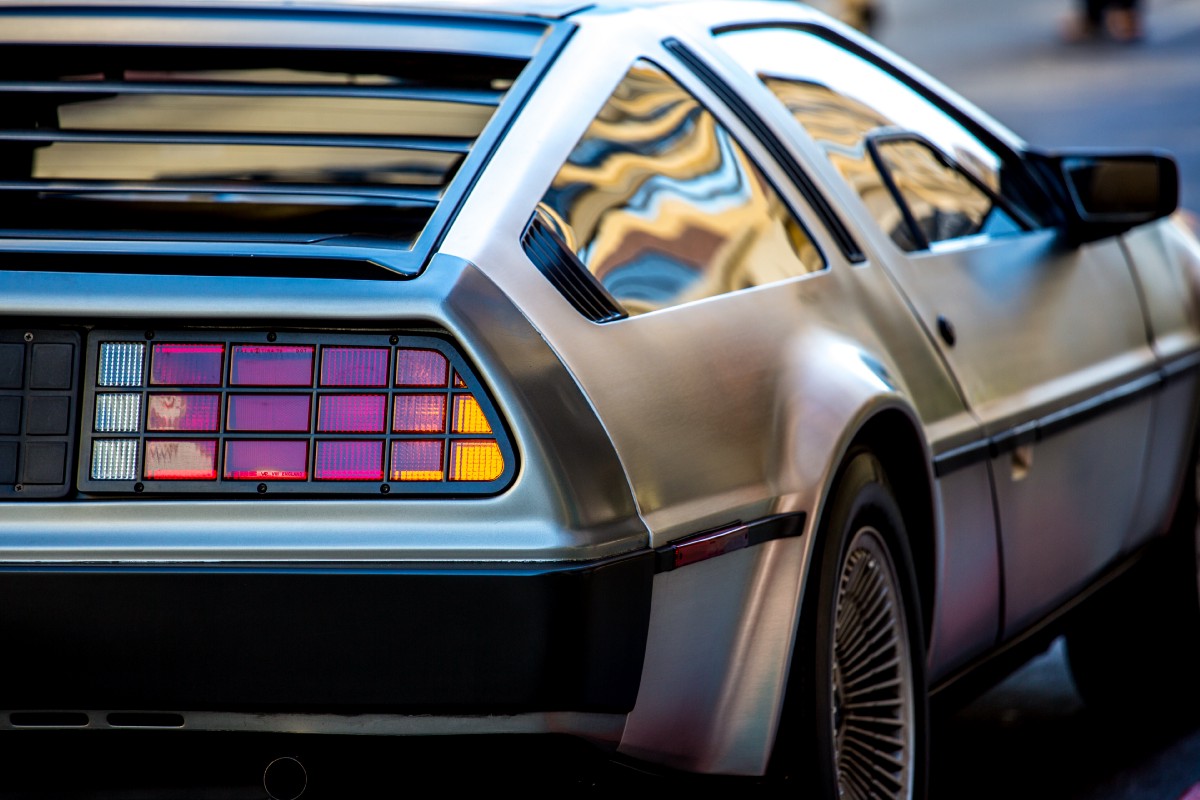
For those who have seen Back to the Future will recognize the legendary DMC DeLorean as one of the most iconic cars in automotive and film history. In the 1985 hit movie, the DeLorean was used as Dr Emmett Brown’s plutonium-powered time machine that had to reach 88 miles per hour in order to time travel. Today, the DeLorean is still highly recognised as an iconic design that tells a unique story.
Iconic design is something recognisable and memorable, and comes in many forms.
Just like the DeLorean, iconic design is something recognisable and memorable. It comes in many forms such as architecture, branding, typography, automobiles, industrial design, and popular culture. Take these examples: the Statue of Liberty is easily identified for its unique profile; McDonald’s is globally recognised for its golden arches; the pasta-loving Mario is the prominent face of Nintendo; even the Coco-Cola bottle is distinguished for its unique shape.
The meaning of iconic design🗽

When a value or meaning of design is understood, shared and mutually agreed by a group of people, it becomes iconic. However, if a design cannot be recognised nor understood, then it will appear arbitrary, such as an abstract work of art.
Sometimes it takes time for a design to become iconic. But even when a design is understood by one culture, it can appear arbitrary to another. It’s even possible for an intended value of a design to be misinterpreted, or altered by social influence.
The Statue of Liberty, a national icon of the United States of America, was a gift from France. The original idea behind the statue was to represent the friendship and mutual desire for liberty between the two countries. However, over the years the statue has become much more.
Because of the Statue of Liberty’s position in New York Harbour, the statue was treated as an entry point and effectively the first sign for the newly arrived in the United States of America. Today, the statue continues to greet millions of immigrants and embodies hope and opportunity for those seeking a better life in America. Despite the statue’s ‘original value’, people all over the world perceive it as the symbol of freedom, hope and dreams.
Iconic design as part of a visual language 🙈 🙉 🙊
Icons, symbols, metaphors, and signs are used in digital design (such as websites and apps) and in the natural world. We see them in the form of written language, road signs, user interfaces, and brands, all of which communicate a cultural meaning and value.
We communicate by using iconic designs that are relevant to something we understand. For example, we use emojis in text messages to convey an emotion or a reaction. And when we see a stop sign, we know what plausible action to take next.
Iconic designs can also be used as visual cues to do something (such as a door handle, or a light switch). UX pioneer Don Norman describes this form of design as a ‘signifier’. He states that ”the term signifier refers to any mark or sound, any perceivable indicator that communicates appropriate behaviour to a person”.
Iconic designs can be subconsciously used as part of a visual language to help save time and memory
When iconic designs are frequently used, it becomes ingrained in our minds and subconsciously used as part of a visual language — an infinite library of learned symbols and metaphors.
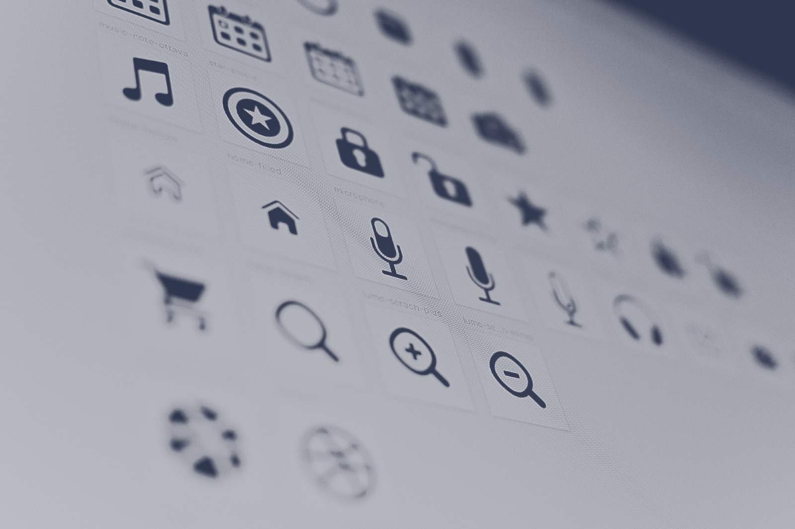
In user interface design, we naturally respond to icons (also known as iconography) that represent objects and meaning from the natural world. Take the magnifying glass, for example, we instantly perceive this icon as a metaphor to search for something. The house is commonly used as a visual cue to navigate to a homepage. And a rubbish bin (or trash can) informs us where we can dispose of unwanted files.
Iconic designs can emotionally influence your reaction towards a brand, product or service. Take star ratings, for example, these golden indicators often capture user attention and influence buying behaviour. However, some designs may be less perceived than others. The hamburger menu icon, for example, can appear arbitrary to novice web users. And security trust marks often lack clarity when displayed on their own with little context.
By using iconic design as part of a visual language that we can all understand, we can quickly make decisions, save time and reduce cognitive load.
Iconic design as part of global brands 🌍

Iconic designs which can be understood without words succeed in global recognition, and this has certainly worked out well for brand giants such as Apple, Google, Mercedes-Benz, and Coca-cola. But for a brand to be truly iconic, it needs to reach out to its audience on multiple levels. The product or service needs a good tone of voice, tell a gripping story, evoke emotion, and be memorable.
Some of the most successful and globally perceived brands have become iconic for positive reasons. Apple is renowned for its fashionable and innovative products such as the iPhone and iWatch. Facebook is the go-to place for social updates, to connect with people, and even when you’re bored. And Google has had a huge impact on the web to the extent of people using the brand as a term to search for something online; what’s the capital of Australia? Google it.
Global brand reputation can suffer through negative social perception. In early 2018, the Cambridge Analytica data scandal influenced people to become even more sceptical of engaging with social media brands, particularly Facebook. These days, social media brands are becoming more iconic for cyberbullying, addiction, fake news, and privacy violation — all the wrong reasons to be made iconic for.