Using Components in the same file is okay if you only have a few, but existing libraries often have many pages of Components you might want to use. Sometimes even multiple files. There is a way to re-use these without copying and pasting these into your working file again and again. This will help you create your own Design System, or work from someone else’s copy.
Official Figma documentation on libraries and component best practices can help you further.

You can use for favourite search engine to find UI kit files, or use Figma’s “Community” tab. It’s in the top left, then you can search by the “UI kits” category and use the “Files” filter.
I grabbed a copy of Polaris Components from Shopify.

Next, you’ll need to save it to a Team Library. If it’s for yourself, you can simply save it in your personal team library. Figma will create you a “Design System” project by default, so I find it helpful to save my UI kits there and mark the project as a favourite. This way, it comes up in the list view on the left for easy access.


In order to share the Components across all projects and files in that team, you’ll need to publish them first.
- Open up your chosen Component file
- Click on the dropdown menu next to it’s name, in the center at the top
- Click on “Publish styles and components”
This should open up a modal where you can use checkboxes to select which components and styles you want shared. Once you’re happy with the selection, hit the “Publish” button.

Finally back in Figma’s home menu view, you’ll need to click on the Team’s name in the lefthand navigator, and click on “Settings” at the top. You should see a list of settings like in the screenshot below. Once you click on “Enable libraries” under the “Team libraries” title you’ll get a list of files that have published styles and components that can be enabled or disabled with a dropdown.
Using the component file you copied earlier: click on the dropdown, then select “Design” if you just want it shared for your prototypes, or pick “All files” if you want to use them in your FigJams too.

Now all that’s left is to test it out.
Make a new file in your team — it doesn’t matter which project you save it in —then look in the top left next to the Layers window. If you click on “Assets”, you should see a list of Components that your file had, usually organised in a series of mini-accordions.
If the component file you downloaded only has styles, you can make some Text layers or Shape layers to apply some styles. With any of the layers selected, use the righthand pane to hover over and click on the four dot button next to any of the following:
- Layout grid
- Text (text layers only)
- Fill
- Stroke
- Effects
You should get a list of different saved styles you can apply to your layer selection.

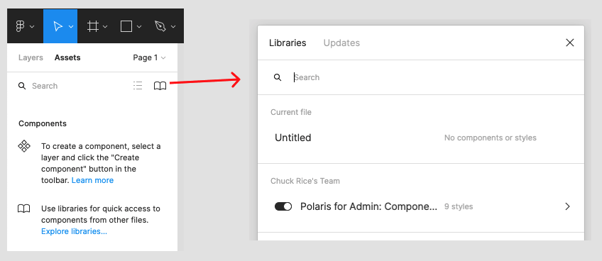
As well as the various effects you can reuse, libraries with Components can be found in the ‘Assets’ tab in the top left of the screen. It’ll show both local Components you’ve made in this file only, as well as any that are available and shared correctly.

Now you and your team can do less copying and pasting, and do more designing!
If you only want to enable sharing of a component file on a file-by-file basis, you can click on the book icon in the top left instead and enable or disable using the toggle.

I hope that was a helpful walkthrough to setting up a team in Figma with shared styles and components. It’s a feature that helps you bootstrap a project using widely used UI kits like Material Design or Bootstrap, or start encouraging more consistent pattern usage across your team in a controlled and systematic way.