Some questions just can’t have simple answers, can they? I have been dealing with this question, how do you know when design is done, for many years now. A deep observation of design from multiple angles had led me to appreciate assessments as tools to improve best practice. That led me to elaborate upon user experience measures, that not only provide clarity for designers, users, and business but also helps answer this question.
Design is never done
Design that is perceived and used by humans is never done. The human experience and people’s perception of the world are always changing, and as a result, any given design could always evolve and become a bit better. This raises the question of what does better mean? Understanding this is as important as understanding when design is done. I have been dealing with these questions for many years now. I am fortunate to have had the opportunity to observe design practice from different angles. From design education where the design process and artefacts are broken down to little pieces and evaluated ‘under a microscope’ through applied research where new tools and ways of practicing design are developed, to my current role as a UX Director at Solvers where I continuously work on improving digital product design processes that deliver fast results that matter to both business and users. My experience has led me to appreciate clear assessment methods that provide context and better frameworks for good practice.
Fine art can exist for the pure sake of self-expression, however, design most often exists to address a need or desire. Usually, this need is an economic one, which sometimes brings up a sad realization that from a simple economic point of view, if business needs are met, we may as well say that design is done. Of course, this depends on whether or not business needs were articulated properly at the beginning of the design process and if these needs have success criteria attached to them. From an experience design point of view though, we — designers know that there is a lot more than a business goal checkbox to tick in order to call it a day.
The sad reality of a checkbox

Designers know that there is a lot more to a design that achieves its purpose than a simple business goal. When considering the experiential value of design, designers would want to explore all aspects of it in their creation — the physical, visceral, and intellectual. These aspects will ever be fluid and responsive to the demographic and ethnographic context of the people who experience design. Therefore, the act of designing will never be simple or one that could easily be contained in a checkbox. However, the act of delivering design work on time and budget is rather a very clear one.
I have witnessed some frustration from people within the design community when the topic of recognizing when a design is done comes up in discussions. Some have said to me that in their design agencies “we checked a box, to get paid”. These designers clearly thrived for a better process, one that involves more user feedback, iterations, and validation, in order to release more complete designs. You may think their agencies promote bad practice. But, their clients probably think business needs were met and therefore they could pay the agency for the work delivered, and through this continue to promote bad practice. I think that this checklist is failing both designers and businesses because there is a lack of a coherent framework to help everyone involved answer the question of how do you know when design is done?
Can success criteria be more humane?
From a classic project management point of view, the project success criteria are evaluated by how accurately the triple constraints met their original estimate i.e., when a project is delivered according to Scope, on Time, and on Budget. When considering the trending practices of human-centered-design and customer-focused products and services, the need for a user-centric success criteria is emerging. If we, the business community and design practitioners, are trying to do right in the eyes and needs of our customers, should we only measure business goals for success or should we also look at the customer experience too? Some elements of user experience have been measured for quite some time, usability being a popular one.
Stop checking boxes, start S.coring

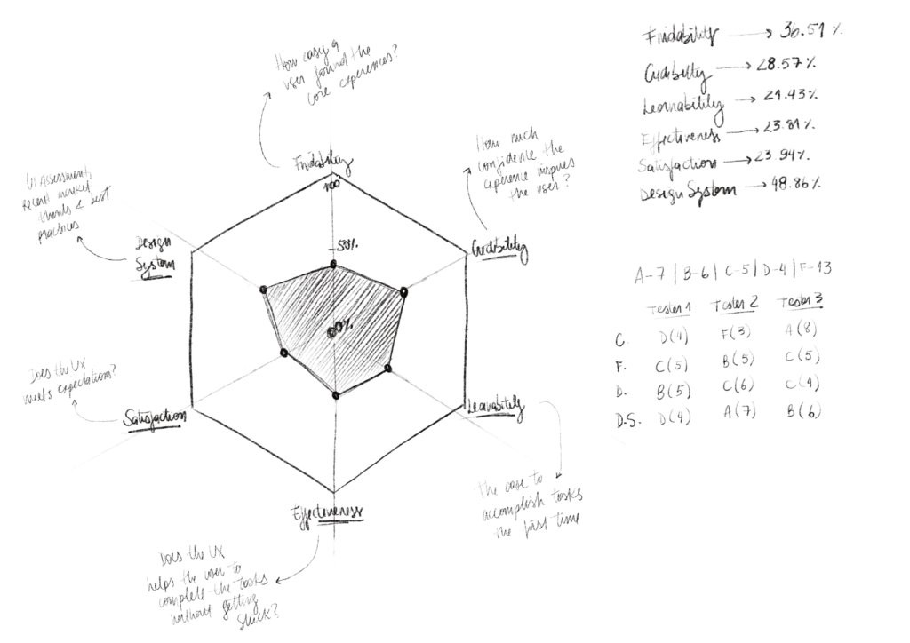
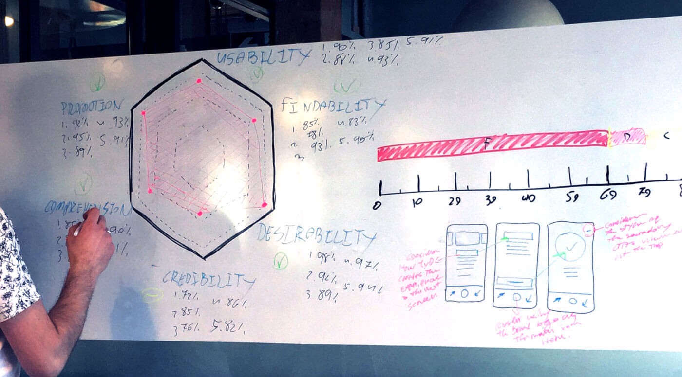
At Solvers, when we considered the challenge of embedding the customer’s side into success criteria, we first needed to find a way to measure the user experience. That led us to develop the S.core. S.core is a system of measuring digital experiences from users’ perspective which helps position digital products on a quality scale.
While many user-based assessments look into usability, S.core looks far beyond usability alone. In order to use customer’s satisfaction as a measure for success, we had to consider the full experience beyond achieving a technical objective only. We incorporated elements such as comprehension, attitude towards a design, emotions a design evokes such as a sense of trust, and even how likely one is to adapt and promote a solution.
This process of measuring the user experience from a user point of view also helped our designers look at their designs objectively. At the end of the day we design for users and user feedback is key to ensure success. Embedding this practice in the design process makes the entire team accountable for the success of the project in the eye of its users without getting unhelpfully attached to one design direction over the other. We user test designs often and measure the experience each time we do so. This helps the design team quickly get feedback on whether or not the latest iteration improves the user experience. The practice of doing so often provides a guide to achieving success with design within the limitations of scope, time, and budget.
Getting high on design

At Solvers we set a target high on the S.core scale as a goal for ourselves to reach with each design. This defines our benchmark and helps us determine when “design is done.” Well, when our designs reach that target then, and only then, do we call it a day.
With respect to the project management pillars I mentioned earlier, time and budget can define when a project is done but it can’t define when design is done. Design is meant to connect with its users on an emotional level and this cannot be scheduled for ‘next Tuesday at 4 pm’. In order to achieve satisfactory design solutions, and yet keep it within business constraints, it is important to have a clear definition of what success for design is and how it can be measured.
Not all design projects reach a happy ending. We have seen projects being pushed and pushed and yet fail to achieve the desired results. If you only judge these project based on visual aesthetics you would be wowed, I promise. Some of these interface designs were so slick they would rock on Dribbble, however, they didn’t S.core high enough with real users for our standards. Some product ideas are too complex and their value proposition can be very difficult to comprehend and slick UI can’t fix this. Being strongly committed to achieving high S.core on all fronts of user experience also led us down the path of advising partners not to go to market with certain solutions just yet. This sets us apart from those ticking off checklists. Our partners not only respond well to this process, but they are also eager to get the user feedback reports as much as they are eager to get the solutions design themselves. This enables them to make informed business decisions and be prepared when going to market with new products.
Conclusion
Understanding when “design is done” is good for business. It enables companies to invest in the development of solutions they already know are validated and can perform well and be adapted. Being brutally honest with yourself as a designer and clients about designs that are not yet ready is also good for business. This helps prevents spending on premature solutions.
Understanding when “design is done” is good for designers. It helps designers understand how users respond to designs and provides them with valuable feedback. It helps create a clear guide for design improvements.
Understanding when “design is done” is good for large teams and agencies. This shared standard makes everyone more accountable for the design process and results. This helps level the field in teams with both designers with strong personalities and ones that are quiet introverts. At the end of the day, it is up to the users to say if the design works or not. There is no room for egos, only room for meaningful design improvements.
Understanding when “design is done” is good for customers. Commitment to good design creates better solutions that ultimately help improve the lives of customers, users, people, or simply, all of us.
