Make content accessible to everyone, regardless of their abilities

UX designers are experts at developing empathy, supposedly.
So why do designers ignore such a large segment of their users?
People with disabilities are often neglected in the design process. They’re excluded from user research and testing, which is evident in the final product experience.
Not to mention that people often experience temporary or situational disabilities, causing them to experience some of the same frustrations when using digital products.
Some companies have faced lawsuits due to inaccessibility. Building accessibility into our products ensures that the companies don’t get sued and our products are accessible to a larger audience.

Within digital accessibility, a key component is writing content that is universally inclusive and accessible for all users.
At its core, content design is about problem solving. Designers should understand what information is essential for users to know in order to solve their problems and achieve their goals.
“Content design is a way of thinking.”
“It’s about using data and evidence to give the audience what they need, at the time they need it and in a way they expect.”
Good content design leads to better business outcomes. In fact, content contributes to the overall user experience by providing guidance and descriptions which can improve user retention and customer delight.
Content design is about understanding:
- What content does the user need to solve a problem or achieve their goal?
- When do users need to see the content?
- What way do users expect to see the content?
- What vocabulary and tone of voice should be used to present the content?
Here are some best practices for making content more accessible.
When it comes to writing accessible content, the language that you use should be understood by everyone.
Many companies hire UX writers to craft messaging using language that is simple and clear for users to understand. If you’re lucky enough to work with UX writers or content designers, include them in your design process to review copy and ensure that the language used is aligned with your brand.
Best practices for language:
- Write in short, clear sentences and paragraphs.
- Avoid using unnecessarily complex words and phrases.
- Expand acronyms on first use. For example, Web Content Accessibility Guidelines (WCAG).
- Consider providing a glossary for terms readers may not know.
For more information regarding language, visit W3.org — ‘Keep content clear and concise’.
When writing content that links to another page, make sure the link text is descriptive and meaningful to the user.
As screen reader users tab through a page, the screen reader will skip the surrounding text and only focus on the links. When the link is in focus, the screen reader will read “link {text}” so the text should make sense out of context.
Avoid using vague text, such as “learn more” or “click here.”
For example, if the link text is “Eric’s Medium profile,” then the screen reader will read “link Eric’s Medium profile.” Then users will know that the link will likely lead them to Eric’s Medium profile.
If instead, your link text is “click here,” then the screen reader will read “link click here,” thus leaving the user confused.
If your link leads to a file attachment, then include relevant information by describing the content of the link target, such as file type and size.
For example, ‘Research Study Report (PDF, 2MB)’.
For more information regarding links, visit W3.org — Link Purpose (In Context).
Alternative text, or alt text, is read aloud by screen readers when an image is in focus. It also appears in place of an image when the image fails to load.
Image alt text describes an image to users with visual impairments, so that they can understand what images are on the page and how they relate to the rest of the content. The text should be descriptive and concise, yet detailed.
Twitter’s latest feature reminds users to add alt text to their images, which is a step in the right direction towards building accessible products.
Best practices for alt text:
- Summarize or write out any text in the image itself.
- Never start with “Image of …” or “Picture of …”
- Describe the type of image, such as an illustration, chart, or screenshot.
- If the caption already explains the image, keep the alt text brief and avoid repeating the caption.
For more information regarding alt text, visit W3.org — Image text alternatives (“alt text”).
Content is often used to guide users to complete an action. Guidance can help users feel like they are being supported during the learning phase.
Users may want guidance at different points, such as an up-front video tutorial or feedback after completing an action.
Guidance be provided in the form of instructions, such as empty states, step processes, error messages and more.

Best practices for guidance:
- Ensure that guidance is clear and easy to understand, for people of all ages and knowledge levels.
- Describe input requirements, such as passwords, date formats, etc.
- Avoid unnecessarily technical language, as some users might not have the knowledge or context to understand it.
- Avoid blaming the user when displaying an error message. Acknowledge the error in a light or neutral tone and provide a solution.
- Use a text-to-speech tool to play back your message and ensure that the language sounds correct and appropriate.
For more information regarding guidance, check out Microsoft’s Designing for Guidance booklet.
With the rise in popularity of podcasts and audiobooks, content creators have made traditional reading available through audio, allowing people to multi-task. But for people with hearing impairments or language barriers, captions should be offered as an alternative to listening.
Videos should also offer a descriptive transcript for users to understand the visual content as well.
This way, everyone has an equal opportunity to access the same content.

Best practices for captions and transcripts:
- Include spoken information in transcripts and captions.
- Describe sounds that provide background or context, such as ‘calming music playing’ or ‘door slams shut’.
- For video transcripts, include descriptions of important visual content.
- For livestreams, provide a live transcript of the audio as well as a sign language for people with visual impairments.
For more information regarding captions and transcripts, visit W3.org — Captions/Subtitles and Transcripts.
Tooltips are helpful and can be necessary with icon menus. When an icon isn’t accompanied by a label, provide a tooltip when hovering over the icon.
Not all icons are universally recognized so having the tooltip helps explain to users what the icon represents.
And even with common icons, the tooltip provides a description for screen readers to read aloud to users with vision impairments.

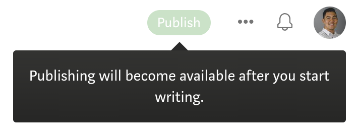
Tooltips can also be helpful in explaining why UI elements, such as buttons, are disabled. It can be frustrating for users to see a disabled action and not know how to enable it.
Before disabling an action, think about alternatives such as providing better instructions or an error message upon clicking on the element.
If you must disable the element by default, a tooltip can bring clarity to the user and give them a better understanding of the UI.
Best practices for tooltips:
For more information regarding tooltips, visit W3.org — Content on Hover or Focus.
To design a fully inclusive and accessible product, understand who your users are to get a gauge on what languages your product should support.
A good example of internationalization is IKEA. Being a multinational company, the assembly instructions for its furniture only use diagrams and illustrations, removing the need for text and translations.
They even came out with assembly manuals for aliens after the US government released a highly anticipated report on UFOs. Talk about a truly accessible company.

The 30% rule
Keep in mind that text in different languages can take up more or less space on a screen, so design your UI with translation in mind. A rule of thumb is to include at least 30% more space in your UI components around text.
To ensure that your components have enough space, test out your designs by translating your content and seeing how they fit within the UI.
If your translated text can’t fit within the component, think about how text lines should truncate or wrap in these scenarios.
Best practices for internationalization:
- Write short, complete sentences.
- Avoid colloquialisms, puns, or local jargon
- Define and use terms consistently
- Translate text that is embedded within images
- Apply the 30% rule
For more information regarding internationalization, visit W3.org — Internationalization.
Thanks for reading!
Be sure to SUBSCRIBE to never miss another article on UX design, career tips, life lessons, and more!
Here are a few more to read next: