Measuring perceptions and acting on findings.

Early in 2019 I wrote, UX Metrics: Why not measure aesthetics? Extending proven user experience measures to account for aesthetic usability effect, which introduced UUP or “up score”. It received more attention than I expected, which spawned exchanges with other designers. Many were about ways to apply the UUP UX metric. Realizing a follow-up on that topic was called for I wrote this article.
If you’re already familiar with UUP and interested in more ways to apply it, feel free to skip ahead. For those that want background, read on.
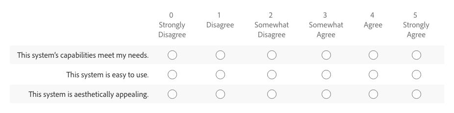
UUP is a tool for measuring the total UX rating of a product. UUP stands for Utility, Usability, and Presentation. It consists of 3 statements related to a product’s capabilities (utility), ease of use (usability), and aesthetics (presentation). Participants rank their agreement with each statement from 0 to 5. It’s an extension of UMUX-Lite (which is based on SUS) with a measure to account for aesthetic opinion.
UUP statements
- [This system’s] capabilities meet my requirements.
- [This system] is easy to use.
- [This system] is aesthetically appealing.
Total UX score
Total UX score is a weighted average calculated from the three ratings. It’s weighted because utility, usability, and presentation tend not to be of equal importance in overall perception. For instance, a product with low utility has little if any value to someone even if ease of use and aesthetic quality are outstanding.
Total UX accounts for the imbalance with:
- Utility worth 3x
- Usability 2x
- Presentation 1x

To calculate total UX score with the same 0 to 5 range the formula is:
Total UX = ((Utility * 3) + (Usability * 2) + Presentation ) / 6
How might we use UUP to detect and address UX issues? There are three methods I refer to as quantitative, qualitative, and lifecycle.

Quantitative application
UUP provides a way to consistently measure UX over time and across products.
Here, the objective is to gather a significant number of responses across product releases to identify trends in results between them. Start with a benchmark survey on a current version, which includes an UUP ratings question. This sets a baseline score. Those results may also provide clues to focus research efforts. For instance, if you see a low usability rating perhaps some usability studies can identify improvement opportunities.
With that baseline you can rerun quantitative surveys that include UUP ratings on subsequent releases. Then, if you decide to target product appearance improvements with a release, you should expect to see a better presentation rating.
For SaaS products on a continuous delivery cycle you can survey at regular time intervals or ad hoc based on the push of significant updates.
In summary:
- Survey to get a baseline product UUP rating.
- Repeat UUP surveys at regular intervals and review for trends.
- Use findings to target additional research on potential problem areas.
When applied across multiple products, UUP allows you to compare UX ratings between them. If product A has a total UUP score of 2.4 and product B has 4.5, you can state with reasonable confidence that B has a better user experience than A, regardless of how similar or dissimilar the two products are. Does it tell you why there is a difference? How to fix it? To what extent the difference is impacting your bottom line? No, of course not. But it surfaces information that may guide additional research.
Qualitative application
UUP helps foster fruitful conversations about high level UX issues and puts numbers to qualitative findings.
This is when UUP is used as part of qualitative research, like a task-based usability study. It’s always done in a moderated session (either in person or remote) and in context of a person viewing or interacting with a prototype, pre-release alpha/beta, or current version. In these situations you may be testing with only 5 to 10 people and may even be modifying the prototype along the way. Because of this, confidence in the precision of one participant’s UUP rating to the next is low compared to a quantitative study.
You may ask, if that’s the case, why measure? Because UUP is a useful catalyst for discussion of topics like utility, usability, and presentation.
To illustrate, let’s return to the example of a usability study. You’ve defined outcomes, identified tasks, written a test plan, and set goals for success. That’s great! But that plan is inevitably built on assumptions that narrow focus. I’ve found asking a participant to respond to UUP statements at the end of a session helps widen discussion to big picture UX topics.
I have participants rate each UUP statement, but I’m not so concerned with the exact number. The value comes from discussion about why they chose the rating they did. I’ve had situations where tasks in a study tested well, but at the end the utility score rated low. This indicates a usable product that someone sees little value in. That’s clearly a problem! This insight opens the door for a conversation that may help understand how to build the right thing.
While UUP scores from small groups of qualitative test participants lack the precision of quantitative surveys, the ability to quantify the squishy perception of user experience can help get buy-in from stakeholders hesitant to invest in qualitative research. Our data-obsessed business culture gravitates to numerical artifacts as objective proof. We must speak that language to be heard and influence decision making.
Lifecycle application
UUP can expose weak links in your design, development, and release product lifecycle causing UX to suffer.
This is where the two prior applications of UUP come together. If you’re regularly gathering ratings on a released product, and taking measurements during the iterative design and development cycle, you can look for trends across the two.
Imagine an UUP survey indicates low usability on your current product.
- You decide to set usability improvement goals for the next update.
- While designing and developing the new version you take UUP measures during qualitative testing and see improvement.
- Following the release of that update you gather quantitative UUP measures on the updated product.
Are the positive results you saw during design and development reflected in the release scores?
If yes, that provides some confidence in your design/development/release lifecycle. If the scores don’t align, why not? Did the product released fall short of the prototype? Did you test with people that didn’t accurately represent your customers? Did you misunderstand use cases? Did you misread market demands? A sizable difference in qual vs quant score alone on a product can’t answer those questions, but it shines a light on potential problems to investigate further.

UUP puts an objective measure on the subjective — namely utility, usability, presentation, and overall user experience. What meaning can you gather from those numbers? Honestly, none — or at least very little.
Why is that? Because no metric, no matter how hyped, often used, beloved, or touted by experts tells you anything about why something rated the way it did. For that, you need to talk to, interact with, and observe people. There is no shortcut around doing essential design research. However, metrics like UUP can illuminate problems that might otherwise go undetected.
I liken it to body temperature. If it’s 101°F you know that’s not right. How serious is the problem? What’s the right treatment? There is no way to tell from that one measure, but it’s still useful. It’s a simple indicator that may encourage you to call your doctor, run more tests, and get treated once the problem is diagnosed.
You’ve got this far (thank you!) and may be thinking, “Is my organization ready to adopt UUP?” I’ll argue that it’s a useful tool for a team new to the concept of UX metrics as well as valuable to organizations with robust measurement programs. That’s because:
- It’s simple to run.
- It can be applied to any product.
- It provides actionable UX insights.
For a company without UX metrics, running a benchmark UUP survey can be a useful indicator of customer perception around user experience. It’s also a way to introduce UX metrics, start to build that competency, and demonstrate value. It’s an easy and effective first step in the journey to systematically measuring user experience and acting on the findings.
For a company that’s already conducting discovery research, defining measurable UX outcomes, doing iterative design testing, and measuring customer satisfaction — UUP offers a consistent, repeatable, and comparable measure that can help tie together an overarching UX story. It doesn’t replace other tools, but has the potential to add significant value with minimal investment — Good design ROI.
In the end, no organization (regardless of size) has limitless design and research resources. We need to make choices. Metrics like UUP and others are tools to assist in the decision making to allocate those finite resources. With that in mind, UUP can help you to design and build great products.
Notes
Regarding the 5 point score of UUP, people have asked about using a 10 or 100 point scale. The ratings and calculations can easily be converted if it works better for your UX messaging. However, regardless of scale, a zero baseline is always recommended rather than having the lowest rating be a positive number. Also, UUP ratings intentionally have no neutral response. A participant cannot opt out of taking a side, either positive of negative to a statement by picking the middle answer. It’s essential that any modification to the response scale maintain that feature.
Lastly, I want to extend my thanks and acknowledgement to friends and colleagues that helped me write and refine this article — including (but not limited to) Jakub Sroka, Shrie Spangler, Jeff Matthews, and many others.