Starting a new project is in a lot of ways the hardest part. It’s the only stage of development that you’re turning nothing into something.
Luckily, there are proven methods to reduce the “empty canvas” syndrome. We’ll talk about the best ways to handle the early stages of brainstorming and concepting and how it translates into wireframing to prototyping.
Brainstorming — The Design Studio Exercise
As described in the Guide to Wireframing, brainstorming for design ideas can feel like you’re trying to grab something out of thin air, especially if you don’t have a fixed method. In these cases, its best to have organized methods to lend structure to an otherwise disorderly process.
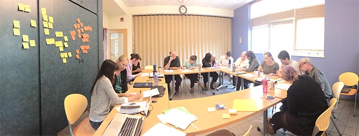
Our favorite at UXPin is the design studio exercise, which is widely advocated by designers like Will Evans and Todd Zaki Warfel. This activity satisfies multiple functions at once: creating inspiration for ideas, building unity as a team, and unearthing possible UI design issues. More importantly, by actually involving stakeholders (instead of just asking for opinions), there’s less a risk of design by committee.
Source: Establishing Design Direction
This is a process we follow that takes a little over an hour, but helps us turn 10-15 rough ideas into 3-4 solid ones worthy of wireframing.
-
Start with a problem (15 minutes)— Choose a problem or challenge you’re looking to overcome, ideally based on actual research. Explain the problem to the group as a whole, including relevant details like personas, user scenarios, and business objectives.
-
Break into teams of four or five (5 minutes) — You can divide the groups any way you want, even randomly. The important thing is that the group sizes meet the optimal range of four or five people.
-
Try to solve the problem with a round of rapid sketching (8-10 minutes)— Each round should last no more than 10 minutes, and the sketches should be done quickly to encourage fast thinking.
-
Discuss sketches within group for critiques or revisions (15 minutes)— Sharing your sketches within the group will open the door for collaboration, with each group working together to make their solutions as efficient as possible.
-
Do two more rounds of sketching and revisions (15 minutes total)— After a cool down period, do another round of rapid sketches and again present them to the group. After about three rounds of sketching, you should have a stockpile of possible solutions to work with.
-
Group Reflection (15 minutes)— All the groups come together as a whole and present their ideas. This is the most important phase, where the best ideas are presented and critiqued by everyone.
Source: Establishing Design Direction
Designer Brad Frost wrote an excellent piece about how this exercise helped him. Since everyone can present ideas (even non-design folks), you may find the seed of an idea in the least likely of places. Just make sure there’s a strong leader — ideally the designer will have the final say.
The design studio exercise is not the only brainstorming activity available to you. Stanford compiled a small list of equally beneficial design brainstorming activities, which you can see on their Use Our Methods page. We list other strategies for idea generation in the free Guide to UX Design Process & Documentation.
Wireframing — From Ideas to Outlines
After you’ve generated enough ideas, the design team will split off and start iterating, but this doesn’t mean you can let the team drift apart.
The typical process flow after brainstorming follows the order of sketching, low fidelity wireframing, mid to hi fidelity mockups, and finally prototyping. In some cases, designers may even skip mockups entirely and dive into rapid prototyping, but we recommend giving each their due time.
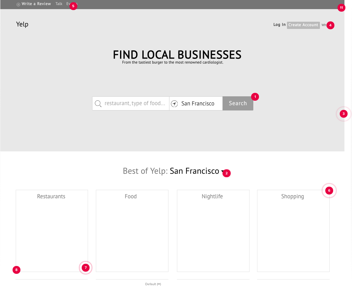
Your most basic outline — outside of rough sketches — will be your wireframe. To follow along, you can check out our low-fidelity wireframe that we created for a redesign of Yelp. This is where your ideas are laid out tangibly, so as to avoid misinterpretation across the team. The typical wireframe includes three layers of information:
-
Content — graphics, textual content (blogs, articles, product descriptions, etc.), logos, page headings, forms, etc.
-
Layout — header, footer, branding, content areas, etc., and content prioritization.
-
Behavior — here is where you can include notes and annotations to explain functions that can’t be shown in a 2-D image, i.e., error messaging, pop-up forms, default settings, etc.
While it’s tempting to “skimp” during the wireframing phase, it pays off in the long run to make them as useful as possible. Low fidelity wireframes help save time and money by giving you a quick medium for feedback on visual hierarchy. High fidelity wireframes (which are known as mockups) are better for reflecting form and function when persuading stakeholders. Whichever path you choose, the seven steps we list below will help you maximize the benefits of wireframing:
-
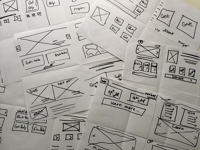
Start with a sketch — This doesn’t need to be anything fancy, only something to help you avoid starting from scratch. Like we did in our redesign of Yelp, it’ll help even more to show your sketches around the team first to get some early critique before building the wireframe.
-
Share them with your team — Wireframes aren’t meant to be kept to oneself, and in fact, some even think that wireframes are better for communication than design. It is much easier to revise a wireframe than a coded prototype. (We address this in UXPin with our Preview mode and Live Presentation which build collaboration into the process.)
-
Use proper documentation — It may seem extraneous, but keeping track of revision dates, authors, references, etc. is worth it in case you have to backtrack. If you’re going to use a wireframing tool, check if it automatically tracks iterations.
-
Don’t lose sight of each page’s goal — When hammering out the fine details, it’s easy forget how all the pages connect. No matter what tool you use, periodically zoom out on all the pages you’re wireframing to see how everything fits together. This will help you think about flow, which is crucial when you start prototyping.
-
Focus on content — For most wireframing, boxes and basic shapes will do. The goal is visual hierarchy, not visual perfection. Minor details like font size, graphics, and colors only matter if your wireframe is high fidelity.
-
Utilize common elements — Make use of tools that apply changes to all pages at once — they will save you time. On a related note, you can also standardize design by adapting patterns from these 40 resources.
-
Conduct informal user tests — As recommended by usability researcher Jakob Nielsen, testing with as few as 5 people can help you understand up to 95% of potential design issues. Hallway testing your wireframes is a great way to test early, test often, and test cheaply.
Wireframes are the bridge between idea and prototypes. If you’d like to see some great wireframe examples, check out this gallery of 18 real company wireframes to see how some big name companies like Apple and Twitter started with simple low-fidelity wireframes.
For a more comprehensive explanation of the wireframing process including helpful exercises and template libraries, check out the Guide to Wireframing.
Prototyping – Breathing Life Into Static Design
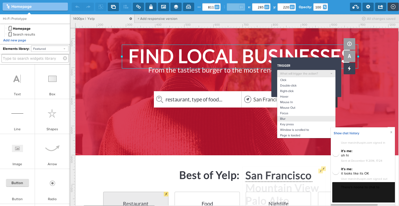
If wireframes test the structure of your site, then prototypes test the experience. CEO of UXPin, Marcin Treder, explains in an article that the goal of a prototype is to simulate the interaction between a user and the interface. What separates prototypes from other early stage phases is the UI elements, things like clickable buttons, user flow, and functionality. As with the other stages, catching and fixing problems in the design stage is much easier than when you’re stuck in code.
Some of the most helpful advice on prototyping comes from the UI Designer at Basecamp Jonas Downey, who tested their new app Know Your Company with a prototype. They had many ideas, but needed a quick way to test if it could all be molded into a cohesive product. Here’s 7 tips that we’ve found helpful in the hundreds of prototypes we’ve created (like the one above):
-
Function over appearance — Testing functionality is the point of a prototype. Don’t worry so much about the look of the site at this stage; just tackle the interface details now and the appearance later. While our above example is high fidelity, we started at much lower fidelity by adding interactions to our wireframe.
-
Don’t be afraid to try new things — Now is the time to experiment with interaction design, before the develop process gets any further.
-
Don’t get too attached — There’s going to come a time when you’ll have to throw something out because there’s just too many problems. Show no mercy when it comes to removing the broken sections, because design is sculpture by subtraction.
-
Wait on optimization — Sure, it’s tempting to optimize CSS styles, markup, JavaScript, etc. right from the start…but you shouldn’t need to with a low fidelity prototype. You may need to completely rewrite a feature later, which means all that time spent optimizing was a waste.
-
Take right shortcuts — We’re not suggesting you cut corners, but, for example, if parts of your site requires authentication, assume you are already logged in for the prototype, and create the authentication interface later. Focus on the big issues.
-
Clean up when you have time — Things get messy in the prototyping phase, so when you’re exhausted after fixing the big problems, take a little breather by cleaning up the scraps. Keep track of the scraps in a project management program (we use Asana).
-
Know when to stop — It can be hard to gauge when to stop prototyping and when to start building the real thing. But once you’ve agreed to the visual design and functionality, drop the prototype and get started on the actual site.
The above tips are what have worked best for our own design process. In addition to digital prototyping, you can also try paper prototyping as an early process. When you’re ready to get started, you can check out an all-fidelity wireframing and prototyping like our own UXPin and other tools like Invision, Balsamiq, and Moqups.
To Reality and Beyond
This piece should help you understand the process of turning design ideas into workable prototypes, but that’s just the beginning. While it may be difficult to create something from nothing, turning something into something better and workable is no easy feat either.
“You can use an eraser on the drafting table or a sledge hammer on the construction site.” – Frank Lloyd Wright
On the bright side, if you follow these recommendations for the brainstorming, wireframing, and prototyping phases, you will have a solid foundation that will support the rest of your development. A good start leads to a good end.
For more practical advice on building web interfaces based on examples from 33 top companies like AirBnB, Wufoo, and Linkedin, check out the free 109-page e-book Web UI Best Practices.

