As a web designer you always want to stay on top of the latest ideologies. User experience design is the process of building around what the user needs to do. You have to consider specific reasons for why users are coming to your website in the first place. And the goal is to build a layout which is ease to use, easy to navigate, and provides quick access to the most important information.
In this article I would like to share a few ideas for studying UX trends among other websites. While browsing the Internet you should consider these ideas and pinpoint good design vs bad design. As you understand what to do(and what not to do), the planning process will be a lot easier. And building a usable website will follow an understanding between what your users need and how they interact with a typical webpage.
Navigating Pages
This concept is probably the most important and does get a fair amount of discussion. Nowadays there are so many types of navigation systems you can follow. Horizontal menus, horizontal dropdowns, vertical accordions, fixed navbars, and hidden sliding menus are just a few popular solutions. It will take some patience to determine which is right for your projects.
But I think a quicker solution to the problem is planning out your content pages in advance. Websites always change and grow to include more content, more resources, and better structure. So it is not uncommon to update your navigation system time-to-time. By planning the generic content structure you’ll have a better idea of just how many links need to squeeze into the navigation.
Also think about how many of these pages should be nested inside a parent container? Will you have 3rd-tier nested pages? Different websites will have different needs but the navigation is always a requirement. Users want to be able to quickly skim between pages and access the content they really want.
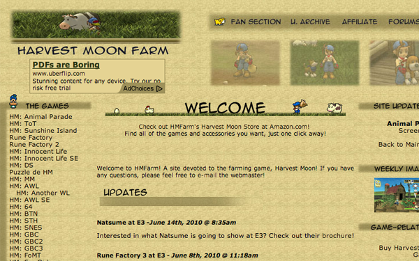
Consider the example website above, HMFarm which is dedicated to the Harvest Moon game series. They actually have so many links that the website splits the navigation into two sidebars, lining the center content area. I don’t think it is the most elegant solution but it does present all the content front-and-center. Easy to read, easy to navigate, and quick access to all the important content. Keep your eyes peeled when visiting other websites for how they are solving the navigation experience.
Well-Spaced Typography
Equally as important as the concept of page navigation is how page text will be styled. Most of the content on the Internet today is still written digitally. This means visitors will be reading most of your pages rather than listening or watching. How your text is displayed will make a difference.
I like to say that bigger text is often always better. But this is generally the case when focused on the juicy inner body content, the stuff visitors are really interested in reading. Other sections like your sidebar, header, or footer may try squeezing in smaller fonts to fill in gaps. I think this distinction is important so that visitors can tell at a glance where your main content is displayed.
Contrast and visibility are two important factors. Light text on dark backgrounds and dark text on lighter backgrounds is the way to go. And shades of grey are often better than solid black or solid white. Text-shadows may be useful in some instances – but don’t go overboard including them everywhere. Your page will be an eyesore if every bit of text is embossed and styled. But I don’t think you can push too large unless the font is absurdly oversized.
Larger text is also easier to read when wrapped around images and other webpage media. Although text is very important, it is not the only source of Internet-based publishing. Lots of blogs and websites can also publish image galleries, pull-quotes, embedded videos, and other neat features. You want to allow plenty of line-height and margin space between text and viewable elements. And all of this content should blend organically into a soothing website layout, easy to read and easy to understand.
Print and Mobile Layouts
I think the buzz around mobile-responsive websites has caught the attention of many web designers. But it is still fairly commonplace to ignore print stylesheets – and this is within good reason for many cases. But designing freelance or building on your own projects may eventually benefit from generating printed styles.
I feel this article on CSS-Tricks delves a bit deeper into creating print stylesheets. Basically you want to strip all of the unnecessary items out of the layout. It is also a good idea to remove any colored backgrounds. White is easiest for printers so they are not wasting excess ink. It is true that not everybody will need to print your pages, but it doesn’t hurt to offer a clean solution.
Additionally mobile users shouldn’t suffer through a layout dependent on jQuery and menu animations. If you have a full-width site layout which can still handle mobile users then that is great! But not all websites viewed on desktop will translate properly onto smartphones.
The easiest solution is to build for responsive designs. As the browser window resizes you can overwrite styles in your layout to hide certain elements, or display new ones. We have published a recent gallery of responsive websites which is worth looking over. Plenty of good ideas and techniques for creating natural mobile layouts.
Content Attraction
One final point to consider is what makes each website so attractive? Throughout your Internet surfing there will come plenty of sites which are just plain ugly, provide very little content, or the content which is available has been structured in an awful layout. These websites should be learning experiences for what not to do in your own projects.
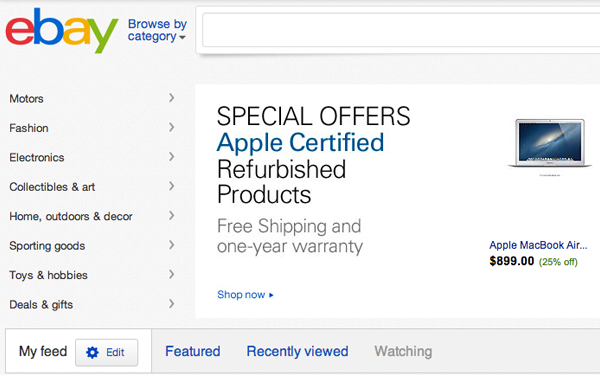
And similarly you will come to websites like eBay or Amazon which are generating a lot of revenue in product sales. What attracts people to these brands? The innovators in various niches will be the ones who eventually win over the competition. Whatever can be done better should be done better, and then take it to the next step.
A good rule of thumb is to keep interactions open between website staff and visitors. Allow them to send feedback about your designs, the interface, and the content. Both good and bad feedback can be useful depending on how many people are sending messages. Use this method as a gauge for what could be updated to improve the experience of your website projects.
Final Thoughts
I can’t say this is an exhaustive list of trends, but I hope to get you thinking in the right direction. Never stop questioning new ideas for interfaces and layout features. There are always new design ideas to consider and break out of the mold. As the late Steve Jobs once said, “people don’t know what they want until you show it to them”.


