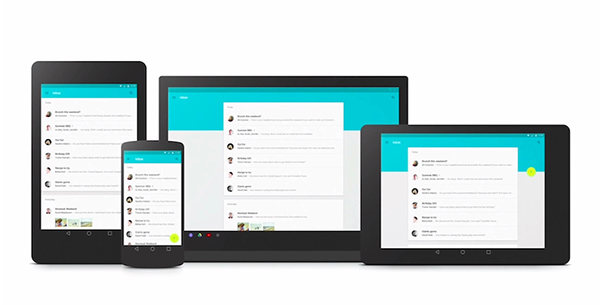
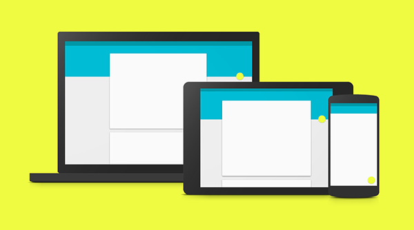
In the simplest of explanations, Google developed Material Design to unify the experiences users have across various Google platforms. Additionally, this unification is to bring improved overall experience a user has with technology by making the interaction easier, simpler and more intuitive.
Tell Me, What is Google?
Google is a very big company, which includes various technologies from search engine to browser to laptop to operating system to glasses to watches to a lot of things. It only makes sense for a company with so many technologies under its ownership to synchronize the experience between various devices or interactions. Material Design is a lot more than just a new UI; it’s a whole (new) Google experience.
SEE ALSO: Mobile Design Patterns: A Practical Look

A big part of Material Design is the way a user interacts with various technologies in that they have a seamless flow between interactions. Say you’re writing an email and walk away from your computer while it’s still unfinished and open. You can continue writing that email on your watch, phone or tablet without having to worry about saving it as a draft, syncing it, finding it and continuing where you left off. Another example: You’ve just arrived home and the emails that pop up first are from your friends and family not work because Google’s technology knows not to bother you with work-related stuff when it’s family time. This technically has nothing to do with UI. Material Design is about how Google can improve your life by making their technology smarter.
The UI of Material Design
Now that Material Design will be the staple of Google’s interface it’s important to understand how they came about making it. A big part of making Material Design is the physical world. Google Design Lead for Search Jon Wiley told Fast Company:
“When you make things, you inherit thousands of years of expertise. But software design is just getting started.”
This statement alone means that in making the UI for Material Design they wanted to create something brilliant and astonishing. However, they needed tsome serious research to figure out what would give Material Design that specific design influence. Wiley further explained:
“We took a step back. We looked at all of the software and asked, what is this made of?”
Cardstock to Influence Design
Google wanted to add perceptiveness of physical objects into the digital world. As you may remember Apple was notorious for trying to do that with skeumorphism; in Google’s eyes Skeumorphism was on the right track but can be done better. There are no fancy textures in Material Design, the UI is clean and simple. Skeumorphism was a big exaggeration compared to Material Design. But, how does cardstock fit in?

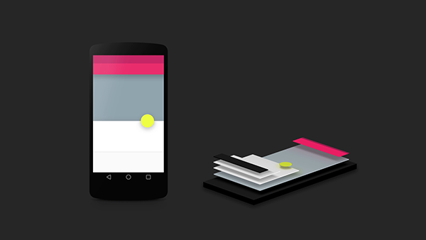
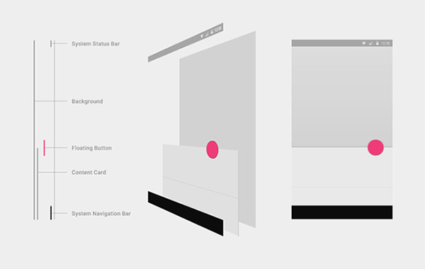
Cardstock is a big part of making Material Design what it is. The designers at Google, wanting to make the digital as physical as possible, stacked UI elements one behind another – like stacks of cards. This is nothing new, as a lot of designs are like this. However, Google did take a step further by implementing shadows to make the UI actually appear like cardstock. The real world was important for Google designers to preserve; the real world and physics serves as big reference point.

Studying Real Paper
Google took paper to heart as a fundamental influence of the design. Google Design Lead for Andriod Matias Duarte explained to Fast Company that Material Design is looking to improve pixels form just having color and instead leverage your screen to change shape and depth of the pixels in response to a touch. In order to bring the most realistic experience into the digital world, they studied actual paper. The designers made paper icons with various layers to see how shadows were actually cast. Although real paper cannot morph and manipulate like the cardstock within Material Design’s UI, it helped to study it anyhow. After all, Material Design is making headway within the design community. More importantly, it will be a big part of design for Google as they roll it out. Even if Material Design wasn’t making headway, it’s still crucial to test your design, as it will impact users.
![]()
Aiming for Digital Physics
One big principle within Material Design was to create a sense of faux physics within the digital realm. This was to create some type of sense and relationship for the user in the way they see the screen and various apps interacting and working. It was important to showcase some sort of relationship since physics don’t apply to the digital world. The reason to do this would be quiet simple: To forgo having to implement “intuitive” app design. As apps or websites – or any single one of their components – aren’t by nature intuitive, designers have to rely on conventions. Otherwise, apps and websites are hard to use. Material Design aims to create a visual relationship within its UI so that intuitive is easier to come by for users. The key is also to realize they want to cater to a relationship, that’s why the actual UI has subtle animation, shadows and color to make interacting with Material Design more fun.
What’s the Point of Material Design?
All in all, Material Design is how Google is going to unify its experience across various products and technologies. A fundamental part of Material Design is to enable seamless information flow between devices and having smarter technology. Think about how tedious it is to deal with just email — there are various apps for email alone; some apps aren’t cross platform. Same goes for file sharing, pictures, or even text messages.

If the synchronization between your TV, watch and smartphone or your car is in fact seamless it will be easier for you. As a user, you won’t have to worry about making sure your messages or files are synced to a device, you won’t be bombarded with work emails while you’re at home – and vice versa, pictures sent to you from last night won’t be popping up while you’re at work.
Material Design is much more than just elegant UI (no matter how elegant it may actually be). A big takeaway from what Google is doing is that they are going after overall experiences. Most importantly, they are trying to improve how people use technology and make it easier and better.
Conclusion
Google, being the awesome giant that they are, announced they are going to implement Material Design in various platforms. When you think about it, they own so many technologies that it only makes sense for them to provide a unified interaction experience. What do you think of Material Design? Do you think it’s a good move on their part to try to unify and improve the experiences people have while using Google products?
