When it comes to web design, the quality of experience that users have with a site determines whether it’s successful or not – regardless of how visually catchy the design is. A positive experience drives sales and conversions, while a negative one deters visitors from staying or returning. Therefore performance optimization should be a central part of your design process if you’re aiming for high conversions and user satisfaction. Here are some ways to improve your site’s user experience.
Increase Site Speed
Consider how many people take out their phones to quickly check email or look something up when they have a spare second in the day. Whether it’s while waiting for the bus, standing in line for coffee or running to a meeting, they expect to achieve their goal on the web in that short amount of time. Forty percent of users will abandon a page after waiting longer than 3 seconds, and many people share their bad site experiences with others. It’s your job as a designer to make sure your site is loading fast enough to satisfy these standards and to make sure yours provides an experience that gets positive feedback.
To begin the process of improving your speed, first use a site speed testing tool to measure how it’s currently performing. Then make changes like:
- Resize or remove large images and files
- Reduce the number of plug-ins in your site
- Eliminate flash files, which greatly weigh down performance
- Cache your site so that it won’t have to take time to fully assemble every time a user accesses it
- Always retest your speed after making changes so you know what is effective in improving it.
Clean Up Your Navigation
Reassess your navigation system: does your menu and search field honor conventions in that they are easily identifiable and usable? Minimize the number of options users have when entering your site by combining pages/content and getting rid of low-traffic pages. The fewer options there are, the more direct your site’s purpose is, and the easier it is for users to decide where they want to go. You can evaluate how users currently use your site by carrying out usability tests and referring to your site analytics data.

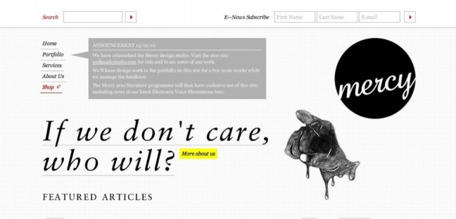
Mercy Online
This site has a visible search box, an option to easily subscribe to a newsletter and a few clickable links to navigate to other pages.
Aim For High Conversion Rates
You can be sure that a high converting website is also highly usable. Focus on the usability of your site, and user satisfaction (and in turn, conversions) will follow. To maximize usability:
- Make your purpose clear. Use recognizable and concise calls-to-action so that users know exactly what they are meant to do with your site. Show users the value your product or service will add to their lives.
- Be consistent. Make sure each page of your site sends the same message, and shares the style of design elements and layout.
- Make text readable. Tailor your content to be easily perceived while users scan the page. Headlines, variations in font sizes and weights, and breaks in text blocks create a breathable set of information that can be retained even while glancing through it.
- Keep it simple. Comparable to the fact that simple navigation makes it easier for users to decide what to do, simplicity in your entire site design keeps users from being overwhelmed with information. Ample white space and a unified style give users a sense of comfort and professionalism, and builds their confidence that they’ll find what they’re looking for quickly.

Red Digital Agency
Red presents a good balance of white space, imagery, text and color to reveal its purpose and capture attention.
Build Trust
Visitors to your site will have a more positive experience if they can trust you. Whether it’s the validity of your information, your protection of their personal information or confidence in the quality of your product, it’s important to give them reason to trust you. You can do this by providing visible contact information, allowing customer feedback, presenting previous customer testimonials and/or client logos, and displaying your SSL certificate if you have a registration or checkout page.
When working to improve your site’s user experience, just remember to consider what your audience is looking for, and test and measure the changes you make to create a more effective site.